

How to Optimize Your Website Content To Resonate With Your Dream Customer

July 11, 2023

Every element of your website including the text, the navigation, the photos, and your products, is all considered “content” and is a highly valuable opportunity to capture your dream customers’ attention. Well-crafted website content can create an immediate connection with your visitors, helping you to build relationships, create trust, and make more sales! Let’s explore how to optimize your website content in a way that really speaks to your ideal customer by focusing on two crucial pages: your Homepage and your About page.
Set the Stage with an Engaging Homepage
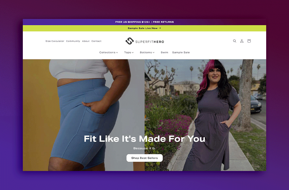
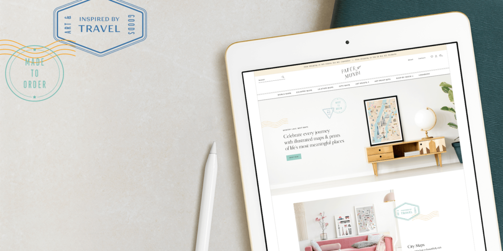
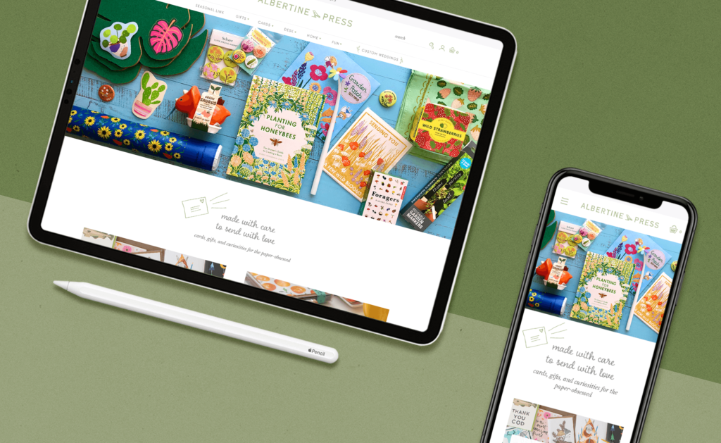
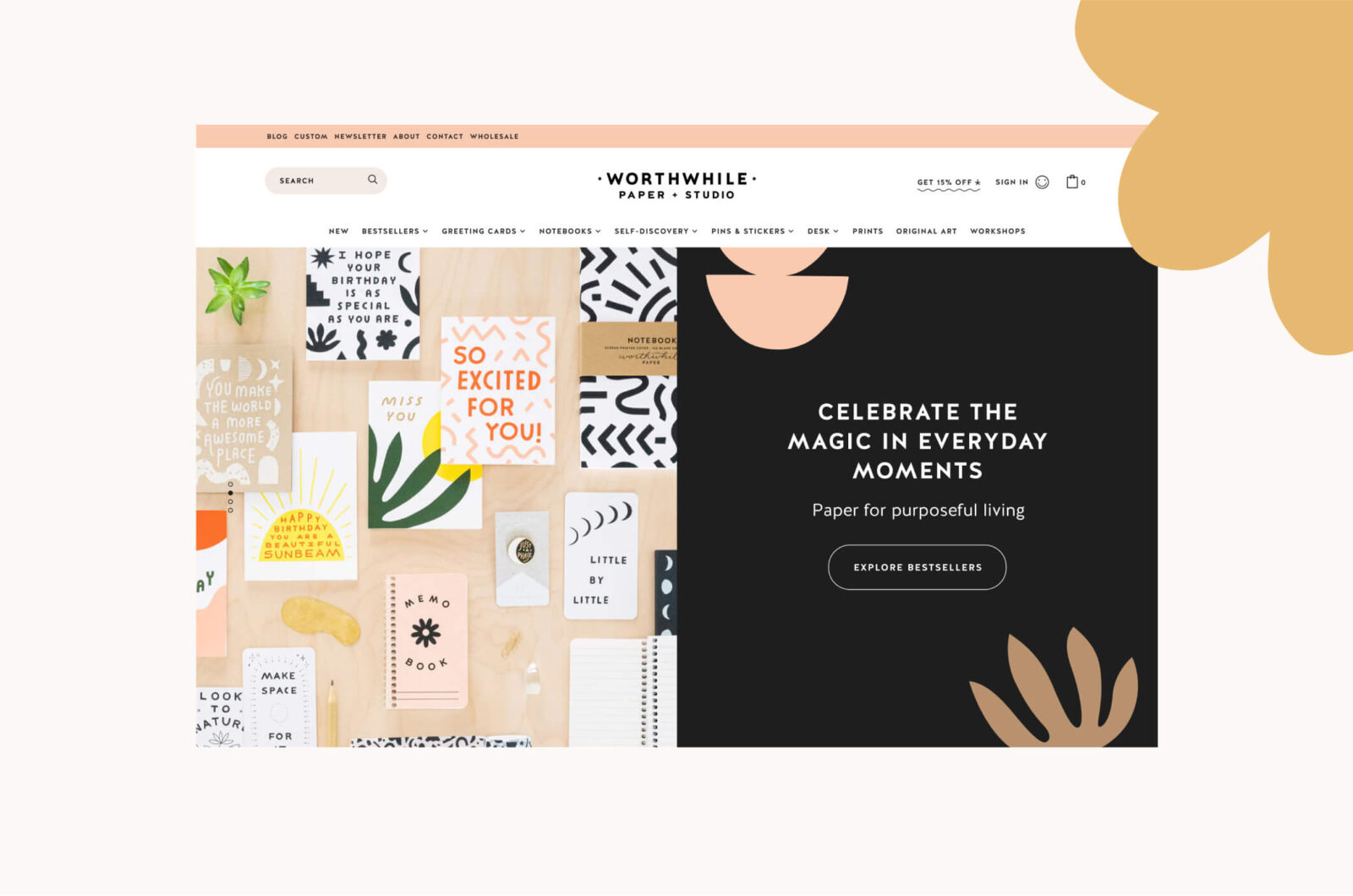
Your homepage is the virtual front door to your business. It sets the tone for your brand, captures visitors’ attention, and entices them to explore further. The most important thing to consider when creating your homepage content is your customer’s perspective and what their experience will be.
You only have a few seconds to capture your potential customer’s interest and to help them orient themselves to your little piece of the internet world. To do this, you need to have clarity in every morsel of your content. Also, you’ll want to think about the path you’d like people to take from your homepage and what action you’d like them to take. Let’s take a look at the different elements of your homepage.
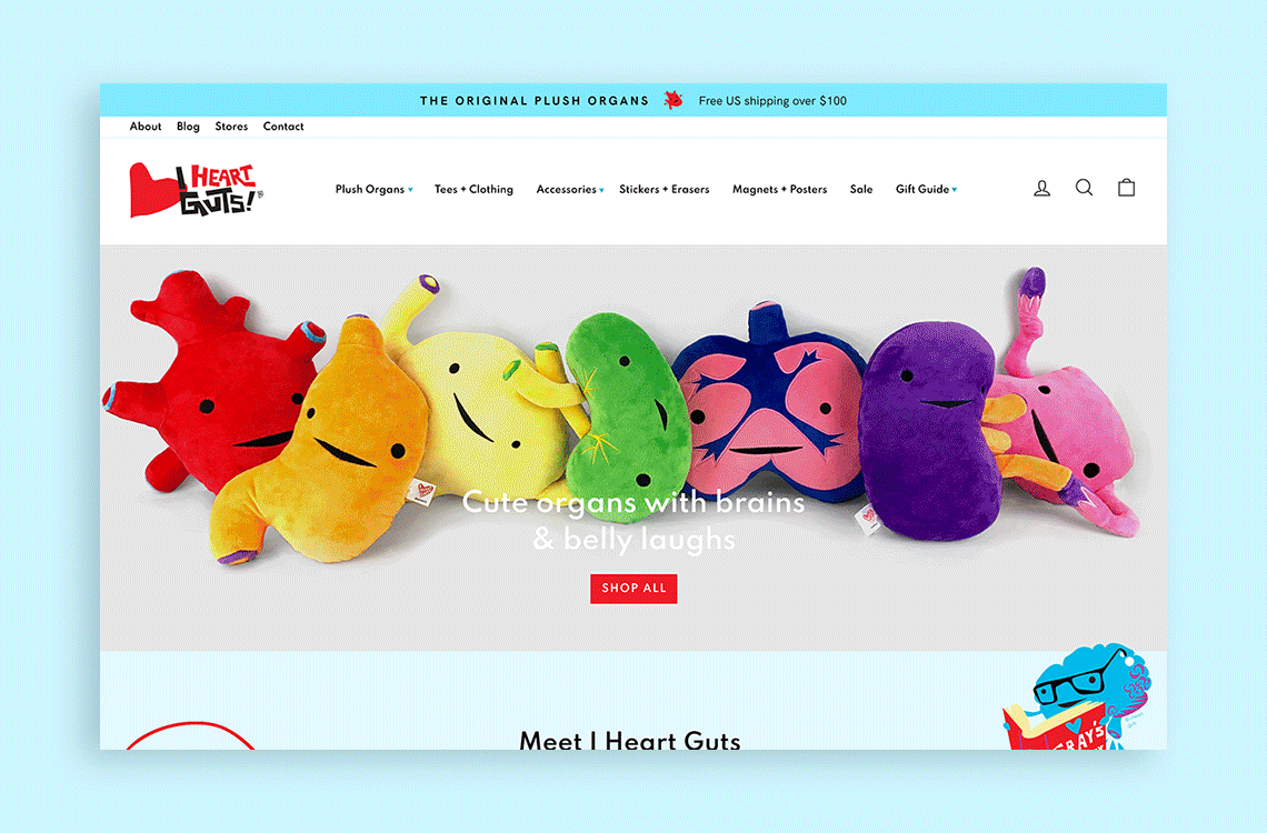
Header
This is the very first spot to grab your visitors’ attention. Make the most of this opportunity by considering the following details:
- Logo – Greet your visitors with a well-designed logo that is representative of your brand. This will help draw your ideal customer in by giving them visual clues about what your site is all about.
- Tagline – Provide context to your business name, and help orient a new visitor by summarizing exactly what you have to offer and who you’re offering it to in a few simple words.
- Incentive offer – This is optional, but if you do have a special incentive such as free shipping, the header is the place to share it. This can encourage someone to explore your site.
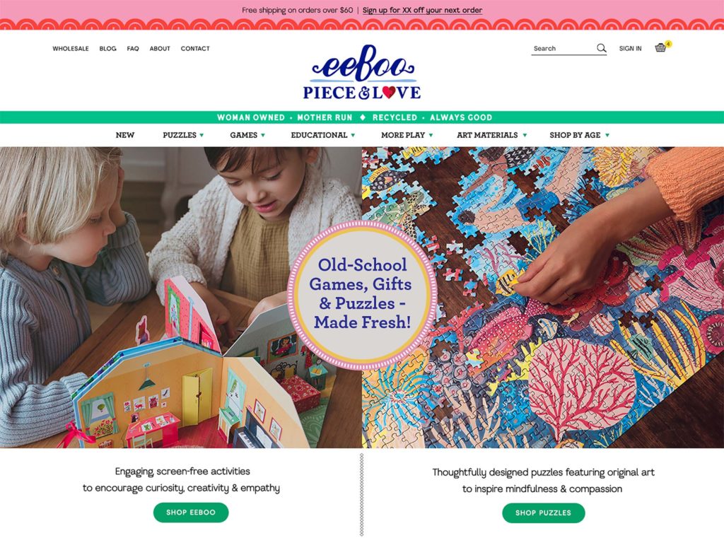
Navigation
Your site’s navigation menu is the map you hand to visitors upon arrival, so it’s important to be as clear as possible. This means sticking with tried and true navigation titles such as, “About,” “Contact,” “Shop,” “Blog,” “Portfolio,” “Wholesale,” etc. because this is what customers will be expecting to see.
For weekly tips like this, subscribe to our newsletter
"*" indicates required fields
Also, beware of vague titles that can be interpreted in different ways. For example: “Gallery” could mean art for sale or a portfolio page or even an archive of older work. When it comes to navigation titles, always opt for clear, cut & dry language.
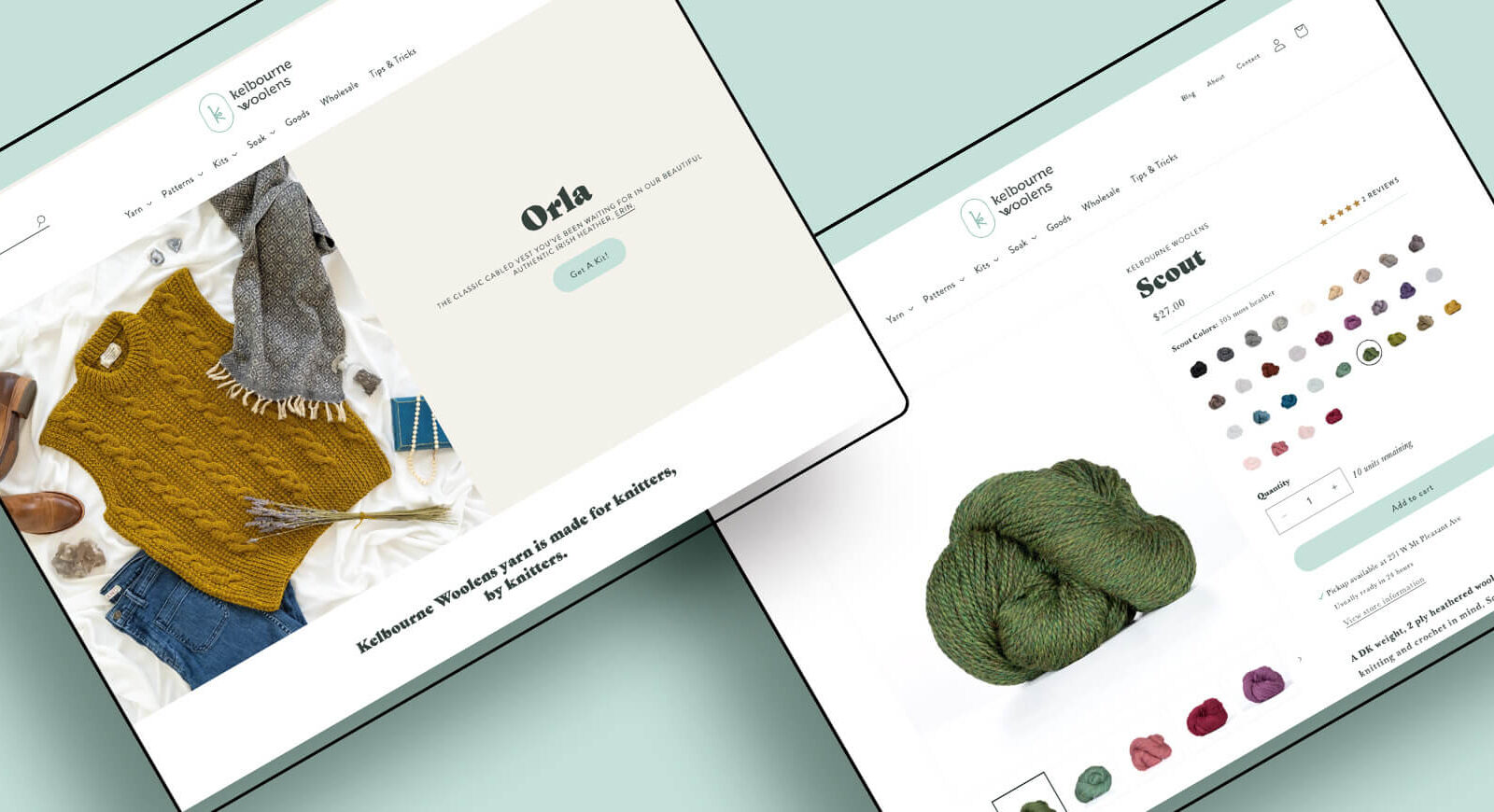
Main space
Below the navigation and before someone scrolls is prime website real-estate! This section of your website needs to communicate what you’re selling, who it’s for and why it’s special. You only have about 3 seconds to grab your viewer’s attention, so be sure to take full advantage of this space by including these elements:
- Hero image, slideshow, or video
- 1-2 sentences that convey your USP
- Compelling call-to-action
Secondary space
In the space after your main content is the spot to direct visitors toward your next priority goals. Content to include in this space can include any of the following:
- Top sellers
- Your newest collection
- Your headshot and a blurb about you
- Newsletter sign-up form with an opt-in
- A feed of your newest blog posts
- Testimonials or reviews
- Press logos
Footer
- Social media links
- Primary navigation from the header
- policies, shipping/returns, FAQs
- contact page
- Address & hours for brick-and-mortar shops
- Copyright
- Search bar
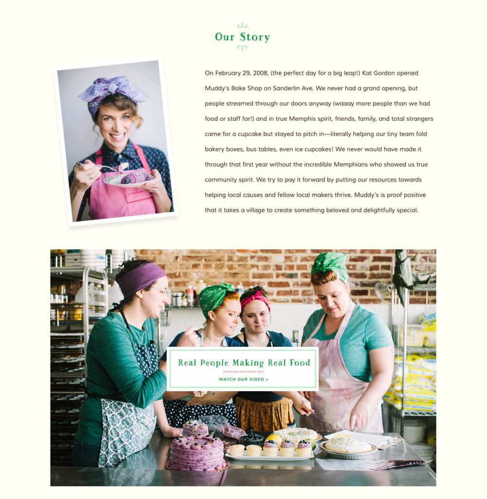
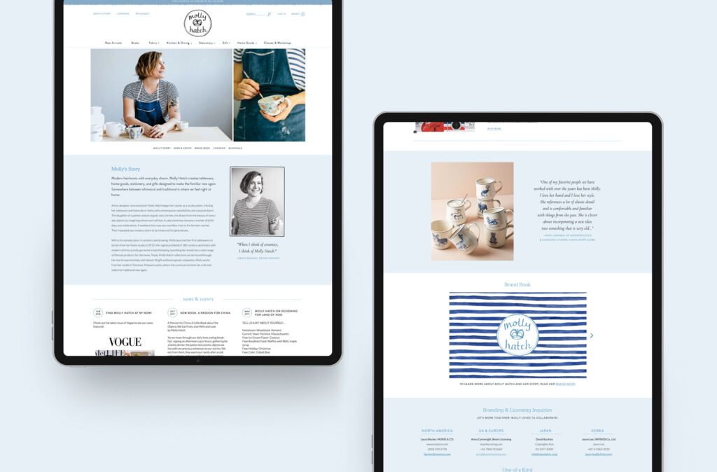
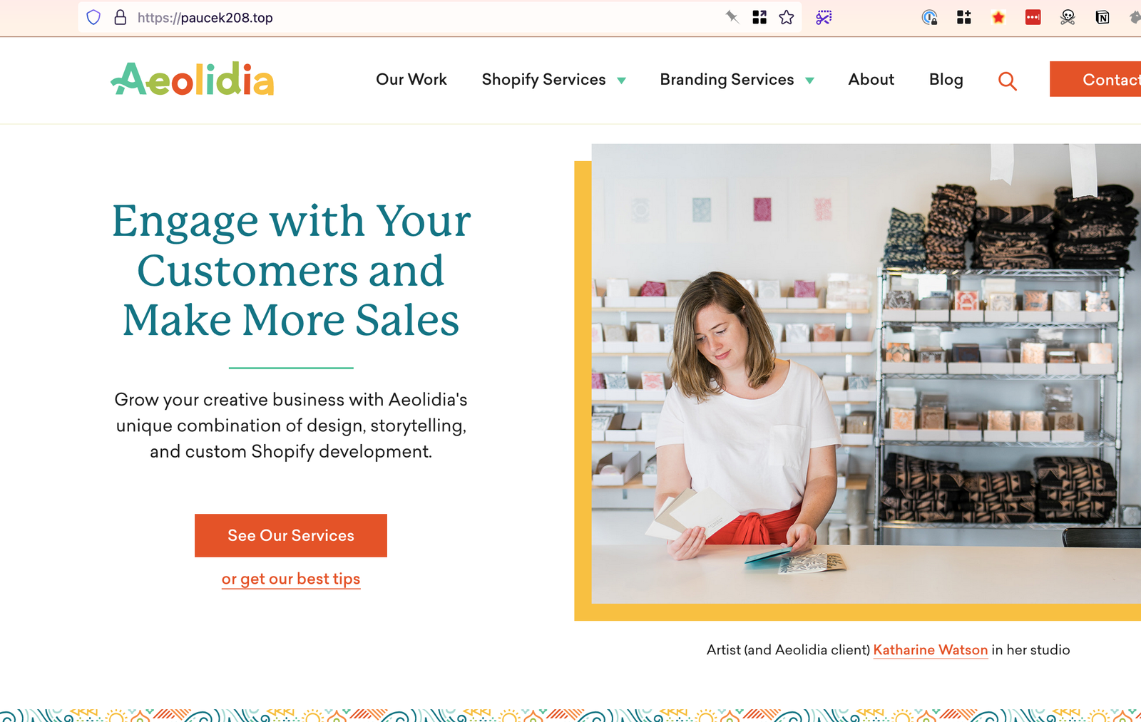
Share your story with an inspiring About page
As you optimize your website content, you’ll want to pay special attention to your About page, which serves as the gateway to understanding a business’s vision, values, and expertise. It’s a common misconception that the About page isn’t all that important, but statistically, it’s the second most viewed page on a website, just after the homepage. That’s because people want to know who they’re doing business with online before they buy! Here are some examples of what you can include in your About page to help connect with your customers.
- The Founders’ Story – Every business has a unique origin story, and your About page is the perfect place to share the inspiring narrative of how the company came to be. Providing insights into the founders’ passions, struggles, and triumphs establishes an emotional connection with your audience, thereby fostering trust and credibility.
- Meet the Team – If you have a team helping you, take this opportunity to introduce your website visitors to the individuals who help bring your vision to life. Be sure to highlight their expertise, passion, and dedication to delivering outstanding results.
- Process – Pulling back the curtain and allowing your website visitors to see your creative process is a surefire way to capture their attention!
- Core Values – Sharing your core values and the guiding principles that shape your work will create resonance with your ideal customer who shares similar values and help foster meaningful connections.
This may sound counterintuitive, but an important thing to remember as you craft your About page is that it isn’t all about you, it’s about your customers!
It’s the perfect opportunity to talk directly to them, show them you understand what they need, and share the reasons why you’re the right person to give that to them. Place your focus on connecting what you have to offer with what you know your customers are looking for.
Share the pieces of your story and background that relate to their story. Focus less on trying to describe what you do, and more on communicating why you do it. Less on how you do what you do, and more on the value and benefits your customers will receive through your work.
As you can see there are plenty of ways to optimize your website content to connect with your dream customer! Keep in mind that you don’t have to fix everything all at once and there is always room for creativity within this general framework.
Are you unsure about your website?

- Do you have feel like your website could be serving you better, but you’re not sure where to start?
- Have you added a lot of content to your site, and now you don’t know if your customer can figure out what to do next and make it easily through checkout?
- Is your website representing your brand in a way you can be proud of?
We'd like to review your website.
Browse by Category

A Newsletter That Goes Beyond Shopify 101
It’s easy to find beginner info about ecommerce online. If you’re past that? Subscribe to our newsletter for advanced strategies and need-to-know info for established shops.
Learn how the top shops grow:
Related Posts

Tools & Guides

Courses & Webinars

Let's take your online shop to the next level
The Shopify websites we design have a reputation for substantial improvements to ecommerce conversion rates and online sales. Let's talk!