


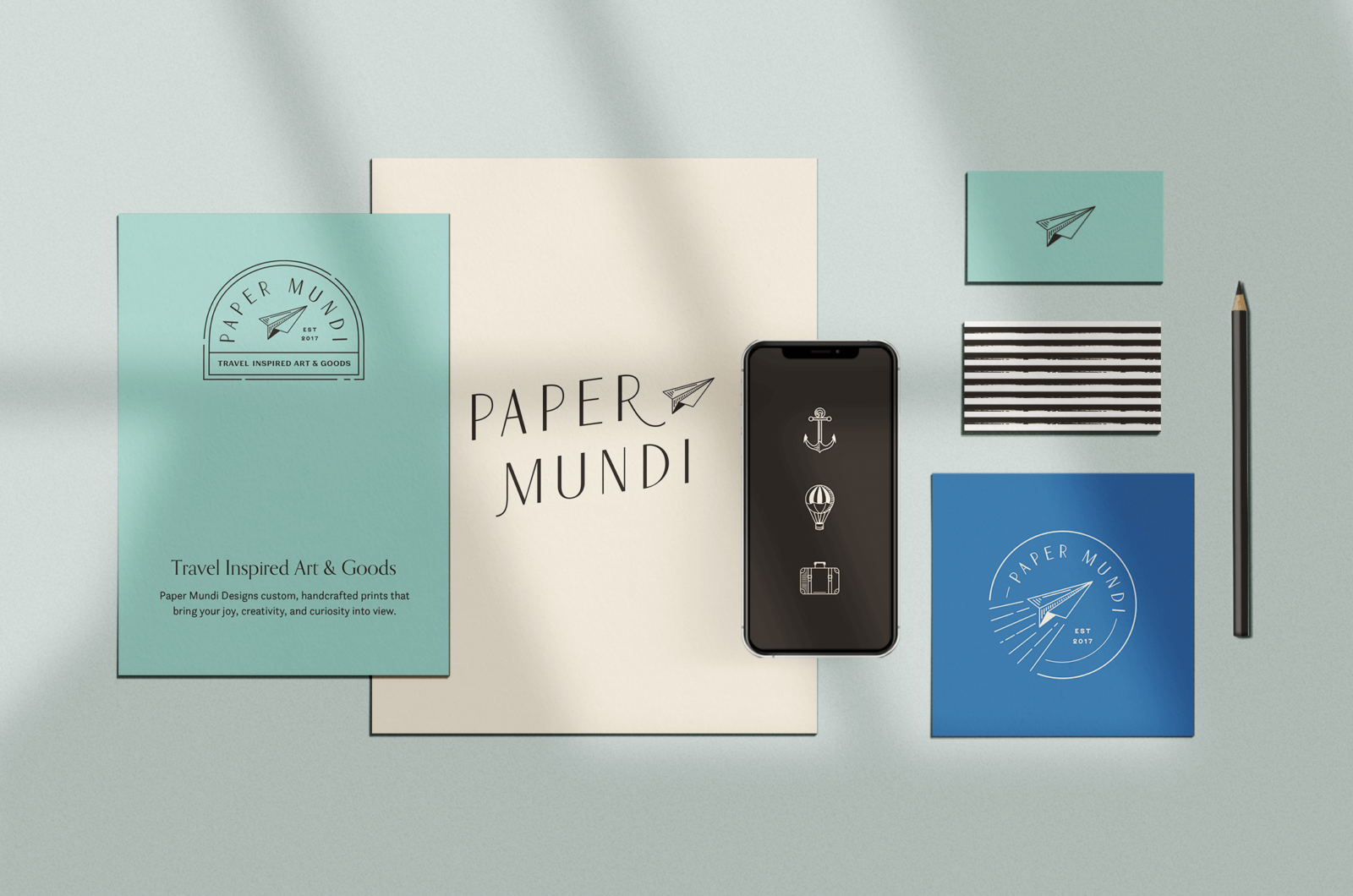
A cohesive logo and brand identity design can make everything fall into place for your business. One thing that can trip people up is choosing fonts and colors. Barbara Kowalski and Christine Castro Hughes are designers on my team at Aeolidia. Below is their advice for creating a professional-looking brand.
Choosing Typefaces
Barbara shared, “One golden rule of branding that makes your business look more professional is to keep the font you’ve used in the logo only for the logo. It may be tempting to use the font in other places but using it elsewhere, say on your website for headers or accents, ends up diluting the impact of your logo as a standalone mark. Especially if your logo is a logotype, that is, a text-only logo, keeping the fonts to the logo only elevates the logo’s impact and prevents confusion from seeing the same font reappear. Following this rule will place your brand in line with the guidelines that most professional and custom brand identities follow.
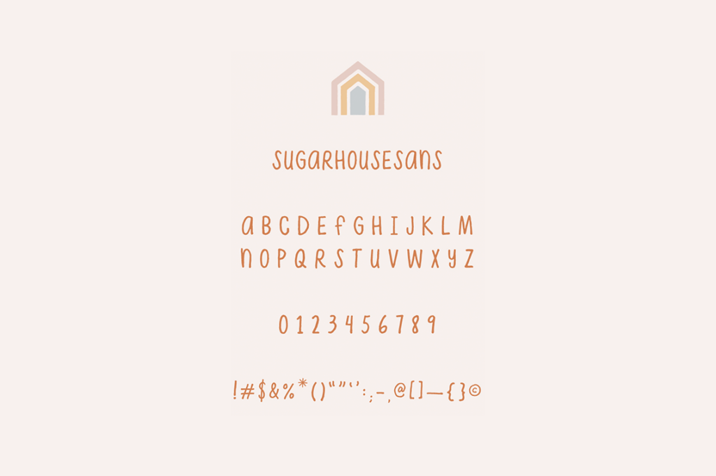
When choosing fonts for your brand, you want to have some variety, but not too much. A great rule of thumb is to use three different fonts or font weights. This lets you have one font or weight for headers, one for body text, and one for the occasional accent text.
There are many fonts available to us nowadays, including many free fonts on sites like Google Fonts or Font Squirrel. While free fonts are helpful for the budget, they can also make your brand font selection look identical to many other brands. One tip for finding more unique free fonts is to sort Google Fonts by popularity and then scroll past the first rows of results. There are some great font finds lower down on the popularity list that can make your brand look more unique simply because customers are less used to seeing them.”
Christine added, “Creating an effective logo is more than just picking out a cute font. When you’ve landed on your brand strategy and style, you not only want to find the right typeface to illustrate the vibe you’re going for, but you also want to make sure it is original, legible, and complimentary to other elements in your logo.
For weekly tips like this, subscribe to our newsletter
"*" indicates required fields
If other companies are using typewriter fonts, that’s a cue to seek something unique for your own brand. If your brand name is a made-up word, select a no-nonsense typeface so that it’s easy to read. If you’ve created an ornate illustration to represent your brand, choose a typeface with cleaner lines to complement it. When in doubt, err on the side of simplicity. A classic logo will stand the test of time.”
Creating a Color Scheme
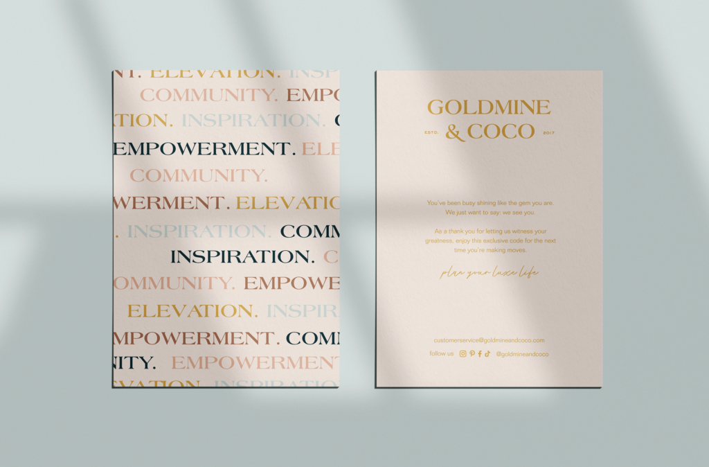
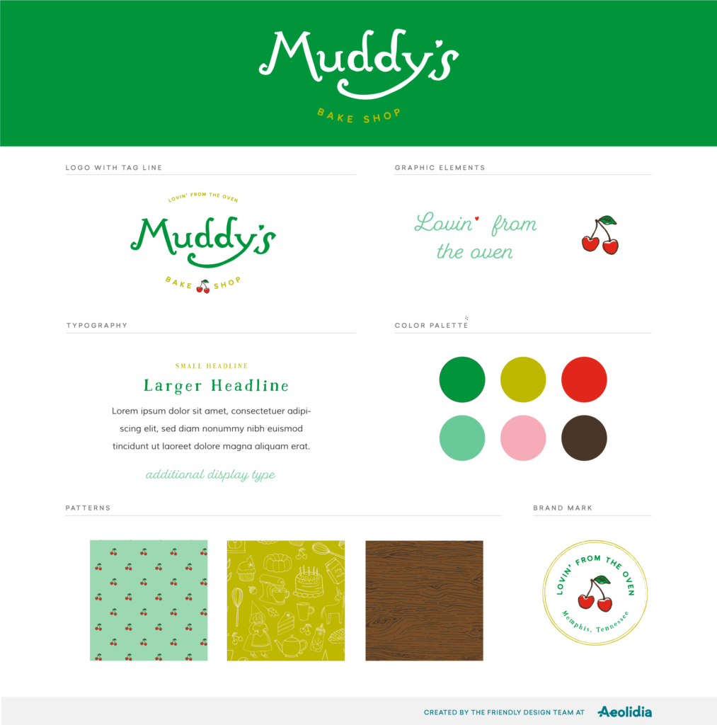
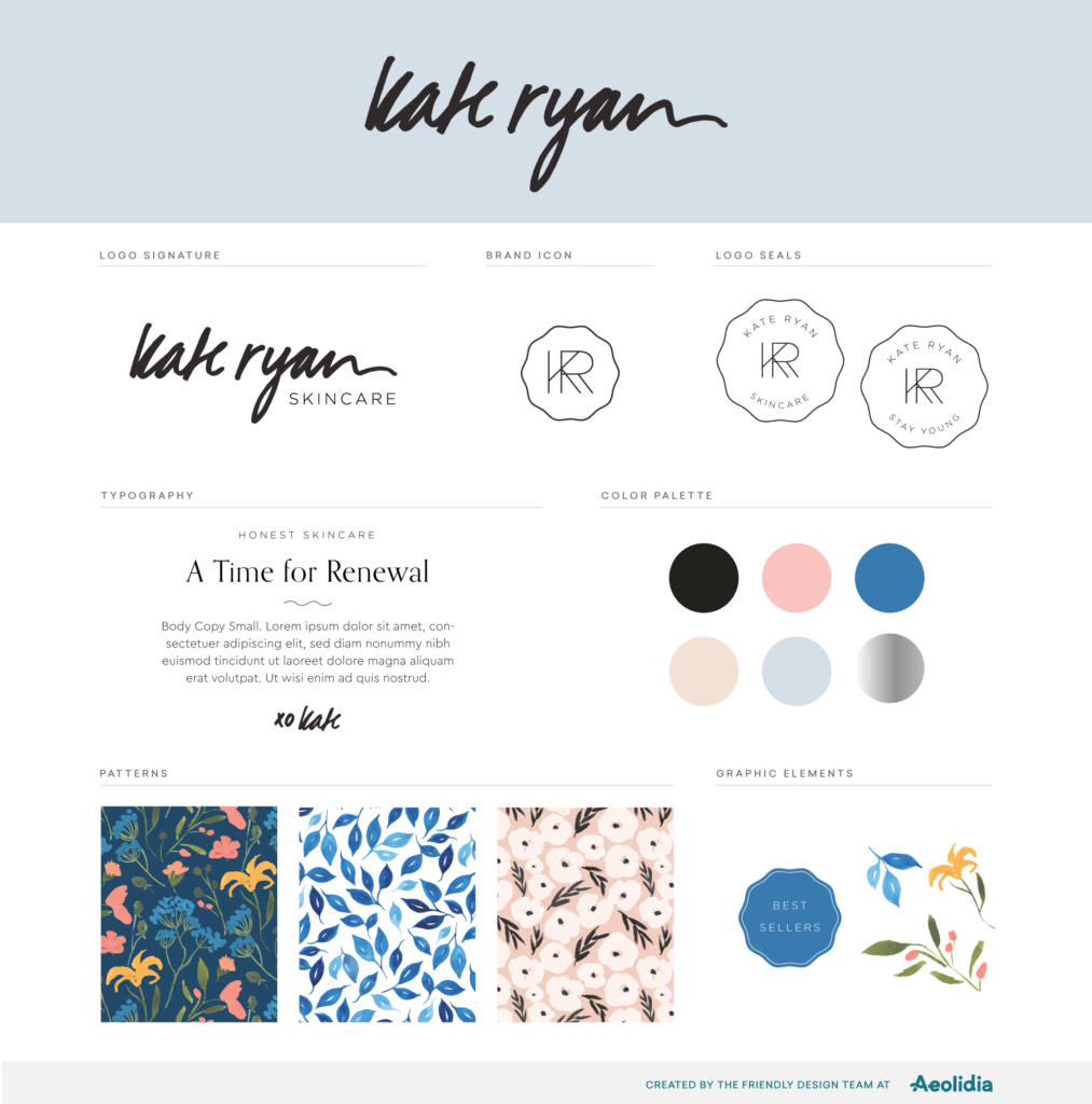
Barbara tells us, “Your brand color scheme should reflect your brand essence through color. It’s important to explore your brand personality before picking colors so that you have a clear idea of what sentiments you’d like to convey. A helpful exercise is to identify five keywords that represent your brand and have them as a list in front of you as you look at colors. As you choose a palette, keep referring to the list and ask yourself if the colors reflect your keywords. Trying to define your whole brand through colors can be overwhelming. It’s so much easier when you think of it as simply picking colors to match sentiments like soft, cheerful, edgy or cheeky.
Generally, brand colors are divided into primary colors and secondary accent colors. The primary colors build the core of your brand while secondary colors accentuate it. There are no hard and fast rules for how many colors you need for your brand. A good goal is to have a variety of colors so that your brand assets can be versatile, but not so many that you get overwhelmed and unsure of how to use them all.”
Christine suggests, “Consider your intended use of color in print and on the web. In physical marketing materials, will you be printing digitally or are you going with Pantone Matching System colors? PMS printing can be more cost prohibitive, but it’s the best way to ensure a color match every single time. With digital printing, you let go of control a little more because every print run — and even pieces within the same run — can be different.
Online, make sure that there is enough contrast for legibility. You may end up selecting different CMYK values for printing and HEX values for your website. And remember: White space is your friend! It gives focus to the important elements on a page and gives your eyes a place to rest.”
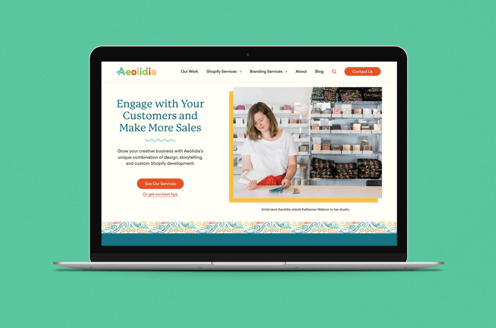
We could literally geek out all day about branding. In fact, some days we do! Here is an in-depth article all about choosing fonts for your business and you can find many more tips here on our blog. Could your brand use a refresh? We’re here to help!
This post was originally published in UPPERCASE magazine.
A Newsletter That Goes Beyond Shopify 101

It’s easy to find beginner info about ecommerce online. If you’re past that? Subscribe to our newsletter for advanced strategies and need-to-know info for established shops. You'll get:
- Weekly tips to help you market and sell your products
- Updates when there is news that may impact your site
- Round ups of interesting links and info for brands
- Invites to our live trainings and webinars
- Instant access to our past emails
"*" indicates required fields
Browse by Category

A Newsletter That Goes Beyond Shopify 101
It’s easy to find beginner info about ecommerce online. If you’re past that? Subscribe to our newsletter for advanced strategies and need-to-know info for established shops.
Learn how the top shops grow:
Related Posts


Tools & Guides


Courses & Webinars


Let's take your online shop to the next level
The Shopify websites we design have a reputation for substantial improvements to ecommerce conversion rates and online sales. Let's talk!