Higher Website Conversion Rates For Kate Ryan Skincare
by Stacey Trock
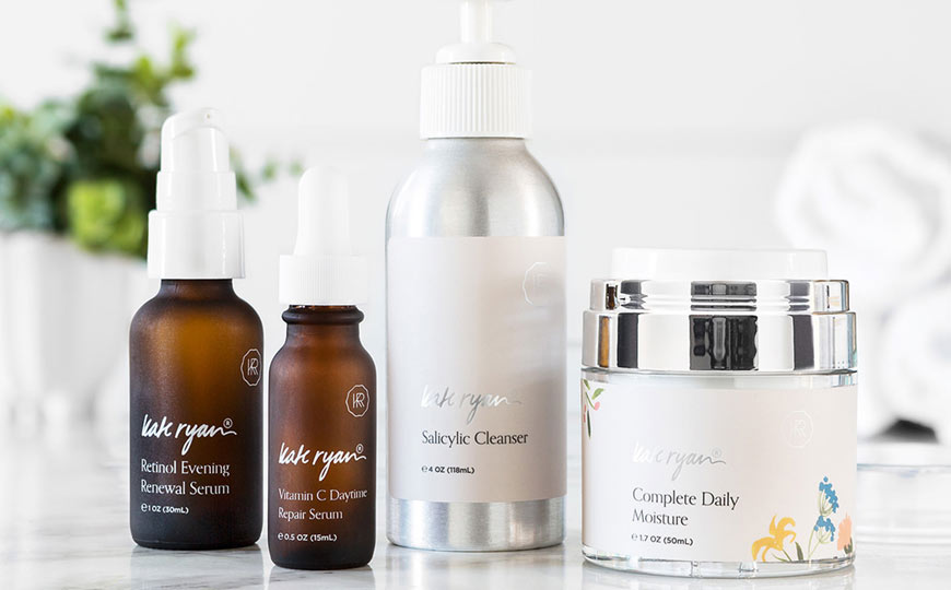
Kate Ryan Skincare is a proprietary line of skincare products made with honest, safe, and real ingredients in small batches. Founded in 2012, they offered proven products with a loyal customer base built on trust and honest advice. But from a sales perspective, they needed higher website conversion rates to achieve their goals.
After an analysis of their brand, it was clear that their products were spot-on, but that their website wasn’t pulling its weight to convert sales. Kate Ryan is a brand that takes great pride in their formulas, with founding principles of transparency and quality ingredients, but their unique story and voice weren’t coming through on their website. Before their redesign, owner Erica Finnan described the limitations of their previous WordPress/WooCommerce site:
We need to identify our strengths and how we stand out in the very crowded, heavily marketed skincare space to find the consumers looking for products like ours. We feel like we’ve reached a plateau based on our current methodology.
The problem? A crowded market space and low conversion rates. Kate Ryan Skincare didn’t need a full makeover. They needed a website that connected with their customers, conveyed the quality of their product, and delivered higher conversion rates. A website as powerful as their products.
For weekly tips like this, subscribe to our newsletter
"*" indicates required fields
Our Solutions for Higher Conversion Rates: Move to Shopify + an Overall Refresh Focused on Connecting
A solid connection with the customer is the result of positive experiences across multiple touch points. It’s an overall look that simultaneously sparkles and conveys professionalism. It’s messaging that clearly touts the unique benefits of the product. It’s an email strategy that sends emails at key points in the customer path and features on-target copy. It’s a shopping cart that allows a shopper to check out with ease. For this redesign, we did a complete revamp deep on strategy and high on polish with a welcoming touch.
The business of skincare is very personal. We wanted the build of our web store to mimic the welcoming feeling of a brick and mortar shop. Aeolidia created the experience we were looking for and so much more. When potential customers visit our “front door”, the vibe is personal but not too much so, the site gives enough information to build trust but in a way that’s not overwhelming and it’s very easy to get around to find what you’re looking for.
For the Kate Ryan Skincare website, our team of experts identified pain points and built solutions that integrate into a beautiful, functional and sales-driven website. From the outset, we knew a move to Shopify would deliver the conversion-focused results this brand required.
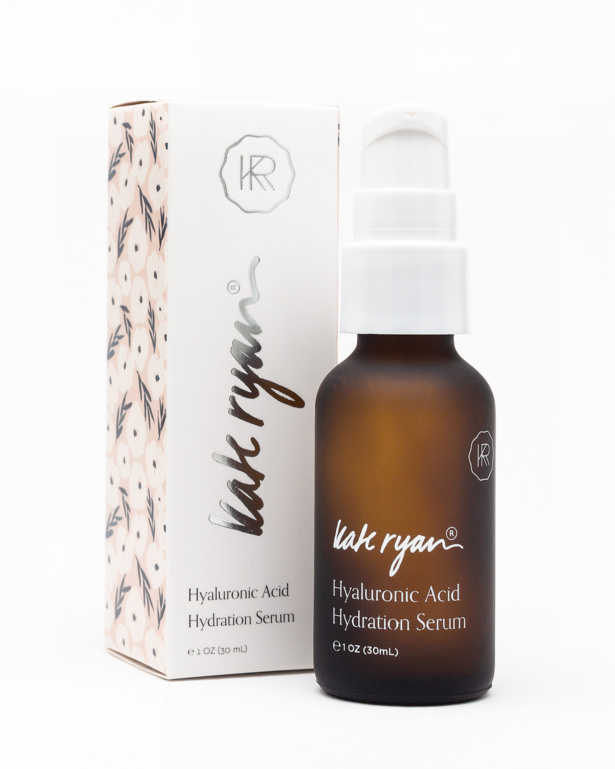
Identity: Designer Jess envisioned a clean and purposeful identity that feels sophisticated yet warm and approachable. The new visual identity is a natural evolution for the Kate Ryan brand; it’s a fresh start that won’t ostracize current long-time customers.
Design: Web designer Do-Hee took a fresh and immersive approach to translating the new branding elements to KRS’s online shop. White space, warm tones and a few spot illustrations ensure the products are showcased front and center, while creating a modern, welcoming space.

Copywriting: Copywriter Natalia wrote product description copy that emphasizes Kate Ryan’s unique space in the skincare market, being a brand that’s both natural and science-based. This powerful copy instantly communicates the benefits of the product.
Focus on Subscriptions: By introducing a ‘Subscribe & Save’ option, customers can have their favorite products delivered on a recurring basis. It’s a feature that’s convenient for users and provides consistent, recurring income for Kate Ryan Skincare. Web Analyst Helen used ReCharge to seamlessly integrate subscription functionality for the smooth shopping experience.
Email Strategy: Web Analyst Helen dug deep into stats and developed an automated email strategy that connects with customers at key touch points on their journey. The build of additional flows, integrating ReCharge with Klaviyo, for Kate Ryan’s subscription service allows the brand to capitalize on a recurring income stream. Email copywriter Stacey Trock focused on connecting with the customer, reinforcing the brand’s ideals while infusing a personal, welcoming touch.
Photography: Photographer Jen took a range of product photography, emphasizing the brand’s clean lines and warm feel. The look is a balance of natural and effective, coherent with Kate Ryan’s overarching philosophy.
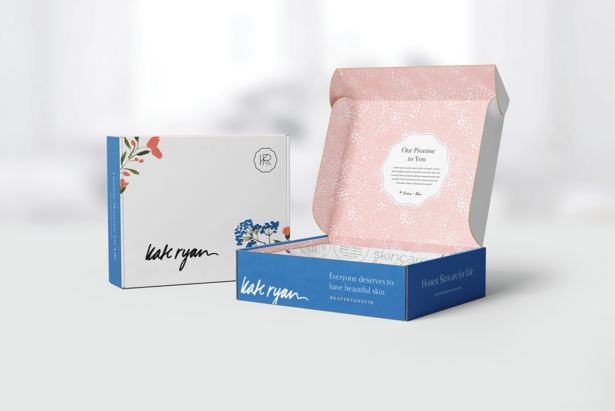
Package Design: Designer Jess created packaging so that the box customers receive in the mail is just as amazing as the overall feel of the site and the product photography. A beautiful delivery leads to repeat customers and happy people, a crucial component of success for an e-commerce business.
Website: A supremely-speedy site with the ability to quickly add content to their site quickly (to take advantage of flash sales and social media opportunities) was central to developer Jon’s directive. The result is a smooth Shopify site that delivers just as beautifully on the back end as it appears at the front! A ‘New Here? Start Here!’ link at the right edge of the menu is specifically designed to connect with new visitors to the site and help them feel comfortable selecting the products that are right for them.
Aeolidia added so much value to our project. We had ideas that we thought were awesome until their team discussed it and made it ten times better. Now we not only have a website that customers love when they first “walk in”, they stay and shop around because of the experience. The same information value that Aeolidia provided to us on their website, we are now doing for our customers.
The Result: Higher Website Conversion Rates and Compliments Everywhere
We [now] have a beautiful website that works very well both for us on the business side and most importantly for our customers. There isn’t a day that goes by where we (or our customers) don’t comment – wow, loving the new site!
The results of the redesign go beyond the beautiful new look and improved functionality. The new, higher website conversion rates are stunning, too! Kate Ryan’s desktop conversion rate is 32% higher than their previous site and their mobile conversion rate is 143% higher! All the other engagement metrics are around 40% better, evidence that the Shopify site is working significantly better than the previous one.
Before, we had window shoppers: “looks like you have nice products & ingredients and you seem like nice people but I think I’ll continue the search”. Now we are building a whole base of new customers and we have a new confidence in our brand – our website matches the quality in our company and products and people are putting their trust in us – that feels REALLY good!
Higher website conversion rates mean converting more of those window shoppers into customers. This means increased sales and a brand that’s growing, and no longer plateaued. Its success that’s the result of a completely fresh web design infused with a sales-focused strategy.
This website is saving us time (and money) because it’s so intuitive and easy to use. I created a custom order for a new client the other day and sent the email invoice in a matter of minutes – so easy and our customer was very impressed!
View this project in our portfolio »
View Kate Ryan Skincare’s Site »
Thinking of Moving to Shopify?
Kate Ryan Skincare had plateaued with the functionality of their WordPress/WooCommerce site. But with a redesign, they’ve experienced higher website conversion rates, as well as compliments aplenty from customers about the gorgeous design. Creating a new site on Shopify, a platform designed for optimizing conversion rates and integrating with an advanced email strategy, was key.
I often think of the analogy with our business to watching our golden retriever puppy learning to swim – he was paddling as hard as he could but making no forward progress (and darn near drowning – I had to pass off our 6 month old baby to go in after him!) until he teamed up with his older, wiser brother and caught on!
Erica said it best. We’re that older golden retriever with years of experience and we’re eager to help your business get amazing results. You don’t need to be treading water in your business!
Has your small business plateaued? If you’re looking for higher website conversion rates (just one way to grow your online sales!), we can help. As Shopify Experts, we’ve helped hundreds of creative online shop owners transform their brands and businesses.
Hire Aeolidia for Shopify Web Design
We would be glad to help take your website to the next level. Learn more and get on our schedule here:
Hire Impactful Shopify Help
Are you looking for a partner that can upgrade your brand and site, then stick around long term to optimize and maintain? Aeolidia is big enough to handle your complexities and small enough to be personally invested in your goals. Let's talk!
Related Posts
Let's take your online shop to the next level
The Shopify websites we design have a reputation for substantial improvements to ecommerce conversion rates and online sales. Let's talk!

