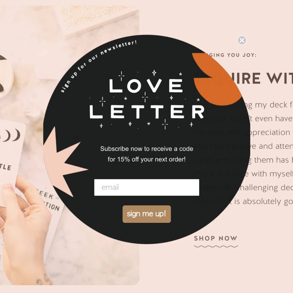
Email pop-ups. Love them or hate them, they’re well known to improve e-commerce email signup conversion rates, which is why so many online retailers use them. But writing copy for them isn’t easy! You know they’re a bit of a nuisance and you want to acknowledge that, but you also want your website visitors to sign up for your email list despite the slight annoyance. How do you convey all that in just a few lines of text?
We’ve written previously about best practices when adding an email pop-up box to your website. In that post, we included examples of pop-up email subscribe boxes that were well-written, nicely designed, and offered a compelling reason to join a list. In this post, I collected 24 additional examples of email pop-ups used by independent online retailers.
Because so many online shop owners wonder if they have to provide a discount or some type of incentive in order to get people to join a list, I divided these examples based on whether they offered a discount (or some other form of incentive), or just asked politely for people to join without offering anything. I included some of the pros and cons of using each type of incentive (or no incentive at all) in your pop-up box, and detailed some ways you can incorporate these lessons into writing your own email pop-up calls to action.
Discounts + free shipping
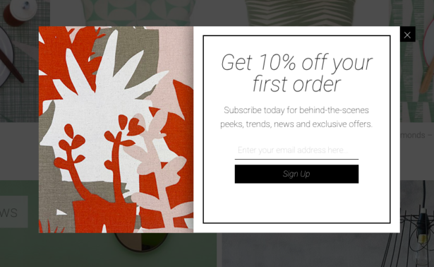
Offering a discount is probably the easiest — and most popular — way to get people to join your list. The most common discount offers seem to be 10% off your first order or free shipping. Some retailers go as high as 15% off the first purchase or offer a flat dollars-off discount.
PROS:
- Easy to communicate value
- Usually increases conversion rates
CONS:
- People sometimes join just to get the discount, then unsubscribe
- You have to discount your merchandise
Some more examples of email pop-ups that offer a discount or free shipping (as you can see, this approach is very popular):
Free gift with purchase
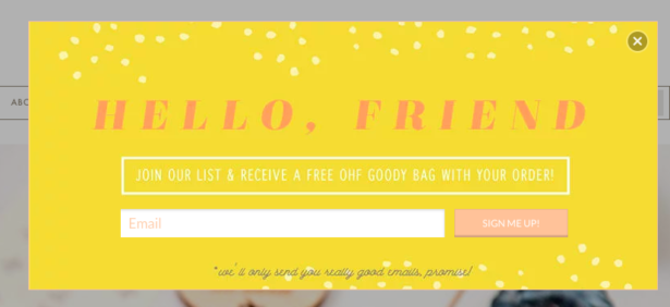
Offering a free gift to be included with a customer’s purchase is another way to add value to subscribing to an email list. The free gift is usually something small that doesn’t add too much to shipping costs. For example, a skincare brand might include a free facial mask with each purchase, or a stationery brand might throw in free stickers.
For weekly tips like this, subscribe to our newsletter
"*" indicates required fields
PROS:
- A gift adds tangible value to being on the list
- The gift doesn’t have to cost you that much
- Unlike offering discounts and free shipping, you have much more control over the cost of this giveaway
CONS:
- Hard to quickly communicate the value of the free gift (what is it, exactly?)
Free download
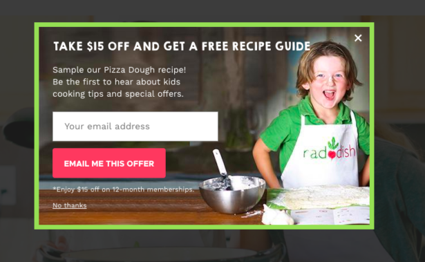
A handful of retailers offer a downloadable freebie as an incentive for joining an email list. This is less common in the e-commerce space as it is in the services space, but we’re beginning to see more retailers offer PDFs as email sign-up bonuses. Some examples include: recipes, checklists, calendars, and worksheets.
PROS:
- Except for the time it takes to create it, you’re not cutting into your bottom line by giving away content
CONS:
- It’s hard to communicate the value of a free PDF in just a few lines of copy
- Some customers don’t think free information is as valuable as discounts or free stuff
Staying Up-to-Date (or “no incentive”)
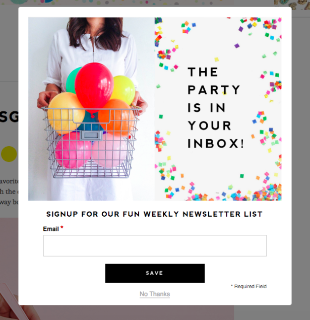
Some retailers just don’t want to offer an incentive for joining the list. That’s okay! You don’t have to use discounts, freebies or giveaways when you ask people to join your mailing list. If you don’t offer anything as an incentive for joining, you still need to communicate the value of being on your email list. Some of these intangibles might be:
- Future discounts
- First access to sales
- News of events (trunk shows, sample sales, classes, pop-ups, etc.)
- Exclusive content
- Sneak peeks on new products
- Being part of a community
PROS:
- Doesn’t cheapen the value of your products or train people to expect to pay less, like discounts do.
- More likely to build an engaged list of people who really do want to hear from you.
CONS:
- May be harder to get people to sign up without a specific offer.
Contests + giveaways
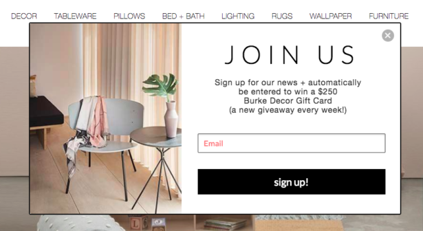
One of my favorite email signup incentives (and one that I’m surprised I don’t see more often) is entering to win a contest or giveaway. I’ve seen this done using gift cards as well as product giveaways.
PROS:
- You control the giveaway amount and frequency, so it’s easy to budget for
- Contests make it easy to communicate the value of joining the list
CONS:
- Some contests require you to post terms and conditions
- You need to handle fulfillment and winner notifications
Pulling it all together: writing your pop-up copy
Once you’ve decided what your incentive is, you need to figure out how to write it into your pop-up copy. I noticed two ways retailers tend to do this: making the incentive your headline, or incorporating it into the secondary copy.
Most retailers that had tangible incentives made that incentive their headline.
For example:
- Enter to win a $2,500 gift card
- Get 10% off your first order
- Free shipping
When those incentives are the first thing you read in big, bold letters, you immediately get the value of joining the list and you’re probably less likely to click away.
This is difficult to do when you’re not offering a tangible goodie. In the examples above from companies that were not offering a discount, gift, freebie or contest entry, the intangibles (early access, sale notifications, etc.) were usually mentioned in the secondary copy, not the headline. The headlines were reserved for more direct calls to action (“Join our Newsletter”), or branded greetings (“Hello, Friend,” “The Party is in Your Inbox”).
Example of discount-based email pop-up copy
Use your incentive in your headline.
- Headline (contains incentive): Get 10% off your first order
- Secondary copy: Plus updates on sales, new products, and in-store events when you join our email list.
- Button copy: Sign up
Example of non-discount-based email pop-up copy
Mention the intangible benefits in your secondary copy.
- Headline: Hello there, friend.
- Secondary copy (contains benefits): We’d love to send you occasional shop updates, info on sales and discounts, and party planning advice from our blog.
- Button copy: Subscribe
Always be testing
Many of the email pop-up apps that are available for Shopify incorporate A/B copy testing as part of their suite of tools. This means you can test out copy to see which is higher converting. You can even test different incentives. (I highly recommend using the same design to test different copy so you’re comparing apples to apples.) What works well in one online shop may not work in yours, so run tests to see which incentive — and what copy — converts the most visitors from your site to your email list.
Your turn
What incentive are you currently using to entice people to join your email list? How is it performing? Have you ever thought about trying a new approach, or simply rewriting your pop-up copy to better communicate the value of being on your list? We’d love to hear from you!
Email Marketing Strategies for the Holidays and Beyond
Learn expert tips for maximizing holiday sales with email marketing.
4 thoughts on “Email Pop-Up Copy: What Works Best for Online Retailers?”
Leave a Comment
Related Posts
Let's take your online shop to the next level
The Shopify websites we design have a reputation for substantial improvements to ecommerce conversion rates and online sales. Let's talk!


I wanted to provide one quick clarification on the giveaways. If you are doing a contest or giveaway I’d STRONGLY suggest terms and conditions. Many countries have strict restrictions on giveaways, so you’d want to limit where your winners can live (and eliminate the chance of overseas shipping!) Plus if you are based in the U.S. you’ll need what’s legally called an Alternative Method of Entry, so you don’t accidentally run an illegal lottery. I’ve got an outline you can use to create your giveaway rules here: https://theartistsjd.com/official-rules/
hello! I love reading your newsletters – some great tips for small creative businesses.
Just wanted to point out that stationery is with an ‘e’ (maybe it’s just a typo!) …us stationery designers never like to be stationary!
Ah, thanks, Sandra! I appreciate that.
Thanks, Kiffanie!
Hello Arianne, Love your blog and newsletters (one of the few that I actually enjoy receiving and take a few moments to read!). One thing you don’t really address here is the pros/cons of an actual pop-up. I just struggle with this because they annoy me sooo much personally. What’s a good way to evaluate the benefits of pop-ups vs. “in-line” references or mentions of your list on your web pages and content (as well as in the footer)? Thanks!
Hi Miriam, Some studies show that popups can be up to 4x more effective at collecting signups than embedded forms. Embedded forms on the page in the footer are helpful to give people a way to sign up if they have dismissed the popup. You could try an exit intent popup, as the least annoying option while people are on the site.