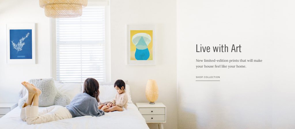
Last year, we worked with 20×200 to create an updated ecommerce experience for their online art hub. They’ve been connecting both novice and expert art collectors with incredible independent artists since 2007, and while they’d received a lot of press from big-name publications like The New York Times, The Wall Street Journal, Real Simple, and Better Homes & Gardens over the years, their website was in need of a refresh. Founder and CEO Jen Bekman told us:
“The new site needs to do a better job of merchandising our product, telling our story, communicating our values + it also should put all the press and accolades we’ve received front and center. We have TONS of existing assets that we can make better use of.”
Our designer Do-Hee Kim jumped into action with the goal of better showcasing their limited-edition art for sale, highlighting the artists they work with, and bringing attention to their curated art collections. Do-Hee’s designs for their custom Shopify website stayed true to the spirit of 20×200’s existing visual brand identity, but Do-Hee also offered art direction and ecommerce photography ideas to create an updated, contemporary, and refined look for their new website.
What types of ecommerce photography does your online shop need?
In order to run a successful ecommerce business, your online shop will need two different types of product photography: photos of your products on a white background and “lifestyle” or “editorial” photos.
White background photos that clearly showcase all of the different features and angles of your products are important for your product pages. Your potential customers will want to have a good idea of what they’re ordering. By shooting photos of your product against a plain white background, there won’t be anything to distract their eyes from how amazing your products are.
In addition to white background photos, you’ll also want “lifestyle” or “editorial” photos that show your products in action. You will probably want to use these photos as “hero shots” on your website homepage or share them on Instagram and Pinterest. If you sell clothing or jewelry, you’ll want photos of a model wearing the products. If you’re a company like 20×200 that sells art online, you’ll want images of your artwork displayed on a wall in a home.
For weekly tips like this, subscribe to our newsletter
"*" indicates required fields
How do I find ecommerce photography solutions that don’t cost tens of thousands of dollars?
Jen and the team at 20×200 had lots of photos of their artwork, but designer Do-Hee provided some great ecommerce photography ideas for their new website that would help them make better use of their existing assets. During the design phase of our project, she shared:
For all your “editorial” / lifestyle imagery, I think having some lifestyle details helps layer in warmth and approachability but it’s important to make sure the image is not too busy and it draws the eye to the ART in the image (versus the furniture, room, etc). While the perfect set up interior shot is great, I don’t think you need to put on a large scale production to achieve what I’m thinking will work for your website.
Overall, I think you can improve how you showcase art by mostly leveraging stock imagery and custom template images. (And if you happen to get the right beautiful interior shot, that’s great too!)
For your hero images (think the main banner image on the homepage), I’d recommend a combination of:
1) simple interior or wall shot that really draws the eye to the art but has some details of a room to emphasize the “living with” art component.
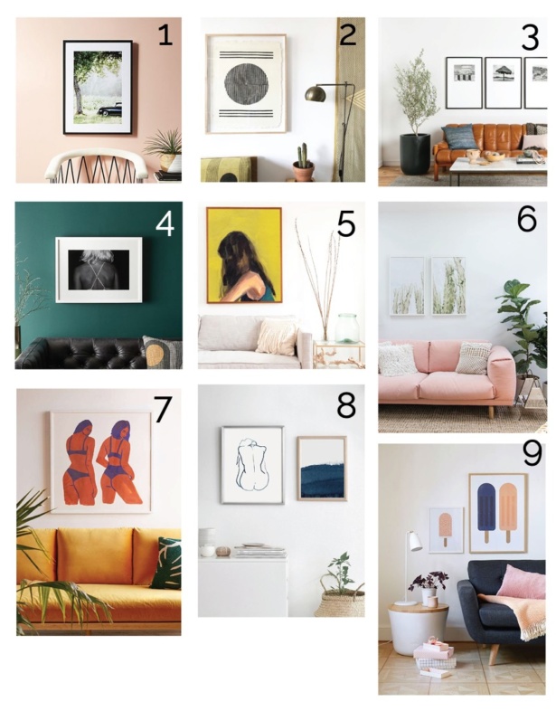
2) Frame(s) on “wall” with color-blocking detail or other graphic detail. I think you could use just simple frames on a blank wall, photoshop some color or texture into it to add a bit of visual interest, tell a color story, or whatever and leave out some of these “lifestyle elements” from time to time if there isn’t the right “background”.
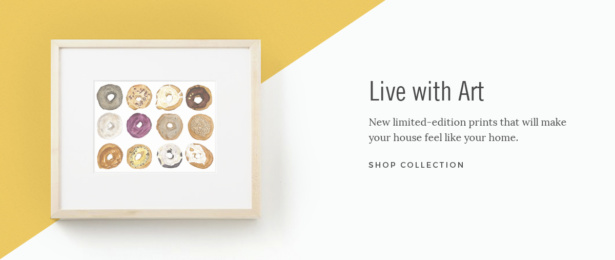
How to put these ecommerce photography ideas into action:
There are a few different ways to put these photography ideas into action:
- Custom “individual” photography
- Off-the-shelf stock photography + Photoshop
- Custom “template” photography + Photoshop
Custom “individual” photography:
If you have the time and budget to invest in a professional photographer, you can make sure that your website features the perfect shots. This can be costly if you decide to hire a professional photographer to shoot your entire collection, but it can also pay off big time.
You might also decide to invest in professional photography for only your newest products or the best-sellers you want to feature on your home page. The professional ecommerce product photography services we offer focus on creating perfectly on-brand “hero shots” of your products. Our photographer Jen Lacey is an ace at styling and capturing product photos for creative online shops.
Off-the-shelf stock photography:
As Do-Hee shared with the 20×200 team during the design phase, using stock photography plus Photoshop can be one less expensive way to create beautiful lifestyle photos for your website:
There are TONS of resources out there for you to purchase stock photos and “mockups” onto which you can superimpose your artwork / photoshop your art work in. This route does take some technical knowledge and Photoshop skills, but nothing too complicated.
For example, Do-Hee created a quick mockup for a neutral homepage banner using some of 20×200’s artwork plus this stock photo:
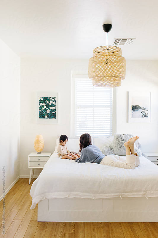

Do-Hee’s favorite stock photo site is Stocksy.com. Stock photo sites like Creative Market also offer mockup bundles or “scene-builders” where you can swap out the photos with Photoshop or a similar tool. She says,
Stock photo sites take quite a bit of time to weed through to find photos that are “on brand” and high quality and work for your use case, but if you use your imagination, you can make it work! Scene builders aren’t my personal favorite since they don’t look as “natural” as “photos”, but they can be great if you’re on a tight budget, and they run the gamut from really simple to complex. Creative Market and so many other stock photo sites have a lot of these! They just take some time to find the right one 🙂 And again, you will need to know how to use something like Photoshop to use these.
Custom “template” photography
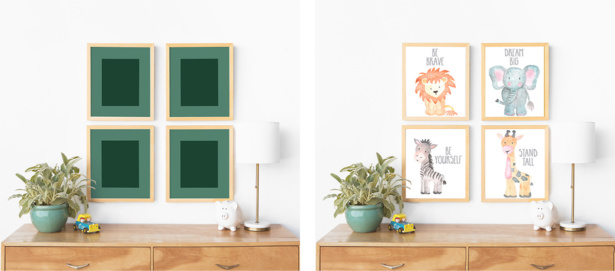
This third option is sort of like a blend between the first two options. By working with a professional photographer, you can have your own custom “stock” mockup photos made that you can drop your own art into. As Do-Hee explains,
Maybe you really want a scene with a yellow lamp but can’t find a stock photo, or one with a neutral couch, etc. Maybe you’re really against using stock photos. We’ve worked with clients in the past to create a few custom “template” scenes with their frames and select props that they can photoshop and customize moving forward to place in artwork. This gives you a nice combination of flexibility and control.
In this blog post, we share how our photographer Jen styled a beautiful collection of custom art print mockups for our client Adoren Studio. Here’s an example in action:
Does your ecommerce website need an updated look?
If your website is in need of a fresh new look, whether it’s professional product photography, an updated brand identity, or a custom Shopify website, we can help! Contact us to learn more about our services.
Hire Impactful Shopify Help
Are you looking for a partner that can upgrade your brand and site, then stick around long term to optimize and maintain? Aeolidia is big enough to handle your complexities and small enough to be personally invested in your goals. Let's talk!
Related Posts
Let's take your online shop to the next level
The Shopify websites we design have a reputation for substantial improvements to ecommerce conversion rates and online sales. Let's talk!

