 Grab my guide to the 10 main ways to grow traffic and optimize to boost sales.
8 Common Website Mistakes Small Businesses Make

July 3, 2019 / Updated: September 28, 2022

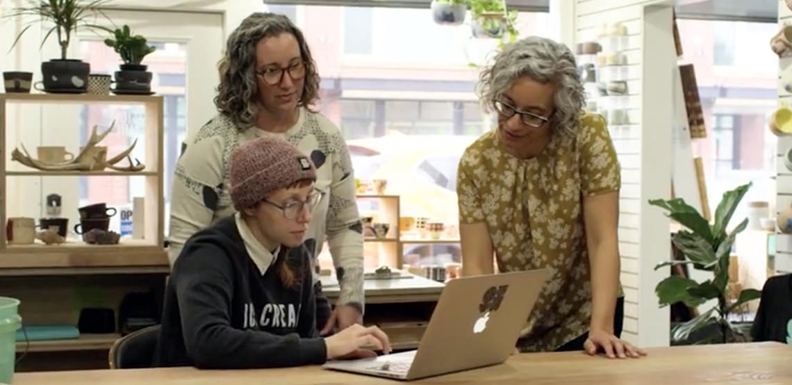
We had the pleasure of going to Craftcation Conference in Southern California in April, and we got to host two Think Tanks there, which I really enjoy. Our think tanks at Craftcation were 10-15 business owners sitting around a table who wanted tips about their ecommerce websites.
Each person got about 15 minutes, introduced themselves and their business, asked a focusing question if they had one, and then we made suggestions for them as a group. I was glad to have Helen with me, as she’s our Ecommerce Strategist at Aeolidia, and has deep knowledge of what drives traffic to an online store and how to increase conversion rates on Shopify.
The funny thing was that I talked to a woman who had attended one of our think tanks a couple of years earlier. She told me, “man, you really handed my ass to me at that think tank!” I was humorously taken aback because I think of myself as an amiable person. She continued, “I talked to my friend after, and she said if you had been nice to me, I wouldn’t have made all those helpful changes to my site.”
“But I AM nice!” I cried. Then I thought about it, though, and realized that I no longer take business personally at all. If you come up and tell me you’re going to list everything wrong with what I’m doing, I’m going to grab a notebook and have a seat. I just assume everyone else is also eager to know what they could be doing better.
So this time, armed with the knowledge that I’m a bit intense about finding fault with websites, I issued a disclaimer to my think tank groups that I really am very nice, but I don’t want to waste their time complimenting them, when I could be showing them exactly what they need to do to increase their online sales.
As we went around the table, these mistakes came up over and over again, and I wanted to share them with you, so you could apply them to your own site.
1. You don’t need a home link
“Home” doesn’t need to be one of the links in the top navigation area on your site. People mostly know that they can click your logo to go back home (make sure you can). And anyway, they might as well be exploring products, not hanging out on your home page. Save that spot for your most important shop category.
2. Prioritize your navigation
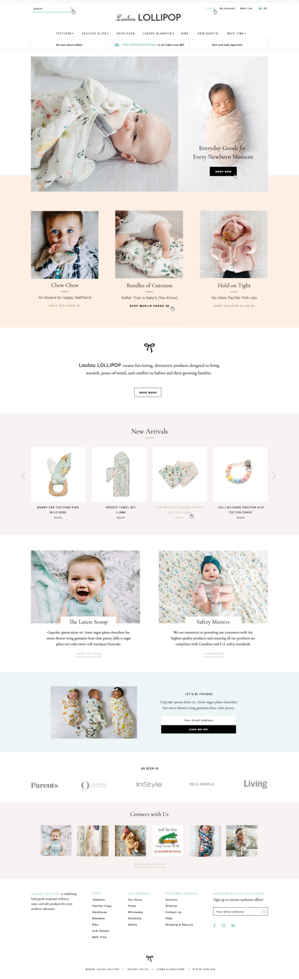
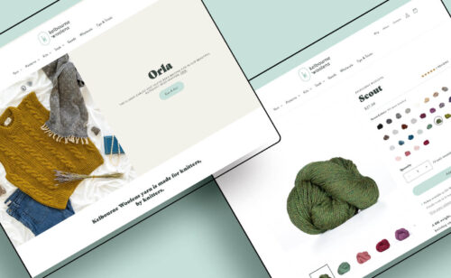
You need to guide your customers through your site. So your first few links in your header navigation should be the most important places you want them to go. Usually, for an ecommerce site, these are shop categories. You don’t need to have your press page and terms and conditions and whatnot all up top. The most important things should be up top, and the rest can be organized neatly in the footer. Here’s an example of clearly organized ecommerce navigation, which Christine Castro Hughes designed for Loulou LOLLIPOP:
3. What’s the one main thing you want people to do?
This is a question I asked over and over again around the table, because I often could not tell. Sometimes there were three or four big actions I could take from the home page, and sometimes there didn’t seem to be any action to take. Figure out what you would want your new customer to do on your site, if they only did one thing, and make it easy and obvious to do that.
4. What do you do?
We also saw quite a few sites where we saw something, maybe a photo of artwork, and still didn’t understand what the website was about. Is this artwork for sale? Originals or prints? Or is this just a portfolio? Can I buy it on a greeting card? Explain what you do instantly with a photo and a line or two of text. Someone who is only going to glance at your site should instantly get it.
5. Use calls to action
You need to tell your customers what to do on your site. So make sure each page has a call to action (often a button to click) that guides them on the path to make a purchase.
6. Social media links can go to the bottom
We saw a lot of websites with social media links right up top in the header. The way we see it, you’d probably rather people start shopping with you than go wander off to the most distracting sites on the internet, right? You can put your social media links in the footer, for people who’ve already checked you out or are purposefully looking for them.
7. Prioritize your About page
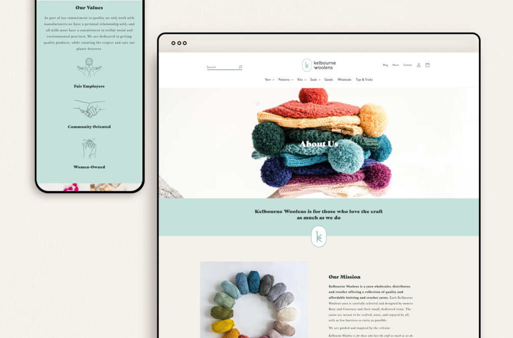
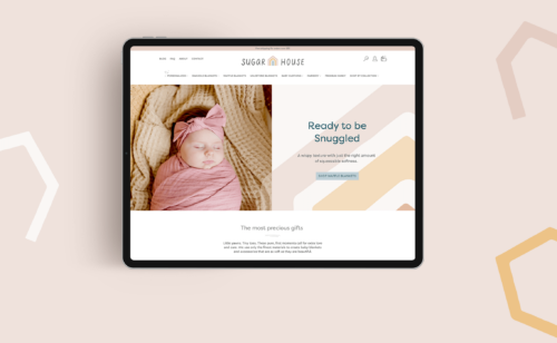
Particularly for artists/designers, and small business owners, we like to see their About page be one of their featured links. Your story is what makes you stand out among the crowd, and if you do this well, like Kelbourne Woolens about page seen below, your customers will fall in love with your brand.
8. Photos
Photos! Unless you’ve got these nailed, I know they’re probably the bane of your existence. You really want your photos to be consistent (same size, dimensions, and style), or else it looks like a garage sale on your site. And I strongly recommend you use two types of product photos: lifestyle photos and white background ones that show your product in use and make it look irresistible.
That’s all! See, I’m nice! Except when I called your site a garage sale, sorry.
Are you ready to fix these common website mistakes?
Aeolidia works with creative small businesses that are at a tipping point. The product-based businesses we work with often have a thriving online shop already, but they might be hitting roadblocks with the limitations of their current ecommerce site.
Sometimes they are making one or more of these common website mistakes, and sometimes they’ve simply outgrown the capabilities of templated Shopify sites. We specialize in building custom Shopify websites as well as branding and packaging design that meets the needs of growing businesses.
Hire Aeolidia for Conversion Rate Optimization
We would like to work with you on improving your existing site to improve its effectiveness. Learn more and get on our schedule.
Hire Impactful Shopify Help

Are you looking for a partner that can upgrade your brand and site, then stick around long term to optimize and maintain? Aeolidia is big enough to handle your complexities and small enough to be personally invested in your goals. Let's talk!
Browse Posts
A Newsletter That Goes Beyond Shopify 101
It’s easy to find beginner info about ecommerce online. If you’re past that? Subscribe to our newsletter for advanced strategies and need-to-know info for established shops.
Learn how the top shops grow:
"*" indicates required fields
3 thoughts on “8 Common Website Mistakes Small Businesses Make”
Leave a Comment

Let's take your online shop to the next level
The Shopify websites we design have a reputation for substantial improvements to ecommerce conversion rates and online sales. Let's talk!
This was yet another helpful post. Thanks for all the info!
I sold my business over a year ago, and I want to sell the remains of it on my website. I’m not trying to grow my business, but scale way down, so I’m not your ideal client. The business will evolve into something more creative, later, maybe, probably.
When I read #8 Photos, “or it will look like a garage sale” I really laughed, AND you gave me an idea! That’s where I need to go, maybe. Like a funky pop-up get-it-while-you-can kind of collection of things. It’s at least half Bits & Bobs anyway.
All the tips from 8 Common Mistakes will be helpful no matter what. I clicked on everything so I learned lots.
Thanks again!
Thanks so much, Kate! I’m glad I sparked an idea for you.