Why Seeing a Single Design Concept Makes a Strong Logo
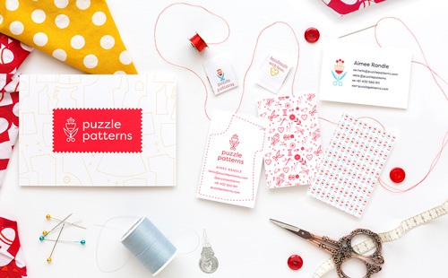
Instead of presenting several different logo design options when revealing the work we’ve done on your brand, we present a single design concept.
This process doesn’t mean you won’t be involved in design. Nor does it mean you could end up stuck with a logo or website design that you don’t like. Instead, it’s how we set your project up for success and satisfaction. Here, I wanted to explain why we take the single design concept approach for logos (and websites) and why we think it works best for our clients.
How many design concepts should you see?
When you work with a designer, an early step is to communicate what your brand is about. Our goal is to make something just right for you, and we start with learning as much as we can about your business.
If you’re a designer or have a specific vision (many of our clients do), we have many ways to collaborate with you. We share Pinterest mood boards, use your illustrations or handwriting, and include you every step of the way.
The designer, armed with the information and ideas you’ve shared, then goes into research mode. She learns about your products, niche, competitors, and customers. Foremost in her mind are your project goals.
Next, she begins sketching, and may go through dozens of ideas and concepts before arriving at her best-proposed solution to your design problem.
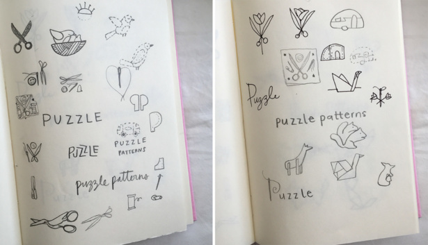
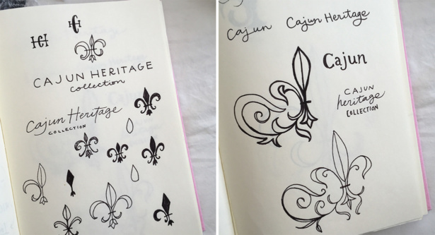
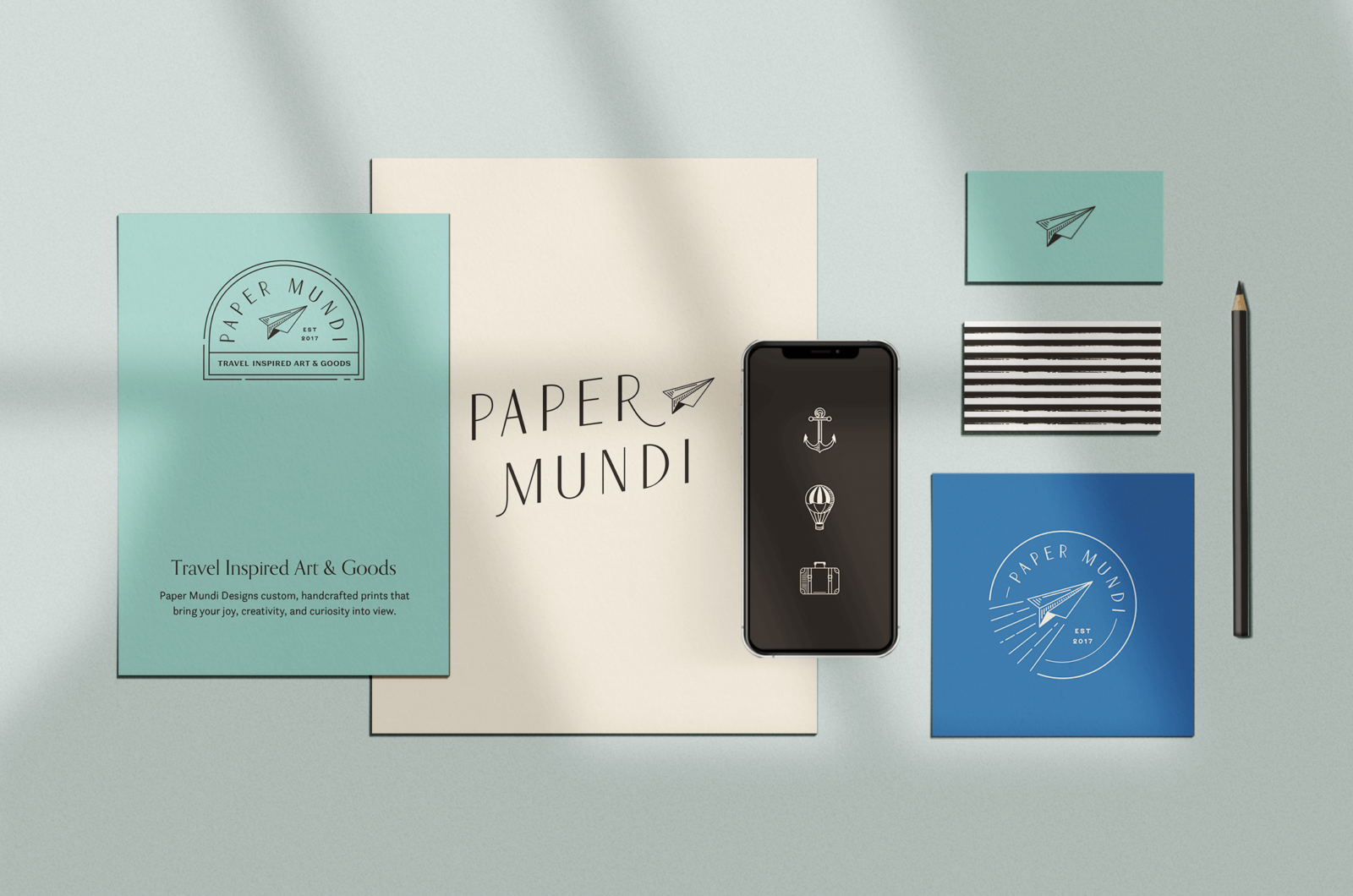
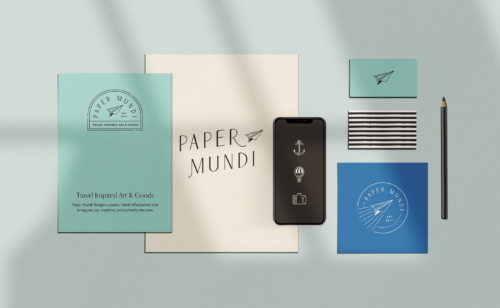
She then shares a design presentation with you. In this example, let’s say it’s your logo idea. Aeolidia design presentations show one logo concept to focus on, and they are detailed, with examples to help you envision your logo “in the wild.”
As the client, your job is now to review the logo design concept. You need to report back to the designer how well you feel it’s working and what revisions you’d like to see.
There will be a big difference in your experience depending on how many design ideas you’re shown. I’m sure you can imagine that needing to give feedback on 50 ideas would be quite overwhelming. In fact, it would feel like you were doing the designer’s work for her, right? She should be able to take 50 ideas and pare that down to a smaller group of good solutions.
How many would you want to see? Five? Three? Let’s say she sends you three to look at. Now you have a tricky responsibility. You’re not a logo designer (that’s why you hired one). But you’re supposed to choose now? All three would work, but the fonts are different and graphics are different.
For weekly tips like this, subscribe to our newsletter
"*" indicates required fields
You don’t know enough about fonts to feel confident making a choice, and the graphics look beautiful! What to do? Maybe you could ask to see Option A’s graphic paired with Option C’s font? What would that look like?
Red alert! You’re wading in muddy waters now. This almost always leads to a weak and watered-down logo, when focus strays away from one idea.
We used to work this way, it was often a total mess, and we moved on to a more effective method. Here’s why.
Why we believe in presenting a single design concept
At Aeolidia, we show you a single design concept at this stage. One design concept doesn’t mean that the designer is single minded, or isn’t open to ideas. Our designers usually sketch out dozens of ideas for you. They explore many concepts and directions, add things in, throw things out, mix and match.
It’s a tough process, and takes a trained and experienced eye. They don’t stop once they’ve pared down to a few concepts and then leave the rest of the work up to you. They continue the work they’re skilled at, and choose the one best idea to then refine with you.
I can understand why it might seem beneficial to be able to see more than one design concept. After all there is no single “right” solution, so how could a designer claim that any one is “the one?”
There are many designers that show multiple concepts. In my experience, when your designer shows you more than one concept, she already knows which is the best, and she is hoping you will pick it.
We decided to skip this risky game of giving clients choice for choice’s sake. We no longer present our 2nd and 3rd best ideas to you. Instead of leaving the work of refining a “not quite right” logo to you, the client, we put more upfront work into understanding your brand.
If we understand your brand, we can hit on one best solution out of the gate. We want to create a design that exceeds your expectations, delights your customers, and helps you meet goal after goal.
Real-life examples of how well this works
We have seen outstanding results since we began focusing on one best solution. It’s now common for our designers to present a logo concept and end up with instant approval.
It’s a win when we get no revision requests from our client. Not because it makes less work for us, but because it shows that we understand the brand. It’s what we aim for now!
Here are a few recent “home run” client responses to our initial design concepts:
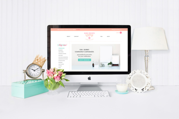
“I LOVE it! It is so clean, straight foward, but still showcases our brand and vibe. I honestly have no feedback this point other than at the bottom where we have ‘Let’s be Friends’ the light pink behind the dark pink is giving me a weird visual effect of fuzziness so lets just switch that. Other than that, LOVE.”
“Hi! I agree with Kristin completely. I love how clean and simple the site looks, yet all the key elements are in just the right places! I’m loving the side navigation — makes so much sense.”
—The Miss Design Berry team
“Oh Ann, take my breath away! This is such an amazing start, I’m having a hard time imagining it better! Okay, I will spend some time drooling over it all and give you my feedback, however I’m not sure there is anything else to say, other than AMAZING! You put in words what is in my head and heart.”
—Susan Merkle, Lonestead Range
“Oh Jess! I was feeling very confident after our chat last week and you really delivered. This is beautiful and the design is so simple and clear but I keep looking at it and seeing more and finding more to love. I am so pleased, I can’t wait to see how everything ties together from here, fabulous work! I trust your judgement and can’t wait to see your vision.”
—Aimee Randle, Puzzle Patterns
This type of reaction happens so often now that we’ve started to expect it.
What if I don’t like the initial design concept?
What if we don’t hit it out of the park on the first design concept? Are you stuck with our idea anyway? Absolutely not!
We never force a client to accept a concept, or press forward trying to revise the wrong concept. In our partnership, we are the design experts, but you are always the expert on your own business.
We take that seriously. If you don’t believe our design idea will help you meet your goals or work for your brand, we’ll start again from scratch. If the first design is not right, it’s almost always because we didn’t have all the info we needed. So we go back to the research and discovery phase, and then begin again with a stronger understanding of the project.
This is something that almost never happens. I’m devastated whenever anyone leaves Aeolidia feeling disappointed. So if it does turn out that we didn’t understand something important about your brand, of course we go back and make it right.
Every client gets multiple rounds of revisions for every piece of a project. No one is stuck with our first idea if it’s not right.
In a nutshell?
Aeolidia shares one design with you, which means you will only see our best work. Our initial presentation is in-depth and well thought out. It usually is exactly what our client needs. When it isn’t, though, we do what it takes to make sure the design is right. Even if that means going back to the drawing board a time or two.
Our clients’ satisfaction levels are through the roof. They love being able to relax knowing that they’re in good hands. We listen to everything they tell us about their brand. We are deeply invested in helping them meet their goals.
A single best design concept not only makes the process easier for our clients, they end up with a stronger brand because of it.
“My designer, Jess, was truly magical. She delivered exactly what I envisioned, and then some! She just “got” me from the very beginning. It was like she took everything I pictured in my head, and was able to make it a reality. She was reassuring when I was hesitant during the design phase. She graciously accommodated every request that I made. I really appreciated how she designed with my ideal customer in mind. She not only gave life to my brand, she inspired me to grow my business far beyond what I imaged. She helped me envision my brand on a much larger scale.”
—Lindsey Baudoin, Cajun Heritage
“After a thorough interview process, customers have to trust the process and expertise by turning over the “designer” reins to Aeolidia. This isn’t a common approach and I value this because that demonstrates confidence and understanding the customer’s needs. Too many designers want the customer to be in the driver’s seat although the customer hired them to do a particular job that he/she may not be skilled at.
I view Aeolidia as platinum-level graphics design services company. If you want a design company who has extensive expertise in brand development and creating a website to reflect your brand in the best light, hire them despite the price tag! They are worth every penny spent.”
—Patricia, Indigo Ember
What about you?
Have you worked with a designer before? I’d love to hear about your experiences. What works best for you? What would you have done differently, or what did you learn along the way? What questions do you still have about this process? Contact me if you’d like to talk more, or see how well this will work for your business.
Hire Impactful Shopify Help
Are you looking for a partner that can upgrade your brand and site, then stick around long term to optimize and maintain? Aeolidia is big enough to handle your complexities and small enough to be personally invested in your goals. Let's talk!
7 thoughts on “Why Seeing a Single Design Concept Makes a Strong Logo”
Leave a Comment
Related Posts
Let's take your online shop to the next level
The Shopify websites we design have a reputation for substantial improvements to ecommerce conversion rates and online sales. Let's talk!




This is a great article. A couple years ago I fell into the revision(s) circle with a client and it was a huge waste of time. I’ve been working on streamlining the process, but this post really gives me hope that it can be done. Great approach and great execution, thanks for a wonderful insight!
It can be done! You just need to set expectations up front and not surprise people with your process. Best wishes, James.
I’m really glad to read this! I’ve been moving more and more towards this direction myself, and you’re 100% right about the designer always having their “favorite” one!
Yeah! So why sidetrack the client with worse choices? 😀
Arianne, I joined Makers Biz 2018. I’m about halfway through all the videos, including notes, completing workbooks, layout plans in an order that makes sense to me. I’m looking forward to working with you after we get the initial Etsy Shop opened and running. I’ve done some basic designing for that, but nothing like you can do! I can’t afford this right now, but give me some sales and I’m all over it!
Thanks for your wonderful contribution to that whole process!
Thanks, Roxanne!
I’m really glad to read this! Thanks.