
Love them or hate them (and we know, many people hate them), email pop-ups (those windows that appear while you’re browing a website asking you to subscribe to an email list) are a necessary evil in the e-commerce world. Adding a pop-up can increase email signup conversion rates by several percentage points on average, and with email’s ridiculous power in e-commerce marketing (a 4300% ROI, really?) every new email address you grab means dollar signs for you.
But, ugh. How do you use an email pop-up in your online shop without feeling like a total jerkizoid?
We’ve been developing e-commerce websites on Shopify for a while now, and we’re also nice people, so we felt particularly qualified to answer the question of Shopify email pop-up tactics that convert visitors into subscribers without inspiring rage.
In this post, we’re going to cover some must-haves for pop-ups (non-negotiable stuff that can affect your website’s performance and search rankings), as well as some general advice on how to use them effectively without annoying people. We’ll also look at some awesome email pop-up examples from past Aeolidia clients and friends. (And don’t worry, while we focus on Shopify and some of the specific advice here is for Shopify, this advice applies to all e-commerce websites.)
Must-Have Considerations for Email Pop-Ups
Understanding Google Penalties for Mobile Pop-Ups
Starting in January 2017, Google unleashed a penalty for websites using “intrusive interstitials” for mobile views. What does this mean? To start with, “intrusive interstitials” basically means pop-up content, which on mobile can be incredibly disruptive to the user experience if it blocks most of the main content. So if your pop-up email capture box appears when someone visits your website from a mobile device (a phone or tablet) and it blocks most of the main content, Google now penalizes you by not showing your website as high in the search rankings. Not good!
Now, you may have a website that isn’t even showing up in search anyway, and maybe you’re collecting lots of email addresses from people on mobile devices using a pop-up. You might choose to ignore this policy. But you should at least know the risks you’re taking.
Using a Shopify Email Pop-Up App with Flexibility
So how do you turn off or modify pop-ups for just mobile users? You can use a Shopify email pop-up app where you control display settings for mobile (such as Privy, JustUno, WisePops, or Sumo, among others). If you’re not using Shopify, you want to work with a plugin or other code that is flexible enough to control pop-up settings for mobile users.
For weekly tips like this, subscribe to our newsletter
"*" indicates required fields
Monitoring Load Times and Site Speed
Some pop-ups can slow down your website load times, which can lead to a higher bounce rate and more Google penalties. If your pop-up email capture box is image-heavy (and the images are big), your site visitors might experience an interruption. You can check your site performance by running your URL through the Google Page Speed testing tool.
How to Not Be Annoying
Now that we’ve covered the considerations that might lead to bad things happening (site penalties and people clicking away), let’s talk about things that might simply annoy people.
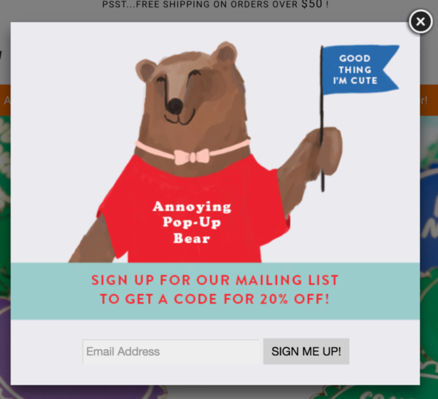
Timing Is Everything
We’ve coded pop-ups to work differently based on traffic source, time of day, browser, repeat visits, time on site, etc. Many Shopify email pop-up apps allow this flexibility out-of-the-box, and this advanced targeting can yield amazing results. You should be able to control when your pop-up appears based on traffic source, repeat visit status, browsing time, scroll depth, etc. You can also set pop-ups to appear only on certain pages, or just when someone is about to click away forever (this is called “exit intent”). Make sure your pop-ups are smart enough to stay away after a user has dismissed or submitted one.
Pop-Up Content is King
It may seem like people immediately click away from pop-up windows without reading them, but A/B tests reveal varying success rates with different pop-up messages, so we know people absorb the content. (Spoiler alert: discounts always lead to more signups — wah wah.)
Basic elements of an email pop-up window:
- Graphics: the visual elements (including photos, illustration, and colors) that appear inside the pop-up box
- Intro copy: serves as the headline or greeting and appears alongside the call to action
- Call to action: the compelling reason someone should sign up to your list (for example: sign up to our list to get 10% off your first order, etc.)
- Dismissal option: the “x” at the top right corner or “no, thanks” that allows a visitor to click to get rid of the pop-up box
A good pop-up window should:
- Reflect your brand voice
- Communicate that the visitor will be signing up to a list
- Communicate the value of signing up for your email list (what do they get for joining?)
Where Your Pop-Up Appears Matters
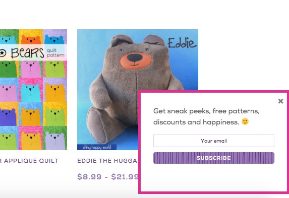
Your pop-up doesn’t have to appear as a box in the middle of the page. With many Shopify email pop-up apps, you can control the display type, so your pop-up can appear as an announcement bar, or pop in from the bottom corner, or even display as a full-page takeover.
You Don’t Have to Offer Discounts
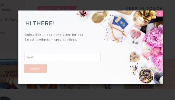
Even though discounts tend to perform better as list signup incentives, you can capture plenty of emails without offering an immediate discount or free shipping. While these calls to action tend to be somewhat less compelling, you can still use them in a pop-up to gather more emails than you would if your signup incentive was sitting quietly in your email footer.
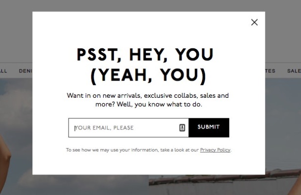
Here are some ideas for email pop-up calls to action that don’t rely on immediate discount offers:
- Giveaways: offering a change to win a small product (usually monthly) in exchange for joining the email list
- Free digital content: giving away free digital downloads with useful information for your target audience in exchange for joining the email list (things like cleaning checklists, children’s coloring book printables, recipes, etc.)
- Access to exclusive sales: running sales that you advertise only to your email list and communicating that joining the email list gives subscribers access to these sales
- Free gift with purchase: offering a little something (that doesn’t cost you much) with an email subscriber’s first order
Get some more ideas for your email pop-up copy here.
Always Be Testing
Don’t assume you know what will work best with your audience, even if you know them well! Always test conversion rates on variations of your pop-up placement, design and copy. How does an announcement bar compare to a box that pops up in the middle of the page? Or how does one signup incentive compare to another? What timing works best? What copy or graphics convert better? Some Shopify email pop-up apps offer A/B testing functionality out-of-the-box, but you can track statistics on your own by counting site visitors and signups associated with each version of your pop-up.
Examples of Awesome Pop-Ups That Don’t Inspire Rage
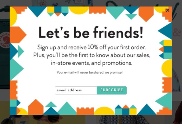
This great example from past Aeolidia client Mapamundi Kids has a great intro (“Let’s be friends!”) and two sign-up incentives. The graphics are playful, friendly, and totally on-brand.
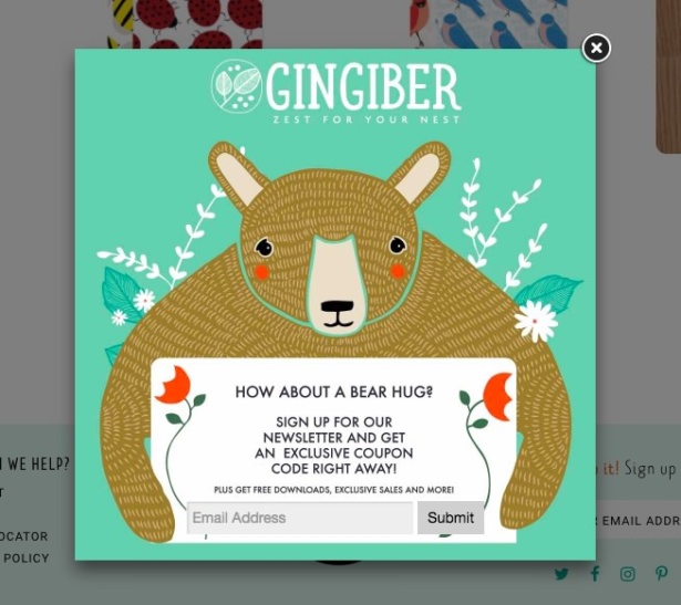
Are bears particularly high-converting? Probably. This “bear hug” pop-up from our past client, Gingiber, uses a beautiful illustration that’s quite endearing, coupled with (again) TWO sign-up incentives. What’s not to love?
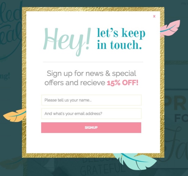
This email pop-up from another one of our past clients, Tickled Teal, has an attention-grabbing intro and a simple discount incentive. We love how the pop-up box is designed like an invitation, too!
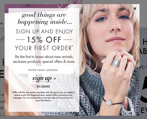
This email pop-up example from Dogeared Jewelry uses a simple discount incentive and includes all the important fine print right on the pop-up window.
Go Forth and Use Pop-Ups… Wisely
Collecting email addresses is so important, and pop-ups are very effective, but they’ll never cease to be controversial. Every website is different, so what works for one e-commerce business may not work for yours. Test, analyze, and tweak your pop-ups regularly. And look at how other maker businesses are using pop-ups to be inspired! What kind of incentives, language, and artwork are they using? What can you incorporate into your own business?
You certainly don’t want to “trick” people into being on your list. Give them a real, compelling reason to want to hear from you and you’ll build an engaged email list that you can rely on for steady sales for years to come.
Get help setting up all the important elements of an online shop. See our rate sheet today.
A Newsletter That Goes Beyond Shopify 101
It’s easy to find beginner info about ecommerce online. If you’re past that? Subscribe to our newsletter for advanced strategies and need-to-know info for established shops. You'll get:
- Weekly tips to help you market and sell your products
- Updates when there is news that may impact your site
- Round ups of interesting links and info for brands
- Invites to our live trainings and webinars
- Instant access to our past emails
"*" indicates required fields
5 thoughts on “Shopify Email Pop-Up Best Practices”
Leave a Comment
Related Posts
Let's take your online shop to the next level
The Shopify websites we design have a reputation for substantial improvements to ecommerce conversion rates and online sales. Let's talk!





Thanks for mentioning WisePops Katherine 🙂
Your introduction made my day (“We’ve been developing e-commerce websites on Shopify for a while now, *and we’re also nice people*, so we felt particularly qualified to answer the question”)
Thanks for this – super helpful. We currently use pop ups to collect email on both our retail (b2c) and wholesale (b2b) sites. We are currently in the process of combining into one website- retailers will log in to access the wholesale site. My big question/worry/fear- is how will I be able to keep wholesalers from accidentally signing up on the “retail” site- I don’t want them to start getting b2c emails and also it can be confusing because reigning up for an email list and registering to purchase on the website are not the same thing. Has anyone else dealt with this? Would appreciate feedback! Thank you-
Carol, it’s impossible to keep this perfectly under control. I’d recommend making it very clear in each email you send who it’s meant for, and the wholesalers can sort themselves out. I wouldn’t overthink it — they can unsubscribe if the content isn’t relevant.
You may also want to consider setting up an automated reply / automation / autoresponder to send to new subscribers explaining what they signed up for and how they can register to purchase, if interested.
[…] casual traffic into a newsletter subscriber by making it easy to sign up for your email list. Use a pop-up on your website and put an email signup on your website’s footer. Collect email addresses on social media, on […]
[…] Source […]