


This post was updated with current info on August 19, 2016.
Well, my dears, the time has definitely come: your website must be mobile-friendly. You can no longer get away without a mobile-friendly website! The internet has been headed this direction and it got very real now.
Google now has a “mobile-friendly” designation in their search results, so that people searching on phones can opt to skip your site if they don’t see that note that it will work for them. According to Google’s blog post about this, a page is eligible for the “mobile-friendly” label if it meets the following criteria as detected by Googlebot:
- Avoids software that is not common on mobile devices, like Flash
- Uses text that is readable without zooming
- Sizes content to the screen so users don’t have to scroll horizontally or zoom
- Places links far enough apart so that the correct one can be easily tapped
In August 2014, Shopify reported that mobile overtook desktop ecommerce traffic, which means that if your site isn’t optimized for a smartphone screen, you have the potential to double your sales without increasing your traffic, just by fixing up your website.
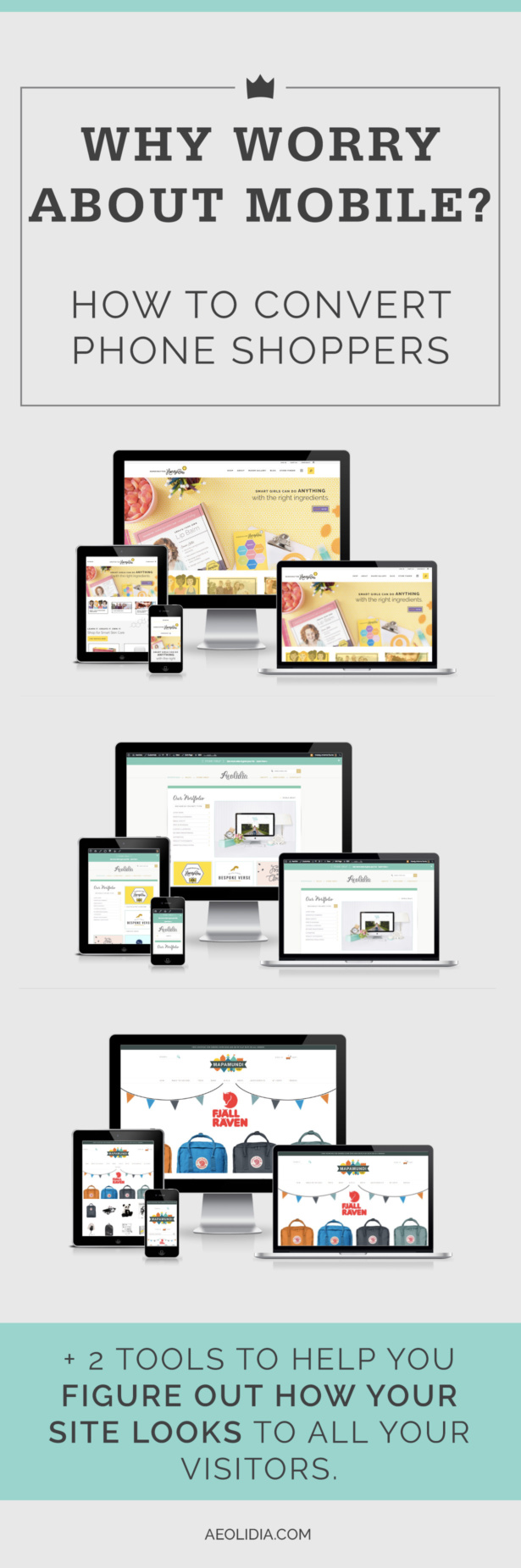
All of our website projects include a mobile solution, and have for some time. Today let’s talk about what you can do to make sure you aren’t losing half of your customers to poor mobile compatibility.
Does your website look good and work well on a smartphone?
Take a look at your site on a phone. Are you able to find things, shop, get through checkout? Is all the content readable, or do you need to do the “tap tap” or “un-pinch” gesture to expand it?
If you don’t have a smartphone or a tablet, there are some online tools that you can use to check your site out.
- Am I Responsive? This clever site will show you how your website looks across different devices, and it allows you to scroll and click within each one!
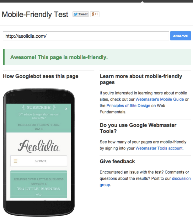
- Google’s Mobile Friendly Test will let you know if Google classifies your site as mobile-friendly in their search, and show you what the Googlebot sees.

Responsive vs. mobile theme
Things change with the internet all the time, and you can’t just build a shop website and feel “done.” The big change in 2014 was that your site needs to be mobile-friendly. Your two choices are to have a responsive site or a mobile theme for your site, and I’ll explain the difference.
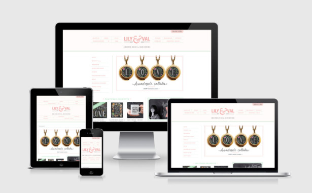
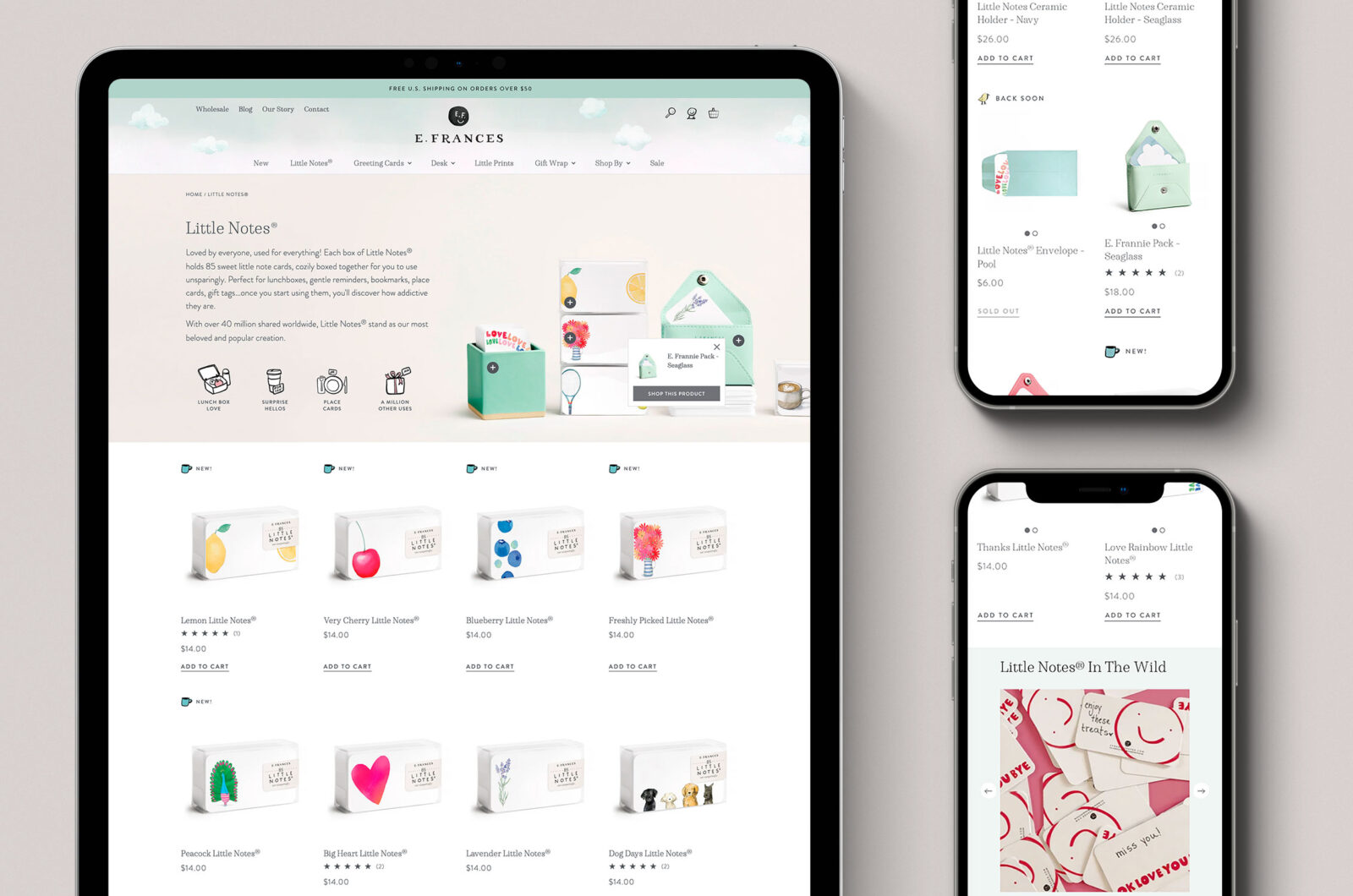
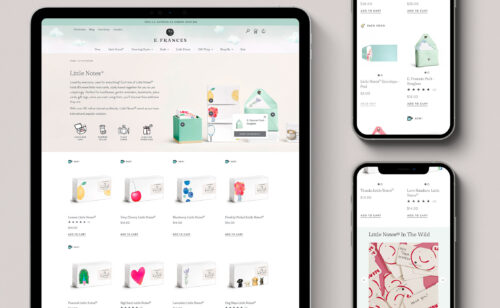
A responsive site scales down in size as the browser gets smaller. Images will shrink, text will rearrange itself, and maybe blocks of content will move to different locations. This is the current ideal solution, as it’s not dependent on browser size. Your site will look good at every size, not just at the iPhone size and the iPad size. For an example of a responsive site, look right here at aeolidia.com – when you’re using a computer, you’ll see that the site adjusts as you make your browser window thinner. It looks good and works well on tablets and smartphones.
A mobile theme is a version of your website meant for mobile browsers. It isn’t your exact same website (though it uses the same data), and doesn’t necessarily even look like your website. When someone visits your site using a smartphone, the mobile theme will be displayed instead of the desktop theme.
How do I get mobile-ready?
If you’ve worked with someone to create your website, you can check in with them about your next step. If you’ve built the site yourself and have the know-how to make it mobile friendly, now is the time! If you’re using a template or existing design theme, it’s time to switch to a responsive theme.
For Shopify sites that don’t want to make big changes, we’ve found a solution that seems to work well. It’s also very quick to set up. It’s an app that’s free for the most basic version, or has a monthly cost if you want to snazz it up. Fablet will create a separate mobile version of your site without messing with the look or functionality of your desktop site. You can see Fablet in action by visiting one of our clients’ sites on a phone: Stargrass Paper.
Let Aeolidia take care of it
If your website has no mobile solution, a mobile-friendly website upgrade should pay for itself. If it’s time to start fresh, with a custom site design that scales responsively, we would be thrilled to be your team as you get your site up to date.
If it’s been that long since the site was designed, we can assist with a redesign to convert more of your mobile and desktop visitors to customers. Let’s talk!
Forecasting Your ROI


Aeolidia aims to be a step towards 10x-ing a business, not just a 10% improvement. Is it time for your business to take this step?
Browse by Category

A Newsletter That Goes Beyond Shopify 101
It’s easy to find beginner info about ecommerce online. If you’re past that? Subscribe to our newsletter for advanced strategies and need-to-know info for established shops.
Learn how the top shops grow:
Related Posts


Tools & Guides


Courses & Webinars


1 thought on “Why & How to Make a Mobile-Friendly Website”
Leave a Comment


Let's take your online shop to the next level
The Shopify websites we design have a reputation for substantial improvements to ecommerce conversion rates and online sales. Let's talk!
Thanks for these great tips. I just used the google mobile friendly tester to check up on my site.