

How To Boost Conversion Rates On Shopify: A Guide To Website Optimization

August 1, 2023

Meenal Patel website theme for an artist, illustrator, and writer.
When it comes to running a successful online business on Shopify, achieving high conversion rates is essential for driving growth and profitability. Your website’s performance and user experience play a crucial role in influencing visitors to make a purchase. In this blog post, we will explore key strategies to increase conversion rates on your Shopify store, focusing on website improvement and mobile-friendliness.
Analyzing Your Current Conversion Rates
To kick-start your optimization journey, begin by assessing your current conversion rates. Use Shopify’s built-in analytics or third-party tools to track essential metrics such as bounce rate, time spent on site, and conversion funnel performance. This analysis will provide valuable insights into the areas that need improvement.
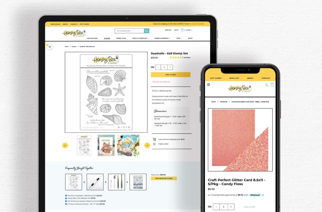
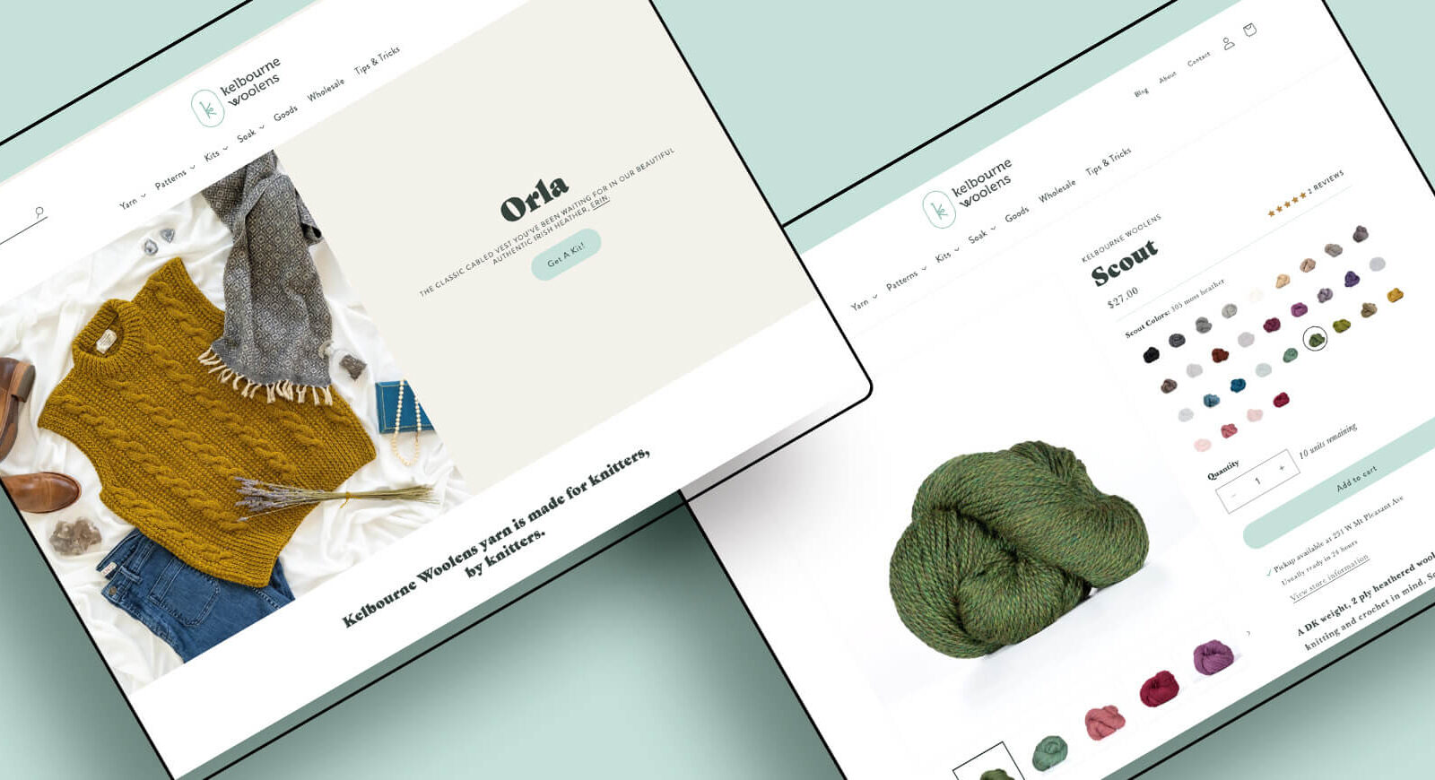
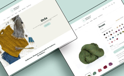
Optimize your product pages
Your product pages are the bread and butter of your ecommerce shop. Without these, your shop wouldn’t even be a shop, so it’s important to make sure these pages look and perform their best.
The big rule for conversion optimization is to make it easy for the user. For product pages, this means you’ll want to make sure that the most important information is close to the top of the page. Don’t make your visitors dig around to find must-know information like product features, size, color, and price. Here are our top tips for optimizing your product pages:
- Make it easy to buy – You’ll also want to make sure your ADD TO CART button is close to the top of your pages and very noticeable and easy to find. You might even try testing different bright colors or text options for that button, such as ADD TO SHOPPING BAG or BUY NOW, to see if another version of the button resonates better with your own target customer and increases your conversion rate.
- Make your shop categories boringly obvious – No “cute” category names, please! Do you have a jewelry category? Call it “jewelry,” not “baubles.” Have a section for children? Call it “children” or “kids,” not “minis.” Adding personality to your site is good, but having the personality hide simple information is bad.
- Optimize your product descriptions – Make sure your product descriptions are interesting and informative. People want to know what size things are, what they’re made of, and what colors you offer, sure, but you also need to be sure you’re telling the customer a story that will help her picture owning your product, and make her feel like she needs to have it. If you’re stuck on this, you’ll be amazed by what our copywriter can do with your information – turning dry descriptions into sweet little blurbs that will sell.
- Work on your photos – You need clear, detailed, and beautiful pictures of your products from all angles, and in use. Don’t skimp on this! Make sure photos make your customer picture the item in her life, make the size of the item understandable, and are the true colors. Unless you’re able to take well-lit, in-focus, and interesting pictures of your own products, hire some help. Dark, small, blurry pictures will be the death of your online business. That’s why we offer product photography to our clients – and would be happy to do this for you as a standalone project.
- Showcase important product features – Custom-designed icons can be a great way to showcase the special features of your products. For example, if you sell bath and body or gourmet food products, you might want to ensure that your customers know if your products are made from certified organic or non-GMO ingredients or that they are cruelty-free. If you sell sustainable clothing, you may want to inform customers that your garments are sweatshop free or made from a recycled polyester blend.
- Reviews and testimonials – Reviews, testimonials, and guarantees are great ways to use social proof to improve your chances of converting website visitors into customers. You can collect testimonials via post-purchase automated email campaigns using Klaviyo.
- Product samples and video demos – These can be great ways to ease a first-time customer’s concerns.
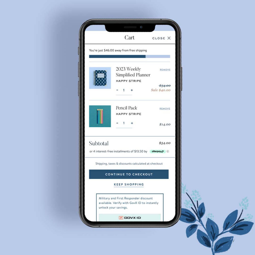
Optimize your checkout
Once you’ve got your product pages optimized for conversions, you’ll want to make sure that your customer’s checkout experience is also a breeze. A lengthy and complicated checkout process can lead to cart abandonment. Simplifying the checkout flow will help enhance the overall user experience.
For weekly tips like this, subscribe to our newsletter
"*" indicates required fields
- Make the shopping cart easy to find – People are expecting this in the top right corner, possibly with an icon of a cart. Don’t hide it, move it, name it something else, or give it a confusing icon.
- Offer free shipping – This is the easiest change to make and should be quite effective. Your shopper will assign a value to an item while shopping (suggested by you!) and then changing that value at checkout can be a deal-breaker. You can roll an extra fee into your product price to offset the change.
- Safe and secure transactions are key – When it comes to SEO, Google holds websites that fall into the “Your Money or Your Life” category to a higher standard. This includes all ecommerce sites. Because you are processing credit card transactions, you must go the extra step to ensure that your website is secure or you’ll have no hope of reaching the top of the search results. SSL certificates – that little lockbox icon – are built into Shopify websites automatically. Shopify also automatically takes care of something called PCI DSS Compliance for you.
- Deliver a great customer service experience – Consider activating live chat. By making it easy for your customers to ask questions about your products or shipping times, you’re more likely to make that sale that otherwise might be lost. If there are certain products that people often ask you questions about, activate live chat on those specific product pages as well your checkout. Live chat can help improve your customer service experience. Providing excellent customer service is the #1 way of improving customer retention.
- Reduce fears and last-minute hesitations – When people are ordering gifts or something for a special occasion, they’re concerned about shipping times and return policies. Include a link to your FAQ page or your shipping and return policies on your checkout pages to reduce last-minute hesitations. With the Privy app, you can set up an exit intent pop-up that will present visitors with a discount code or special offer before they leave your site to go look for a coupon code or better offer.
- Retargeting ad campaigns – Kit can create customized social media ads and retargeting ad campaigns to remind people who’ve visited your site, but didn’t make a purchase, to come back and buy.
- Subscriptions – If you sell a product that people return to purchase frequently, like bath or beauty products, you can also offer subscription billing to make it easier for your customers to buy regularly and to create recurring revenue for you. Subscription billing is typically offered at a slightly discounted rate, as an incentive.
- Add functionality to your site – One of the things that we like about Shopify (our partner link) is that you can add functionality to your site through their app store. Shopping cart abandonment apps can be a good way to get someone who dropped off of your site with products in their cart to come back and finish checkout. Adding cross-sells, up-sells, promotions, or bribes can be a way to get more value out of a single customer.
Improve Website Performance
Your website’s performance directly impacts user experience, search engine rankings, and ultimately, conversion rates. As an online business owner on Shopify, ensuring that your website loads quickly and functions seamlessly across all devices is paramount to attracting and retaining visitors.
- Optimize Loading Speeds – A slow-loading website can deter visitors and harm your conversion rates. Be sure to optimize image sizes to enhance page loading times.
- User testing – You can do this the old-school way – grab a friend and assign her a task, such as “find and purchase some earrings” and have your tester talk out loud about her thought process as she shops. You can uncover some interesting things doing this. Maybe something that makes perfect sense to you can be confusing to people new to your site. Pay attention during the cart and checkout steps, as here is where you can see what may be making customers abandon their cart.
- Go through the full shopping and checkout process yourself. This way, you’ll be able to catch anything that is confusing, surprising, or (gasp!) broken. Don’t rely on your cart software blindly. You can also do this on a larger scale with sites like UserTesting.
- Survey your audience – If your audience is pretty engaged with you, you may want to add a survey to your site or send a survey to your newsletter subscribers (perhaps with a reward for answering). Be sure each question on your survey is written so that the answers will reveal to you what action step you could take to improve your user experience. Avoid filler questions that will waste peoples’ time (and yours!).
- Make sure all your news or dated content is up to date – I have left shops before because I see the blog stopped updating five months ago, and I wonder if the shop is still in business. Make sure any blog posts, news, social media feeds that are integrated into your site, lists of events and sales, etc. are current, so people don’t see virtual cobwebs and leave.
- Mobile-Optimized Content – If your mobile visitors are more than half of your traffic, pay attention to mobile-first, not desktop. When adding content, try vertical or square photos on the home page. It would make sense for you to optimize your site for the phone, then check that the desktop view looks okay as a second priority. Craft concise and engaging content that suits the mobile browsing experience. Use shorter paragraphs, bullet points, and clear headings to facilitate easy reading. If your photos are horizontal (short and wide) or if you put small text on them (or even medium text on them), those photos are nearly pointless for mobile customers.
- Thumb-Friendly Navigation – Design navigation elements with mobile users in mind. Ensure buttons and links are large enough and appropriately spaced for effortless interaction.
- Click-to-Call and Contact Forms – Make it convenient for mobile users to reach out to you by incorporating click-to-call buttons and user-friendly contact forms. Streamlining communication enhances customer engagement and may lead to more conversions.
We’re here to help!
Our specialty at Aeolidia is making high-converting, strategic ecommerce sites. View our portfolio, then contact us today to turn everything around for your business.
Traffic or Tactics?


Diagnose your shop’s growth & sales needs and stop leaving money on the table.
Browse by Category

A Newsletter That Goes Beyond Shopify 101
It’s easy to find beginner info about ecommerce online. If you’re past that? Subscribe to our newsletter for advanced strategies and need-to-know info for established shops.
Learn how the top shops grow:
Related Posts


Tools & Guides


Courses & Webinars


Let's take your online shop to the next level
The Shopify websites we design have a reputation for substantial improvements to ecommerce conversion rates and online sales. Let's talk!