Rachel Post is a metalsmith and lapidarist who creates one-of-a-kind jewelry. She cuts her own stone cabochons, and rock hounds her own material, so each piece is a very personal work of art.
When we asked Rachel about her work, she let us know:
I want people to feel a connection with my work in a way that it speaks to them. That they feel an emotional connection to the stones I use. It makes them feel special to wear it. That they know that a piece of my jewelry will be the only one out there. A connection to the earth and the world around.
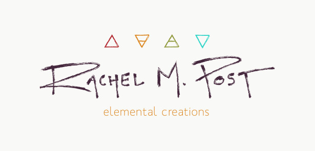
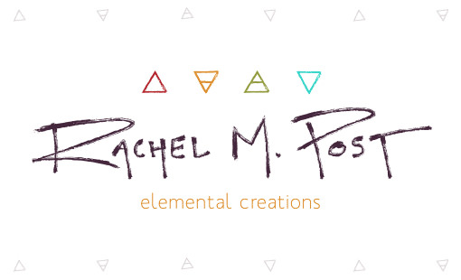
Sarah worked on the designs for Rachel’s new brand identity and handwritng logo, and as she became familiar with her work, she fell in love with the honesty in the jewelry and the way Rachel maintains the feel of rawness and natural elements. She wanted to ensure that the new logo design held that same raw and powerful feel.
The handwriting logo process
I asked Sarah about working with Rachel and she said:
Before making it to the final design, Rachel talked about what her design meant to her and how she wanted it to represent her jewellery and something I noticed pretty early on was how much of herself Rachel puts into each of her designs.
We talked about icons she liked, feelings she wanted to inspire, the process she goes through picking stones and creating her one-of-a-kind pieces. After the first round of designs I put together, it clicked for both of us that Rachel needed to be PART of her brand, not just in name but in design.
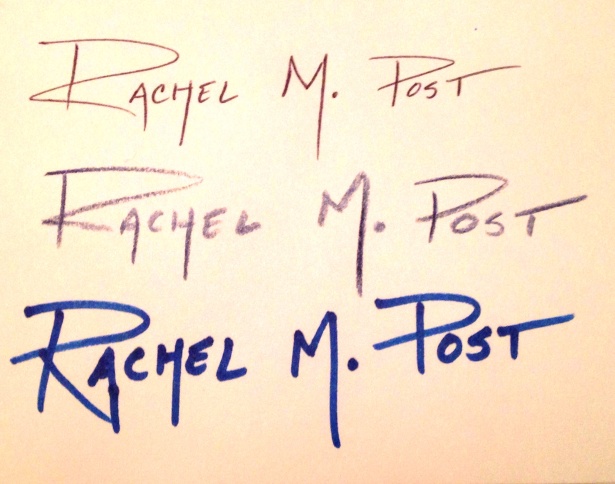
She sent me several of her own hand-written signatures and from there we took a few elements from her first round of designs and matched them with a hand lettered trace of her personal signature. While she liked the idea of using owls / feathers / nature as elements in her brand, we let go of what we thought looked pretty to incorporate more depth behind the icons in her logo. The four triangle icons are the elemental symbols for fire, earth, water and air. These four elements along with Rachel herself create her beautiful products, and in the end, this made her branding a true and meaningful representation of her business.
The end result is a very personal handwritten logo – one that resonates with Rachel and her customers. After the design work was complete, Rachel told us:
I appreciated the attention to details with my branding. It is a reflection of my individual style and my inspirations that I collect from nature. I commend Sarah for creating the hand lettering for my logo from my own script to make it truly my own mark.
Are you ready for a brand identity that is personal and powerful?
Our designers spend time learning about your brand and your goals so that they can create an identity that makes perfect sense for your business. If you’d like a logo that speaks to the heart and soul you put into your business, we’d love to hear from you!
Brand Strategy

Building a solid, strategic foundation for your brand. With Ann Parker, our brand and web designer and brand strategist.
Related Posts
Let's take your online shop to the next level
The Shopify websites we design have a reputation for substantial improvements to ecommerce conversion rates and online sales. Let's talk!

