


Welcome to the first in our Before & After series! In April, we launched the adorable Terra Zizu site, helping parents learn about infant potty training. This was a fun process, and I wanted to share the transformation with you. Today we’ll explore how breaking up text can improve your website.
Before contacting us, Nga, the site owner, had set up a simple website using a WordPress template. The business was originally called Roo Roos, and went through a lot of changes during our design process.
Terra Zizu (Roo Roos) BEFORE:

Click here to view a screen shot of the old site.
Nga didn’t consider this a finished site, so I don’t want to pick on it too much, but you’ll see that it’s very text-heavy and it’s hard for your eye to figure out where to go first. The tagline (“organic goodness for your lil’ roo”) is ambiguous about what is offered on the site, and there is a lot of visual clutter toward the bottom of the home page that doesn’t need to be there.
The first step was a logo, created by Zaara of Kittenchops. During the process of branding her business, Nga came up with a new name, Terra Zizu:
“Terra Zizu translates to Earth Baby. Terra is from the latin root meaning earth, and Zizu translates to baby in Sanskrit. As you know, it took awhile to come up with this name, but I wanted to get a name that was unique and brand-able, and conveyed images of earth, nature, organic but still sounded cute, catchy, and kiddie-ish (but not cheesy kiddie). Also, since infant potty training (see more info about IPT below) is commonly practiced in Asia, India and Africa, I wanted the name to somehow reflect that (thus the Sanskrit origin).”
– Nga Zimmerman
Wonderful inspiration, right? Zaara created a sweet and memorable logo incorporating a mushroom for the earth, and a swaddled baby. She also created some additional illustrations to bring some fun and color to the site (which is was sorely lacking before).

Meanwhile, Jen was working on photography for the site. She did both standalone product shots as well as shots with a baby model. Product photography can make or break a sale. With the new photos, Nga’s product looks high-quality and customers will easily be able to answer their own questions about the colors, shape, or fit of the pants.
Next, Lauren popped in to design the website. Lauren created a simple, vibrant layout, keeping these keywords in mind:
- upscale
- clean
- eco-friendly
- premium
- organic
- childlike and free-spirited, but not cheesy
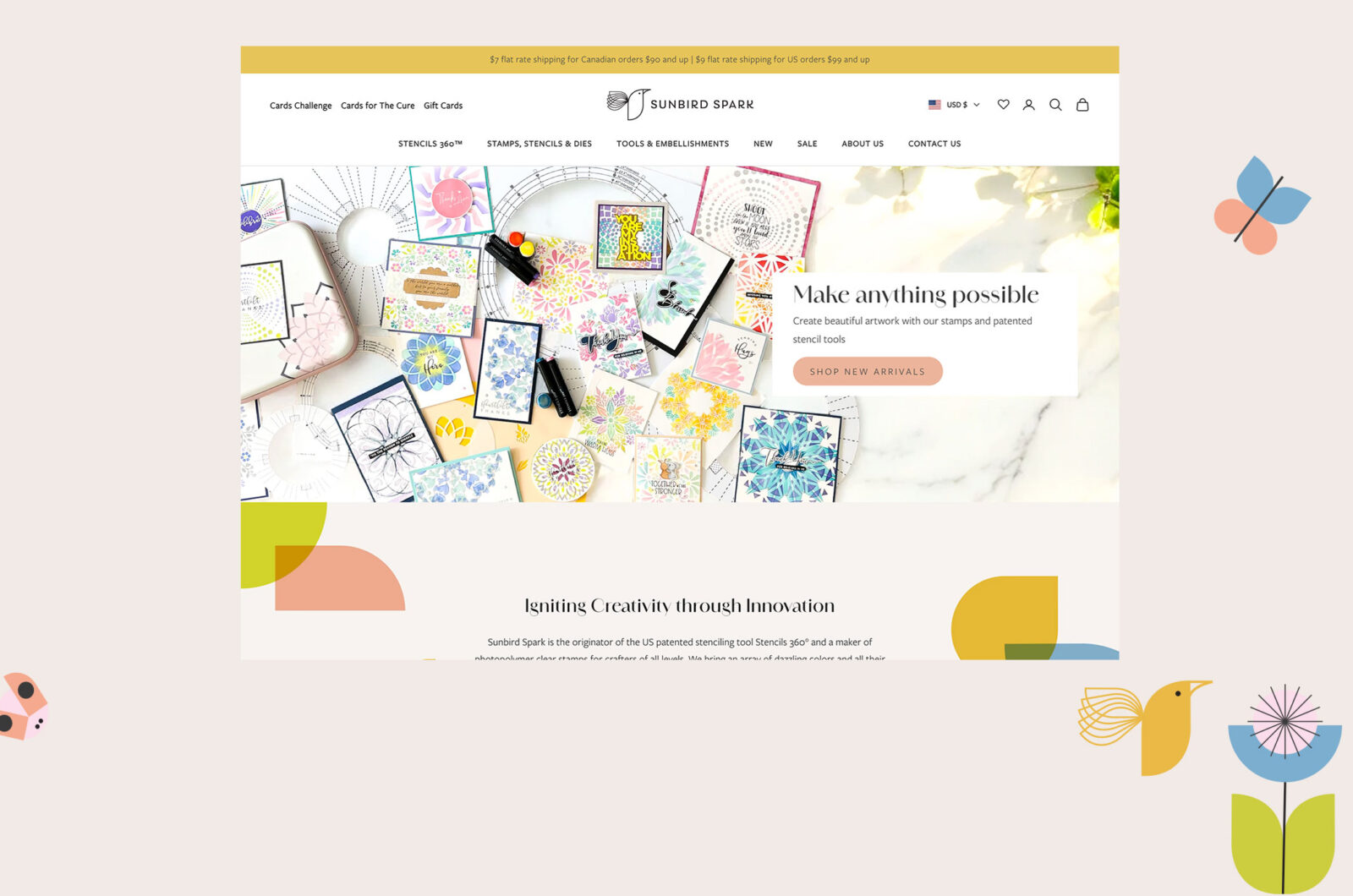
Now when you go to the website, you get a colorful, cheerful welcome and a quick intro to what the site’s about. From there, the links to the main areas of the site are clear and easy to find, and it’s simple both to learn more about IPT and to purchase training pants from the shop.
Terra Zizu AFTER:
Contact me to let me know if you’d like us to work some design magic on your site!
A Newsletter That Goes Beyond Shopify 101

It’s easy to find beginner info about ecommerce online. If you’re past that? Subscribe to our newsletter for advanced strategies and need-to-know info for established shops. You'll get:
- Weekly tips to help you market and sell your products
- Updates when there is news that may impact your site
- Round ups of interesting links and info for brands
- Invites to our live trainings and webinars
- Instant access to our past emails
"*" indicates required fields
Browse by Category

A Newsletter That Goes Beyond Shopify 101
It’s easy to find beginner info about ecommerce online. If you’re past that? Subscribe to our newsletter for advanced strategies and need-to-know info for established shops.
Learn how the top shops grow:
Related Posts

Tools & Guides


Courses & Webinars


Let's take your online shop to the next level
The Shopify websites we design have a reputation for substantial improvements to ecommerce conversion rates and online sales. Let's talk!