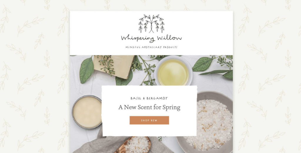
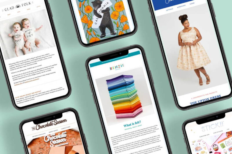
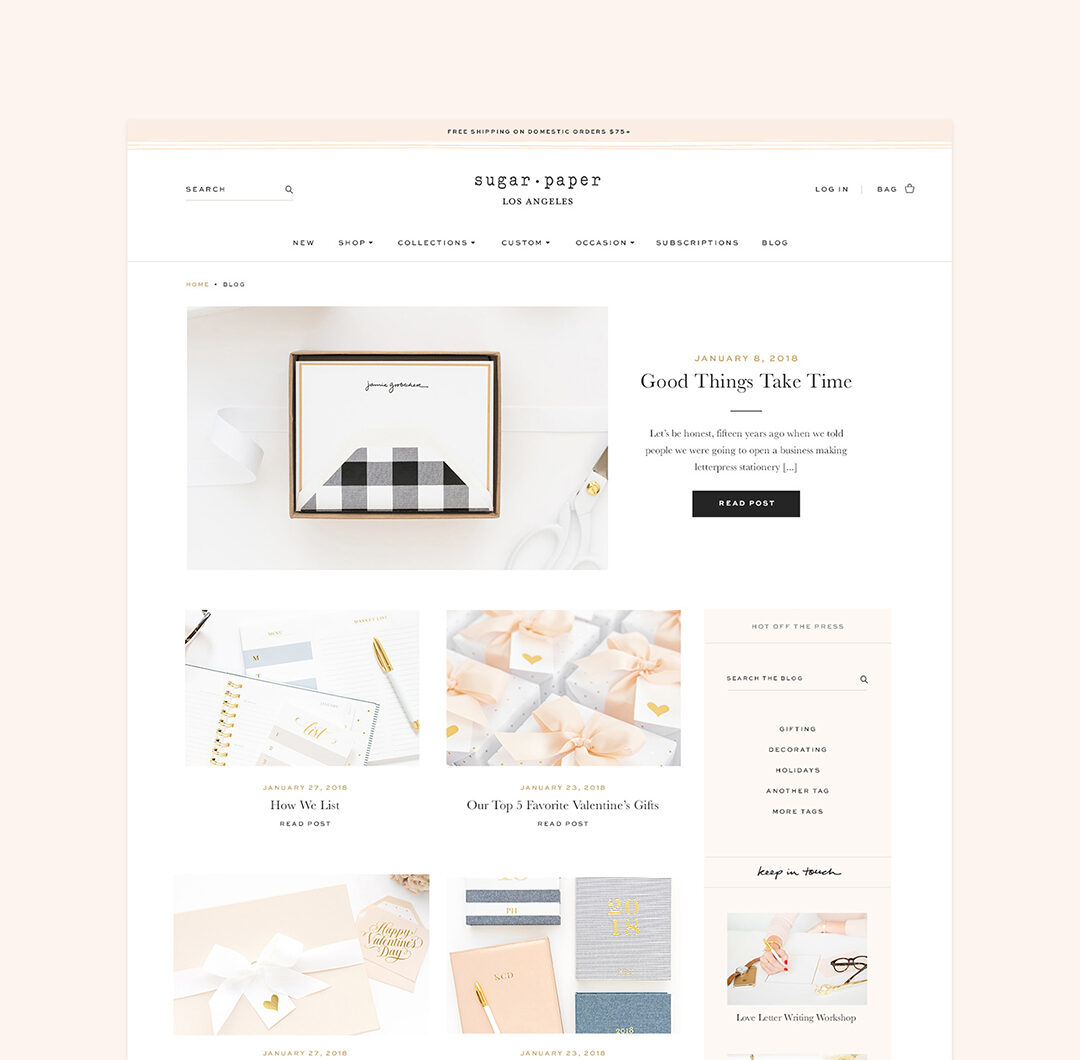
Email is a crucial component of a successful marketing strategy, and today we’re going to talk about how to make your email subscription form as effective as possible. This form on your website is where you collect the email addresses of current and potential customers for your newsletter, and you want this form to be compelling because you want more people on your email list, right?
Let’s look at the importance of email marketing this way: if 3% of your website visitors make a purchase, that means that 97% of them leave empty-handed. What will happen to those customers? Will they remember to come back to you? Not many will unless you have a way of keeping in touch. This is the power of email. It can take up to 15 visits to convert a website visitor into a shopper, and staying in regular email contact is one of the most effective ways to ensure that the visitor receives this repeated exposure to your brand.
Tips for making your email subscription form convert
It’s likely that when you insert your email signup form code on your website (either on the home page, in the footer, or in a pop-up), your service provider provides you with some default text. Something like, “Sign up for news and updates!” Even though that exclamation point is catchy, you can do so much better.
It’s important that your email subscription form is enticing to first-time visitors. Remember those 97% who have left your shop empty-handed? Many of those are casual customers who aren’t yet fans of your company. Using text like ‘news and updates’ may be attractive to loyal customers (who likely are already signed up for your newsletter), but it isn’t compelling for an undecided visitor. After all, don’t we all already get too many emails in our inbox?
So, let’s talk about how to effectively convert casual website visitors into newsletter subscribers with an effective email subscription form.
1. Come up with an irresistible offer
Your offer needs to be irresistible to your ideal target customer. While a discount is a common offer, it’s not your only option (and it’s not our favorite, as it sets a precedent that devalues your products). To get some ideas of your options, see this blog post: Email Pop-Up Copy: What Works Best?
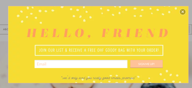
The more explicit the better! Mentioning “special offers” feels vague and meaningless. Specific offers, such as a free bracelet with purchase, a printable project, or a recipe, helps the customer decide if they want what you’re offering. For a few ideas about offers aside from a discount, read our blog post on newsletter signup incentives.
2. Make sure your wording is exciting and positive
No one likes having too much email in their inbox. We understand that you might feel a little guilty that you’re about to fill someone else’s inbox up with even more email. Time after time, we see email subscribe offers that say things like, “I promise not to email you too often” or “no spam, ever!” or “sign up for our infrequent emails.”
For weekly tips like this, subscribe to our newsletter
"*" indicates required fields
Don’t feel bad about sending your customers amazing emails! And when you remind the customer that email can be a drag right as you’re asking me to sign up for email… well, that kind of defeats the purpose. Instead of letting your potential subscriber know that you won’t annoy them, tell them how you’re going to help, entertain or inform them.
3. Make sure the visitor sees it and can find it again
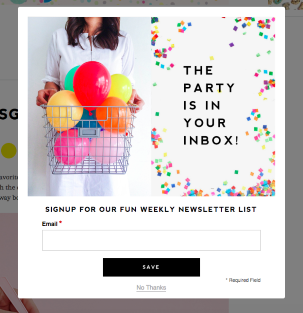
Email pop-ups can be great for catching your visitor’s attention. We recommend NOT making the pop-up appear the second a visitor shows up at your site. Odds are, they’ve just come over for the first time and have no idea who you are or what you sell, leading them to immediately to close the window. Instead, use an app that lets you delay the pop-up (by amount of time on the site, percentage of the page scrolled, or “exit intent”).
If you do make an offer on the pop-up and the customer closes it, you need to ensure they can find that offer again. The footer of your site is a great place for an email sign up form (it needs to be on every page, in case the customer skips visiting your home page). It should be the same offer, so the visitor doesn’t feel like they missed out on anything. We have some more pop up tips, here: Email Pop-Up Best Practices.
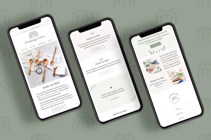
And of course, just like the rest of your site, it’s important to make sure your email signup form is mobile-friendly. The percentage of visitors viewing your site on a phone has increased dramatically over the past few years and will likely continue to do so. Make sure your entire pop-up can be read on a phone, and that it is easy to close it, as well.
4. Put together a welcome series of emails (and other automations)
When your visitor signs up to receive your newsletter is the moment they are the most interested in your business. One of the worst things you can do is allow someone to sign up, and then let weeks elapse before they hear from you. Imagine giving a prospective contact your details and they don’t call you for a month… not the best first impression!
If you’re sending weekly or monthly newsletters, it’s impossible to make sure a new customer receives an email right away – unless you’re using email automations. When you set up an automated email series, you can send a new email subscriber a “welcome” email right away, with that amazing thing you offered them. And, from there, you can send a whole sequence of emails specifically targeted at their exact point in their customer journey – letting them get to know you and your business, introducing your best products, and helping them decide which is right for them.
If you want to get started, read our blog post: Why & How to Start an Email Autoresponder Series and then read about how automation is part of an effective email marketing strategy. Or, if you’d like help with planning, writing, and implementing email automations, that’s one of the services we offer and you can learn more here.
5. Find other places to promote your mailing list
Your website footer is not the only place you can promote your mailing list! You can do it in your blog posts, in the printed material you send with orders, and/or in your email signature. We always recommend that you include email sign up information in your bio and regularly in social media posts as part of an engaged social media strategy. You can come up with multiple offers and freebies in different areas to get people on your mailing list. You can write guest blog posts or appear on podcasts and share your mailing list offer. Get creative! Where and how are you communicating with potential customers, and can you interest them in your mailing list?
6. Keep an eye on your stats
Once it’s all set up and running, don’t forget to analyze! Which types of emails have the highest open and click rates? Which ones drive the most sales? What works well and what doesn’t? Can you tweak and re-send a newsletter from a year ago that did really well? Data is everything!
If you’re looking for more information about improving your email marketing strategy, we think you might be interested in our free Webinar on Email Marketing (or the companion Email Marketing blog post). The tips we’ve shared today about optimizing your newsletter sign up form obviously work best as part of a comprehensive, overall email marketing strategy. There’s no one tip or shortcut that will revolutionize your marketing- results come from authentically connecting with your customer across multiple touchpoints, creating a brand that resonates with your ideal customer, and continually monitoring your results.
A Newsletter That Goes Beyond Shopify 101
It’s easy to find beginner info about ecommerce online. If you’re past that? Subscribe to our newsletter for advanced strategies and need-to-know info for established shops. You'll get:
- Weekly tips to help you market and sell your products
- Updates when there is news that may impact your site
- Round ups of interesting links and info for brands
- Invites to our live trainings and webinars
- Instant access to our past emails
"*" indicates required fields
1 thought on “6 Email Subscription Form Best Practices”
Leave a Comment
Related Posts
Let's take your online shop to the next level
The Shopify websites we design have a reputation for substantial improvements to ecommerce conversion rates and online sales. Let's talk!





Got some fantastic ideas about improving in email subscription from. like most site owners I used traditional boring format of subscription form and result was not good, so I’m thinking about what’s the wrong? after reading your post I understood where I need to improve and I think it’s time to apply your ideas and see what result it will bring. Thanks for sharing this nice Ideas.