How Sugar Paper Gained a Third Store with an Online Flagship
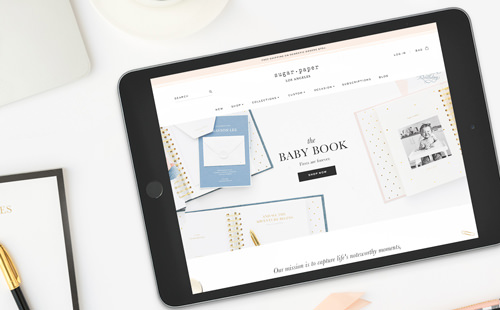
When you own a thriving brick-and-mortar shop, it can be easy to think of the role of your website as a supporting player in your business. But what happens when you consider that your online presence can be an extension of your IRL store that is equally important?
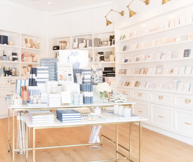
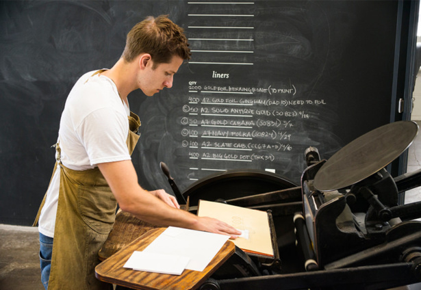
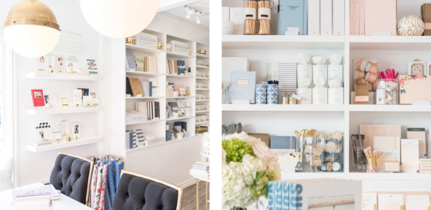
We worked on a new web design for Sugar Paper, a Los Angeles-based stationery studio providing luxury, custom letterpress products for all of life’s noteworthy moments. The handmade nature of Sugar Paper’s products lends itself very well to an in-person experience. At their two brick-and-mortar locations in Brentwood and Newport Beach, customers stop in to browse their collections, hold the paper in their hands, and create custom sets of invitations in their studio.
To keep this experience fresh, co-founders Chelsea and Jamie regularly redecorate and reconfigure the space. By “turning” the store to showcase new products, themes, color stories, seasons, and occasions, Sugar Paper reminds customers of the many things in life worth celebrating.
A new online flagship
Chelsea wanted their new site to have a friendly customer experience that made shopping more joyful. They also hoped to find ways to incorporate storytelling into the customer experience. This story — that their custom stationery is made in-house with a meticulous eye for detail — would be instrumental in inspiring customers to purchase on their site, something that they previously did not have the capability to do.
Before we got to work on the look and feel of the new Sugar Paper site, we carefully planned how it would function. Over internal meetings and lively discussions about which features would most benefit the Sugar Paper business model, we created a wireframe that outlined what exactly the website would do.
For weekly tips like this, subscribe to our newsletter
"*" indicates required fields
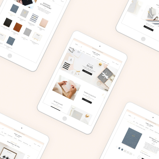
To make it easier for customers to make a purchase, our designer Do-Hee shifted the site’s navigation from an informational one to a shopping-focused navigation. Key features included a category that highlights what’s new at Sugar Paper, a main shop menu that features the most relevant collection so that customers can easily find what they’re looking for, and a new Collections feature that helps them shop in a more curated way. This is especially useful during the holidays or a time of year when the shop might want to feature products based on a seasonal theme.
“I tried to think about the different ways that customers shop for stationery and home goods, and presented them in logical and varied ways,” Do-Hee explained.
Make your invite space inviting
With the wireframe in place, Do-Hee shifted gears to design. Her goal was to elevate the sense of storytelling and bring in analog elements to communicate the handmade and human aspect of the brand, all while keeping the vibe of the existing site. This would help new and existing customers alike forge a deeper connection to the brand.
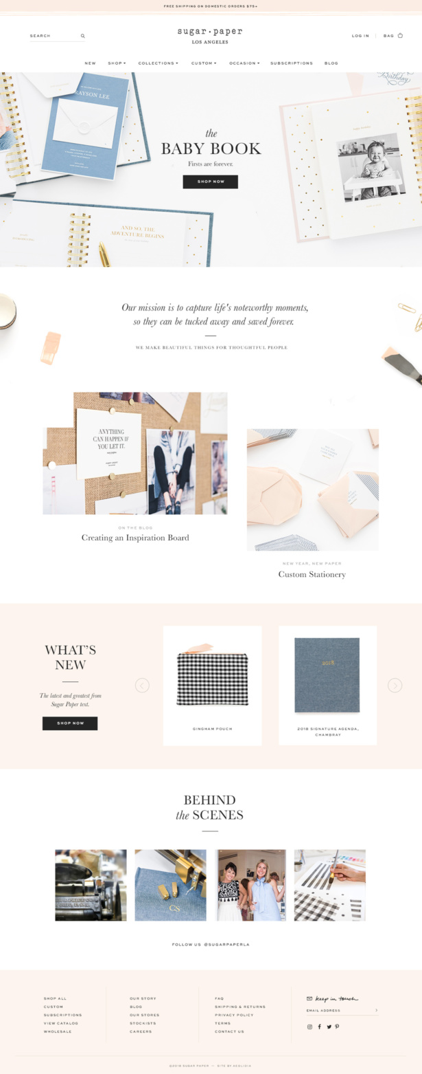
“Overall, the homepage has a warm, contemporary look and feel that introduces your customers to the world of Sugar Paper and invites them to stay a while,” she said.
The large feature spot below the navigation is where the hero photo truly shines. It showcases a beautiful campaign image, supporting text, and link to shop THE strongest thing Sugar Paper has to offer at any given time. This feature is easily updated so that (just like the brick-and-mortar shops) the online shop can be regularly “turned” according to seasons and occasions.
It doesn’t stop there. Following an intro that gets to the human element of the brand with brief, but effective copy, we included a section for two “flex marketing spots.”
“We imagine their team using these spots flexibly to link to the range of content on your website,” Do-Hee said. “You’d be able to swap out the images and text to best suit your content marketing needs.”
Now Open: an additional location
Take a stroll through Sugar Paper’s new online space to get a feel for how inviting it is. Even with more than 500 products available, the site does not overwhelm. Rather, it intuitively presents visitors with options so they can easily find what they’re looking for, and inspires them to continue browsing along the way.

Also inspired? The Sugar Paper team.
“We were so moved by how cohesive the site looks that we have decided to consider it a third store that will be ‘turned’ as well. You have put so many lovely elements in it that we realized pretty quickly that we couldn’t look at it as just a sales site, it is a store and it needs to nurtured and maintained as one. So now, as we move forward with marketing, we will be considering that and keeping that in mind to bring the best we can with content and design to this lovely little spot on the internet.”
View this project in our portfolio »
Are you ready to transform your little spot on the internet into a functional, inspired place that works to drive sales 24/7? Contact us about your new flagship site design!
A Newsletter That Goes Beyond Shopify 101
It’s easy to find beginner info about ecommerce online. If you’re past that? Subscribe to our newsletter for advanced strategies and need-to-know info for established shops. You'll get:
- Weekly tips to help you market and sell your products
- Updates when there is news that may impact your site
- Round ups of interesting links and info for brands
- Invites to our live trainings and webinars
- Instant access to our past emails
"*" indicates required fields
2 thoughts on “How Sugar Paper Gained a Third Store with an Online Flagship”
Leave a Comment
Related Posts
Let's take your online shop to the next level
The Shopify websites we design have a reputation for substantial improvements to ecommerce conversion rates and online sales. Let's talk!



You guys did such a good job on the site. So important that a website effectively reflects the brand. This one looks great!
Thank you, Sarah!