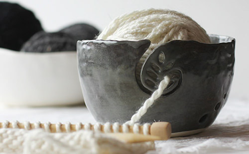
Artists may spend years and decades honing their craft before they officially launch as a business, only to find themselves beginners again when it comes to building their brand’s visual identity. Luckily, at Aeolidia, our expertise is crafting beautiful, timeless brands for makers and artisans like Nona Kelhofer, who came to us when she realized she was ready to transform her passion into a business—but wasn’t sure where to begin.
Nona needed a brand, starting with a business name and visual identity, for her handmade, heirloom-quality pottery. A ceramicist with decades of experience, she wanted her new business to reflect the thoughtful, minimal aesthetic of her pieces. Connectivity, creativity, and organic mindfulness in ordinary moments were central to her brand, so we began by brainstorming business names that would evoke these same qualities.
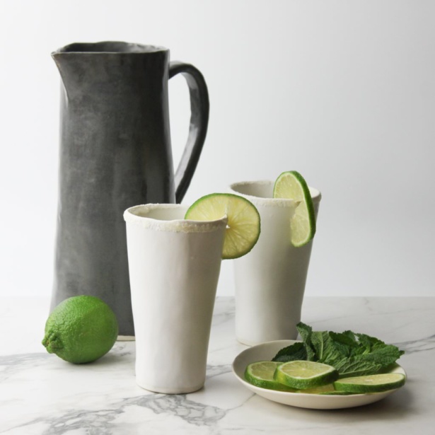
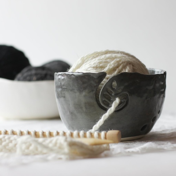
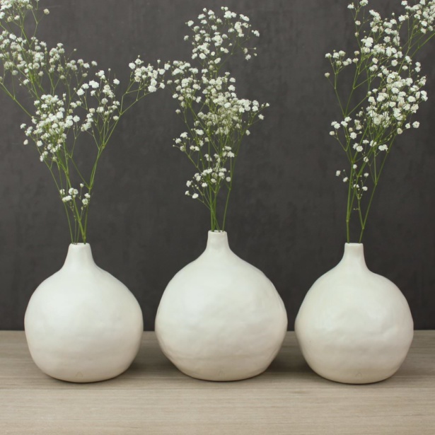
Defining the Intangible in a One-Word Name
In describing her pieces, Nona said they are, “designed to be timeless, to blend and leave space yet also engage.” It’d be important, then, for her name to be abstract enough to leave space for people to wonder and imagine what it means, while also maintaining a sense of accessibility.
For weekly tips like this, subscribe to our newsletter
"*" indicates required fields
Inspired by the physical shape of Nona’s pottery, I brainstormed names rooted in the word “Vessel” and combined it with allusions to her creative process. Beginning with sketches and measurements done entirely by hand, she uses the twelve-thousand-year-old technique of pinch pots to create pieces like bowls and cups. The suffix -ry hints at her precise and intentional craftsmanship. The two concepts were fused into one single, minimal word: Vesselry.
The simplicity of the name gives it a confident, elegant, and timeless feel, while the literal meaning of “vessel” hints at the giving nature of a vessel, how abundance flows from it.
In connecting to the name, Nona loved the use of a single world and how it “seems to elevate the simple vessel, in a similar way serving food on hand made dishes elevates the dining experience. It also conveys an air of elegance that relates to the sculptural quality of my forms.”
A Mark Worthy of Setting in Clay
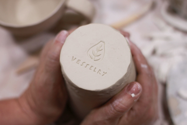
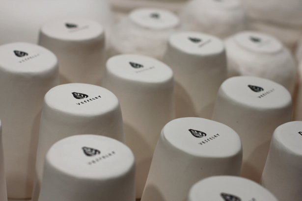
Our next task was to translate the simple elegance of the brand’s name into its new visual identity. For this, Jess drew from the literal shape of a vessel and blended it with the natural element of a leaf to create an organic mark. She utilized negative space to draw the eye out, engaging the viewer, while giving the mark an ancient yet modern feel that makes it timeless.
To showcase the thoughtful, handmade quality of Nona’s work, Jess paired the mark with uppercase lettering that she drew by hand. Like each of Nona’s pieces, which bear her fingerprints from her physical touch, the hand lettering was meant to be completely unique to the Vesselry brand.

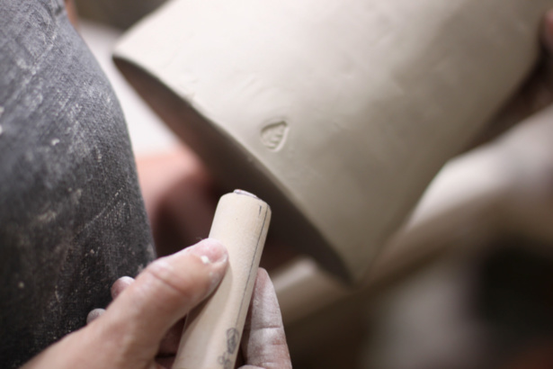
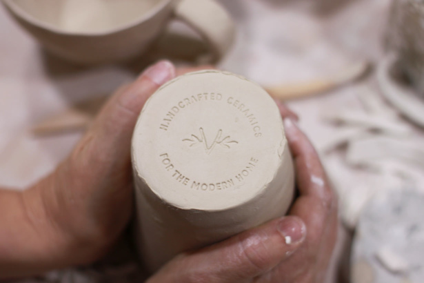
Nona loved the organic simple feeling of the mark, and how it beautifully balanced an elegant aesthetic with a handmade feel. With the logo set, Jess began focusing on ways to extend this new visual identity to all aspects of the Vesselry brand, mocking up how the logo would look on the bottom of a ceramic piece, on an advertisement, on a simple website, and even at a booth at an art show.
In choosing a color palette, Jess went with, “charcoal and white to maintain a really nice clean and elegant look. Then I added in some lovely neutrals like the taupe, warm grey, and sage that will help to give some pops of color.”
Visualizing the Brand’s Future
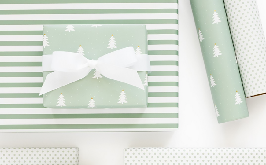
At every step, design decisions were made to further underscore the brand’s timeless, organic elegance. Even small touches, like patterns for tissue and wrapping paper, gift tags and care cards, and templates for the brand’s email newsletter, came together with this message in mind.
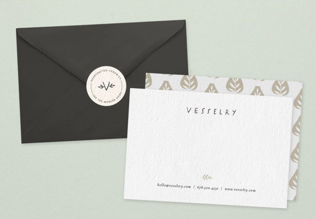
This not only helped Nona begin to see her brand as a living, breathing entity, but it helped set a strong foundation for her brand’s direction going forward. From these initial steps taken during our project, Nona was able to build her own website using a Shopify template. The website design, photography style, and social media content she’s built for Vesselry have all tied back to the brand expression that we discovered during our work together. It’s all served to strengthen her brand.
“As I developed the content for my website, each decision helped to refine a more clear sense of Vesselry beyond the name, logo, and palette,” she says.
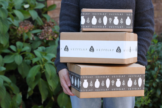
You can see the results on the newly-launched Vesselry website. Simple headlines like One Vessel At a Time reiterate the brand’s commitment to filling everyday moments with joy. On her Instagram feed, Nona’s choice of neutral colors, like this white-against-white image of a carefully arranged row of porcelain cups, showcases her pieces’ beautiful, one-of-a-kind shapes and how they elevate the ordinary.
View this project in our portfolio »
Can We Do This For You?
Nona’s business is now poised for success. If you’re interested in learning more about our schedule and rates, please get in touch today. We would love to show the same care and strategy for your brand.
A Newsletter That Goes Beyond Shopify 101
It’s easy to find beginner info about ecommerce online. If you’re past that? Subscribe to our newsletter for advanced strategies and need-to-know info for established shops. You'll get:
- Weekly tips to help you market and sell your products
- Updates when there is news that may impact your site
- Round ups of interesting links and info for brands
- Invites to our live trainings and webinars
- Instant access to our past emails
"*" indicates required fields
2 thoughts on “Sculpting Passion into a Brand: The Making of Vesselry”
Leave a Comment
Related Posts
Let's take your online shop to the next level
The Shopify websites we design have a reputation for substantial improvements to ecommerce conversion rates and online sales. Let's talk!



This is gorgeous! I love everything about the branding and the product pictures are beautiful. Great job!!
Thank you, Heather!