No matter the age, everyone loves to party. No one knows this more than Charlotte Callaghan, owner of Hip Hip Yay, who wanted a new logo for a party shop that would appeal to both adults and kids.
Though her online shop was about a year old, she’d quickly realized it needed a complete redo, starting with her logo. With a stronger brand identity and a cleaner, more user-friendly navigation on her new site, she hoped to see an increase in pageviews and email signups that would convert to sales. Charlotte knew she wanted something that was cute, fun, and could stand on its own without being influenced by current trends. And, she really, really had a thing for gold foil.
“I know gold foil is always going to cost me more for everything, but I do love the look and class it presents.” Also on Charlotte’s wishlist: bright pinks, pastel palettes, and a bright, airy aesthetic.
Naturally, we were thrilled to get an invite to develop this exciting brand. Christine put on her party hat and got to work creating a logo that was type-focused in order to let color, graphics, and patterns play a big role in the rest of the branding. It was important to cater to fun and hip party throwers, but to also give the mark a timeless feel.
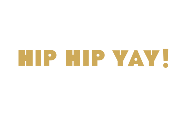
The above logo—which featured fun, non-traditional letterforms—was an immediate hit. With the concept approved, this logo development party moved right along to Round Two, which is where elements like the color palette, alternate logo marks, and icons (ideal for uses like social media and packaging) come into play.
For weekly tips like this, subscribe to our newsletter
"*" indicates required fields
The colors Christine incorporated into the design featured “the bright, happy hues you are drawn to —they also all happen to look really good with gold. While everything is fun and playful, the type and graphics are still simple and clean. This keeps your branding friendly but not trendy.” They gave the mark a bright, catchy feel that appeals to kids, while the simple sophistication of the design is equally pleasing to adults.

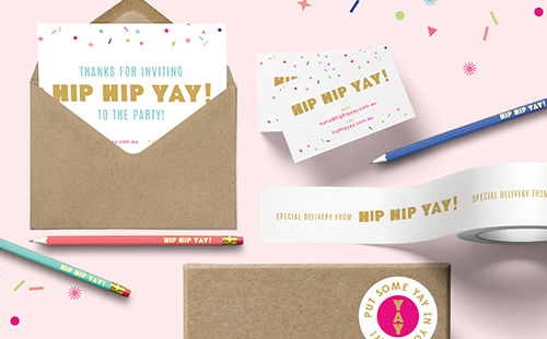
Charlotte couldn’t agree more. Very minor changes, like adding an exclamation point to the logo (because of course!) led to its quick finalization followed by the creation of additional branding materials. Business card designs, packing tape and tissue, and these adorable pencils and stickers…we can’t help saying Yay! every time we look at them.
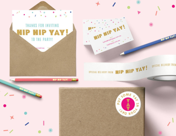
When Charlotte saw her new logo and brand identity she told us:
I absolutely love all of it! I am so so happy with it all, you have honestly exceeded all of my expectations and I am so so excited!
See more projects in our portfolio.
Join the Party!
Could your logo use an invite to our redesign party? We’re always taking new names for our list! Contact us to get started.
Hire Impactful Shopify Help
Are you looking for a partner that can upgrade your brand and site, then stick around long term to optimize and maintain? Aeolidia is big enough to handle your complexities and small enough to be personally invested in your goals. Let's talk!
Related Posts
Let's take your online shop to the next level
The Shopify websites we design have a reputation for substantial improvements to ecommerce conversion rates and online sales. Let's talk!

