Sam and I spent two days walking up and down and up and down the vibrant pink carpet at the National Stationery Show, a trade show for paper businesses. I’m going to write more about what goes on that the show, who goes, and share tips, but first, some gorgeousness! Here are some examples of distinctive trade show booth design that stood out to us as the most distinctive showstoppers. All photos by Sam Hirst.
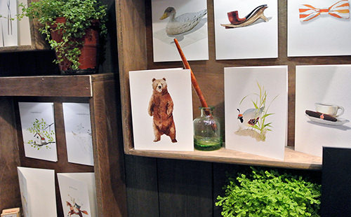
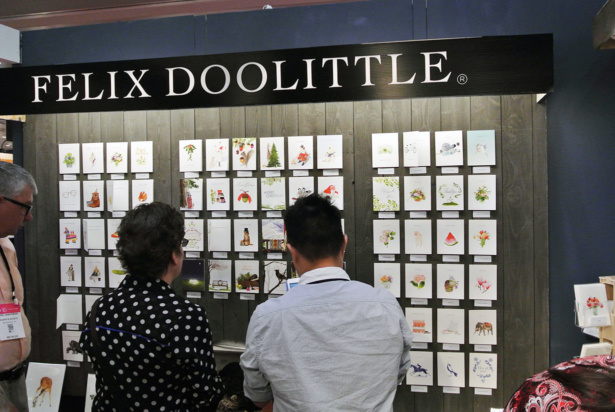
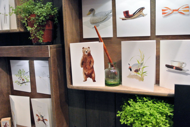
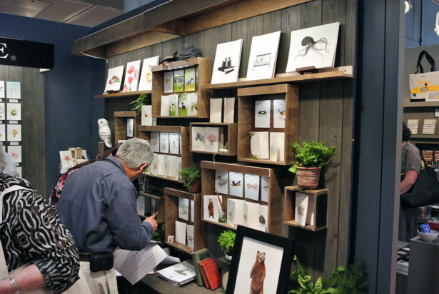
Felix Doolittle
Felix’s booth was small and completely packed with buyers. This was my favorite booth at the show, because I’m a nature nerd, and it felt like the cards were set up in little natural history displays – like a beloved butterfly collection or something.
His booth really elevated his products. Picture the same illustrated cards on a plain white wall. Still lovely, but much easier for buyers to pass by, or not “get it.”
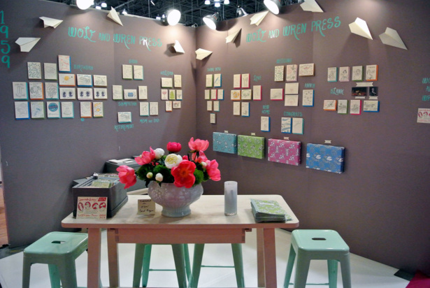
Wolf & Wren Press
I loved the color-matched stools and logo here, and the paper plane detail broke up the boxiness of the booth, while drawing your eye to the products.
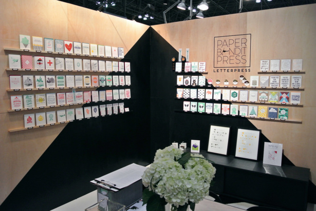
Paper Bandit Press
The wooden walls with geometrical paint job did a great job of drawing us into this corner booth.
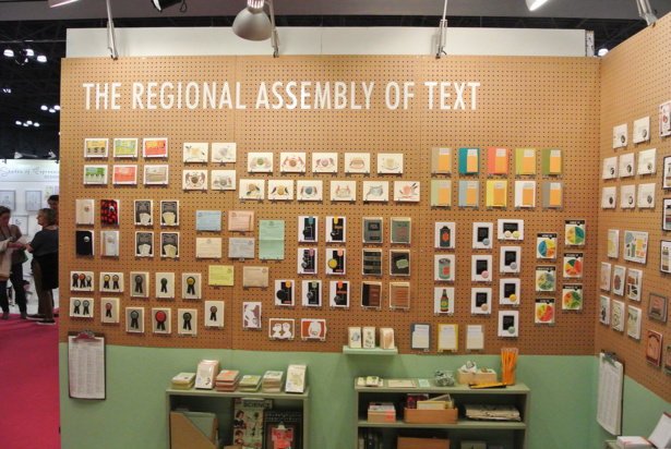
The Regional Assembly of Text
The pegboard wall and color scheme made this booth stand out from all of those around it. It was clear that a lot of careful work went into displaying the cards.
For weekly tips like this, subscribe to our newsletter
"*" indicates required fields
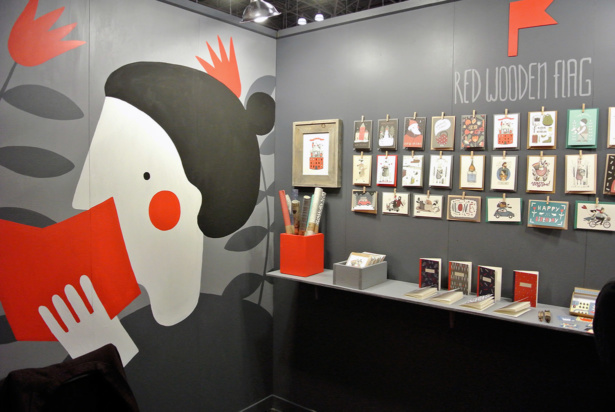
Red Wooden Flag
This fully illustrated wall caught the eye for sure, and the perfect use of the unusual color scheme also attracted you to the booth to discover the careful and detailed storybook illustrations of this exhibitor.
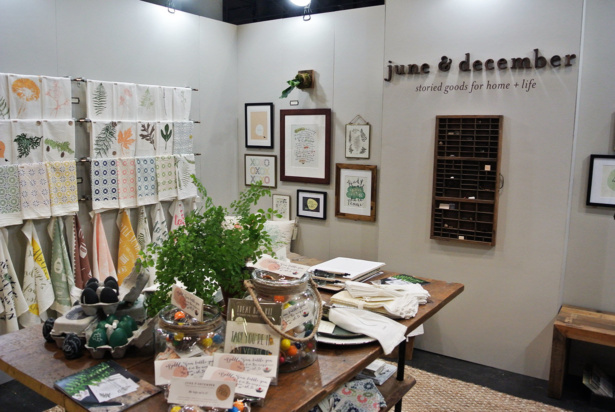
June & December
June & December’s thoughtful arrangements, carefully and beautifully cluttered table, and variety of products made this booth so interesting and welcoming.
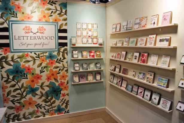
Letterwood
The painted wall in this booth caught your eye from a distance, and when you were up close you could see that they’d even painted the screws to camouflage them into the flowers. A great way to get people curious about your work.
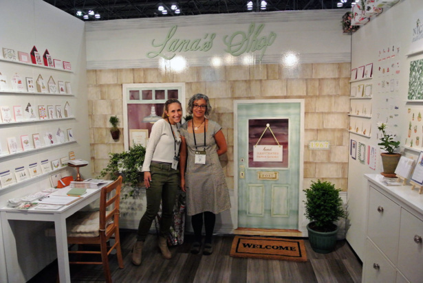
Lana’s Shop
We almost dropped dead at Lana’s booth when we saw the full watercolor mural wall, complete with welcome mat and potted plants. There wasn’t anything else like it at the show, and it was a perfect advertisement for Lana’s detailed illustration style.
More to come about distinctive trade show booth design! Join our members list, so you don’t miss anything.
A Newsletter That Goes Beyond Shopify 101
It’s easy to find beginner info about ecommerce online. If you’re past that? Subscribe to our newsletter for advanced strategies and need-to-know info for established shops. You'll get:
- Weekly tips to help you market and sell your products
- Updates when there is news that may impact your site
- Round ups of interesting links and info for brands
- Invites to our live trainings and webinars
- Instant access to our past emails
"*" indicates required fields
1 thought on “Distinctive Trade Show Booth Design at the National Stationery Show”
Leave a Comment
Related Posts
Let's take your online shop to the next level
The Shopify websites we design have a reputation for substantial improvements to ecommerce conversion rates and online sales. Let's talk!






I am blown away by these booths. So beautiful.