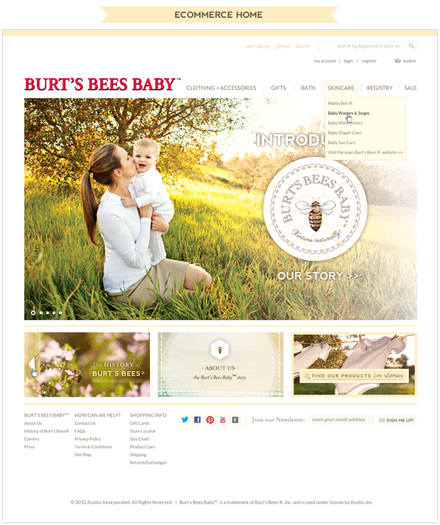
We spent last summer creating an extensive website design for Burt’s Bees Baby™ (a licensee of Burt’s Bees®). What a fun opportunity to design something that will be seen by so many eyes!
Burt’s Bees Baby™ launched summer of 2013, with the ecommerce site following shortly after in the fall, offering soft, natural, 100% cotton clothing and accessories for our littlest family members. The products were launched in Target and Babies R’ Us stores, and have been getting press ever since in magazines and on blogs (and are now in thousands of stores across the US and Canada).
The Burt’s Bees Baby™ team had become aware of our work on other sites, and rather than taking the standard route and working with a large ad agency, they decided to work with Aeolidia to create a fresh and beautiful website, based around their existing logo and branding.
Of course, I’m biased, but I think they made a great decision! I remember as we started on this project, I was collecting a list of competitor links to show to our designer, Lauren, as inspiration. I soon noticed that many established national companies had websites that not only looked stiff and “out of the box,” but often had certain sections that looked awkward or unfinished. We knew we could do much better.
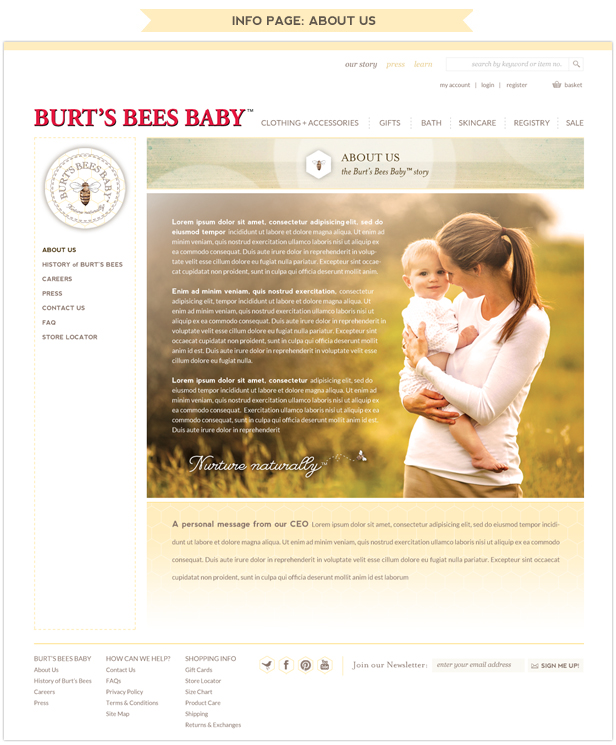
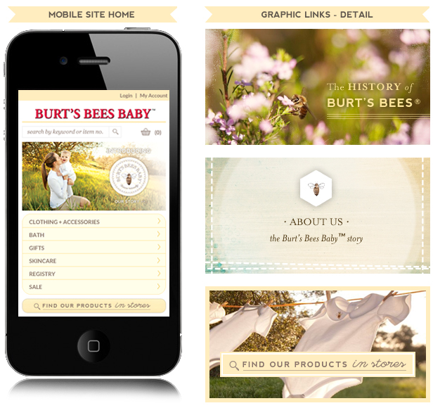
We chose Lauren for this project because the soft, magical, golden look they wanted was a perfect fit for her design sensibilities. Many, many late nights later, she truly has something to be proud of, and Burt’s Bees Baby™ have a professional website with a touch of fireflies and summer evenings – one that doesn’t feel impersonal, and that makes it very easy for customers to learn more and shop.
I asked Lauren for her thoughts on the project after launch, and she shared,
“Though this project was large in scale (I just discovered that between assets, drafts, mockups and finals, the number of individual files in my Burt’s Bees Baby™ folders combine to equal over 400!) the personality and sincerity behind the brand made each step feel custom, personal, handcrafted. When I saw the brand identity they had already developed when they came to us, I was in love! The honey-filled color palette, beautiful type choices, and stunning product photography made putting their layouts together a pleasure. Whenever I pointed toward an example of some graphic element or functionality on a big corporate site, they’d come back with something like, ‘that just doesn’t feel like “us,” remember that we want our visitors to feel really at home here! Don’t sacrifice on functionality, but remember to keep it personal.’
Another great takeaway for me has to do with the patience and consistency that was demonstrated by the Burt’s Bees Baby™ team throughout. In between the initial flurry of excitement and possibility we all feel at the beginning of a project, and the sense of anticipation and excitement just before launch, there’s a wide valley of hard work that requires a lot of endurance from the client as they work to produce content and give thoughtful, useful feedback. They have to have a strong sense of vision for the brand and company to power through this phase. The ladies at Burt’s Bees Baby™ modeled all of the great qualities necessary to get through the valley together quickly: consistency, clarity, responsiveness, professionalism, flexibility, trust, and above all, patience!”
Burt’s Bees Baby™ already had a team they were working with for web development, so we got to concentrate on polishing up each little corner of the site, and sent designs on to their team to incorporate into the site. We did get to participate in the development a bit, creating their blog.
Lauren designed a blog that complemented the main site, but with its own distinct look. Zoe, one of our crack team of WordPress experts, jumped in to integrate the look into WordPress, making for a very extensible blog that will grow with them as they expand their community and library of information about babies and children.
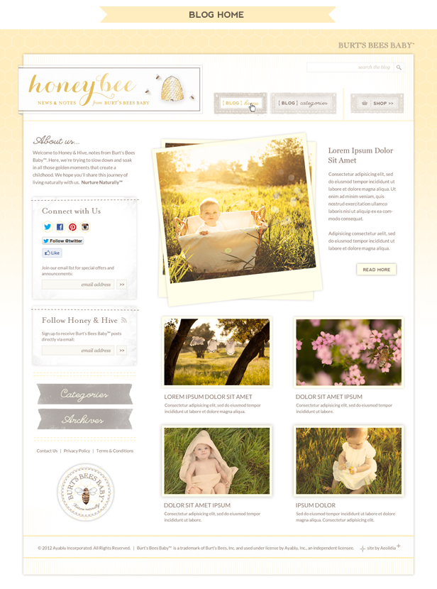
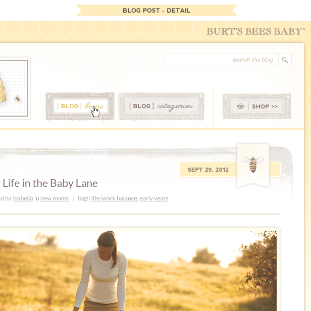
This was a great experience for all of us, and though we’re committed to working with our favorite small businesses, Burt’s Bees Baby™ was such a great “big little” company for us to collaborate with, that we genuinely enjoyed challenging ourselves to do something grand.
Hire Impactful Shopify Help
Are you looking for a partner that can upgrade your brand and site, then stick around long term to optimize and maintain? Aeolidia is big enough to handle your complexities and small enough to be personally invested in your goals. Let's talk!
Related Posts
Let's take your online shop to the next level
The Shopify websites we design have a reputation for substantial improvements to ecommerce conversion rates and online sales. Let's talk!

