How to Show a Lot of Information Simply | Cloth-ears
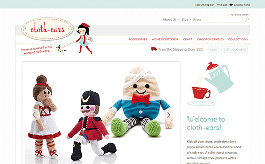
Julie, the owner of Cloth-ears, calls her boutique, “a collection of vintage & retro style accessories, gifts and homeware with a nostalgic warmth.” We were excited to tackle the project of turning her dumpy (but sweet!) site into something polished and professional, but still fun. We’re excited to share the website before and after! Here is the new Cloth-ears site, created by Lauren Hardage (illustration by Leslie Dallion).
Before beginning a website design, we always make sure we’re clear on what the objectives of the new site are, and get some info on where the original site has been failing our client. Julie’s key points were to:
- Look more professional, while remaining unique.
- Instill a feeling of trust in her customers.
- Increase the number of customers and average sales.
- Add new features to the shop, such as coupons, free postage, and up-sells.
- Make it easy for customers to share her products on social media.
Julie summed it up in this way:
We want a professional looking website, that customers feel secure and confident to use, at the same time we do not want to look corporate or stuffy, we want it to look fresh, unique & personable.
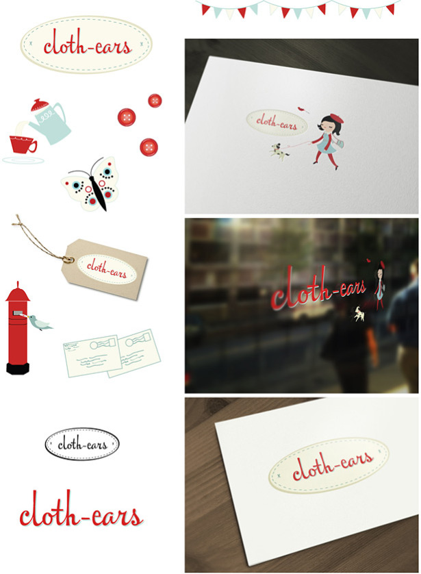
We began with the logo design, and I’d like to show Lauren’s mock-up of the branding here:
Website before and after: click the image below to see the Cloth-ears site before Lauren worked her magic on it.
You’ll see that the original home page was long long long, and hard for the viewer to decide what to look at. Every link on the site was together in the left navigation, and the red-on-blue color scheme was a bit hard on the eyes. Lauren’s new home page (which you can see at the top of this article) is clean, clear, and easy on the eyes. The account and cart links are up top, the important informational pages next, then the shop categories. “View cart” and the search box are in the top right, where customers expect to find them, cutting down on confusion. Julie had so many categories that we made each top-level category into a “department” of sorts. When you click on Accessories, for instance, you’re taken to a page that then includes a left-hand navigation with subcategories, and shows a graphical depiction of each of your options.
One large featured image is shown, as well as some other items Julie wants people to notice. The large photo draws your eye first, and the “featured finds for you” banner gives you a better idea of what you’re seeing and why, in contrast to Julie’s original grid of seemingly random products. You’ll see that it’s also very easy to sign up for the newsletter, get help, or connect on social media from any of the pages.
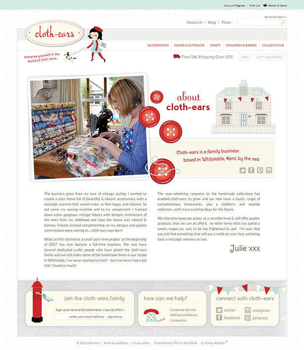
Above is Julie’s new “About” page, looking whimsical and approachable. You’ll see that we also include the social media links here, so you feel welcome to contact Julie, and Julie’s “signature” in the cheery font used throughout the site gives this page a personal touch.
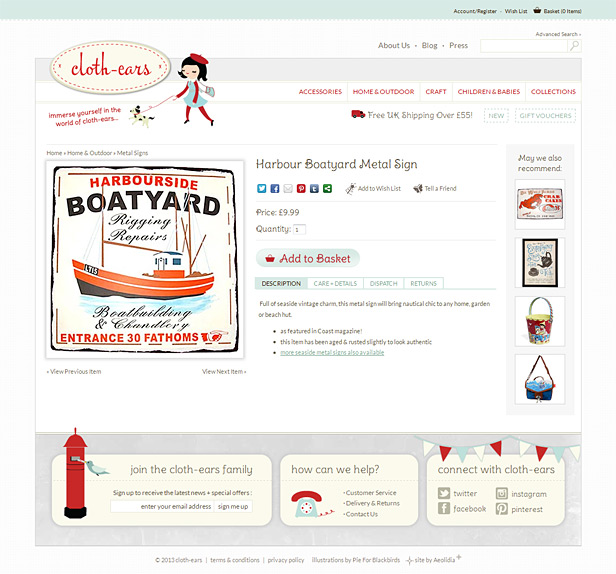
Lastly, we’re very happy with how we sharpened up the product detail pages. The product page before we got to work on it contained a single item image, a brief bulleted list of facts, an “add to cart” button, and some other shop products. The new page presents this info, plus much more, without taking up any more room on the screen. There is now an icon showing you if an item is new or not, a link to all items created by the same designer, and many options for social sharing. The “add to basket” button is easy to spot, and if you want further information about the product, as well as info on shipping and returns, it’s all right there in the tabbed information area. Additional products you may like are still shown, but now in their own section of the page, with a title letting you know what you’re looking at. This was indeed a satisfying project and a dramatic website before and after!
The new site also includes a blog, which I encourage you to check out! You missed the Christmas advent calendar posts, but it looks like Julie is posting slices of life from her seaside town of Whitstable, and doing giveaways of her adorable products.
Julie sent us this nice testimonial recently:
We checked out many web developers for our website redesign and what we found was that most were either great at design but poor on the technical or vice versa. Aeolidia, however are brilliant at both!
The Basecamp system that they use was a great way to communicate across the pond with such a talented team.
We have also found the “aftercare” to be fantastic. Prompt replies and responses.
The new website design & logo has produced a fresh and professional feel to our brand.
Big, big thanks to Arianne, Keenan, Lauren, Leslie & Chris!
Please let Julie know how you like her new shop! Which “department” is looking the most fun to you? I particularly like the retro metal signs she stocks, and I’m a sucker for all things Moomin!
If you have questions about how to wedge lots of info on a page while keeping it clean and easy to read, hit me with those. Please post a link to your site if you feel like it’s drowning in too much text or info.
See more projects in our portfolio.
A Newsletter That Goes Beyond Shopify 101
It’s easy to find beginner info about ecommerce online. If you’re past that? Subscribe to our newsletter for advanced strategies and need-to-know info for established shops. You'll get:
- Weekly tips to help you market and sell your products
- Updates when there is news that may impact your site
- Round ups of interesting links and info for brands
- Invites to our live trainings and webinars
- Instant access to our past emails
"*" indicates required fields
4 thoughts on “How to Show a Lot of Information Simply | Cloth-ears”
Leave a Comment
Related Posts
Let's take your online shop to the next level
The Shopify websites we design have a reputation for substantial improvements to ecommerce conversion rates and online sales. Let's talk!





Wow! The new site is seriously gorgeous…so welcoming and a great blend of clean, simple design that is still unique and interesting!
My blog is a pile of of information, and the set-up is a result of me trying to figure things out on my own with very little technical knowledge.
I’d love to have a site that is easier to navigate and that showcases all of the content I’ve built-up.
Hi Audrey,
Thank you! Peeking at your site, I definitely agree that you have a bit of an info pile going on there. I would recommend prioritizing and organizing your links and getting them out of that single straight line.
This article is a good place to start!
http://ohmyhandmade.com/2012/small-business-tips/strategically-planning-a-site-map/
Love it + everything about it, especially reading all the steps. To me the white makes the page look bigger … the blue looks confining and lots going on…but, maybe that is due to the red + the blue, I don’t know!!!
Yes! Both sites have lots going on, as you say, but the “before” site looks crowded and confusing, while we were able to organize the content on the “after” so that it’s not overwhelming. Glad you like it!