
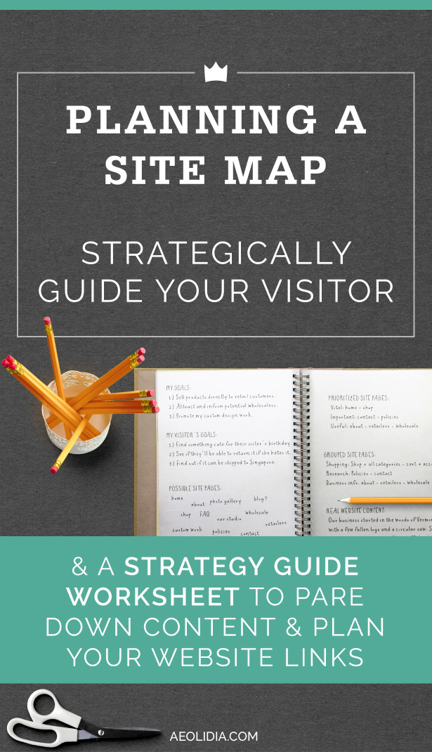
A vital first step before creating a website is working on content strategy, and a very important part of your content strategy is going to be figuring out your site map: what pages will be on your website, and how are you going to organize your navigation so that people can find what they need?
If you already have a website, it’s always good to take a look at it after some time has passed, reassess your goals, and adjust your pages and navigation. It can be great to do this on an existing site, because you will hopefully now have some data and feedback to use to inform your decisions.
At Aeolidia, my web design company, we have built content strategy consultations into all but our simplest projects, because we’ve realized that without a good content strategy, you are not going to have an effective website.
I polled our designers and developers for their thoughts on site pages and navigation, and together we came up with some great questions to ask yourself to get started, and some general tips. Download my worksheet and let’s work on building your site map!
Step 1: Define your goals

You’ll find it’s hard to plan without a goal in mind! List out the goals of your website. For example, if you have an ecommerce website your primary goal is likely to be selling your products. You may also have a secondary goal of showcasing your custom work and creating interest in that, or a goal of attracting more wholesale customers.
Go ahead and brainstorm here. What is every possible thing your website could do to benefit you? Once you have these ideas, rank them in order of importance, so you’ll know how to prioritize the different sections of your site later.
Step 2: Consider your visitor’s goals

Your visitor’s goals are almost as important as your own, because your website won’t do you any good if visitors aren’t interested in it or can’t find what they want.
Write down your visitor’s goals when they reach your website. Jena, our content strategist, thinks site owners should consider what to include by imagining using their site as a customer would: “maybe exploring other shops to see what info they gravitate toward- and then using that knowledge toward their own layout and content, and also thinking about what they like and prefer in online shops as a customer.”
If you have a site that you’re redesigning or adjusting, dig into your stats and analytics to see which pages people are going to. You should be able to find out what is valuable content to your visitors here, and what they aren’t interested in and don’t explore.
Step 3: Brainstorm your pages

Now you can brainstorm all possible pages you may include on your website. It’s fine to include anything at this stage, and you want to be sure you don’t leave out any page you may end up needing.
How do you plan to grow? For shops, will you need many more categories or subcategories in the future? For informational sites, are you writing a book that will need an area on the site, or will you be adding a new portfolio area to the site? Put these future pages in your list.
For shops, consider product categories carefully: how many products are in multiple categories? Can any categories be absorbed into another category? Categories should be a tool to locate particular types of items, and striking a balance between too few and too many should be your goal.
Step 4: Narrow it down

Less is more when it comes to websites! Lauren, our designer, says, “Don’t let the site become a repository/braindump for everything about your brand or business, remember: user user user above all. All content should go through a filter of what is interesting or helpful for your visitors. This seems obvious, but it’s easy to drift off course here and lose perspective when you’re knee-deep in content.”
For every possible website page you’ve written down, consider if it directly helps you with your goals, or if your customer would need or want the page. If not, cross it off the list.
As you do this, you’ll need to think at least briefly about what goes on each of these pages and why. If you don’t have a compelling reason to include the content, don’t! Unnecessary content creates more work for you to update and manage, and more clutter for your visitor to wade through.
Lauren had the great tip that instead of throwing out these pages entirely, you can keep notes and use discarded pages as ideas for future blog posts: “I think it makes cutting cool/neat content easier if you can tell yourself it will have a home at some point.”
One type of page really stood out for our team as unnecessary – press pages! We were all in agreement that a standalone page for press about your company is not the best way to show this info.
Margot, our designer, thinks people try to include too much content on their sites and says, “I have a particular distaste for Press pages for this reason – almost no one cares how much you’ve gotten and I personally think any more than 3-5 mentions, including a logo of the publication or image is plenty. I like to put them on the homepage, removing the need for a whole page dedicated to Press.”
Step 5: Prioritize

Once you have a list of pages to include on your website, you need to decide how to prioritize them. Take each page you’re unsure about and run it through the flow chart in our guide to decide its fate.
Once the links make sense for your visitors, look over them again based on your own goals as the site owner. Zoe, our developer, suggests that if your priorities don’t match your customer’s priorities (or at least overlap), that throws up red flags about your content and marketing strategy in general, and you may need to re-think the purpose of your site for you and your visitors.
Step 6: Group

You have all your pages now, and you know roughly how important each one is. Now your task is to get pages organized into cohesive groups that your visitors will understand and be able to use to find what they are looking for.
Group pages into lists of similar content. You can condense certain groups of pages into one page where possible (such as your shipping, returns, and other policies). When grouping info together into one page, prioritize it so that the thing your visitor is most likely looking for is up top, with further info to scroll through (rather than click to).
Step 7: Finalize, create content, and work on wire frame
Lauren suggests working on your content early on: “After you get a quick, tentative list of pages together, let your real content inform the priorities reflected by the site plan. Once you start writing real copy and taking stock of the actual assets you have on hand, the shape of the website will start to emerge from the inside out. How different pages should be combined or divided will become clear naturally. Weak areas can be de-emphasized or eliminated, and strong areas highlighted. This is really hard to predict using placeholder text: dig into the work of developing real content as soon as possible!”
Choose titles for each page so that it is obvious without clicking what information will be found there. If visitors have to click to tell what content is going to be on a page, go back to the drawing board on the name.
Now you can take your pages and create a rough site map and/or wire frame to plan your navigation. A site map can be written out in the form of an outline or ordered list, and a wire frame is a sketch of the layout of a website (not the design), showing where each navigation area and piece of content should be placed. This may be something you want to do yourself, or something to leave to your web designer!
![]()
If you’d like to dig into this some more, see how we organized the navigation links on the 1canoe2 website.
Originally posted on Oh My! Handmade
A Newsletter That Goes Beyond Shopify 101
It’s easy to find beginner info about ecommerce online. If you’re past that? Subscribe to our newsletter for advanced strategies and need-to-know info for established shops. You'll get:
- Weekly tips to help you market and sell your products
- Updates when there is news that may impact your site
- Round ups of interesting links and info for brands
- Invites to our live trainings and webinars
- Instant access to our past emails
"*" indicates required fields
0 thoughts on “Strategically Planning a Site Map”
Leave a Comment
Related Posts
Let's take your online shop to the next level
The Shopify websites we design have a reputation for substantial improvements to ecommerce conversion rates and online sales. Let's talk!











It is really helpful for me . I am just a few times while started my career in writing this information solve my all questions related to web content ☺️☺️ thanks a lot dear.