 Part of what I do at Aeolidia (along with coding websites, of course) is site reviews, which involve digging deep into a client’s website from how it looks on the front end to the data underneath and writing up a thorough, researched report on how they’re doing and how they can move forward to their goals. It’s super nerdy strategy stuff, it’s time consuming, and I really love it.
For e-commerce sites, we tend to spend a lot of time looking at the “conversion funnel”, which is marketing/ e-commerce jargon for the steps that lead to sales. That flow starts with getting customers to your site and includes things like getting their eyes on many products.
One tip that I’ve given again and again via these site reviews and via general client education calls that I feel like a lot of store owners miss is that you can create as many collections (categories, in Shopify-speak) as you want, and they don’t all have to be exposed via your store navigation.
Collections in Shopify can be used for much more than your regular shop categories!
This seems super simple when I write it out. However, it’s an opportunity I see a lot of shop owners miss.
Many e-commerce shop owners work with collections (categories) only when they need to add something to their main navigation, for example if they’ve added a new product category to their inventory. That’s it – they stop there, and don’t use collections in any other ways. Perhaps they promote particular products via social media, but the collections stay relatively static.
As mentioned, one piece of that conversion funnel is getting customer eyes on more products. Linking to a single product, even if you’ve got related products on the page, isn’t exposing buyers to that many items. Same with seasonal promotions on social media that link to your shop home page or an existing (non-targeted) collection.
I was talking about this with a client earlier this spring, so I used the example of Easter. Amazon.com does this well at a much larger scale that would be completely insane for a small business, but that still serves as a proof of concept. See their Easter Shop as an example:
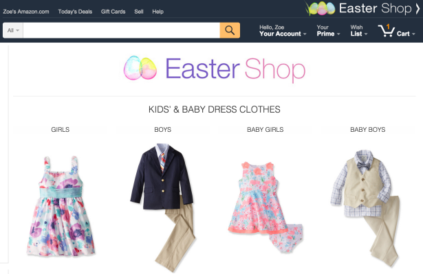
Instead of linking a seasonal promotion to a specific example product or the whole shop home page, create a collection targeted to that promotion. You don’t need to get to literal about it, and you don’t have to add it your site navigation, but you can then link to that collection from your social media posts and/or your blog and expose your customers to all those products rather than just one or two.
For example, maybe you don’t sell anything specifically Easter-ish, but you have a lot of pastel and spring-y colors or designs. Create a collection of those, preferably consisting of items at a variety of price points.
The particular client I was talking to back in March had brought us on for the site review in part because she was feeling frustrated and tired and uninspired, feelings to which I think any small business owner can relate.
I told her to think of these “hidden” collections as another way to engage with her work and her product, a chance to “curate” (since that’s so popular these days) her own stuff and come up with new and interesting and fun combinations.
Use your shop collections to inspire customers and to show them things they might love but otherwise miss.
It’s also an interesting way to see what customers are interested in by looking at which shared promotional collections (or “themes” or however you’re grouping them) get the most shares, the most visits, and the most conversions.
10 Examples of Promotional Themes
In case this is still feeling a little obscure, here are a 10 examples of other themes around which you could build temporary/ promotional collections:
- Holidays, both major and obscure
- Color or pattern themes
- Style themes (e.g. nautical)
- Seasonal trends (e.g. spring cleaning, back to school, birthstones)
- Shape themes (circular designs or fabrics)
- Price ranges
- Gift guides by personality or interest (e.g. gifts for the outdoors lover)
- Size (e.g. desktop items)
- Guides pulled together by professionals (e.g. designer guides, blogger guides, toys for kids picked by a teacher)
- Inspired by a particular thing (e.g. inspired by a photo, a place, or even a single object)
Of course the particular themes and collections would very much depend on the individual store and products, but hopefully this is a helpful starting point.
This was originally posted on ZoeRooney.com. If you’d like to use Zoe’s ecommerce brainpower to increase sales on your site, please do get in touch with us.
Forecasting Your ROI

Aeolidia aims to be a step towards 10x-ing a business, not just a 10% improvement. Is it time for your business to take this step?
4 thoughts on “Promote Your Products Using Shopify Hidden Collections”
Leave a Comment
Related Posts
Let's take your online shop to the next level
The Shopify websites we design have a reputation for substantial improvements to ecommerce conversion rates and online sales. Let's talk!

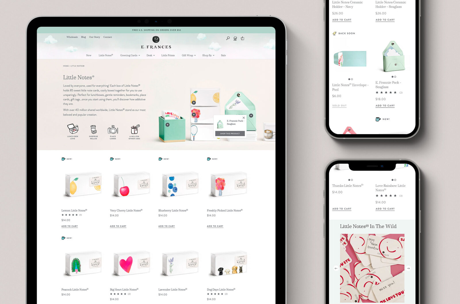



Great ideas here! I’ve been using this strategy on my shopify store http://www.wilddill.com for a while and agree that it inspires my creativity. I almost think of each collection like a Pinterest board, so I have custom collections for holidays or blog style round-ups that go out in my newsletters. My latest theme is called Under The Sea and features nursery decor, baby clothing, toys that all fit that topic.
So smart, thank you for sharing!
This is a great post, thank you. I don’t have a Shopify store, but I’ll try doing the Collection idea in my Etsy shop as a category. I’m thinking color themes or holidays. Thanks so much! Aloha, Mika Harmony
Yes, lots of ways you can do this, Mika – I’m glad it was helpful!