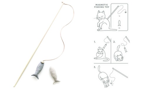
In addition to designing websites, logos, and doing branding, our designers love working on package design. Package design is so, so important for physical products businesses! A well-designed package can mean the difference between customers having that “a-ha” moment with your product (and buying it!) or just never picking it up at all, whether it’s sitting on a retail shelf, displayed at a craft fair, or selling online.
We worked on a package design project recently that I wanted to share with you for two reasons:
- The before and after is just incredible. Our client went from literally packaging her product in a cardboard shipping tube to finally displaying one of her most innovative designs in a package that not only did her product justice, it looks beautiful.
- I want to share how fun and collaborative our design process is. We don’t disappear into a sealed vault while designing packaging—we share our ideas and progress every step of the way. As you can see with this project, clients sometimes come up with ideas that create real breakthroughs in our design process.
A better package design for Siamese Social Club
Kristin Cella started creating her modern, sustainable pet products by hand after she couldn’t find any cat accessories on the market that fit her minimalist aesthetic. She founded her business, Siamese Social Club, in 2005. Sarah on the Aeolidia team designed Kristin’s new logo and brand identity in 2014, and this year we came back to polish up her packaging.
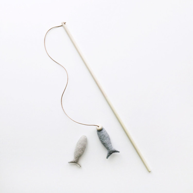
While her products delight customers looking for minimalism and functionality in their pet products, Kristin found that her minimalist, functional packaging wasn’t helping to sell one of her best designs, her magnetic fishing cat toy.
Kristen started selling the fishing rod toy in a simple cardboard tube package, which she purchased from Uline, affixed with stickers. But, as she explains,
I found that the magnetic fish were hard to fish out from inside. Also, the tubes had [the Uline] logo printed in blue inside the tube which would rub off on my toys. I had to wrap them individually before putting them in the tubes and it was a pain in the ass.
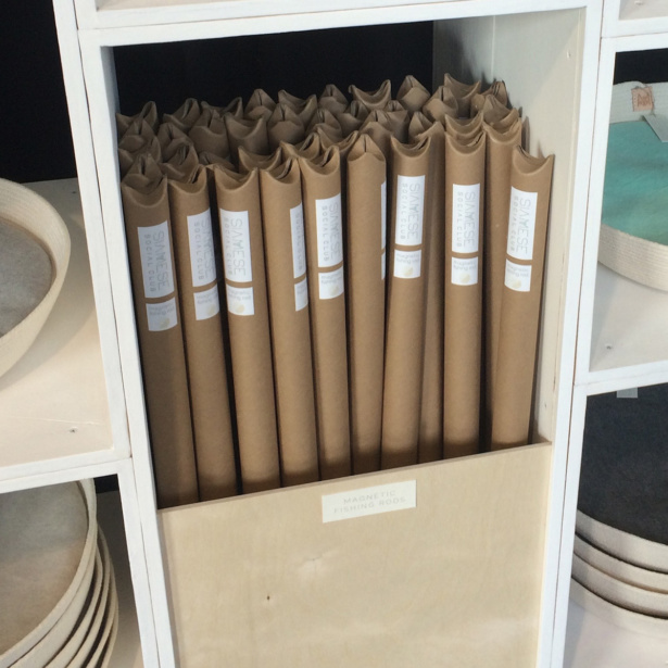
The tubes didn’t showcase the delightful product, either! Stacked on a shelf, they looked more like a shipment of products about to be dropped in the mail than a cleverly designed, minimalist cat toy.
Kristen needed a package design that showed what the product inside was. So she and her husband made a DIY attempt at a better package design.
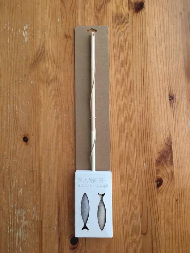
While this box was a much better representation of the product than a plain-looking tube, the felted merino wool fish kept “floating” inside the package, and the exposed plain cardboard felt unfinished. Kristen knew this packaging wasn’t ideal.
Though her husband owns a local sign company and could print, cut, and assemble almost any box design they could come up with, the couple was still having trouble envisioning how to display the product in a box that held it together correctly and illustrated the toy’s magnetic functionality.
Kristen:
Visually the box wasn’t all that appealing and there was something missing from the design. The toy itself is such an unusual one, trying to meet all of my requirements (functionally, visually, price-wise, etc.) was the most challenging part. That’s why I decided to contact Aeolidia for help.
For weekly tips like this, subscribe to our newsletter
"*" indicates required fields
Getting Started with a Professional Package Design
Kristen began working with Aeolidia designer Sarah Connor on a box design that would accomplish 6 goals:
- Demonstrate that the toy uses magnets to attach the fish to the end of the pole, so cats can “capture” the fish, which can be reattached
- Hold the product in place so customers could feel the felted wool fish without pulling it through the box, detaching it
- Display the wood fishing pole so customers could see the paint detail and hold the material in their hands
- Match the minimalist and sustainable feel of the Siamese Social Club brand
- Illustrate that the product is for cats (duh!)
- Be fairly easy to pack and assemble, as Kristen would be doing the boxing by hand
In addition, the packaging had to communicate a short but important safety notice.
Tall order, right? Not to worry! This is why you call in the professionals.
Preliminary Sketches and Design Ideas
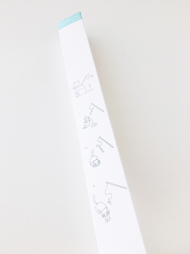
Almost immediately, Sarah came up with the idea to include an illustration in the product package design that would communicate instructions for use in a simple, easy-to-understand style.
Sarah says:
You know, sort of like how IKEA do their instruction books. Step one, unbox. Step two, jiggle in front of cat. Step three, cat pupils dilate with hunt instinct. Step four, enjoy play. I see this in my head and it’s so cute and dorky!
I tried to keep everything as minimal as possible while using enough detail to convey how to play with the toy and that the end is magnetic and comes off once the kitty has pounced on its “prey.”
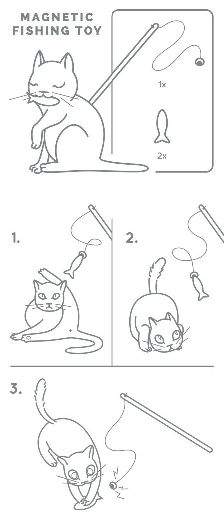
Because she was familiar with the client, Sarah included a few extra details in her IKEA-esque drawing and waited for Kristen’s approval.
Kristen:
Ohhhhh my gosh, Sarah, this is fantastic! Really, it is SO good! The cat is adorable (the increasing pupil size is amazing and I LOVE how you snuck in that cat butthole—classic Sarah!) and it totally shows how everything works as simply as possible. And the little zappy lines in the last one emphasize the magnet perfectly!
Sarah:
Haha, I am so, so glad you like this! I was a bit scared the butthole would be a bit too much but I am thrilled you dig it! I think anyone who owns a cat sees plenty of butt to not be offended by this.
For the package design, Sarah envisioned a minimal, triangle-shaped box.
Sarah:
Since triangles feature heavily in your brand style I thought it might be cool to bring it into your packaging design, a simple triangle box with a fishy cutout at the bottom. Then we could get the fish pressed up against the cutout like you already do in the boxes you are using now. I love this as people can feel the texture of the fish. I worry that people might be able to pull the fish through the hole, and that would suck, so we might need to test some ideas on how to stop that from happening. Maybe even just making the cutout shape smaller so they can feel but can’t pull anything through.
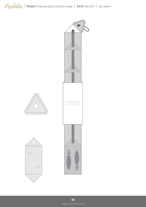
Sarah also envisioned a paper sleeve to fit over the triangular box that would contain a pop of color and all the information.
Sarah:
Then I’m thinking we add a fitted sleeve to the box that slips over the top and sits in the center. These are super easy to make and put together. I’m thinking bright white card stock, bright logo, and your triangle pattern sprinkled around the place with all the information for your product on each of the three sides: washing instructions, about Siamese Social Club, cat illustration, etc.
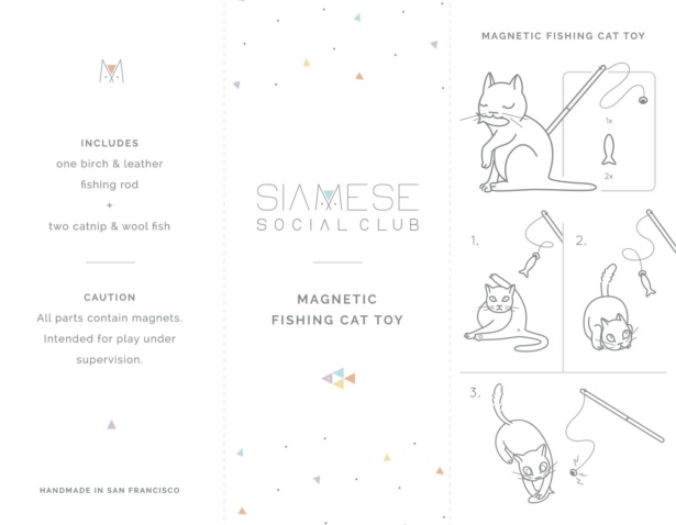
One thing that this package design did not include, however, was a way for buyers to see and touch the detail on the wood rod design, which is actually dipped in paint—quite a beautiful finishing touch!
After interacting with Sarah’s triangular box design for a while, Kristen actually devised a hack she thought would work.
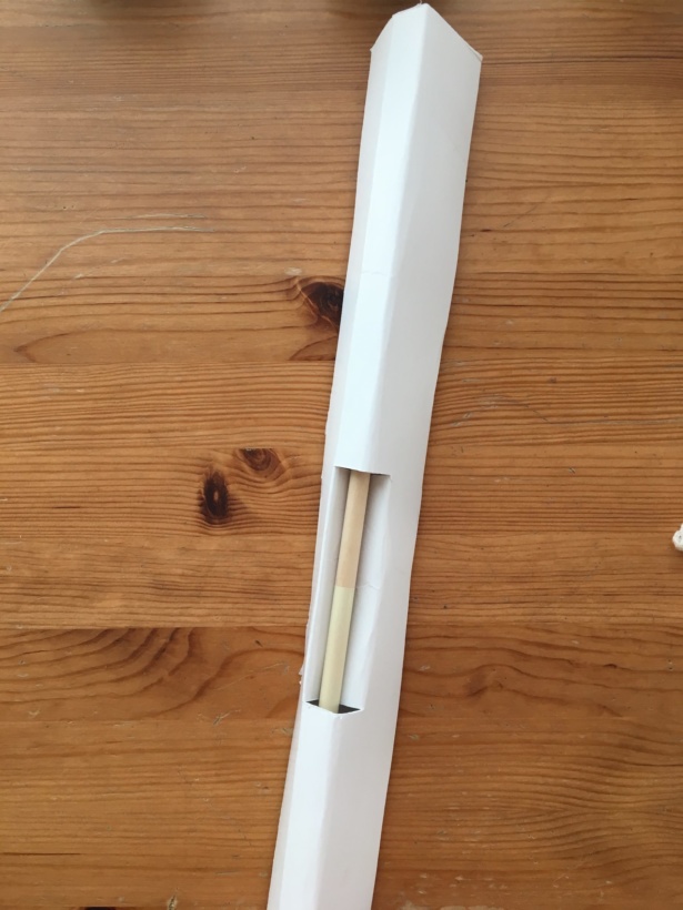
We love working with clients who become a part of the design process! This innovation on Kristen’s end was a real breakthrough on this project.
Sarah and Kristen both came to the conclusion that, with the exposed rod, an additional paper sleeve was no longer needed. So Sarah worked up a new package design that incorporated the exposed rod cut-out with details printed directly onto the box design.
Finishing Touches and Final Details
Kristen worked at her husband’s sign shop to print up mock-ups of the box in several colors.
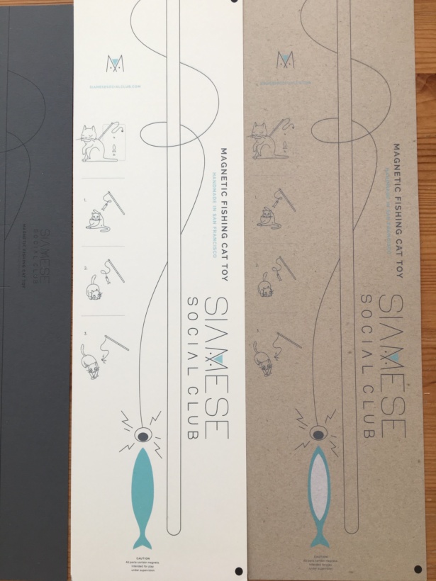
Ultimately she settled on white, which helped Sarah’s illustrations and designs really stand out.
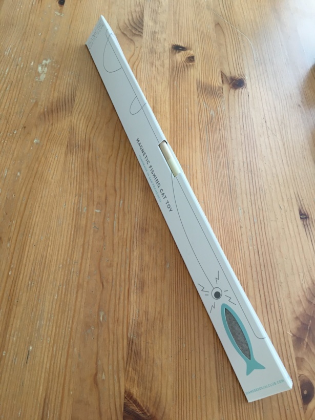
Results
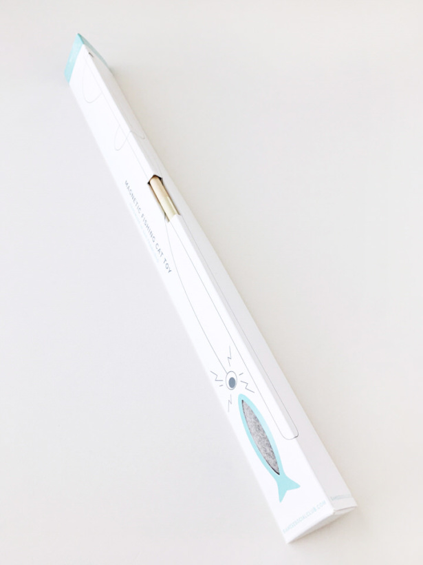
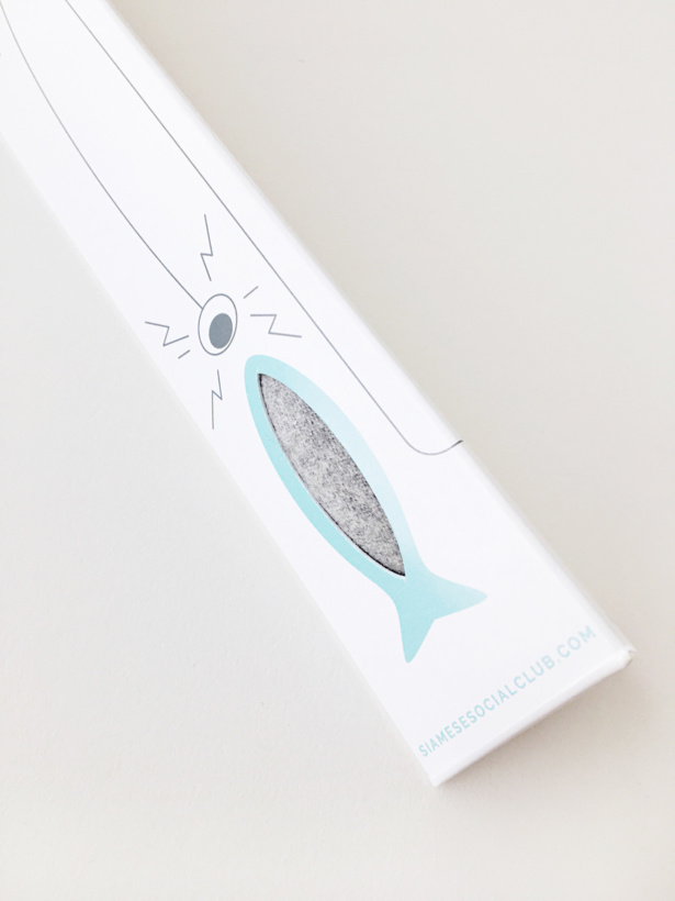
Kristen loves the new packaging. Not only is it prettier, but it’s also actually boosting sales!
Now that I have new packaging, my toys are selling much faster in person at craft shows and I’ve seen a slight increase in online sales, too. Overall, everyone who sees the new box design gets pretty excited, especially when they discover the illustrated directions on the back!
Are your product sales suffering because of poor package design? Contact us to talk about how Aeolidia can help design product packaging that elevates your brand and helps your products fly off the shelves. Want to know what we can do to help you grow? Download our services guide, here:
Hire Impactful Shopify Help
Are you looking for a partner that can upgrade your brand and site, then stick around long term to optimize and maintain? Aeolidia is big enough to handle your complexities and small enough to be personally invested in your goals. Let's talk!
4 thoughts on “Package Design Before & After: Siamese Social Club”
Leave a Comment
Related Posts
Let's take your online shop to the next level
The Shopify websites we design have a reputation for substantial improvements to ecommerce conversion rates and online sales. Let's talk!






Oh Em Gee, that is fabulous! Simple and sleek, I love it!!!!
Thanks, Lisa! Let me know if we can ever help you with anything!
What a great story and a fabulous packaging solution! Thanks for sharing.
Thanks, Kris, your surface design is lovely!