Brand Identity For a Luxury Spa Brand
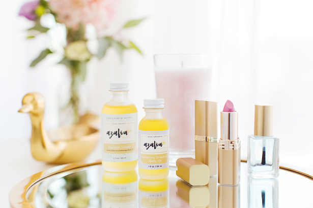
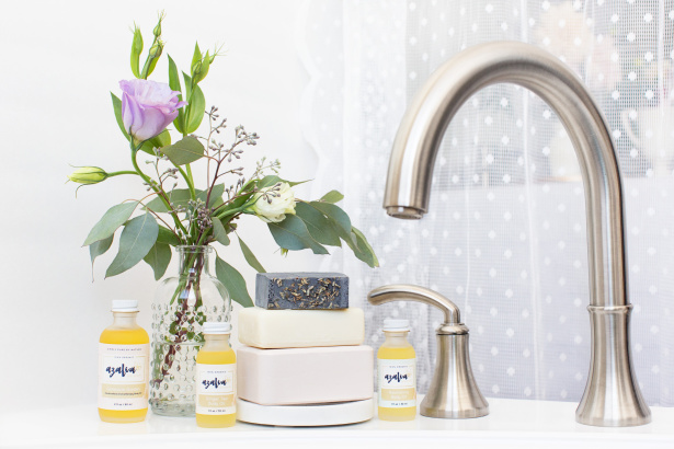
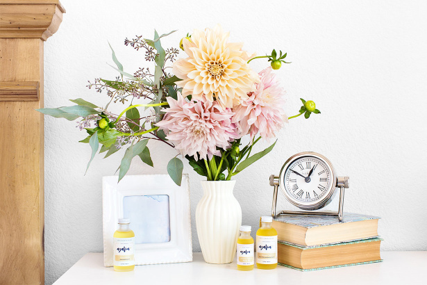
Azalia Spa Goods is a line of aromatherapy body oils made from pure botanical ingredients. Founder Aimee Aleta Flor asked us to develop her visual identity, messaging, and branding after the logo and messaging she’d been using began to feel fragmented and inconsistent. A luxury spa brand needs to connect with customers on a very personal level—there’s a visual appeal that’s essential, that the customer has to see themselves reflected in, as well as a level of trust that needs to be established quickly. Each element of the brand, from its logo to its product descriptions, tagline, photography, and package design, has to work cohesively to do such heavy lifting (all while making it appear effortless).
Although we decided to start over from scratch, Aimee had already done an amazing amount of work to understand her target audience and value proposition. She knew the customer she was trying to appeal to inside and out, from her core values and interests, right down to her favorite book and the car she drives! She was also very clear about what her brand needed to embody: free-spiritedness, eco-consciousness, kindness to self and others, and handcrafted elegance.
We began by developing her tagline. While a few of the concepts I submitted focused on her products and their benefits, I kept thinking of how peace of mind, and living consciously and full of awareness is so important to Azalia’s ideal customer, so I chose to focus on a tagline that expressed those values. Common values and philosophies often make for a stronger connection with your customers; it creates a sense of understanding that leads to loyalty. Of these, “Simply Pure By Nature” grabbed Aimee immediately in the first round of tagline concepts.
This allowed us to move onto the next step: logo creation! Again, Aimee’s input was well thought-out and helped launch the project in the right direction. The objectives she shared with Aeolidia designer Sarah were focused and specific: “I want people to feel a spa experience when using our product and be inspired by nature and lovely details with the look of our product. Retailers we hope to partner up with are Anthropologie, Whole Foods, green spas (Noktivo Spa) and specialty boutiques (Pink Olive).”
In addition to the creative brief, Sarah found plenty of inspiration from Aimee’s Pinterest board: “Something I noticed with everything you pinned is that you really love simple, clean brands that give all their detail over to beautiful patterns and textiles. I LOVE that!”
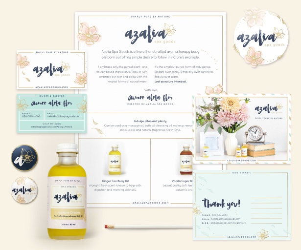
Upon submitting initial logo concepts, Sarah offered this piece of advice: “Think about how we will be using your brand. Big and small, business cards, banners, adverts, cards, packaging, stickers, wrapping paper, boxes, stamps… it’s an endless list!” Especially this early in the process, choosing a creative direction requires the client to use their imagination to see the potential in each concept. Again, Aimee was focused and decisive; she honed in on a concept she loved and had Sarah keep going with it. It paired a beautiful stylized font that had a handwritten feel with a simple floral detail.
In the next round, as she refined the concept, Sarah used variations on the floral and leaf patterns that ranged from intricate to minimal. She created four options with notes on each approach, such as “in this last option, I stripped the idea right back to create a minimal version. It’s not too much and brings the visual focus back to the primary typeface, which I really like.”
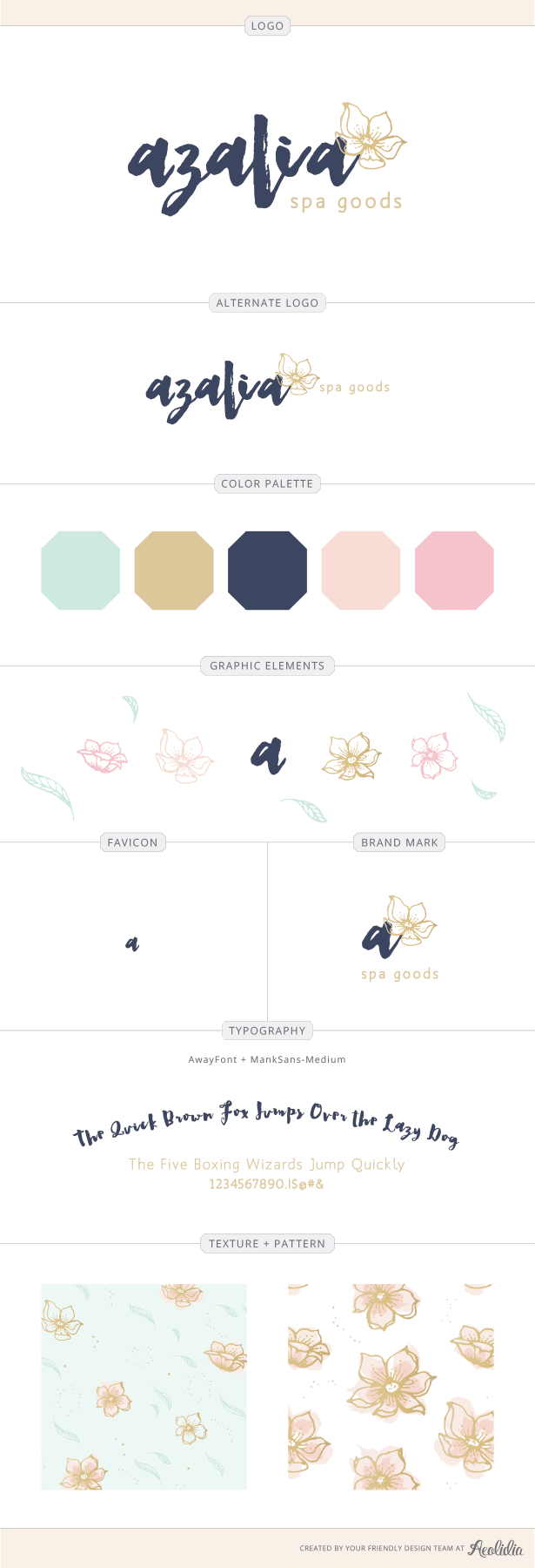
Aimee completely agreed, taking Sarah’s input a step further by imagining each concept in all the different ways it’d be used: “Although I really loved logo 01, I think it’s stunning by itself, but when I imagined it as a whole picture on packaging, if ever there’s a pattern, I think it would appear a bit busy.”
This is something all designers take into account, as Sarah planned on introducing patterns and textures to all the other brand elements that would come next. Sarah and Aimee continued working on color palettes and graphic elements while I worked on copy for her website and product descriptions, which would be featured both online and on the packaging designs. Throughout each step, Aimee’s focus and confidence in her audience and project objectives helped everyone on the Aeolidia team create a brand that came together beautifully, efficiently, and (most importantly) effectively.
Take a look at the final big picture of Azalia Spa Goods’ brand.
If you’re dreaming about a brand that’s a complete experience and expression of your product and values, contact us! We can’t wait to bring out its beauty.
Hire Impactful Shopify Help
Are you looking for a partner that can upgrade your brand and site, then stick around long term to optimize and maintain? Aeolidia is big enough to handle your complexities and small enough to be personally invested in your goals. Let's talk!
5 thoughts on “Brand Identity For a Luxury Spa Brand”
Leave a Comment
Related Posts
Let's take your online shop to the next level
The Shopify websites we design have a reputation for substantial improvements to ecommerce conversion rates and online sales. Let's talk!




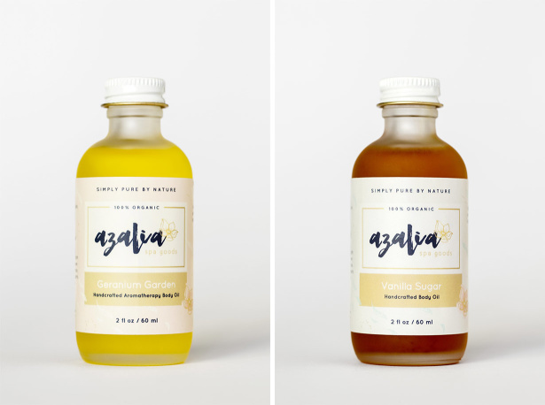
The branding on this product looks so lovely and packaged so beautifully on your website. It makes my eyes happy 🙂 Great Job!
Drop. Dead. Gorgeous. Well played Aeolidia and congratulations to Aimee!
Thanks, Lela! I can’t stop looking at it myself.
Thanks, Suzy! I’m blown away by the Aeolidia team!
Thanks for sharing the process behind this beautiful branding. I love how the colors of the product inside the bottles really shine with the choice of label design.