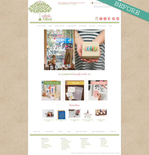
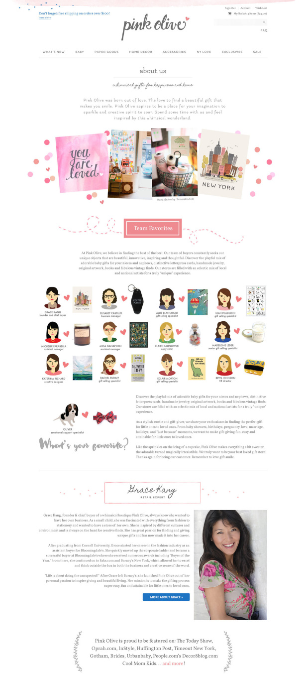
How do you create a website that will help your business stand out in the crowd? That was the big question we tackled when we redesigned the Pink Olive website. Pink Olive was launched by Grace Kang out of her personal passion to inspire giving and beautiful living. Her mission is to make the gifting process super easy, fun and attainable for little ones to loved ones. Here’s a quick peek at the Pink Olive website before the redesign:
Grace told us:
As a retailer, there is a lot of competition on the internet and easy for people to open an e-commerce store with similar vendors. How do we differentiate ourselves from other, equally beautifully designed websites?
My goal is to have a cohesive, professionally designed website that fully represent the Pink Olive experience. The minute they land on our homepage, I want them to feel like they’ve discovered a hidden gem. Our brick and mortar customers often share with us how this is their #happyplace or that their house is starting to “look like Pink Olive” — that is music to my ears 🙂 Life is all about celebrating the little things, and special moments and we want our new visitors to go on a celebratory journey with us. Overall, I would like to simplify our current website and make it more clean and modern, without losing the whimsical sensibility + mobile friendly.
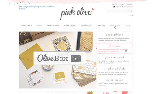
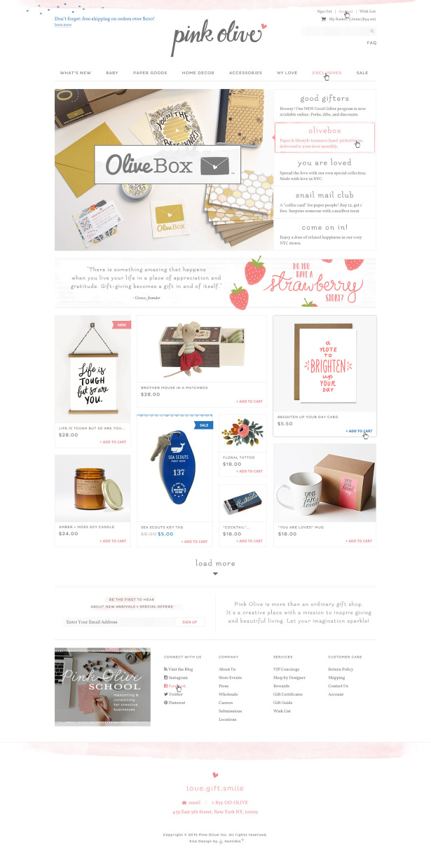
Pink Olive after the website redesign
Grace came to us ready with thoughtful information, and a deep understanding of what she wanted in her new website design. Lauren created a design that is not only gorgeous, but deftly tackles some of the challenges Grace had. She told Grace:
I think you’ll really feel a breath of fresh air looking at the full-width design. Much more modern, and leverages the beauty and charm of your actual products with big, beautiful images arranged in an attractive/modern “masonry” (aka pinterest) layout.
The product grid takes the problem of your item photos being various aspect ratios and turns it into a positive. 🙂 The “card” style format ensures that the homepage will always look clean and sharp even if the photos are a mix of your 3 styles: floating on a white field, gray field, and in context/lifestyle shots.
The slider here is kind of special! This is a style that I’ve seen in a few places now; I think it is unbeatable when it comes to displaying a lot of complex content without visual overwhelm. The fact that it is self-directed in addition to giving info about the different slides without have to click makes it more powerful than a regular/typical slideshow.
Grace:
Our new website represents the third iteration of the Pink Olive brand, and it looks like the third time is indeed the charm – this was the most seamless and enjoyable web redesign process I’ve experienced since our first website launch in 2007. Lauren and the whole Aeolidia team were so easy to work with (not to mention talented), and I couldn’t be happier with how everything turned out. I am so excited to keep growing Pink Olive into a “big” small business with the help of our revamped online home!
Can we help your business stand out?
Talk to us! We love to think big for your business and offer many services that can help: reviewing your existing site design, updating your copywriting or photography, designing a new logo and identity, or creating a brand new custom website design. Our goal is to help your business stand out from the crowd.
Hire Impactful Shopify Help
Are you looking for a partner that can upgrade your brand and site, then stick around long term to optimize and maintain? Aeolidia is big enough to handle your complexities and small enough to be personally invested in your goals. Let's talk!
2 thoughts on “Help Your Business Stand Out: Pink Olive Redesign”
Leave a Comment
Related Posts
Let's take your online shop to the next level
The Shopify websites we design have a reputation for substantial improvements to ecommerce conversion rates and online sales. Let's talk!







I love the redesign!!! It looks amazing!
Thanks Andreea!