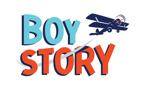
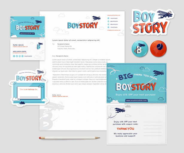
Katie and Kristen are two sisters who set out to find cool, boyish dolls for their sons and ended up creating a collection themselves when the market came up short. We were ecstatic to create the Boy Story logo and identity, especially knowing how important the right visuals are when getting new products into stores.
Boy Story offers Action Dolls and pairs them with comic book-style stories that feature the dolls on a big adventure. We knew that catching the eyes of young boys, girls, their parents (and stores!) would require tapping into their unique sense of fun and excitement.
Our designer Sarah got to work on the logo first. It’s a fundamental part of a brand, usually guiding future design choices like web design, packaging, social media visuals, and even little things like business cards and thank-you notes. Katie and Kristen were creating the kind of high-quality dolls that stay in a family for generations, so they really wanted a visual identity made up of a “collectible and classic image along with a cool, fun, adventurous feel that will spark boys’ interest.” They pictured the dolls and books in boutique stores as well as large chains like Whole Foods, Amazon, and Nordstrom.
Because it would be used for the company as well as their series of books, Katie and Kristen needed both a symbolic graphic logo and a spelled-out logo. Together with Sarah, the three swapped illustration and typeface inspiration on Pinterest, which helped Sarah come up with a first round of logo concepts. Centered around the idea of a boy becoming lost in a story, they included visual treatments of a boy reading, a boy reading with friends, and a silhouette of a boy reading in a camping tent.
Katie and Kristen were excited about this first round and gave wonderfully detailed explanations of what they liked—such as the stars and the moons in one of the concepts, the typeface used in another—as well as what they didn’t feel would connect with their audience (for example, they didn’t want to use actual faces in the branding). Ultimately their helpful feedback steered the project in a better direction: “You are capturing the cute side of it, which we love, but we feel like the cool side is missing a little bit. We have to remember that not only are we selling to the moms, but we are selling to the little boys who need to see it and think it’s cool.”
Newly inspired, Sarah submitted a fresh batch of logo concepts that explored new typography directions, a Captain America-inspired design, and a more textured, hand-drawn-looking design that played with a slightly roughed-up look. This time around, Katie and Kristen were excited about two specific designs, and they asked Sarah to continue exploring them. They liked the color and textures involved and wanted to see it with different font options.
The logo began to take shape, lending itself nicely to symbolic graphic options as well. “We love the font and LOVE the way that the “B” has come together. We really like how the swirl looks now coming off the plane too.”
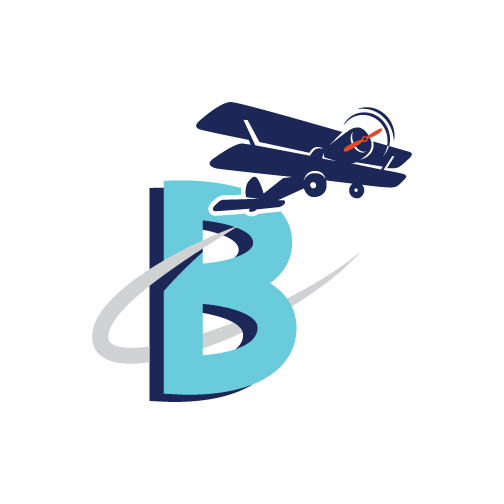
Doesn’t it just look like the adventure’s about to begin? That’s how Sarah felt designing it. With the main Boy Story logo approved, she got to work on accompanying elements, like the color palette, graphic elements made up of a baseball, a plane, and a B, and the textures, patterns, and typefaces that would all come together throughout the Boy Story product packaging, stationery sets, and books.

Did we mention there were also stickers and buttons involved? Just imagine these goodies getting dropped into shopping bags at brick-and-mortar stores for a completely delightful branded experience!
Getting Products into Stores
Do you have a product you’re hoping to launch in retail stores soon? Contact us to get your logo and brand identity designed with the aim of getting products into stores.
A Newsletter That Goes Beyond Shopify 101
It’s easy to find beginner info about ecommerce online. If you’re past that? Subscribe to our newsletter for advanced strategies and need-to-know info for established shops. You'll get:
- Weekly tips to help you market and sell your products
- Updates when there is news that may impact your site
- Round ups of interesting links and info for brands
- Invites to our live trainings and webinars
- Instant access to our past emails
"*" indicates required fields
2 thoughts on “Is Your Product Shelf-Worthy?”
Leave a Comment
Related Posts
Let's take your online shop to the next level
The Shopify websites we design have a reputation for substantial improvements to ecommerce conversion rates and online sales. Let's talk!


Great article! I enjoyed not only seeing the graphics but “hearing” the conversation between client and designer. I think many new business owners who need to work with designers are nervous about how the exchange of feedback will go, so this is a nice peek into that process!
Hey, long time no talk, Debbie! Nice to see you here. 🙂