 Grab my guide to the 10 main ways to grow traffic and optimize to boost sales.
Brand Identity Design: Frankie & Claude

May 18, 2017 / Updated: January 23, 2023

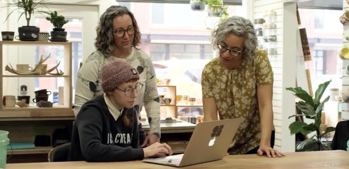
Frankie & Claude is a stationery and lifestyle brand that exudes charm with a unique blend of prettiness, wittiness, and occasional snark. Owner and designer Sam Bearbower dove into the business full-time in 2015 after juggling her work in the legal field with her hobby-turned-passion. Not too soon after launching, her store’s name ran into some trademark issues, and Sam opted to rebrand. What many would’ve considered an obstacle or a step back turned into a huge step forward: an opportunity to take stock of the elements of her brand that made it truly stand out, as this brand identity design case study will show!
Newly named Frankie & Claude, the brand was in need of a new tagline, logo and visual identity. Reflecting on her creative process and what makes her brand unique, Sam noted that all Frankie & Claude products are not only pretty, but functional.
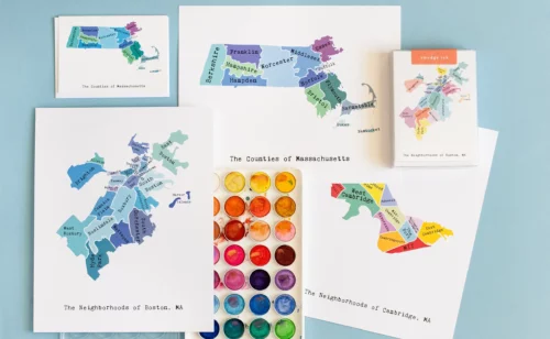
“My initial thought with every product I add is, is it useful? Then, is it pretty and aesthetically pleasing? And of course, is it unique? For instance, our art prints help make a house a home. Our matchstick jars are super functional and make an amazing gift item to hostesses, or to celebrate new homeowners. Our notepads help to keep people organized in a stylish way. Etc., etc.”
We came up with a tagline that demonstrated her aesthetic and philosophy in a concise, fun, and catchy way:
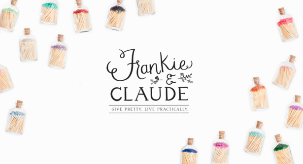
Give Pretty. Live Practically.
From there, Christine conceptualized a new Frankie & Claude logo that paired a delicate, feminine hand-lettered script with similarly thin lined roman letters. The ampersand nestled between the words unifies the letters in a way that makes pretty meet witty. Floral details in the shape of a crest give the mark a more classic feel, while the oval arrangement of the tagline in the secondary logo steps outside of the traditional circle just enough to feel timeless but charming.
Following the initial round of logo concepts, Christine and Sam discussed integrating Sam’s own handwriting into the design, given that so many of her new products would incorporate her hand lettering. Then, inspired by Sam’s hand-lettered version of “Frankie,” Christine drew completely custom type by hand for the “Claude.” This resulted in a totally unique mark that embraces the smallest of imperfections—like the slight variations in line-thickness in the F, and the gentle angling of the last few letters in “Frankie”—in order to visually embody the pretty aesthetic of the brand as well as its willingness to be playful and not take itself too seriously.
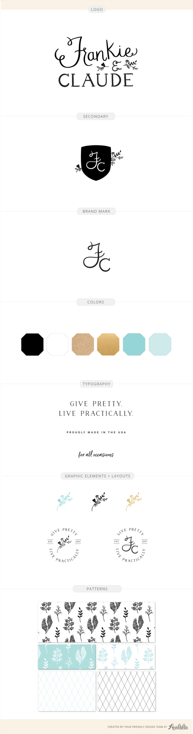
Lastly, Christine incorporated the leafy illustrations from the logo and two new fern-inspired drawings into the brand’s pattern work. She also created a very simple geometric diamond pattern, handy for the more humorous/less feminine products. Though sometimes overlooked, patterns are like the cherry-on-top of details. Potential uses include the backs of business cards or postcards, packaging tissue paper, custom tape or ribbon—so many lovely possibilities!
See this project in our portfolio.
Could you use help with brand identity design?
Are you wanting to unlock the potential of your brand with a new visual identity that speaks volumes? Contact us to discuss all your beautiful design potential!
Browse Posts
Newsletter Sign Up
We write a new email each week to help you grow your business.


Let's take your online shop to the next level
The Shopify websites we design have a reputation for substantial improvements to ecommerce conversion rates and online sales. Let's talk!