Island Thyme is a family-run, artisan producer of skin and body care products. The company has been making its soaps, balm, creams, and lotions for nearly 20 years, on an actual island in the Pacific Northwest. They came to us for an eco-modern redesign.
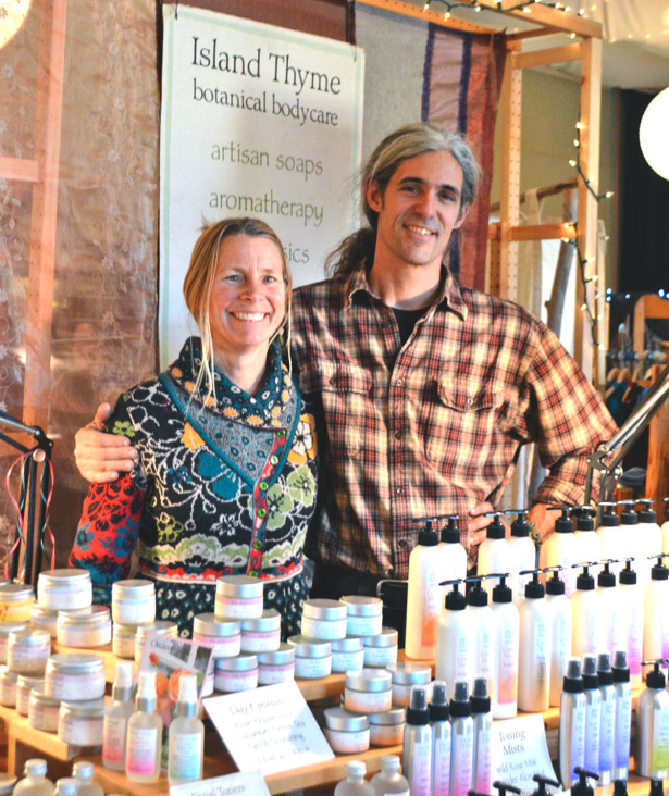
Chris Morris, co-owner of the company, came to us when it was time to update the look and functionality of the Island Thyme website. He told us:
We have a logo that was designed long ago. We wish we had a good quality digital copy or the original but do not. islandthyme.com which runs on an old version of Miva Merchant has served us well but is outdated. The look could be richer and the style could be refreshed. The back end functionality certainly has room for improvement. Adding pages for wholesale customers with their own login is a priority, as is logins for repeat retail customers with order history and an easy checkout process. Quickening order fulfilment… better integration with Quickbooks… and I am sure there is more… We need an attractive site that we can grow with and maintain hopefully for the next 5+ years. We want to convey that:
- our products are made in small batches
- we sell a premium quality product
- that Island Thyme is a professional company while simultaneously very personal and fun
Island Thyme before
Christine began by updating the Island Thyme logo and brand identity. Below is their original logo, which Chris had been reworking, unable to get the look he wanted. I’m also showing the website, which looks dated. There is just too much text fighting for your attention on every part of the page.
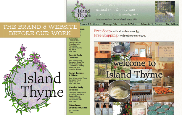
It was important to Chris to keep the feel of the original logo. He told us:
I just want to find a way to pick up upon what we are visually today, while also powerfully moving Island Thyme forward to something new and more dynamic for the future.
We asked Chris what about the original logo that was not working for the business, and he said that aside from looking too homemade:
It will not help us move into the future, like selling more in urban markets like Seattle & Portland. We will need to really express ourselves more dynamically the further we move beyond our local base. The urban market appreciates artisan producers and locally made products very much, but it also expects more sophisticated (hipper and more fashionable) packaging at the same time.
Using a vintage botanical illustration style, the updated identity focuses on the roots of the company — the raw materials from which the products are created.
From the farmer’s market booth to the big time
Island Thyme’s new Shopify website
Christine took the new brand and designed a clean and welcoming new website. The concept is consistent with the new eco-modern branding, featuring sophisticated typography with a few handmade touches. The new site is friendlier and easier to navigate so that customers can do what they came to do—shop the fantastic products!
On the home page, there is a seal that Christine designed which quickly tells customers where the products are made, and an easy path to the About page on the website (important for mom & pop businesses like this one). Our copywriter, Natalia, joined the project to re-write the About page copy for the new website, so that customers understand the roots of the company, as well as its mission.
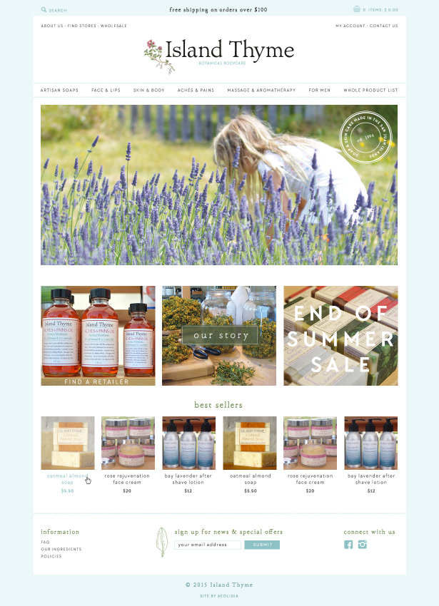
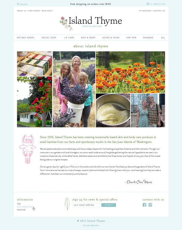
Results of the eco-modern redesign and new website
We asked Chris about his experience working with us and he told us:
We are very pleased to say that Aeolidia was everything we had hoped for.
After over a year of looking at shopping-carts and web design companies we selected Shopify and Aeolidia as two halves to a whole solution for Island Thyme’s e-commerce site redo. Aeolidia’s portfolio of projects was perfect for an “artisan” company like ours. And Shopify offered the structure and back-end we had been hoping for.
At Island Thyme we were used to doing everything, especially on the design end, ourselves. Letting go and trusting was not easy. But we could not be more happy with the results. Islandthyme.com looks so great. The project was completed right on schedule. The branding work Aeolidia proposed doing before the web site development has proved very useful. And Shopify itself has exceeded our expectations.
If you are an “artisan”, “hand-crafted”, “maker”, or just “young-fun-and-hip” company Aeolidia is definitely worth serious consideration. Coupled with Shopify they were a home-run for Island Thyme.
We improved our process at Aeolidia last year. The best thing we’ve done is made our launch dates law. We don’t take longer than we say we will, and we don’t let our clients get away with missing a feedback date or milestone of their own during the project. Chris did feel rushed at times as we worked, but saw the value when we launched their site on the dot in mid-November. Chris told us that they got very positive feedback and orders were very strong right after launch, making for a successful holiday sales season.
Is it time to upgrade the look of your business?
We’d love to learn more about your business and put together a plan for you! Come talk to us – understanding your business and its specific needs so that we can transform your online presence is our specialty.
Are you unsure about your website?
- Do you have feel like your website could be serving you better, but you’re not sure where to start?
- Have you added a lot of content to your site, and now you don’t know if your customer can figure out what to do next and make it easily through checkout?
- Is your website representing your brand in a way you can be proud of?
We'd like to review your website.
Related Posts
Let's take your online shop to the next level
The Shopify websites we design have a reputation for substantial improvements to ecommerce conversion rates and online sales. Let's talk!


