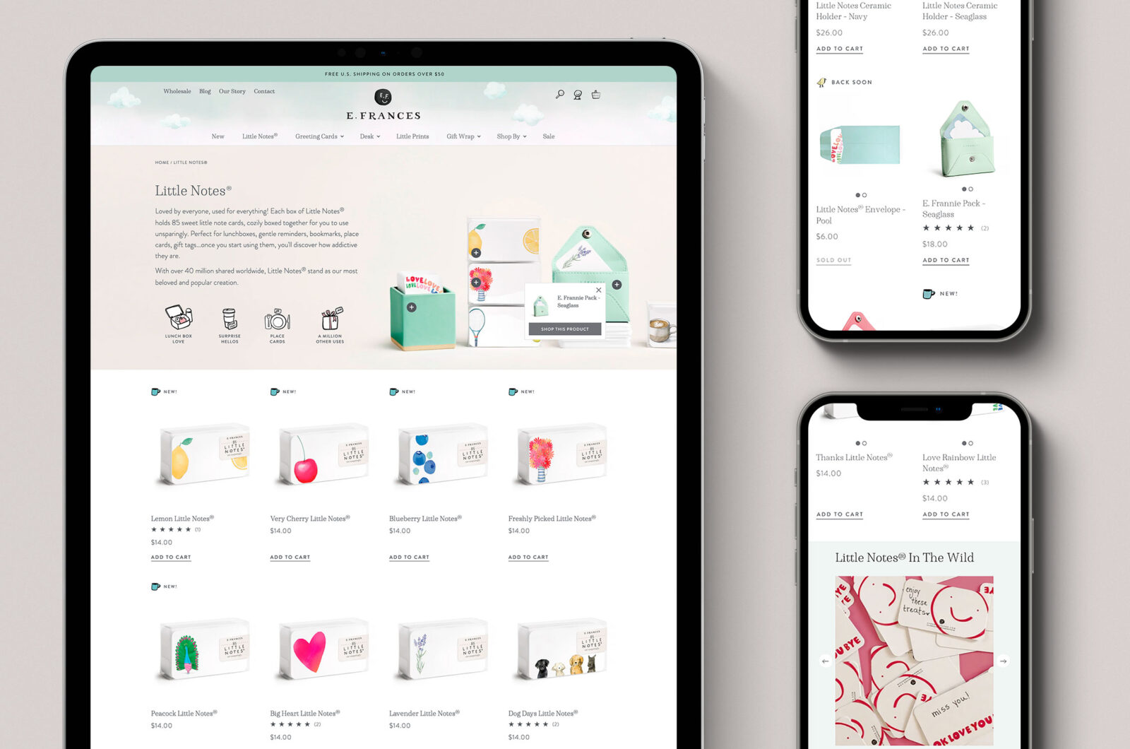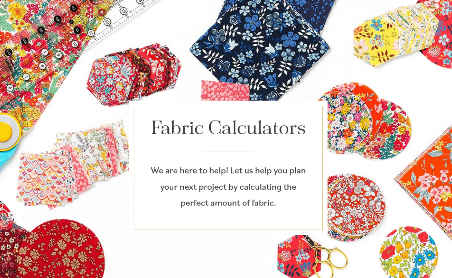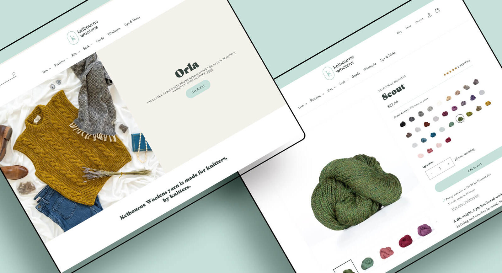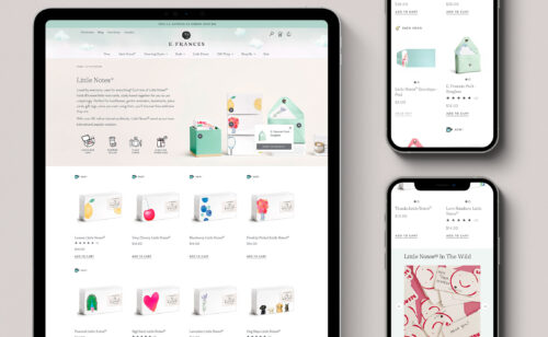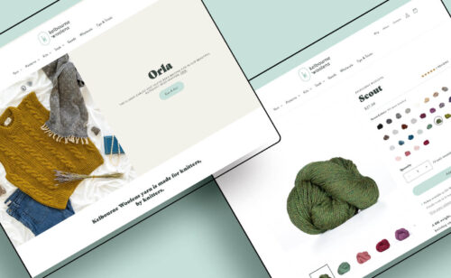
It used to be when you wanted to set up shop online, you were either stuck with the supremely ugly designs that the ecommerce software offered, or you had to hire a designer or learn to code so you could make your shop look halfway decent. Things have really changed, and now you can choose from many well-designed and beautiful pre-made design themes for your shop. The themes in Shopify’s theme store are all rigorously evaluated by the Shopify team, are flexible and editable, and cost between $0 – $180. This is a wonderful thing for businesses just starting out, without the budget to do anything special. With so many beautiful and effective Shopify themes available ready to plug and play, you might be wondering why to invest in a custom Shopify theme. What’s the point? Sure, the site may be more polished, but is that really worth the four months of design and development and the five-figure price tag that comes along with an Aeolidia project?
I know why Aeolidia does what we do, and I’ve seen it work over and over. It’s not always easy to explain the value, though. I was so glad to work on a project this year that is a perfect example of what a custom site design will do for your business. The fun thing about this one is that we can show a “before” an “interim Shopify theme” and the knock-your-socks-off “after.” Peek:
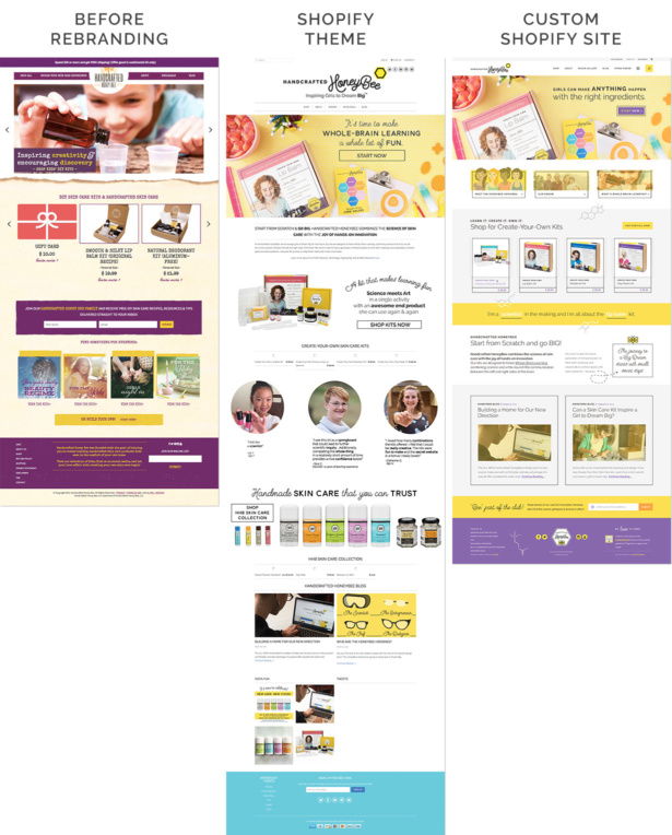
Handcrafted HoneyBee came to us ready to completely transform their brand. They had been struggling with their own DIY design for so long. They had gotten negative feedback about their product packaging from interested big-name retailers, and they knew that to take their business where they wanted to go, they needed to tag in an experienced design team.
We began their project with the foundation: the logo, brand identity, product photography, packaging, business stationery, and marketing materials. While all this was happening, it didn’t feel right to stick with their old look on the old site, so Stacia and Robert chose a theme from the Shopify theme store, did their best to incorporate the new branding, and started selling on the interim site.
Here is some of the work we did on their brand:
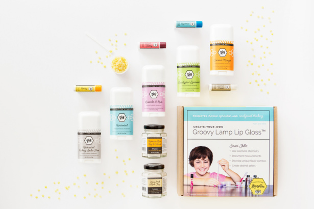
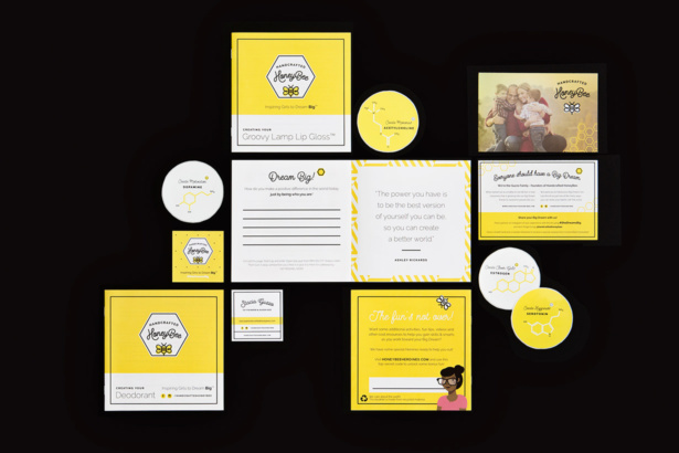
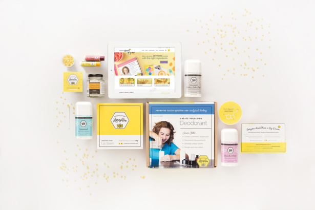
Some people would have stopped at the branding and been satisfied with the pre-made theme. Stacia and Robert completely understood the value in having a custom site for their one of a kind business, and invested in the website design. Here is what we did and what they got out of it.
Starting a website project with goals
Stacia and Robert were dream clients, because they understood the importance of every page on their site, and didn’t need us to talk them into caring about anything – they cared about everything to do with their brand, which a truly passionate business owner just naturally does!
For weekly tips like this, subscribe to our newsletter
"*" indicates required fields
Robert explained,
We sat down with our team (virtually over Basecamp, of course), and we discussed goals. Each member of the team would play her part in helping us to achieve those goals.
Our short-term goal was improving our online sales conversion. We needed streamlined navigation, a clear, coherent value proposition, strong visuals, & simple, secure checkout.
Our long term goal was a bit more complex: strengthening our customers’ relationship with the brand. As the owners, Stacia & I were in charge of content creation, but each member of the Aeolidia team would be able to contribute to the story we were trying to tell, the value we wanted to deliver & the connection we wanted to forge.
We took the analysis one step further and established the goal of each page on our website. Every. Single. Page. We asked ourselves: What is the one action we want the user to take when she is done reading this page? How does each page contribute to the overall customer experience?
A one-of-a-kind business needs a custom-designed website
Rather than trying to cram their content into a Shopify theme that was designed for a basic fill-in-the-blank type shop, Handcrafted HoneyBee needed something special. What they do and sell is a bit different. Sometimes customers will shop based on the product info alone, but more often than not, they need to have the value of the product explained to them visually in a way that compels them to add it to their cart and makes it hard for them to abandon that cart. That’s what we do!
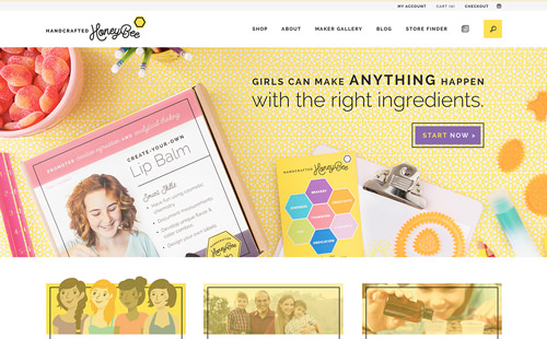
Here is the brand new custom Shopify design for Handcrafted HoneyBee. This was designed completely from scratch, and is not based on pre-existing theme or template:
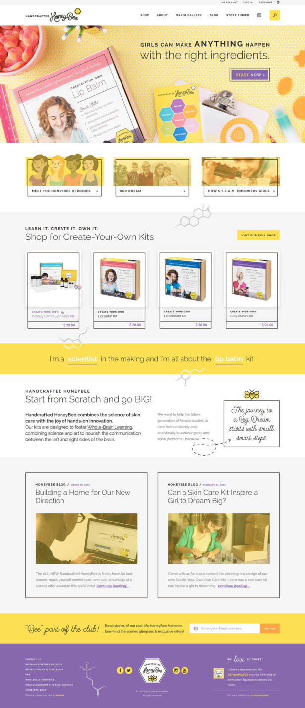
Our designer, Sarah, explains the choices behind the Handcrafted HoneyBee custom Shopify theme, scrolling from top to bottom:
I really care about how your website looks and how it works. Your audience’s experience is so important and the way the site looks now tells a story as they scroll.
Up at the top they are introduced to Handcrafted HoneyBee with your awesome banner. BIG Impact!
Then they are nudged towards 3 super important aspects of your business.
- The Heroines puts the focus on the daughters. As you mentioned, it’s important for mothers to see their daughters as the heroes here.
- Our Dream speaks about why your business is here – the journey you guys have been on and where you want to take HHB in the future.
- How STEAM Empowers Girls again brings the focus back to your Mothers. Here’s how you are empowering your daughters by giving them STEAM toys instead of a simple lipgloss.
What is important to note here as well is that at this point you haven’t launched into BUY BUY BUY. So many kids’ toy websites really push sales at the top of their websites and just like how your audience is desensitized to specific words / phrases – they have also become desensitized to pushy sales techniques. So far we have told them why these toys are so awesome, how they are different and how seriously excellent they would be for their kids!
NOW we get to selling! By this point they are hooked and want to see these kits for themselves. Here’s the main event – Shop For Create-Your-Own-Kits! With this flow to your website, your sales conversions should do really well!
Under your feature products you remind our mums – why they are looking at these kits again? Ohh yeah, thats right, I want my daughter to be a freakin’ ASTRONAUT! Having a bit of animation here and a bit of fun is such a great idea.
By this point – we are hoping most parents have clicked deeper… but for those who are still feeling a bit like, “what’s this all about?” we take them to a bit of a “more information” stack where we give a little more detail into what Handcrafted HoneyBee is – with that juicy hook, “The journey to a Big Dream starts with small, smart steps.” (eee, doesn’t that just get you excited!)
It’s likely your blog snippets will be mostly viewed by repeat viewers or people who already know about Handcrafted HoneyBee. That’s awesome, that’s exactly the eyes we want looking down here as they are the ones more likely to read your blog and sign up to your newsletter if they haven’t already done so.
My point is – your website tells a story. A really rad story that I want to read!
A graphic designer’s eye sees things you won’t
You may feel fairly design savvy, but a graphic designer who lives and breathes ecommerce design is just naturally going to think about things you won’t – she’s thinking about ecommerce every day, and has been doing so for years!
Here are just a handful of the insights our designer, Sarah, brought to this project:
A note on color

Something you will quickly notice is that I limited the colour palette in this design. I KNOW we love your full colour range but I worry that having them all used together will create a bit of a rainbow.
I have limited most elements to use either only your Yellow or Powerful Purple (for hover states on buttons mostly). The reason for this – it’s going to make the colours in your products REALLY catch your eye! Especially on internal pages.
Another reason is that the yellow and muddy black we use are “science” colours so it reminds your audience that these are STEAM [Science, Technology, Engineering, Art, and Math] toys, not just makeup kits for girls. This is important!
The reason I used your Powerful Purple instead of any of the other colour options was because purple is the complimentary colour to Yellow so purple will attract maximum attention when we need it to.
A note on fonts

Something you might notice that I am doing differently with this design compared to the temporary design you have up now is that I am limiting where I use the Smoothly cursive font. There’s a reason for this.
The less I use it, the bigger impact that font has when I DO use it. This means that even though your logo is smallish, it’s the only place “above the fold” that uses that cursive typeface and therefore it draws attention without being HUGE or in your face. It’s subtle eye manipulation.
Another reason I have gone light on the Smoothly font is to help the balance between looking Arty and Scienc-y. This Raleway font being used the way we use it in your brand has a really strong “science” feel to it without being masculine (it’s so perfect!) so when I want to draw attention to the “arty” side of Handcrafted HoneyBee – thats where I will use the Smoothly font.
A great example of this working is your banner. The image takes good care of the arty look and feel, so I didn’t use any cursive font to bring a bit of the science look into the design. And because I haven’t, your logo is eye catching against everything else going on up there. Eye catching – yet not distracting.
Featuring the blog
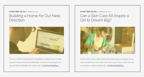
You are putting too much love into your blog for us to feature only one article on your homepage. PLUS it’s an excellent opportunity to get a couple more keywords on your homepage to appease the all mighty Google!
When your audience hovers over a blog article container it will change ever so subtly: the container turns white, the thumbnail image displays in full colour and the blog title link changes to purple. They are small changes but once everything is built and you’re interacting with the site, you want things like this to be subtle. Little details go a LONG way in web design, it’s what makes a website look polished and loved.
Newsletter subscribe

I have included another newsletter signup stack – JUST in case people don’t click the icon in your sticky header. You gotta prepare for all kinds of users 🙂
Something I have done with your newsletter is not actually use the word “Newsletter.”
The reason for this is because your users are constantly bombarded with advertising and people shoving “SIGNUP NOW” call to actions in their face. People have become desensitized to the words “signup”, “newsletter”, “become a member” and a bunch of other super common hooks.
The problem is, we can’t stroll too far from them common terms because they are recognisable and descriptive. We have to be clever!
By using the hook “bee part of the club” and having the email link named “signup” we toe the line between being unique enough to catch attention and descriptive enough so people know they are signing up to a newsletter. Having the exact description of what they get helps a lot as well.
Why custom instead of a Shopify theme?
I’ve pinpointed five things that Aeolidia’s work can do for you that you’re going to have a hard time accomplishing on your own.
1) Completely remove the “amateur” elements of your website
Stacia and Robert really care about what they’re doing, and they can see how cool their product is. But for their customer to see it, a lot of work has to go into polishing up every corner of the site, and telling their story in a strategic way.
Even if your customers don’t know why your site doesn’t feel as trustworthy to them as the other sites they shop on – even if they aren’t design or internet savvy – they are going to have an instant “first impression” of your business based on what they see, and if it’s not totally polished and well-designed, they will click away. Society as a whole is much more design-aware than we used to be, and expectations are high.
You know those places on your website that feel half-done, awkward, or you’ve put content into just to fill a hole? All that will be gone when you create your custom site with us.
2) Build a shop for your target customer
Pre-built Shopify themes necessarily cater to a wide range of businesses with a wide range of customers. This is great for Shopify and the theme designers, because there’s a better chance you’ll find something that will work and choose one of their themes. But it’s not as great for your business or your customers, as you’re trying to shoehorn your content into boxes that you didn’t ask for.
Your new site will tell your story in a way that makes your customer want to get involved, rather than just displaying your products and hoping they’ll care.
3) Make the site work in the way you need it to
We build in the features your particular business needs to sell to your particular customers. Whether this be creating a smooth product customization process, telling your story in an interesting way, catering to your wholesale shoppers, or eliminating tons of busywork from your internal tasks, a custom website can save you and your customers huge amounts of time and hassle.
4) Simplify admin tasks
We use Shopify (that’s an affiliate link, my friend), and we set everything up so that you can easily make your own updates to the content and products, while letting Shopify quietly make updates and improvements to the software behind the scenes.
5) Create a “sales funnel” that maximizes conversions
Your website will be designed to lead visitors from your social media posts or Google to your home page, right to shopping, and off to the cart, without missing a beat. We know how to eliminate distractions, attract eyes to what’s important, and move your visitors to a sale.
The result
What all of this does is establish you as a serious business that is willing to invest in your brand and customer experience.
The business owner’s perspective
I could talk about this all day, but since I’m the one selling this type of work, I’m sure you’d prefer to hear from the shop owner on the other end of the equation – the one investing in the work. The temporary site looked pretty darn good, especially with the brand graphics and guidance from Aeolidia. Robert knew they needed more, though, and shared,
Plenty of people saw the transitional website and asked what more could possibly be needed. I’ll share the reasons why we wanted to go with a custom site.
A custom design places the customer’s online experience completely in your hands. You can include small, subtle touches that can increase customer confidence in your brand. You can integrate the various elements of your online presence (your shop, blog, newsletter signup, member site, wholesale site, etc) in the way that will resonate best with your ideal customer.
With a custom theme, the website’s design & functionality are precisely suited to help your business accomplish its goals, rather than fitting your goals to suit the template.
Here are some special elements that just couldn’t have been pulled off well with a pre-made shop theme:

A rotating graphic with the phrase: “I’m a __________ in the making and I’m all about the __________ kit.” was one of several elements designed to spark a girl’s imagination & connect her story with our educational skincare kits.
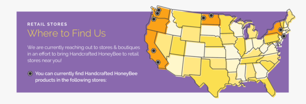
Each of the major pages on the site have eye-catching and informative banner graphics right at the top. Even the store locator has an integrated design that’s consistent with the rest of the brand.
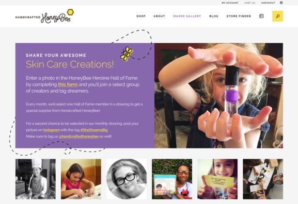
The “HoneyBee Heroine Hall of Fame” encourages the audience to help shape the brand by submitting pictures of a girl with her kit creation.
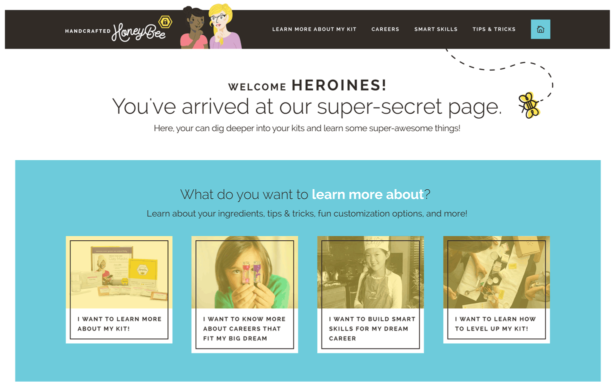
A secret page offering exclusive access for kit creators is not accessible directly from the website. We needed it to look distinct, yet still part of the rest of the platform—special but connected to the place where they got the kit in the first place.
And how about this blog? One complaint we often hear about Shopify is how boring and simple Shopify blogs look. Maybe theme designers just don’t put much love into these sections. Here’s a great example of a Shopify blog at its full potential:
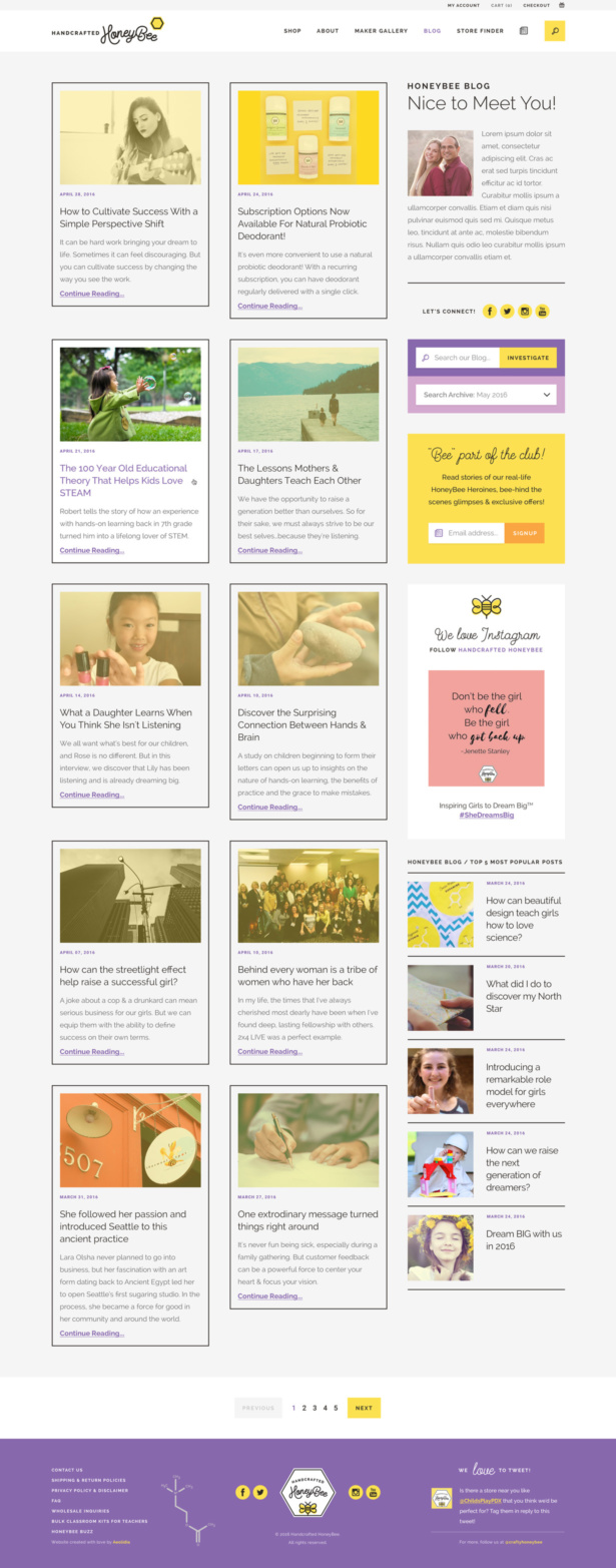
Is it your brand’s time to shine?
Aeolidia provides a lot of advice and support via our blog, newsletter, and Facebook group, but the heart and soul of who we are as a business is a design team driven to bring your business the results that you’re looking for. We design thoughtful and compelling brand identities and strategic, sales-driven Shopify websites. We’ve been doing it for over a decade, and there is no other team who knows your creative product-based business as we do.
Let’s hear from Robert Guzzo one more time:
You want to know the single biggest mistake we made with our original brand identity? Thinking that we could do it ourselves. Or rather, I should say: thinking that we couldn’t afford to hire a professional.
We were looking at our brand visuals as an expense. As something that could be “good enough” if we did things ourselves.
So we designed our own packaging & labeling. We created imagery for social media posts. We used off-the-shelf fonts and stock graphics. Then we worked it over some more and a little more…and a little bit more, tinkering and fiddling to make our homemade designs better.
We tried our best. But our best wasn’t good enough.
If I’m being totally honest, our attempt at design was all over the place. We were failing to curate a single coherent identity. People didn’t know what we stood for or what they could expect from us. We were confusing people more often than we were connecting with them.
All of that changed when we started thinking about our brand identity as an investment in the future of our business, instead of an expense to minimize.
By working with a professional design firm, we had a lot at stake financially. We had to get things right the first time, and the design visuals needed to be built to last. No more tinkering.
The other big benefit of working with professionals was that we purchased our freedom. We could focus on the parts of our business that absolutely required us, and leave the rest in the hands of experts. We gained back precious time to focus on making our business the best it could be, rather than wasting time over-working for “good enough.”
View more projects in our portfolio
Quit messing around and do it right with Aeolidia
If you’re ready, we can make a solid plan for you. If you’re not sure if you’re ready, we can talk about your visitors, conversion rate, and sales numbers, and think about what your best next step might be. Get in touch!
Forecasting Your ROI

Aeolidia aims to be a step towards 10x-ing a business, not just a 10% improvement. Is it time for your business to take this step?
Related Posts
Let's take your online shop to the next level
The Shopify websites we design have a reputation for substantial improvements to ecommerce conversion rates and online sales. Let's talk!

