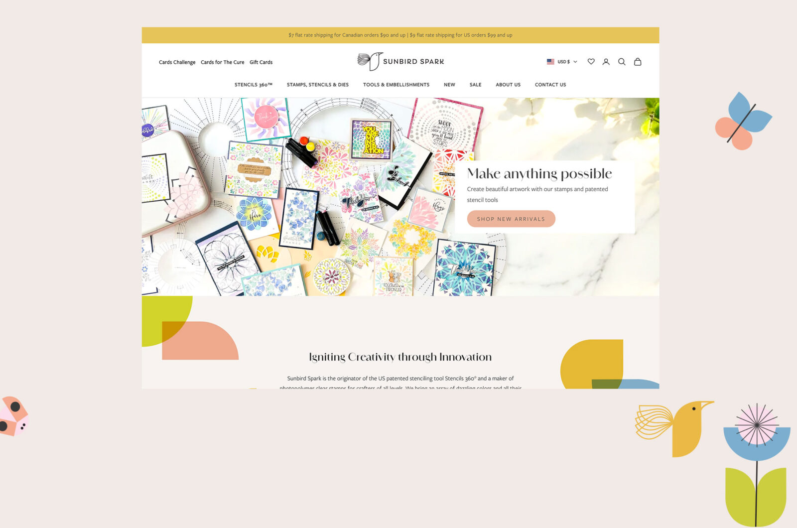
We have had so much fun behind the scenes working with Jon Harvey, a designer of clever greeting cards, and we know you are going to love his new branding and website! We do a lot of stationery website design, and it’s fun to put a unique spin on each new client.
Logo Design
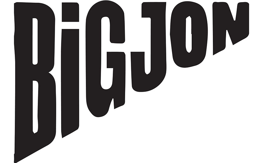
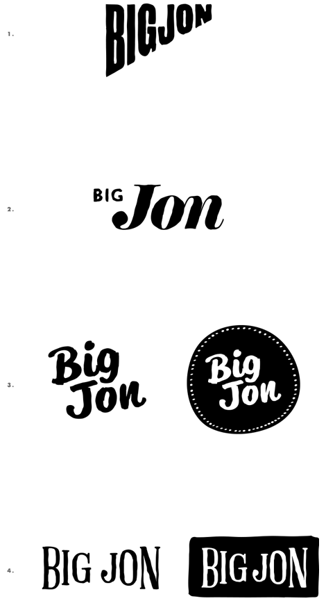
First up, Meg was able to work with Jon on a new logo. When she submitted her initial design ideas, Jon said,
“Logo 1: TICK. This is going straight into the Big Jon Bank and could well be the winner. Thumbs up for: Love the shape, as it was not at all what I had ever thought about and that’s always good. Love it’s simplicity and of course due to the shape like how big BIG is and that JON is smaller.”
After seeing a few more ideas, he decided,
“It is awesome really and the more I was playing around with it it just felt so right and like I had always had it. It’s bold but doesn’t dominate which is aided by the shape, it’s magic, Meg!… It’s freakin brill.”
Stationery Website Design
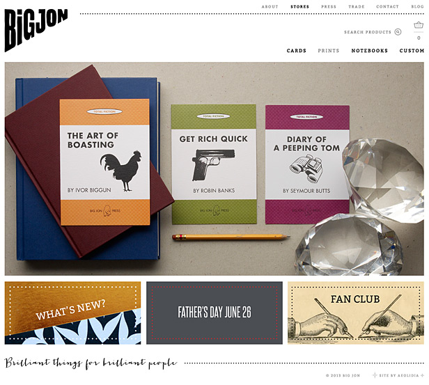
At six feet, five inches tall, Jon is anything but twee, and Meg, who designed Jon’s site, had some fun adding an illustration to his witty about page (side note: Jon is still searching for these exact pantaloons and shoes).
Website Development
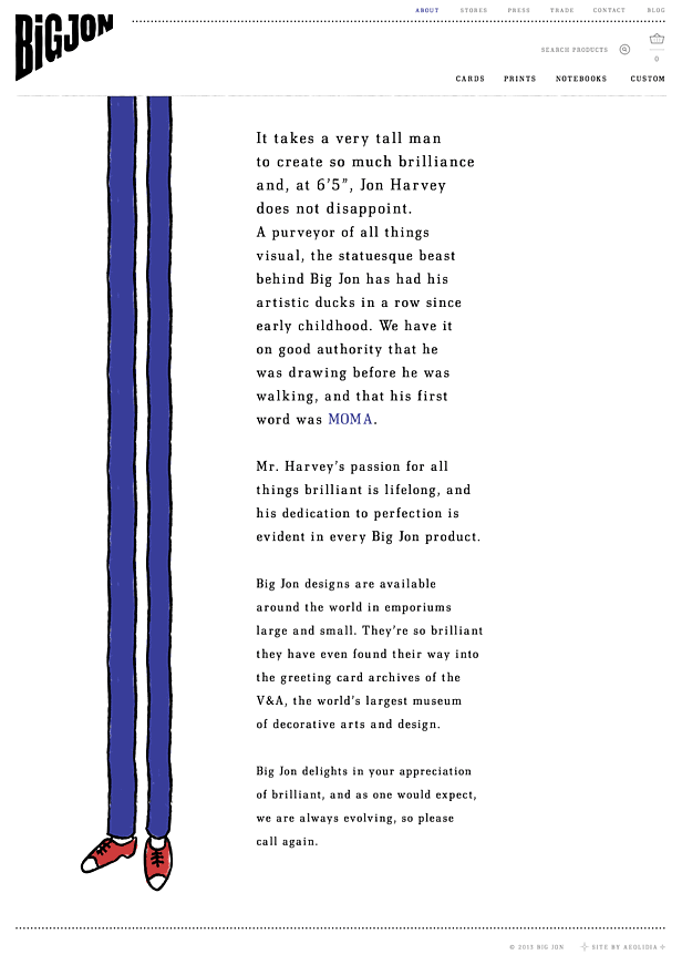
Zak worked with Jon to develop his site, and one of his favorite touches to the project is how the cards display in random order on the category page. Jon has quite a number of cards available in his shop and didn’t want them to display in the same order every time a customer viewed the page.
Copywriting
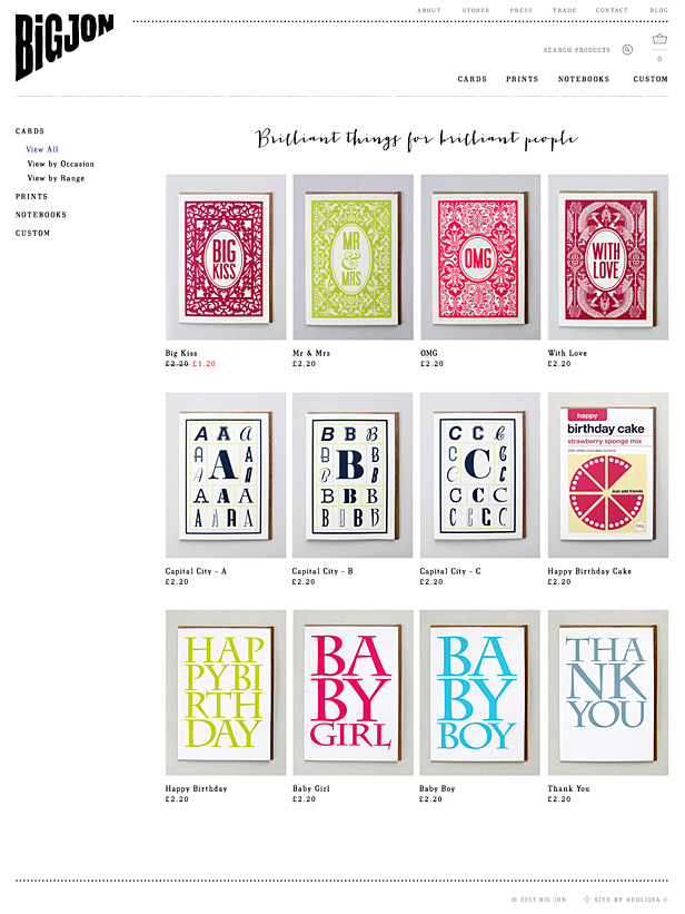
Dewi had a blast working on copywriting with Jon. She said, “What was really memorable about working with “Big” Jon was how much his personality came through in his messages and feedback. Sometimes, in working with a client in this virtual manner — where text is the only form of communication, it can be a challenge to get a read on what voice and tone would best suit the client and his or her business. Not so with Mr. Harvey! His feedback was prompt, good-natured, and always written in his inimitable style.”
Interview with Jon Harvey
Why did you decide to redesign your website?
Jon: I started the site in 2009 and had a very basic site presence on the url bigjon.co.uk – but it was really only a glorified PDF of my products. I knew I needed a site which could grow with me and change as much as my business and products do. That was also an opportunity to reassess my brand and look at how it would come across as a bigger picture. Having 4 years experience under my belt – meant I had a much clearer picture of what I wanted for the business and a web/e-commerce site was a great place to start putting some of those ideas down
What advice would you give to someone who is considering a logo or website redesign?
Jon: Do it! But before you do – research, research, research, and make sure you have a clear idea of what it is you want your brand to say. This evolves over the course of the project but it’s so important to begin with a general idea – even if it’s a long list of what you don’t want! It will make the decision making process a heap easier and it’ll definitely help all the professionals you’ll need to use to turn your vision into a reality.
What do you wish you had known before starting a big project like this?
Jon: That nothing is set in stone so if you have a sleepless night thinking you’ve picked the wrong font or the wrong colour – it doesn’t matter! It’s a very flexible process and unlike paper & print, it’s easy to amend things. Also the finished thing is only the beginning, it’s a platform to build on and evolve, which any good website should do.
Project Testimonial
I needed a coherent and professional ‘shop window’ on the internet. Paying other people with the right experience to do it for me made me interrogate my brand and ask questions of myself which would not have happened if I had attempted to do it all.
I now have an online presence which I am really proud of and can link back to in a million ways be it online, through social media or face to face. The ability to close the sale at the last step of the journey with an e-commerce site is the icing on the cake.
I now look and feel like a professional who means business and the site has actually made me approach my entire brand with a different head on. I’m now more confident in my business and its future than I have ever been.
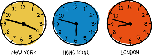
I wanted to swoop in and say a huge thank you to all of you for helping to make my brand and website beyond my wildest dreams – brilliant. Thank you all for your patience, thousands of miles and thousands of seconds time difference can be challenging but you made it feel like we were in the same room – (although not so close that I could see you tutting and rolling your eyes – which I guess maybe happened now and again?!) ha ha. I am over the moon.
— Jon Harvey, Big Jon
Need help with stationery website design?
If you could use our help with your website or branding project, please check out our services and then reach out and say hi; we love talking shop with creative people!
A Newsletter That Goes Beyond Shopify 101
It’s easy to find beginner info about ecommerce online. If you’re past that? Subscribe to our newsletter for advanced strategies and need-to-know info for established shops. You'll get:
- Weekly tips to help you market and sell your products
- Updates when there is news that may impact your site
- Round ups of interesting links and info for brands
- Invites to our live trainings and webinars
- Instant access to our past emails
"*" indicates required fields
Related Posts
Let's take your online shop to the next level
The Shopify websites we design have a reputation for substantial improvements to ecommerce conversion rates and online sales. Let's talk!

