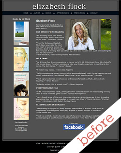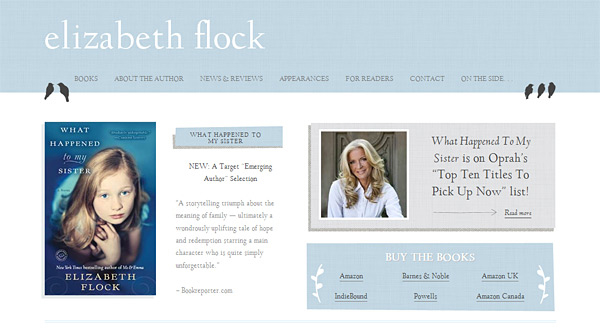
This summer I had a thrill when I got an email from Elizabeth Flock, asking if we were available to redesign her website, as her fifth book was coming out. I did a bit of a double take, then realized she was THAT Elizabeth Flock, who’d written the book Me & Emma that I enjoyed so much that I’d passed it on to my family to read as well. I’m excited to share Elizabeth Flock’s Website Before & After!
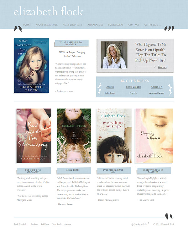
Liz was a delight to work with. She had some fun problems for us to solve, and we were able to move her away from the stark and dark look she’d had before to something light and airy (and with birds!).
She worked with Meg and Brad (AKA Ghostly Ferns) on the design, and Zoe on the WordPress development.
Liz wanted the website to be a clean, simple reflection of her and the work that she does. We had some discussion about look and feel, and Meg and Brad reported back with a few ideas to look at, and this info about their design decisions:
“We really wanted to showcase your books first and foremost. We both thought that they should be the most prominent images on the page. Generally those looking at your website will like looking at images a lot more than text. A lot of website users get turned off by too much text on the homepage. So, we tried to keep text at a minimum here. That’s why we decided to feature only one quote for each book! If you’d like we can feature more on the “Books” page.
We also wanted to highlight two more areas. A bit about you and links to purchase the books. We used subtle textures a reoccurring branch/leaf motif to visually call out certain areas. We wanted to really excite your target demographic, so we chose a subtle blue color and nice rustic textures. We also found a way to incorporate your bird fetish without making the birds too much of a focal point.”
After the revision process, we got this charming message from Liz:
“I just LOVE it!
I’ve been staring at it since your email came in and I just realized I’M SMILING AT THE COMPUTER SCREEN, looking at it.
Cannot thank you enough, you guys.”
Such a nice feeling! We strive for this response on all of our projects.
As you can see, her new website does a much better job of:
- Showcasing the new novel
- Making it easy to buy all of her books
- Helping readers, librarians, and journalists find out what they need to know about both the books and the author
I asked Liz for her thoughts on her project after we launched her site, and she had these wonderful words for us:
“The talented team at Aeolidia didn’t just exceed my expectations, they smashed them into tiny pieces. Their professionalism, kindness, patience and vision made the design process — something I assumed would be a headache — enjoyable and, dare I say, inspiring. Arianne Foulks runs a tight ship but has filled it with wonderful people who are passionate about what they do — a rarity these days. All hail Aeolidia.”
Well, it turns out that putting together websites for novelists is a good time for all! If you know any authors that you’d like to send our way (especially novelists or children’s book authors), please have them get in touch!
What do you think of Elizabeth Flock’s website before & after? Let us know in the comments.
Be sure to check out Elizabeth Flock’s finished website.
View more website projects in our portfolio.
A Newsletter That Goes Beyond Shopify 101
It’s easy to find beginner info about ecommerce online. If you’re past that? Subscribe to our newsletter for advanced strategies and need-to-know info for established shops. You'll get:
- Weekly tips to help you market and sell your products
- Updates when there is news that may impact your site
- Round ups of interesting links and info for brands
- Invites to our live trainings and webinars
- Instant access to our past emails
"*" indicates required fields
Related Posts
Let's take your online shop to the next level
The Shopify websites we design have a reputation for substantial improvements to ecommerce conversion rates and online sales. Let's talk!

