A Website for Handmade Dolls: Bamboletta

Imagine creating a product that regularly sells out within hours or days of it going live on your site. Such was the case for Bamboletta, which sells one-of-a-kind handmade dolls from Canada. With such rapid sales for her brand, founder Christina Platt felt it was time for a website redesign. Her products were widely loved and in demand; in order to keep up with their growing popularity, she wanted the site to showcase her products more effectively and move customers through the purchasing experience more efficiently.
We recommended she remain on Shopify (it’s our top choice for nearly all ecommerce businesses), but work with us to redesign her site from scratch, creating a custom Shopify theme meant just for her business and her customers. The new, user-friendly site recently launched, and we’re pleased to share the strategy that went into building it.
Step 1: Design a website for limited-edition handmade dolls
Creating a user-friendly site is essential to driving sales. In other words, it’s not only friendly to customers, but to your business. What brand wouldn’t want that?
For weekly tips like this, subscribe to our newsletter
"*" indicates required fields
To build a site for Bamboletta that would play nicely with her customers, our first step was to assess the brand experience and what functionality it required. Because the dolls are made in small quantities by Bamboletta’s “sewing mamas” who work from home, the site gets updated weekly with the newest dolls. There are also many different kinds of Bamboletta dolls made to suit kids of different ages and for different styles of play.
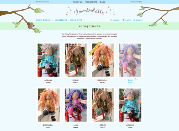
In designing the new site, Christine on our team focused on making customers feel immediately drawn in, welcomed, and informed. The header highlights two key points visitors ought to know: that the products are handmade in Canada and the site offers worldwide shipping. A dropdown menu featuring illustrations and a short description gives a quick glance at what makes each type of doll unique. And below the navigation, a quick introduction with a countdown clock builds anticipation for the next doll release!
Step 2: Function, meet beauty
Of course, function requires aesthetic. To create a soft and happy home for Bamboletta dolls, Christine paired woodland-inspired illustrations with storybook typography on a clean, responsive layout. This new mobile-friendly design balances simplicity and warmth, inspiring customers (new and old alike) to make a purchase.
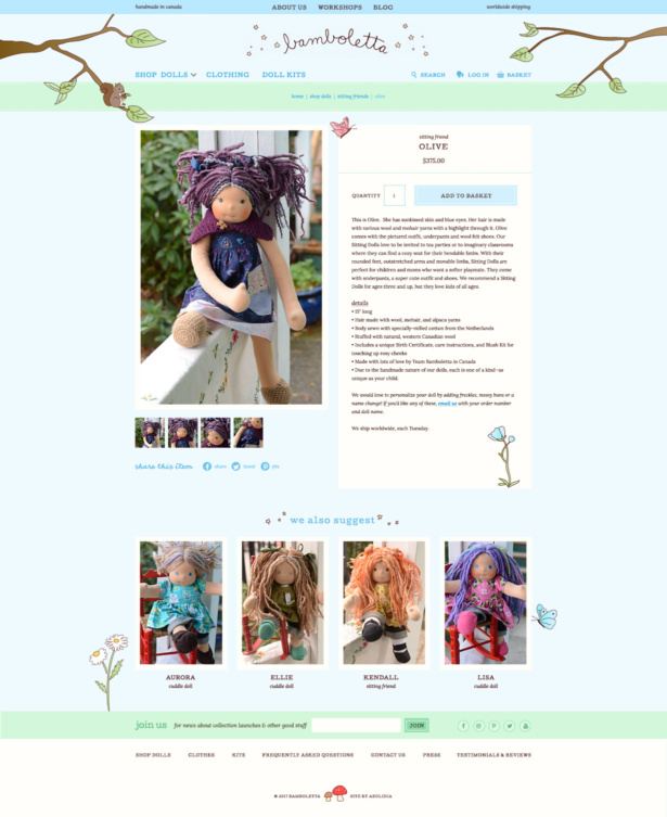
Step 3: Put your web design to work for you
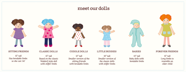
Phew! That’s a lot of weight for one website to pull, but with careful, strategic planning, it came together seamlessly. And that was only the beginning. A hand-illustrated “Meet Our Dolls” section provides a quick overview of the different types of dolls. An Instagram feed offers visitors a peek at the world of Bamboletta behind the scenes. And a section titled “The Magic of Bamboletta” goes that one extra step to show new customers what makes the brand, company, and dolls so special.
View more projects in our portfolio.
More about how Christina scaled her business while keeping it cozy.
Build a better online home
Are you unsure about your website?
- Do you have feel like your website could be serving you better, but you’re not sure where to start?
- Have you added a lot of content to your site, and now you don’t know if your customer can figure out what to do next and make it easily through checkout?
- Is your website representing your brand in a way you can be proud of?
We'd like to review your website.
Related Posts
Let's take your online shop to the next level
The Shopify websites we design have a reputation for substantial improvements to ecommerce conversion rates and online sales. Let's talk!

