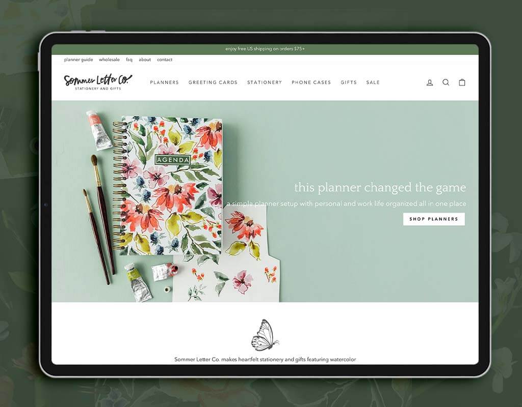
Today we’re going to go behind the scenes on a Shopify Website In a Week project with Kyle Sommer. Kyle is a watercolor artist who makes stationery and gift items with her artwork on them. Her work is very colorful and floral, and we worked with her this fall to bring her artwork and personality into a functional and effective website for Sommer Letter Co.
This is an interesting project to look at because her site was not bad at all before we began! If you’ve been thinking your site is, “good enough,” it may be interesting to see where we can take “good enough” to in just a week. You can watch the 18-minute video interview below, and read on to have your questions answered about how this project can help you increase your ecommerce sales.
What if you had a perfectly on-brand website… next week?
Hiring us to create a fully custom website is a 5-8 month project that can be a lot of work for the shop owner. Website In a Week is easier to fit into a busy schedule. It’s super quick, stats show us that it has been very effective in increasing sales, and our expert strategy and execution help you avoid cobbling together solutions on your own.
This is a problem my team at Aeolidia has been working on for years, and we finally have it down to a science – we can make you a Shopify website in a week that’s better than most other Shopify sites you see out there. Here’s our process:
- Getting to know your business: We’ll ask you dozens of questions about your business, starting with a big questionnaire to plan your project. We want to make sure we know what your current pain points and challenges are, and what your goals for the new site are.
- Preparing you for success: We have a detailed preparation checklist for you that tells us everything we need to know to highlight your business and optimize your site. It also includes some ideas and suggestions you may not have thought of for your site, and tutorials on doing ecommerce well.
- Branding refreshes: If we’re doing any branding as part of the project, you’ll get a phone call with your designer in advance of your branding design day.
- Planning & navigation: Your project manager and web designer will get together a week before design starts to make some plans for you, and then we put together some navigation recommendations.
- One web design day: On your web design day, we invite you into our Slack chat to discuss in real time what we’re working on (or we can do this by email if you prefer). These days are fast, high energy, and fun. We pack a lot into one day!
- Custom coding: The next day, your developer makes some adjustments and changes that need coding work.
- Launch: we help you launch the site – this part’s easy, because you already have a Shopify site. It’s just publishing the new theme.
- Support: No worries — you get to hang out with us on Slack for two more weeks in case there are any issues or questions.
For weekly tips like this, subscribe to our newsletter
"*" indicates required fields
The Shopify Website In a Week service was really achievable because it is less expensive than a custom website and I didn’t feel like I really needed to throw everything in the trash and start from scratch. I just needed my website to be the same but better. I just needed to supercharge the appearance to be more refined. Then functionally, I needed some things that I couldn’t achieve on my own. Aeolidia was able to put all of that into an affordable package that I could actually handle in a small amount of time.
This is my second time working with Aeolidia. I also used their Klaviyo services, and it was great experience. I would do it again.
Kyle Sommer
What can Aeolidia actually get done in a week?
So much! First, we start with a premium Shopify theme that has all the features and flexibility we want. We have a lot of practice with the themes we use, so no time is wasted learning or trying to get it to do something it’s not made for. We are pure efficiency, adding in all your branding, showcasing what’s special about your business, and making clear who it’s for and why they should be interested.
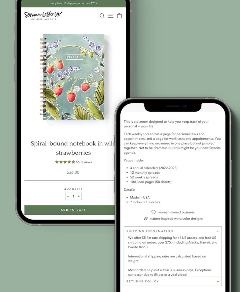
At the end of our week, your home page, collections page, and product page will all be optimized to sell, using our best practices from nearly two decades of ecommerce design. When you opt for our upgraded service, we can add in little touches just for your business, for instance, we created a small library of icons for Kyle to use on her product pages, such as “woman-owned business,” and “nature-inspired watercolor designs.” Kyle’s new site includes a low stock inventory indicator, and an accordion for extra information, to keep it from overwhelming the product page.
Most people opt to go for our upgraded Website In a Week service and get some bells and whistles thrown in. For instance, Kyle wanted a bundle deal for her greeting cards. We have a lot of little tricks up our sleeve after all of years working on Shopify sites. This means that sometimes it is easy for us to add a special feature (the kind of thing where you might be tearing your hair out if you’re trying to do it yourself).
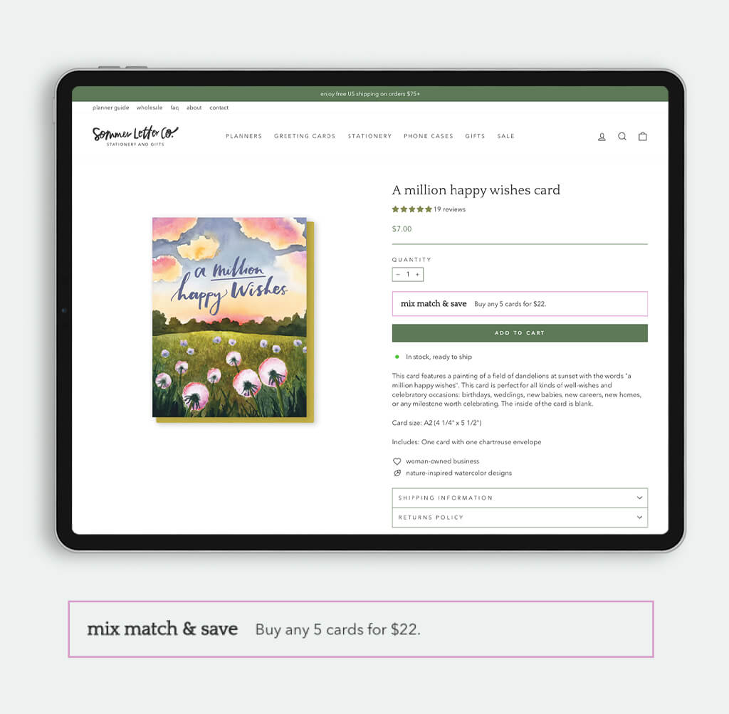
You guys added the bundle deals for my greeting cards. Every single card page has a mix-and-match visual indicator that you can buy any five cards for $22. That’s something I’ve wanted for a long time. It does really well for me at shows in person, and I’ve never been able to translate that online. Since launch, I already have seen more people buying cards and the people who buy cards, buy more. I’m excited to see that one over the course of six months, how that impacts my analytics. That was a custom feature that I really wanted and I was thrilled that you guys were able to do that on such a small project, not a custom site.
Kyle Sommer
How many customers are you losing because your site looks like everyone else’s?
The shop owners we work with are artists and designers, and there’s always a standout visual component to their work. When beautiful work is thrown into a standard template, you don’t experience the full personality of the brand, especially when it’s a visually creative product.
One of my biggest disappointments is when someone hires us to design a gorgeous brand identity, including a signature color scheme, collection of typefaces, icons, patterns, illustrations, and other graphics, and then all we see of the brand on their website is the logo. It’s not always intuitive how to incorporate your full brand identity into a Shopify theme, and some touches need more technical know-how than what you can do using just the admin tools.
Aeolidia did such a good job of bringing that artistic personality into my previously pretty standard out-of-the-box website. Visually, the site has more little touches of color, illustrations, the fonts are working better… the heading typeface is more gentle, more kind, and in line with the voice of my brand. It’s still the same heart and soul, but a stronger personality than a blank template.
Kyle Sommer
Shopify Website In a Week sites are perfectly on-brand, and if your brand is lacking any details, we can take an extra day to flesh those out, so that we have a beautiful graphic identity toolkit to pull from when customizing your site.
Quit worrying about what’s wrong with your Shopify website
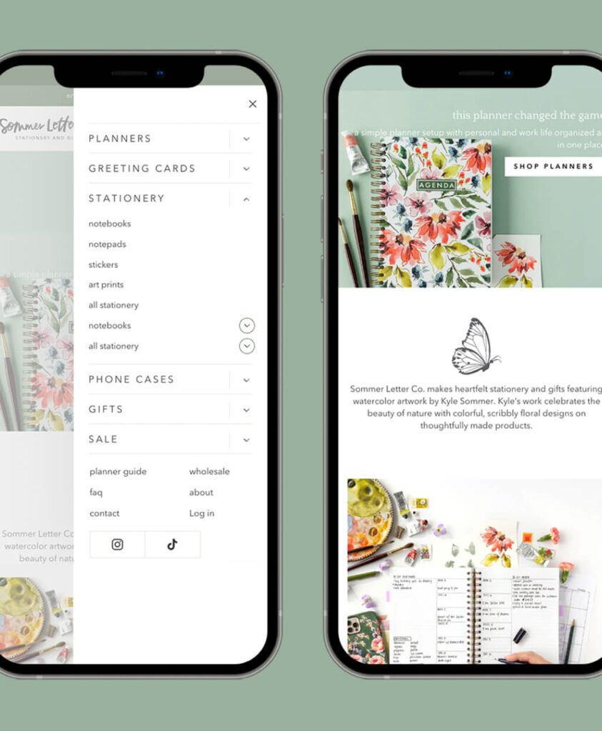
There are so many details that go into creating a truly functional Shopify site. Shopify’s marketing materials make it sound easy like you could set up in a weekend — and you can! But you’ll likely be missing some important touches that boost sales. No one tells you how to create a streamlined product navigation that helps people find what they want. And there are important legal considerations and accessibility needs that you can easily leave out if you don’t know what you’re doing. Not to mention making sure it’s mobile-friendly and that you have an easy path from the home page to checkout. For instance, Kyle’s customers were actively telling her that something seemed wrong with her site on mobile, but she didn’t know how to fix it.
My mobile traffic is absurd. It’s like 90% or something of my traffic is people on their phones and before the site was really hard to navigate from a mobile perspective. Having the top navigation makes more sense. Not only is it beautiful on desktop, but it’s also easier to find what you want and that’s really important for my mobile customer. I’ll be really curious and like five or six months to see how my conversion rate is affected by that, but I’m excited about it. I think it’s way better for people to find what they want.
Kyle Sommer
We can create a Shopify website in a week that has everything you need built in before we begin with you, so we can focus our time on making the experience unique to your brand and your customers.
Your own in-house Shopify team, but for a fraction of the cost
Hiring help can be one of the hardest things when you run a small business. Hiring your own employees means a lot of time writing job descriptions, finding the right place to post them online, wading through hundreds of applications, interviewing… not to mention the legalities and HR components to hiring a new employee. And then after all that, this person likely isn’t an expert at every single thing you need to set up an effective ecommerce site. That requires deep specialization.
“I feel like hiring you guys for Shopify Website In a Week was like having a team of experts instead of just hiring myself, who’s kind of guessing and googling and trying to cobble something together. It was like having a dedicated designer, having a dedicated manager, having the web developer who actually could put that little custom coded tweak here and there throughout. I got help with all those little things that I just am not skilled enough to do. It wasn’t like I hired a designer and still needed all this other help. I don’t know any other Shopify designers who are so curated in that way. I had a bunch of experts and not just one expert working with me.
Kyle Sommer
Aeolidia has a curated experience with access to many experts to help as needed. The Shopify Website In a Week project is necessarily limited in scope, but we can add extras to your proposal and can help out with absolutely anything on retainer after launch. For instance, if you need to re-write some text, we have a copywriter on staff. Our Ecommerce Strategist can always be pulled in for a question or two, and we have a consultant who can teach you how to use the back end of your site.
Will it be worth the investment?
I feel like the biggest barrier for anyone off the bat is just committing to spending the money. I sell products. So when I buy something, I’m usually then going to profit on that item, whereas with web design work it’s not a direct correlation like, “I have 5,000 notebooks to sell.” Instead it’s, “OK, I spent the money and now what will the payoff be?”
Kyle Sommer
I think mentally I had a little bit of nerves around that but I can say now, having done it, this was such a good decision. We’re walking into the holiday season right now, web traffic is up, sales are up, and I have a much more merchandised store experience on my website so that when people are shopping it is easy for them to find what they want and learn more about it. I’d never had someone work on my site before, and I was nervous about the investment, but I already feel it was absolutely worth it a hundred times over.”
Hiring help for your Shopify website can certainly be a leap of faith. No matter what level of business you’re at or how much money you make, it’s hard to choose what to spend money on. Even if you have the budget, there are so many different ways you can spend that money. We understand that, and it’s important for us that you see a good return on your investment.
Every decision we make when working on your project is about either your return on your investment directly or the perception we can create for your brand (which of course facilitates more sales). Every time we start a Shopify Website In a Week project, we see a site that’s not optimized for sales. Usually, the navigation is confusing and the products aren’t presented well. So much information that customers need to make a purchase is missing. These are simple fixes for us, and we can make your site make sense in just a couple of days.
What would your sales be like with a site upgrade like this?
Let’s work on it together! Learn more about our Shopify Website In a Week projects here, or get our rates for this service here:
Transcript
Arianne: Hi Kyle. I’m so excited to be talking to you today about your fancy new website. I wanted to give people a little sneak peek into what actually happens when we redesign a website, especially with this new service we’re doing, the Shopify website in a week, because it’s new to us and new to everybody else, and it can be interesting to think, “well, what can we actually get done in a week?”
So I think we got a lot done on your site, and I’d love to talk about that.
I’d love it if you could quickly introduce yourself and Sommer Letter Co., and we can go from there.
Kyle: Of course. So I am a watercolor artist, I make stationery and gift items that have my artwork on them. It’s very colorful and very floral, and you guys did such a good job of bringing that artistic personality into my previously pretty standard out-of-the-box website.
Arianne: Yeah, your work is gorgeous. And I think you brought up a good point because I always see all this beautiful work online, and then it’s just kind of thrown into a template. I feel like we’re not getting that full personality or just all the little details that we can throw in there when you have a beautiful brand and especially when you do your own design and illustration and things like that. So I think it will be fun to take a look at your site. So let’s do it.
Kyle: Let’s do it.
Arianne: The tiniest intro about me: I’m Arianne Foulks and I run Aeolidia, which is a web design agency. We focus mainly on Shopify websites. We also do branding and a whole bunch of other things that go into running a successful eCommerce business. So the project we’re talking about today is a Shopify website in a week project. This actually usually takes about a day of focused work for the shop owner. So we have one day with the designer and about half a day with the developer, and there’s some preparation work in advance of that. So one thing I really like about this project is thinking about a five or six-month project, that’s a ton of work for the shop owner and hard to figure out how to fit it in. This is actually quick and super effective. So let’s take a look at what we can get done in just a couple of days.
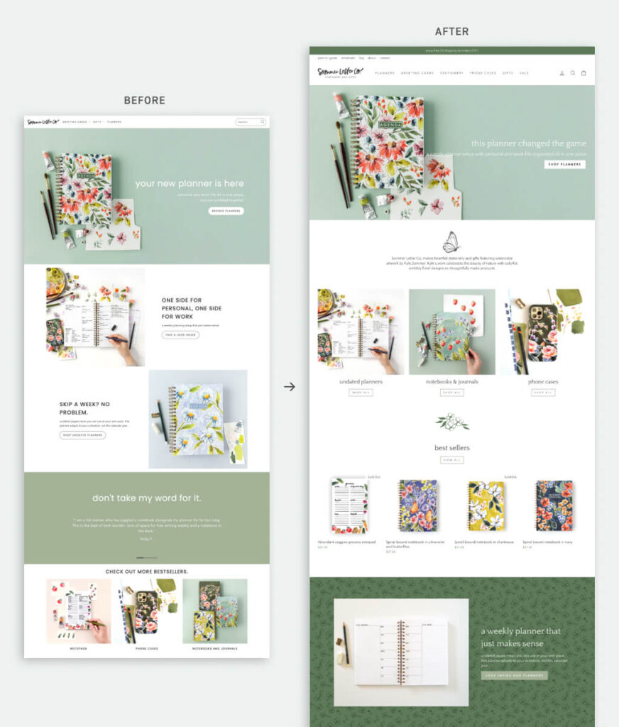
So I’m going to share my screen now — and here is the original Sommer Letter Company website. We took screenshots, so I can’t really hover or click on anything, but I can show you what it used to look like. The thing I like about this redesign is it’s not hugely different, like it’s the same look and the same brand, but it’s just a nice upgrade. So I’m just gonna scroll down so you can see that this is a well thought-out site. It’s got a lot of different sections that pull people into what’s going on with these planners and everything. It has testimonials, bestsellers.
So you could look at this and think this is a perfectly good site. It doesn’t seem like we need to invest a lot more time or money into this. So I think a lot of people get to the point where it’s good enough, and then they just keep chugging on something else, but I want to show you what a change we can make, so I’m gonna switch over to the current site
Here’s the current site, and we even use the same photos so you can really see the difference, like you don’t get overwhelmed by a new photo, you can see that this is the same site, but it’s just a little more pulled together. So what feels really different about this for you Kyle?
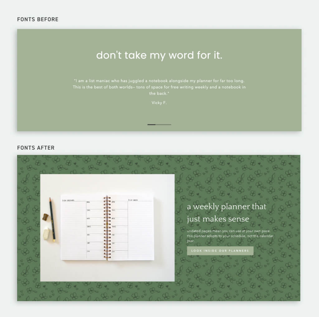
Kyle: I think just visually it has more little touches of color, the little illustrations, the butterfly you see right there, the fonts, the typefaces are working better. I think Christine was the one who picked out the heading typeface that is a little more gentle and has some rounded shapes that are just a little bit more kind and in line with the voice of my brand. So I think yeah, it’s still the same heart and soul, but a stronger personality to it, whereas before it was just kind of like blank template.
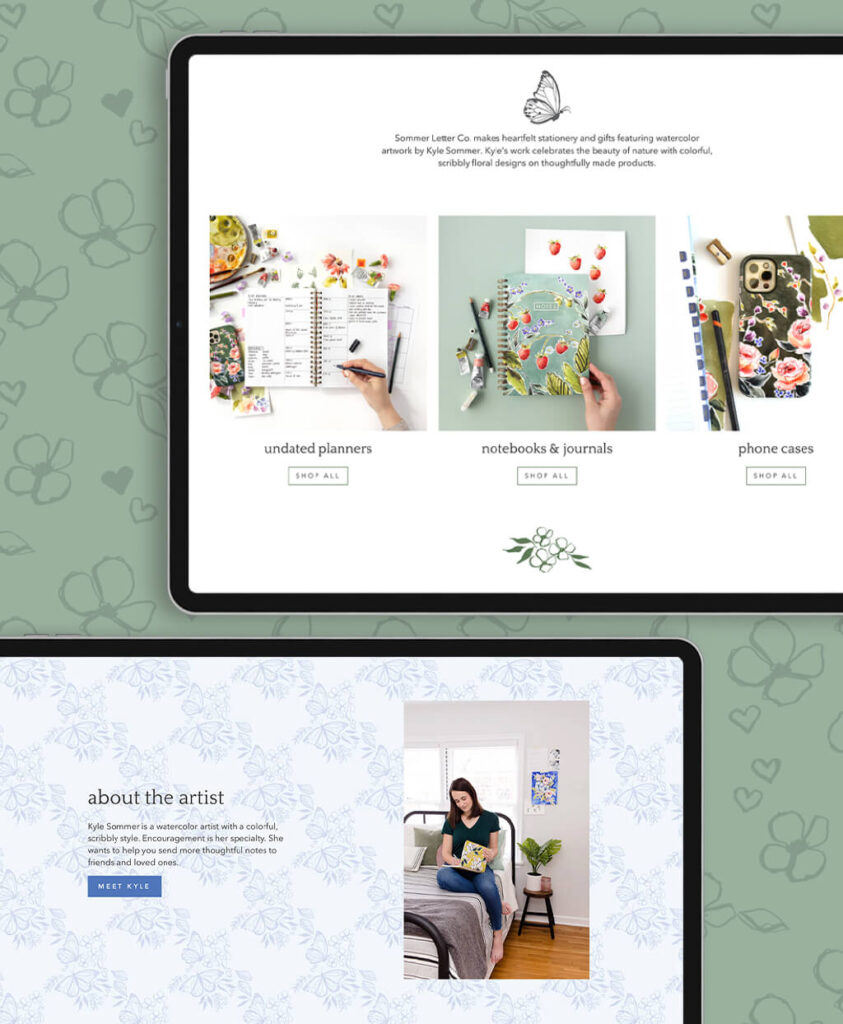
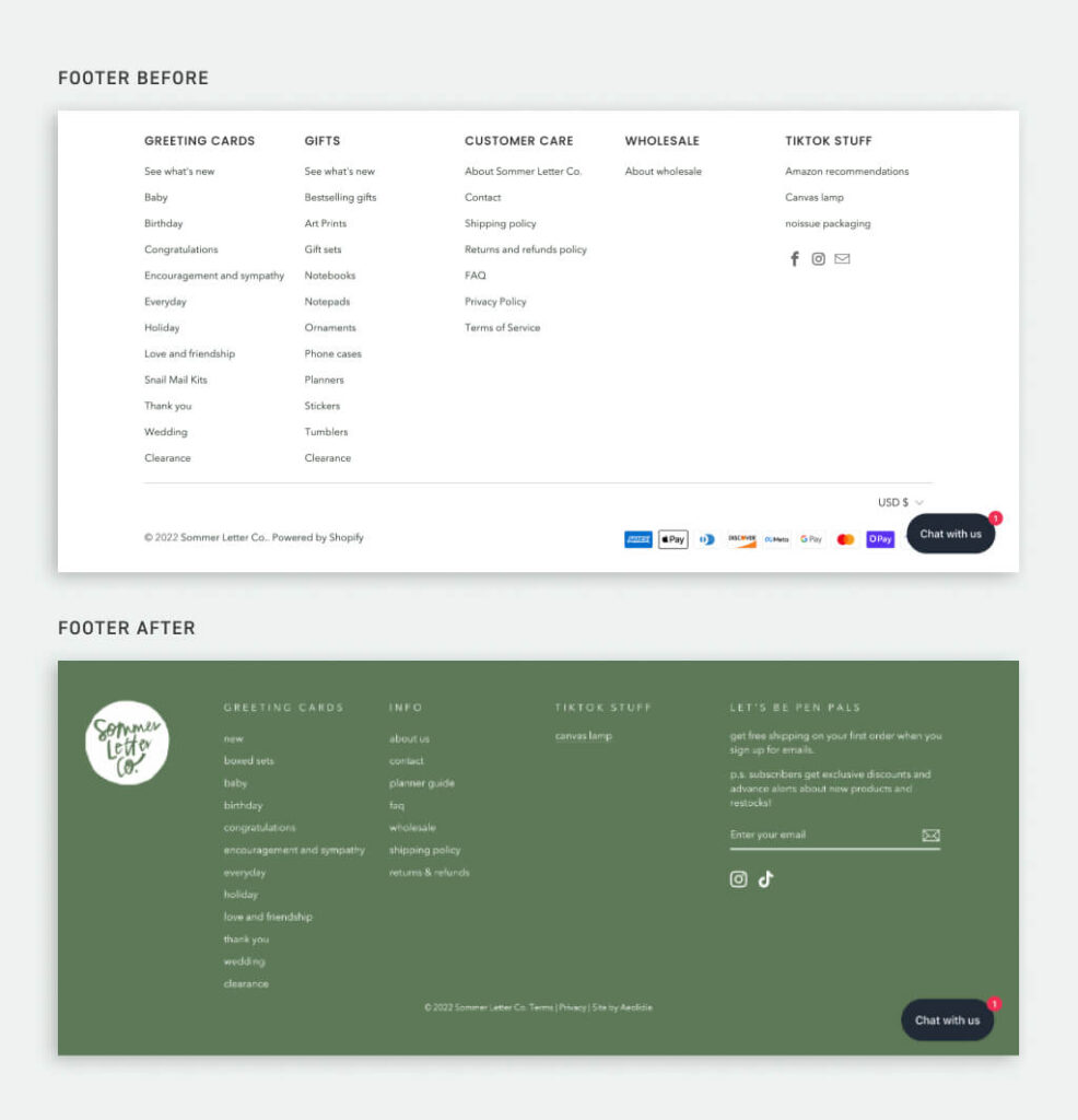
Arianne: Yeah, we’ve got your illustrations here as backgrounds, which is a nice touch but can be hard to do on your own, and I think the first site it seemed like it is very focused on planners, but here if you’re not shopping for a planner, there’s lots of other things you can see on the home paging being pulled in from different things. So we’ve got all these nice backgrounds and things like that, and then you had a lot of stuff down in your footer menu.
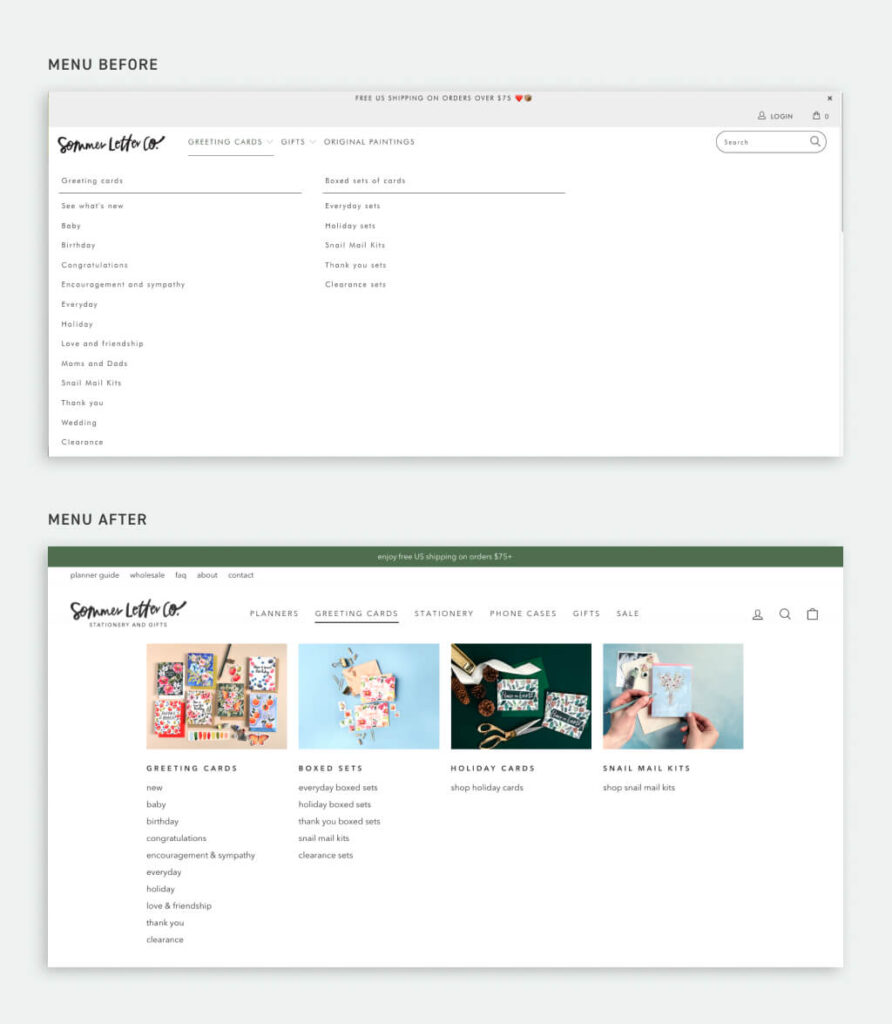
So I like how this is really distinct and separated with this color and it’s divided into nice little sections and we’ve got your email newsletter sign up here, much more front and center, and something obvious people would like to do so, I think that’s probably going to be super helpful for you too. Then I just want to show off this menu because for people that sell a lot of stuff it can be hard to get that organized or even if you sell different stuff and you want to show people a little preview so they know where they want to go. It’s not a mystery in the menu. I really like having these photos here. So if people are just getting to know you and starting to explore, they can figure out where they want to dive in.
Kyle: I think before, I basically had most of my menu under two tabs. It was like you either had cards or gifts. Yeah. It was crammed under those two menus. The way you guys broke it out into more shoppable categories. It just makes more sense from a customer perspective.
Arianne: Yeah, one thing we like to do with navigation is we like people to just be able to glance and understand the main categories, they’re going to be able to see so I really like pulling that out so you can see it here.
Arianne: Another thing I wanted to point out was some changes to the product page. So this is the before, this is how it looked before, and this is pretty straightforward product page. It’s got all the info you need. It has reviews which is really important and great. So this looks pretty good. But then our team came in here and we added just a few things that make a big difference. So you’ve got this nice little low stock thing here now to give people a little urgency around purchasing and then we always love to throw in a little visual that calls out for people what’s special about the product, so we’ve got woman-owned business here and nature-inspired watercolor designs. That’s the sort of thing that’s completely unique to you and you’re not just gonna find it in a Shopify theme ready to pick and choose so it’s nice to do that specialty thing there. And then we’ve got these nice little accordions for the extras that people might be curious about, but it doesn’t have to clutter up what you’re doing. So little touches, but they’re the kinds of things that can make a pretty big difference when people are shopping and we love to see how that works out for your customers.
Arianne: I know it hasn’t been super long since the launch, but I would love to hear more about how you felt about the project and how you’re feeling now. I know it’s hard to make a decision to do this, especially as a business owner, there’s a million things that you can spend your money on, and a million things spend your time on, it’s hard to know what feels important so I’m curious what might have felt like a barrier to working on this project with us at the start.
Kyle: I feel like the biggest barrier for anyone off the bat is just spending the money, just committing to spending the money, because I sell products. So when I buy something, I’m usually then going to profit on that item, whereas with web design work. It’s not a direct correlation of like “I have 5,000 notebooks to sell. OK, I spent the money and now what will the payoff be?” I think mentally I had a little bit of nerves around that but I can say now, having done it, this was such a good decision. We’re walking into the holiday season right now, web traffic is up, sales are up, and I have a much more merchandised store experience on my website so that when people are shopping it is easy for them to find what they want and learn more about it. The planners I have are a little unique, and we have a whole page dedicated to that — education, customer experience. So, yeah, I think I was mostly nervous. I’d never had someone work on my site before, and I was nervous about the investment, but I already feel it was absolutely worth it a hundred times over.
Arianne: That’s awesome. I love to hear that. I think no matter what level of business you’re at or how much money you make, it’s just always hard to choose what to spend money on, even if you have budget, there’s so many different choices. So it’s good to hear that.
Arianne: What stands out for you as a result of working on this project? What feels different right now?
Kyle: I think one of the things that is the biggest for me is a better mobile experience. My mobile traffic is absurd. It’s like 90% or something of my traffic is people on their phones and before the site was really hard to navigate from a mobile perspective. And so I think having the top navigation make more sense. Not only is it beautiful on desktop, but it’s also easier to find what you want and that’s really important for my mobile customer. I’ll be really curious and like five or six months to see how my conversion rate is affected by that, but I’m excited about it. I think it’s way better for people to find what they want.
Arianne: Yeah. That’s let’s see what happens if I shrink this down, and we can get a little bit of that mobile experience. Yeah, we’ve got this menu that makes a lot more sense. It looks like it’s easy to open things up and take a look and then scrolling through it’s easy to get a feel for everything that’s available like in a nice size that works on mobile. You make a good point because I feel like sometimes people really focus on how their site looks on desktop because that’s how they tend to look at it. And then maybe they’ve never even spent much time on mobile figuring out what their site looks like or how it works or so anybody who maybe isn’t ready to do a whole redesign, I’d say it’s worthwhile taking a look at your site on mobile right now and making sure it all works the way that you think it does if that’s not something you do often.
Kyle: Yeah previously, I would have customers message me and say “I think something’s broken on your website”, but it was just the way I had it set up. It didn’t load beautifully on mobile, and they thought it was a glitch, but I was like, nope. That’s how I have it set up. That is just life right now.
Arianne: That’s funny. Yeah, definitely, if customers are getting on your case about how the site works, that’s a good indication it might be time to make a change.
Arianne: So is there a specific feature that stood out for you as a great benefit to having this new site, something we could take a peek at?
Kyle: Yeah. I love that. You guys added the bundle deals for my greeting cards. Like if you go to a product page of greeting card now, every single card page has a mix-and-match visual indicator that you can buy any five cards for 22 dollars. That’s something I’ve wanted for a long time. It does really well for me at shows in person to offer this sort of mix and match deal, and I’ve never been able to translate that online. And so I already have seen more people buying cards and the people who buy cards, buying more cards if that makes sense. Yeah, so I’m excited to see that one over the course of like six months, how that impacts my analytics and everything but that was a little custom tweak custom feature that I really wanted and I was thrilled that you guys were able to do that on such a small project, you know, it wasn’t a custom site. It was Shopify website in a week. And so you still were able to pull that off for me which I really wanted.
Arianne: I know, I love that. I feel like we have a lot of little tricks up our sleeve now after all the years working on things. So sometimes it is easy to just pop a little something in, and it’s the kind of thing where you can be tearing your hair out if you’re trying to do it yourself because the theme is not meant to do that or you can kind of hack it to do it, but then it doesn’t look quite right, or it doesn’t… I really like how this stands out like it’s subtle, but it’s also obvious. It’s not in people’s face, but they’re also not going to miss it because it has this nice little border and same thing with these stock notifications. It’s just a nice little call out. And it fits with your brand and looks gorgeous.
Arianne: Are there any other benefits that you can think of about the site?
Kyle: Yeah, another little custom thing that I kind of like tailored the website in a week package to fit my needs was the planner guide page. Because I have this planner set up that’s a little unique — it’s in the top navigation. I didn’t want to blog, and I still don’t want to blog, I just don’t have the time, but this is a static page that has similar educational-type content that you would find in a blog, it’s a place where I can tell people more about my planners without having the world’s biggest product page and an educational resource for them. That still allows them to learn without me having a permanent blog on my website.
Arianne: Yeah, that’s great. And this kind of thing is really good for SEO too. Even if you’re not blogging, just having these informational pages on the site with all these like good keywords and stuff. This page might start showing up pretty highly in Google and be the entry point to your site for a lot of people, and the nice thing about that is we have all these links to go get to the planner. So you’ll see there’s call to actions all through here, even when you’re in the informational section, it’s easy to go find a planner. So that’s awesome.
Arianne: Is there anything else that you wanted to call out before we move on?
Kyle: I think we can move on. Those are some of my favorite features.
Arianne: Yeah, I love them, too and it’s just so nice working with somebody who has this beautiful photography. It almost makes our work seem, I mean, I just know it’s gonna be more effective, but everything just looks better and is so polished and put together. So I love that you had all these great resources for us.
Arianne: My big question is would you recommend our Shopify website in a week to another business like yours, and if so, I’d love to hear about why.
Kyle: Yes, a hundred percent. Yes, so I took notes on this because I wanted to make sure that I could encapsulate the way I feel about it, but I feel like hiring you guys for Shopify website in a week was like having a little team of experts instead of just hiring either myself, who’s kind of guessing in googling and trying to cobble something together, but it was like having a dedicated designer, having a dedicated manager, having the web developer who actually could put that little custom coded tweak here and there throughout like those little things that I just am not skilled enough to do, and then it wasn’t like I hired a designer and still needed all this other help. It was like I had a little team working for me and I just think I don’t know anyone else who is so curated in that way. I felt like I had a bunch of experts and not just one expert working with me.
Arianne: I’m so glad you felt that way on a quick project because it’s even more so with a custom project or if we put you on retainer too, we can bring in the copywriter or we can do photography. We have people doing email marketing. So, you know, trying to hire a person as a small business, a yearly salary for any of those people is a lot. So for people to get all of them just when you need them for a little bit of things. I feel like that’s a wonderful thing that we can offer, and I love that we have all those resources.
Kyle: Yeah, absolutely. And then I would say to the Shopify website in a week service for me was really achievable because it is less expensive than a custom Shopify website and I didn’t feel like I really needed to throw everything in the trash and start from scratch. I just needed my website to be the same but just better. I just needed to like supercharge the appearance to be more refined, and then functionally, I needed some things that I couldn’t achieve on my own, and so I feel like you guys were able to put all of that into an affordable package that I could actually, you know handle in a small amount of time. I mean I was a little bit shocked. I think we talked in August or September, and you guys were like, yeah, we could be done in a month. I was like “What?! That’s great! Before Christmas I can have this perfect new website before the holidays.” So that was really great timing, and didn’t feel like something else I had to fit on top of my design calendar and my manufacturing calendar and it’s like we can just have a few meetings and one good day of work, and we’ll get through this.
Arianne: Yeah, how much time do you feel it took you to get prepared for the project?
Kyle: Not a ton. I mean I probably did a couple of hours where I took a couple of new photos to make sure we’d have a few more photos of current products. And then I did some little tweaks on the back end with my branding like Christine had recommended a couple of changes with that. So I added the custom patterns I built those, and then it was just being available on slack during the design day. So it was not like the main focus while I was working with you guys. It felt like a side thing not like it took my entire life from me.
Arianne: That’s awesome. And I feel like from our end at least, those design days in slack or over email, are super high energy and lots of motivation, very exciting to see things as they are just appearing right away they’re live on your (secret, hidden part of) your site, but you can still see it and see how it works and all that instant gratification.
Kyle: Totally
Arianne: I know waiting for months to have your site appear can be like at the end, sometimes it’s a little anticlimactic because we’ve been staring at it for so long. It’s like, well it’s new to the customers, but we’ve been looking at this for quite a few weeks now, yeah.
Arianne: Anything else you’d like to add?
Kyle: No, I mean this is my second time working with Aeolidia. I also used their Klaviyo services, and it was great experience. I would do it again.
Arianne: Wonderful. Thank you so much Kyle. I’m so glad you let us peek through the before and after. I know sometimes once you’re on to the new it’s kind of agonizing looking at the old, but yours looked pretty awesome to start with.
Kyle: You’re welcome.
Hire Impactful Shopify Help
Are you looking for a partner that can upgrade your brand and site, then stick around long term to optimize and maintain? Aeolidia is big enough to handle your complexities and small enough to be personally invested in your goals. Let's talk!
Related Posts
Let's take your online shop to the next level
The Shopify websites we design have a reputation for substantial improvements to ecommerce conversion rates and online sales. Let's talk!

