Customizable Products: How to Easily Increase Sales
Here’s a story about a jewelry designer with customizable products who increased her conversion rate by four times and her sales by seven times by making just one change to her website (then capitalizing on it with targeted social media ads)!
Usually, Aeolidia’s design work doesn’t pay off until after we launch the site. But, by working on streamlining customizable products and options, we were able to help a jewelry designer revolutionize her business right away. I’ve been dying to be able to tell you about this!
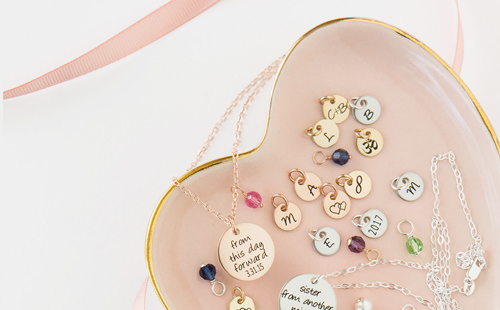
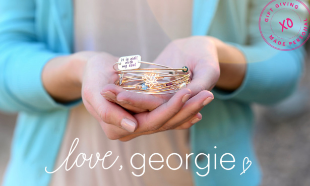
Robyn Klauer, the owner of Love, Georgie, sells customizable jewelry through her Shopify site. As we worked on the design of her product detail pages, we could see there were an overwhelming amount of options for the charms that can be added to her bracelets. Many different icons, colors, and metal choices.
We reviewed the statistics for the existing website and began talking about ways to make the customization process easier. We asked Robyn which charms are selling, as a preliminary question to recommending that Robyn pare her options WAY down.
Robyn took our cue and got exactly what we were driving at:
OMG I’ve had a revelation. I need to offer slightly LESS customization in order to make ordering easier. It hit me like a ton of bricks. Let’s take my “she believed she could so she did” bracelet. The photo shows a year charm and a graduation cap. I’d say a good 75% of the time, people choose those two charms. PEOPLE BUY WHAT I TELL THEM TO BUY. I’ve always said that! And now I’m realizing, people need less choices.
We agreed completely and were glad to find we were on the same page. Numerous studies have been done about how too many choices can be paralyzing for customers. A famous one is about a grocery store giving out samples of jam:
In a California gourmet market, Professor Iyengar and her research assistants set up a booth of samples of Wilkin & Sons jams. Every few hours, they switched from offering a selection of 24 jams to a group of six jams. On average, customers tasted two jams, regardless of the size of the assortment, and each one received a coupon good for $1 off one Wilkin & Sons jam.
Here’s the interesting part. Sixty percent of customers were drawn to the large assortment, while only 40 percent stopped by the small one. But 30 percent of the people who had sampled from the small assortment decided to buy jam, while only 3 percent of those confronted with the two dozen jams purchased a jar.
That study “raised the hypothesis that the presence of choice might be appealing as a theory,” Professor Iyengar said last year, “but in reality, people might find more and more choice to actually be debilitating.”
— Too Many Choices: a Problem That Can Paralyze
It’s much easier to sell a product that doesn’t have lots of choices, and most customers want you to do the work for them. For the few where extreme personalization is important, you can still have that available. I felt that Robyn could have more “ready-made” type jewelry, and then a big noticeable message letting people know that they can personalize it (and taking them to a different page to do so).
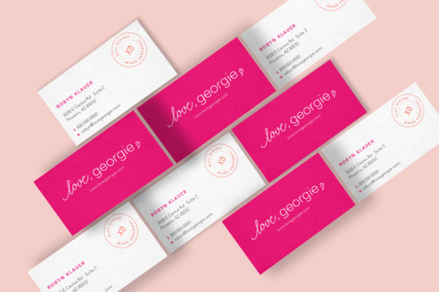
We were designing the Love, Georgie logo at the time of this discussion, and planning for the website. Fast forward three months later, when Robyn came to us with this exciting news:
So this is amazing. I’ve spent no less than 100 hours getting my website options up and ready so that it’s all in line when Jon starts coding. I’ve GREATLY eliminated the amount of options available for each item while making it still feel like a very personalized gift.
After I did that I started to notice an increase in sales. So then I started dumping money into Pinterest ads and Facebook ads (not really knowing what I’m doing but learning). And my sales have skyrocketed. I’ve done $67,000 this month to date on my website (this is my graduation/mother’s day season). Last month I did $7,300 just for perspective. My conversion rate was previously .89% and now it’s around 3.5-4%. I can only imagine what will happen when we launch the new site!
You guys. I had to know more about this, and I’m sure you want to, too. Here’s my interview with Robyn about how exactly this all went down.
Did sales increase immediately as you narrowed the options?
Robyn: Not immediately, as it was off-season and generally low traffic at the time. I also did some testing on different items to see if the number of options offered made a difference. Finding the balance between offering enough options to make it feel personalized, but not so many that it feels overwhelming is the hard part.
For weekly tips like this, subscribe to our newsletter
"*" indicates required fields
I tested pricing along with options. I took one of my most popular items and changed it from offering unlimited charm options (you could choose from birthstones, initials, words, and about 50 symbols) and did two things with different results:
- Before changes: Bracelet with unlimited charm options: average cost per bracelet sold was $52, at a 0.89% conversion rate.
- Options change 1: Bracelet with only two charm options (the ones shown in the example photo): average cost per bracelet sold was $52, at an approximate 4.3% conversion rate.
- Options change 2: Bracelet with 8 charm options: average cost per bracelet sold was $64, with the same 4.3% conversion rate.
So I was able to increase the amount per purchase by offering just the right amount of charms.
I also made it easier to add the product to the cart. In offering unlimited charms, the customer had to let me know which charms in a typed note. When I changed it, I made everything a dropdown menu. I think that by specifically asking, “Do you want to add a birthstone charm?” and they have to pick yes or no, it made the customer stop and think about that specific idea. Prior to doing this, they were overwhelmed by the 80+ total options before so they’d just choose “none” or pick only the two shown as examples in the photo.
Were you doing any other new promotions or marketing at the same time as you adjust the options?
Robyn: I was doing additional marketing. But my marketing efforts became more successful and my cost per acquisition changed drastically. Before my changes, I was seeing just a 0.89% conversion rate on my website. After the changes, I now see a 4.3% conversion rate and we haven’t even launched the new website or branding yet!
My revenue in April and May matched half of my entire annual revenue in 2016. This was of course because of my increase in ad spend. But without the better conversion rate, it wouldn’t have been possible to do.
I slowly increased my ad spend as my conversion rates got better. I ended up being able to spend over 10 times what I was spending before.
Was there anything different about your marketing materials?
Robyn: I did not change my marketing materials at all. The same item photos that I’ve always used were what I advertised. Since my new site and branding haven’t launched yet, I didn’t want to use the new materials in the marketing.
I did use some new charm graphics on my website product detail pages that were created by your designer, Christine, and they helped to visually organize the options better! I’m sure this helped in converting visitors to sales.
Have you gotten any feedback on this change from your customers? What have they told you?
Robyn: I have had them say they googled my website after being in my Etsy shop (which I have no control over changing) to see if it was easier to order. And they were pleased to see it was.
We have also noticed the amount of questions coming in through our website contact form has decreased. Some of the questions that we would get over and over again on a daily basis about how to choose charms and where to write them, etc. we hardly see anymore.
Are the orders keeping up at the new level?
Robyn: Yup! I have had to hire two more people! I imagine it will slow down after Father’s Day, but we are generally higher than we would normally be right now. My jewelry is popular over gift-giving holidays and occasions, so it’s normal to get slower from July-October. But we use that time to prep for Christmas.
Do you sell customizable products?
Wow! I’m sure you’re reeling right now. This is an incredible new start for a business that was relying on Etsy for sales. It seems like giving people more choices will lead to more sales, but the opposite was true in this case.
Products that customers can personalize are a big draw, but can also be hard to sell. Helping people streamline their customization offerings on Shopify is one of our areas of deep expertise, and we would love to help you make sense of your products.
Pair our strategy for your unique business with a design that will draw people in, and see where that takes you! Please get in touch today about what we’d recommend for your business.
Hire Impactful Shopify Help
Are you looking for a partner that can upgrade your brand and site, then stick around long term to optimize and maintain? Aeolidia is big enough to handle your complexities and small enough to be personally invested in your goals. Let's talk!
Related Posts
Let's take your online shop to the next level
The Shopify websites we design have a reputation for substantial improvements to ecommerce conversion rates and online sales. Let's talk!

