Susan Merkle came to us with a vision for her business and a completely clean slate. A designer of fine furnishings and goods made from cowhides and artisan leather, she described her pieces as trophies of nature for the high-end clientele that lives in the luxury mountain homes of the west. She needed a name and logo—a visual identity that would appeal to an elevated taste level while keeping the rustic vibe of western landscapes. In short, she was starting from scratch. Just like the spirit behind her brand, Susan was adventurous and fearless.
“One thing I have heard over and over from makers is that they wished that they had launched with professional help from the beginning, to eliminate costly do-overs,” she told us. “So I have decided to heed this wisdom and invest in professional help from day one. I have my ideas, but I’m not married to any of them and am open to professional advice.”
During our business name brainstorming, certain themes and images began to emerge. Rawness paired with sophistication, as well as a very strong sense of place guided the process to a name that was completely original but also felt timeless. Lonestead Range evokes the idea of homestead, of the Lonestar state, of independence and a vast expanse of land that stretches to a sunset horizon.
With the name enthusiastically in place, we moved on to the brand’s visual identity next. A lifestyle brand like Lonestead Range needs to very clearly communicate its essence, and so Ann on our team focused on conveying a refined but rustic sensibility. It was important that the design go for the unexpected.
For weekly tips like this, subscribe to our newsletter
"*" indicates required fields
“Lonestead Range needs to have something strong with a little toughness, but also beautifully classic,” Ann explained. “I wanted to create a literal ‘brand’ for Lonestead Range that represents the ranch lifestyle and the incredible artisan quality of the products.”

She began this by choosing typography with a slightly vintage feel and a non-trendy approach, purposely avoiding anything overdone, too dated or too decorative. Considering that the brand’s higher price point would mean that customers would be purchasing to make a statement with their items, it was important for the design to be more chic and exclusive than other labels.
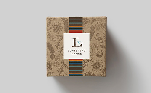
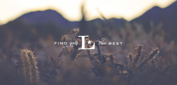
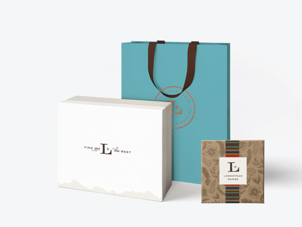
The typeface incorporates modern lines and a bit of rustic industrial. The star, although a simple symbol, is instantly recognized as part of Western American iconography, evoking spurs, state flags, the “big sky” country, etc. It also represents awards for high quality, like 5-star hotels and trophies. Together, they create a simple but strong logo that becomes its own iconic brand mark. It feels more luxe and modern than other brands in the same niche, while still capturing the essence of the lifestyle.
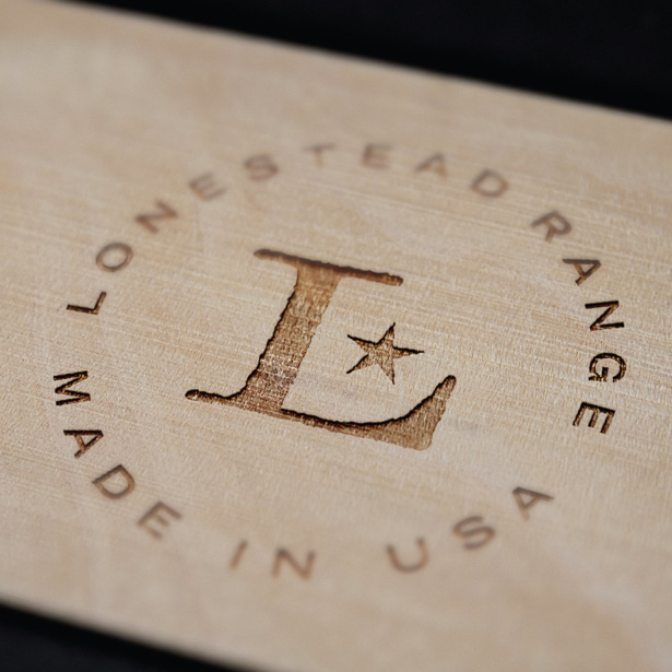
We knew we’d hit the right mark when Susan responded to the initial logo concepts with exclamation points and a heart emoji.
“Oh Ann, Take my breath away! This is such an amazing start, I’m having a hard time imagining it better! I’m not sure there is anything else to say, other than AMAZING! You put in words what is in my head and <3.”
Is it time to consider brand strategy for your own business?
Do you need someone to translate the vision you have for your business into words and design? Check out our branding projects and contact us to get started bringing your brand to life.
Brand Strategy

Building a solid, strategic foundation for your brand. With Ann Parker, our brand and web designer and brand strategist.
Related Posts
Let's take your online shop to the next level
The Shopify websites we design have a reputation for substantial improvements to ecommerce conversion rates and online sales. Let's talk!

