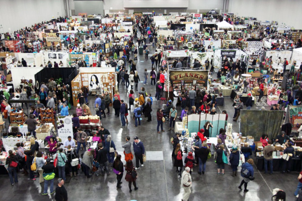
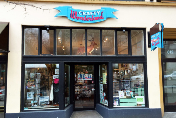
When a retail store grows in unexpected (but amazing) directions, it may be time for a new website. Back when Crafty Wonderland began in 2006, it was a twice-a-year craft fair showcasing gifts and goods by Portland’s finest artisans. It was such a hit, it grew into the largest fair of its kind in the Northwest before expanding into a fabulously successful 10-week pop-up shop that morphed into a permanent brick-and-mortar location.
Phew! Quite a ride, right? As exciting as it was, Crafty Wonderland’s expansion sometimes caused customers to be confused. The retail store and craft fair were two different aspects of the brand, but founders Cathy and Torie were fielding calls and visits from customers who showed up at the shop expecting a craft fair. Or expecting a pop-up shop. Or wanting to shop their beautiful goods online.
For weekly tips like this, subscribe to our newsletter
"*" indicates required fields
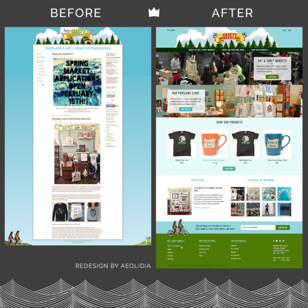
Their existing website wasn’t making things clear, and it was time for a change:
Creating a shoppable website for a retail store that’s also a craft fair
Understandably, Cathy and Torie were ready to simplify and clarify their online presence: “We feel that our current website does not do a great job to distinguish and explain the two facets of the business. We have wanted to add a commerce element to that but are overwhelmed with thinking about how that would add to the confusion!”
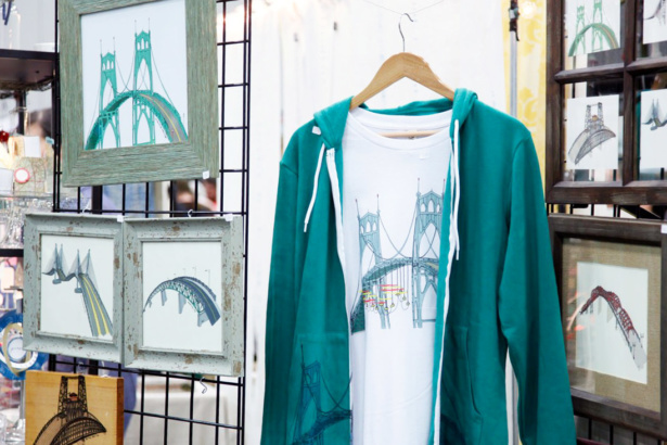

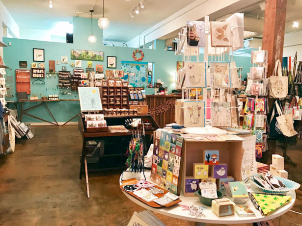
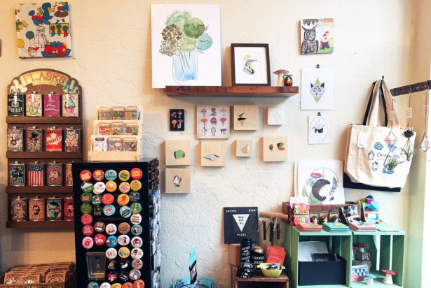
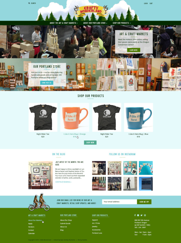
We were now looking at three aspects of Crafty Wonderland’s business: the craft fair events, the brick-and-mortar store, and the online shop. Christine on our team created a design that highlights all these facets in a clean, easy-to-navigate website that won’t overwhelm visitors with too much information. Using a simple navigation bar that immediately differentiates each element visually, the design helps guide customers as they find and discover what they need.
“Your visitor will know right off the bat that Crafty Wonderland has markets, a local store, and an online shop,” Christine explained. “The upcoming market date/time now lives in a notification bar up top—so you can display it when a market is coming up or hide it if you’re not in market season.”
Cue the shopping: using featured items to entice and inform
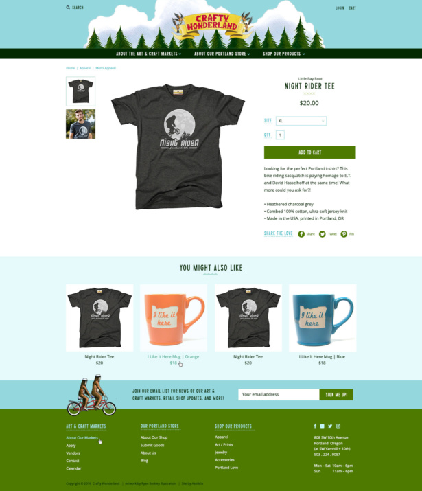
Further down the fold, Christine included four featured products from the online shop to drive home the message that Crafty Wonderland also sells things that customers can buy here and now:
“The awesome thing about this new website is that you can reach more retail shoppers and sell your goods. One great way to make those sales is to showcase what you’re selling right off the bat. I am guessing that most people new to Crafty Wonderland are more likely to be shoppers than sellers, so this new design lets shoppers shop the online store AND attend a market. Win-win!”
The crafty duo’s original hand-drawn illustrations by Ryan Berkley, paired with a bright color palette, clear typography and a few handmade details help keep the design crafty but current, further hinting at the aesthetics of the products they sell.
The new site not only showcases all the different aspects of Crafty Wonderland’s business, it makes it easy to navigate. And you know what they say about craft fairs: easy to navigate means easier to shop. (We may have just made that up, but we hope it’ll stick!)
Visit the brand-new Crafty Wonderland site!
View more projects in our portfolio
Is your business hard to understand online?
The team at Aeolidia has a knack for untangling even the knottiest business branches so that they make perfect sense to the perfect customer! Our schedule for spring is filling rapidly, and I urge you to get in touch today so your website can be a lean mean selling machine before the end of the year.
A Newsletter That Goes Beyond Shopify 101
It’s easy to find beginner info about ecommerce online. If you’re past that? Subscribe to our newsletter for advanced strategies and need-to-know info for established shops. You'll get:
- Weekly tips to help you market and sell your products
- Updates when there is news that may impact your site
- Round ups of interesting links and info for brands
- Invites to our live trainings and webinars
- Instant access to our past emails
"*" indicates required fields
Related Posts
Let's take your online shop to the next level
The Shopify websites we design have a reputation for substantial improvements to ecommerce conversion rates and online sales. Let's talk!

