How to Style Product Photos to Create Customer Desire
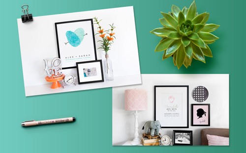
Amie Jones of Flutterbye Prints started out selling note cards geared toward teachers and branched out with customizable artwork created using fingerprints. We recently designed a custom Shopify website for her, and the first part of the project was her product photography. We’re pulling back the curtain to share how to style product photos.
Styled product photos, or “hero shots” are often shown on the homepage of a website. Product photography can make or break a website. Having clear, bright, on-brand photos is key to the success of a website project.
We interviewed Jen, our photographer, about her process during the Flutterbye project. We also asked her for some tips for those of you who are working on product photography as a DIY project!
Interview with Jen Lacey, Aeolidia photographer:
Making plans for product photography
With the Flutterybye photos, we were trying to capture a real-life story, something fresh and bright. Something I love that Amie did was that she sent me options. Not only did she send that darling silhouette print that I photographed but she sent it in three different colors! That really helped and allowed me to style the shot with complimentary props.
Amie and I talked over the phone to discuss what products she would be sending my way to photograph. She knew for certain she wanted to photograph a thumbprint image, which is her best seller and wanted to have the prints match her brand. From there we discussed if the image would be shot from overhead or if I would put a set together and photograph from the front.
We decided to photograph from the front and style the image to look like newlyweds live there; something really clean, simple, and inviting.
For the second hero shot Amie knew she wanted to incorporate some of the kids’ products she creates. She sent me a few options that I got to pick and choose from. Planning for this image was a little looser. Amie wanted the image to be staged as if it was in a child’s room. From there I got to dream and create. Again, this second image would be clean and inviting.
Deciding how to style product photography
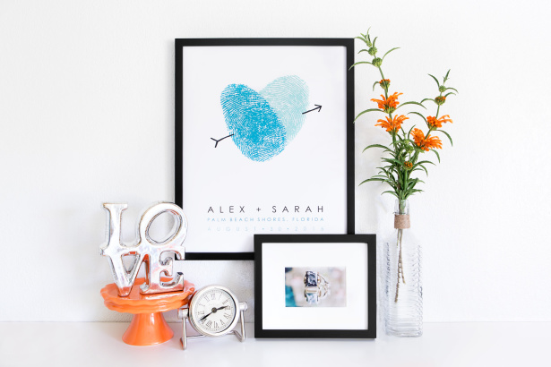
To style these images I first looked at the design that Aeolidia had put together for Amie’s business. Seeing the colors of everything and also looking at the old Flutterbye website and products I was able to decide on the color scheme for the thumbprint image. I had some ideas and I just went prop shopping and browsed a few different stores to find just the right props to fill a shelf.
I kept imagining it was a shelf that would be in an entryway holding a few things from a couple’s wedding day. So I picked up a cake stand, the LOVE decor piece, a framed picture of wedding rings, and I found this amazing drought tolerant plant with vibrant orange blooms. Everything just worked together so nicely.
I did have extra props that I thought would work but ended up editing them out while styling because they weren’t sophisticated; they just made the set look too clunky.
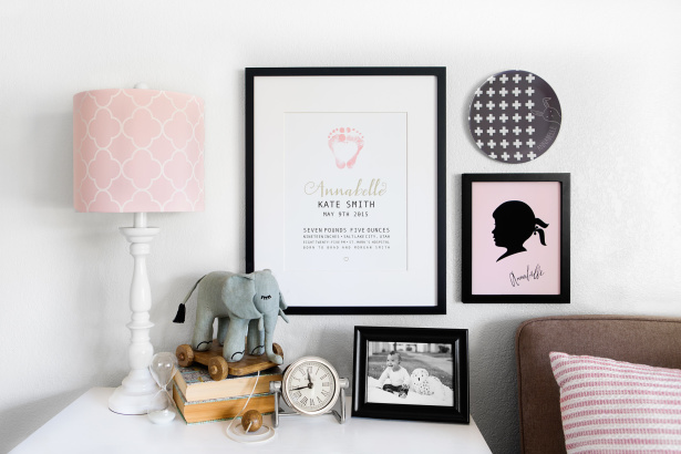
In regards to the little girl’s room, I looked around at what was in my little girl’s room and I pulled from there to create the space. I did pick up a few props that would tie into the color scheme of the posters and plates that Amie sent. And through trial and error, the image came together. I did have something else in mind at first and I remember trying to shoot it and having that unsettled feeling knowing that it wasn’t right. It took a lot of rearranging, of furniture and props to get the final image which I love!
What elements make people interested in buying a product?
When shopping for lifestyle products I’m always looking for some specific things. I’m searching for things to bring height, interesting shapes, colors that are either in the branding or that complement the brand, and small items that can fill empty spaces when needed, and I always consider the textures and surfaces.
So, with Flutterbye, I knew that for the fingerprint image, we would be pulling the colors straight from the brand. I knew I wanted a plant, a picture in a frame that told of a wedding, and some different props for the tabletop, and I wanted that tabletop element to be reflective and interesting.
Shopping at a garden center I was able to find that really cool flower in orange. It was something visually interesting and the perfect color for Flutterbye! I used an image I took a few years ago (back when I photographed weddings) of wedding rings because it had the blues that I wanted, and lastly, I included the LOVE piece because I knew it would reflect the colors around it and was visually interesting.
Tips for sourcing product photography props
When sourcing props, I would start by checking out what you have. Look at the colors of your brand, what is the feel of it? Are you trying to sell something playful? Serious? Whimsical? Etc? All of those little things come into play when styling.
From there, after you know your colors and have an image in your head that you want to create, then you just go out and start shopping. I would love to say I do my shopping online but I am a hands-on type of girl. I want to see the colors, the textures, and even the sizing of things because I’m thinking about how it will photograph and what I’m trying to sell.
I tend to frequent stores like Home Goods, Target, Hobby Lobby, or even Whole Foods. Many times I’m just looking for something small that would help tell a story and these places tend to have those little things. Although, I’m always keeping an eye out for cool things to have on hand in my prop closet (like an old rotary telephone). I’ve found some awesome props at silent auctions, thrift stores, and mom & pop shops. I try to have fun, to think a little outside the box, and I use my imagination throughout the whole process!
How to balance creating a scene with keeping the focus on the product?
Once I have the client’s products in hand my mind starts racing. I am thinking of props that will work with the product but won’t distract from the product.
When shooting, I always try to have my props pointing back to the product that is being sold. In the children’s Flutterbye image, I used black, white, and soft pink. I styled the shot in a way that your eye follows the pink and lingers there. The other elements are just supporting characters, pointing to the lead.
Creating a sense of desire in the viewer
It may seem a bit strange, but I know when I’ve done good work and when I’ve done excellent work. The excellent work I just have this feeling inside of me. I want to keep looking at the image I created even after the job has finished.
When I’m able to create an image where my eye is drawn in, and it follows the lines and elements, creating a visual story just for myself, then I know I’ve been able to create that same emotion for viewers. My hope with that is to stir emotion in viewers, to create a desire and even an unexpected need for them which in turn benefits my client.
What are you particularly proud of in the Flutterbye styled photos?
For the Flutterbye images, I love the vibrancy of the images and the styling that I was able to pull together. One of my favorite elements, and I don’t even think Amie knew this, is the picture that I put of my daughter when she was 6 months old. 🙂 I totally made that image personal! Now I just wish Amie’s poster would have had my daughter’s name and date on there. Just kidding… kind of.
Thank you, Jen! Our client, Amie, said this about her project with Aeolidia,
Working with Aeolidia was a hugely positive experience. I first discovered Aeolidia from finding that a few of the businesses I’ve followed for inspiration had sites developed by Aeolidia. I knew from the beginning that I needed a team that make a site that was pretty, but also very functional. My site needed a lot of custom options because almost every item can be customized. I have a shop on Etsy, and it is very tedious and confusing for customers who are accustomed to entering a name in a box or selecting the options from drop-down menus. I was able to explain what I had in mind and they were able to make it a reality.
This was the largest investment I’ve made in my business so far, but I was very confident in Aeolidia and was excited to get the project started. Aeolidia has a great portfolio, in a range of business, but they are especially attuned to working with small businesses who are looking for a good investment to grow their business and take it to the next level. They were so organized and had such great communication, it was easy to hit the target dates and feel well-understood. Aside from minor tweaks, the site really hit the mark from the very start.
See more projects in our portfolio!
Ready to make a leap for your business?
You’re in the right place if you have a great product and a growing customer base, but feel held back from reaching the next step for your business. By evaluating your goals to create a strong brand identity, stand-out product packaging, and a high-converting ecommerce website, we will knock down what’s holding you back from reaching your potential.
Go ahead and leap! Aeolidia will catch you. Ask about our schedule here.
Hire Impactful Shopify Help
Are you looking for a partner that can upgrade your brand and site, then stick around long term to optimize and maintain? Aeolidia is big enough to handle your complexities and small enough to be personally invested in your goals. Let's talk!
3 thoughts on “How to Style Product Photos to Create Customer Desire”
Leave a Comment
Related Posts
Let's take your online shop to the next level
The Shopify websites we design have a reputation for substantial improvements to ecommerce conversion rates and online sales. Let's talk!







You blog has been very informative, artsy and gracefully display…love it..thank you.
I’m so glad to hear it, Connie!
This is so helpful! Especially the part about looking to “tell a story” with the product you are shooting and how to shop for props. Thank you!