Branding Details for Posie, a Craft Business
Branding a popular craft business
Alicia Paulson is the owner of the popular handcrafted pattern shop, Posie, and the author of the popular Posie Gets Cozy blog. Working with Alicia on the re-brand of her business and redesign of her shop was such a pleasure. Of course, all businesses deserve a solid brand identity, but some businesses really, really deserve one. We’d love to share the process, to inspire other craft businesses!
A little introduction, from Alicia’s website:
These days, I take care of my baby girl, Amelia, and work from my home studio designing crafts, writing self-published patterns, and assembling original kits to help you make some of the things that I’ve designed. I love to take photos and write about stuff at my blog, Posie Gets Cozy. I also love to cook, knit, be in the woods, sit by the pool, fuss with the things in my house, and I am (still) learning to garden.
Looking back over the project and reading all Alicia had to say about Posie as we worked together, her business trajectory reminds me of mine. We have both been in business over a decade, and we have both got along (what felt like) just fine without a proper logo and brand identity. Both businesses are so busy with word of mouth that it didn’t feel like there was an urgent need to pay for professional design work, but once it was done, it felt so right, and it was hard to imagine the days before the beautiful brand.
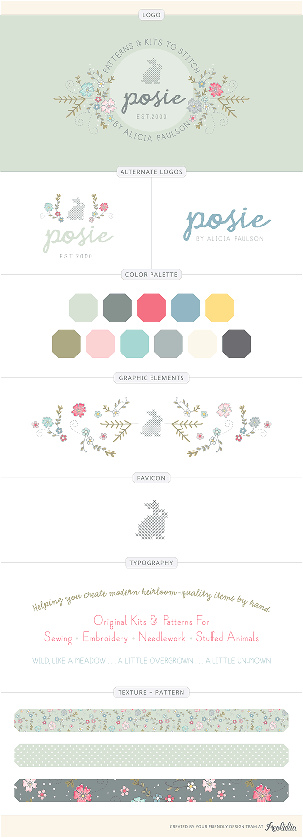
I present to you: Posie! by Alicia Paulson.
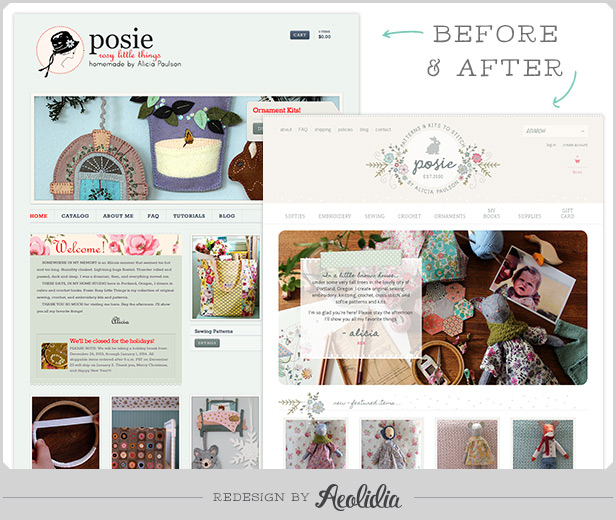
Before and after
Here’s a little peek at what the site looked like before we got in there:
A purposeful logo
With this redesign, Alicia moved away from the somewhat confusing “Rosy Little Things,” allowing “Posie” to stand on its own or be combined with her new, more specific tagline: “Patterns and Kits to Stitch by Alicia Paulson.”
Mariah absorbed all the detail and information Alicia shared with her about Posie and presented her initial ideas. Alicia came back with my favorite “logo reveal” reply ever:
1. Oh.
2. My.
3. GOSH.You nailed it. I burst into tears when I opened the presentation. I didn’t know I had been holding my breath for several weeks. Everything is so beautiful. Thank you, thank you, thank you.
1) I like that it has a defined shape — I’m drawn to it as a container, so to speak, and not just a collection of elements.
2) I like that that shape is a circle. A circle is what I started Posie with, and I suddenly see now how this new logo can and maybe even should inherit a certain spirit of that original logo to connect it to the history of my company.
3) The flower sprays are GORGEOUS. The running-stitch loopy things that splay out are perfect. The DOTS that are sprinkled through are so pretty, and really lighten the feeling, truly making the logo feel fresh and effervescent. I have an idea about the big flowers themselves: What do you think about my redrawing them as actual wild roses — which look really similar to what’s here but would be a bit more rounded, kind of like apple blossoms? I think that would be a nice little nod to the lost “rosy little things,” which a lot of people who know the company will probably remember, and wonder about (for maybe a millisecond, but still).
4) I just love the bunny. Seeing it here in such an “official” way I realize that bunnies in general have kind of become my signature, actually. My daughter’s middle name (well, her second middle name, the one we ourselves got to choose [her birthmother picked her first two names]) is Beatrix. And somehow, since then, bunnies have just sort of filled our life, and been such a source of sweetness and light in it, as she has. And I love that the logo bunny is cross-stitched, because it says “embroidery” and it says “little innocent thing” and it says “simple.” And those are all things I want my brand to say. Not to mention that Maggie Rabbit herself has sold way better than anything else I’ve ever done. So — I really want to keep the bunny!
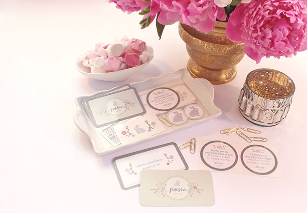
From there, Mariah refined and perfected, worked on a color scheme and associated fonts, and made some sweet little surprises for Alicia to tuck in her packaging. The bunny tattoos have been showing up on Instagram, and I adore them!
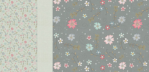
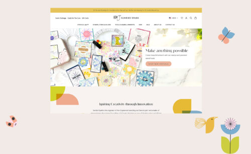
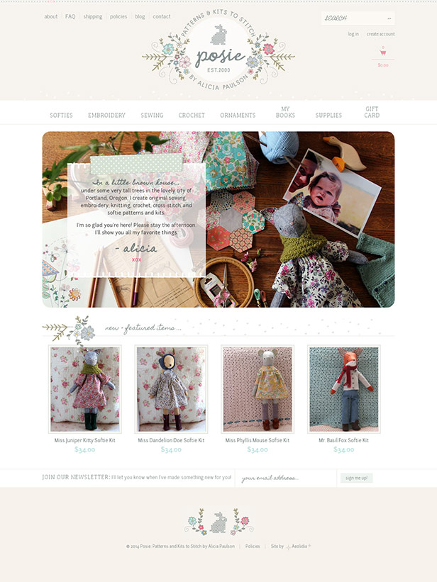
A simple and sweet website
The website is soft and sweet, looks utterly professional and utterly “Posie,” and enhances the sense of wonder, charm, and trust that her customers feel.
More stories about re-branding a business
Aren’t the rebranding stories inspiring? It is so much fun to see what a difference a good brand design makes to the entire presentation of a business. We have many more great stories like this, and if you sign up for our newsletter, I’ll deliver them directly to your inbox.
Brand Strategy
Building a solid, strategic foundation for your brand. With Ann Parker, our brand and web designer and brand strategist.
Related Posts
Let's take your online shop to the next level
The Shopify websites we design have a reputation for substantial improvements to ecommerce conversion rates and online sales. Let's talk!

