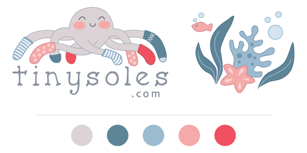
TinySoles is an online shoe store that specializes in children’s shoes and accessories. We had a great time working with them! Here is a peek behind the scenes preparing for a website launch. Our first step was to work on the logo.
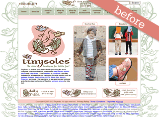
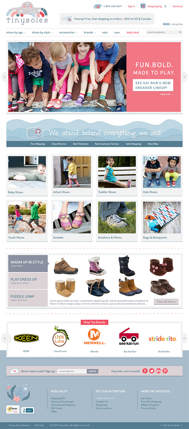
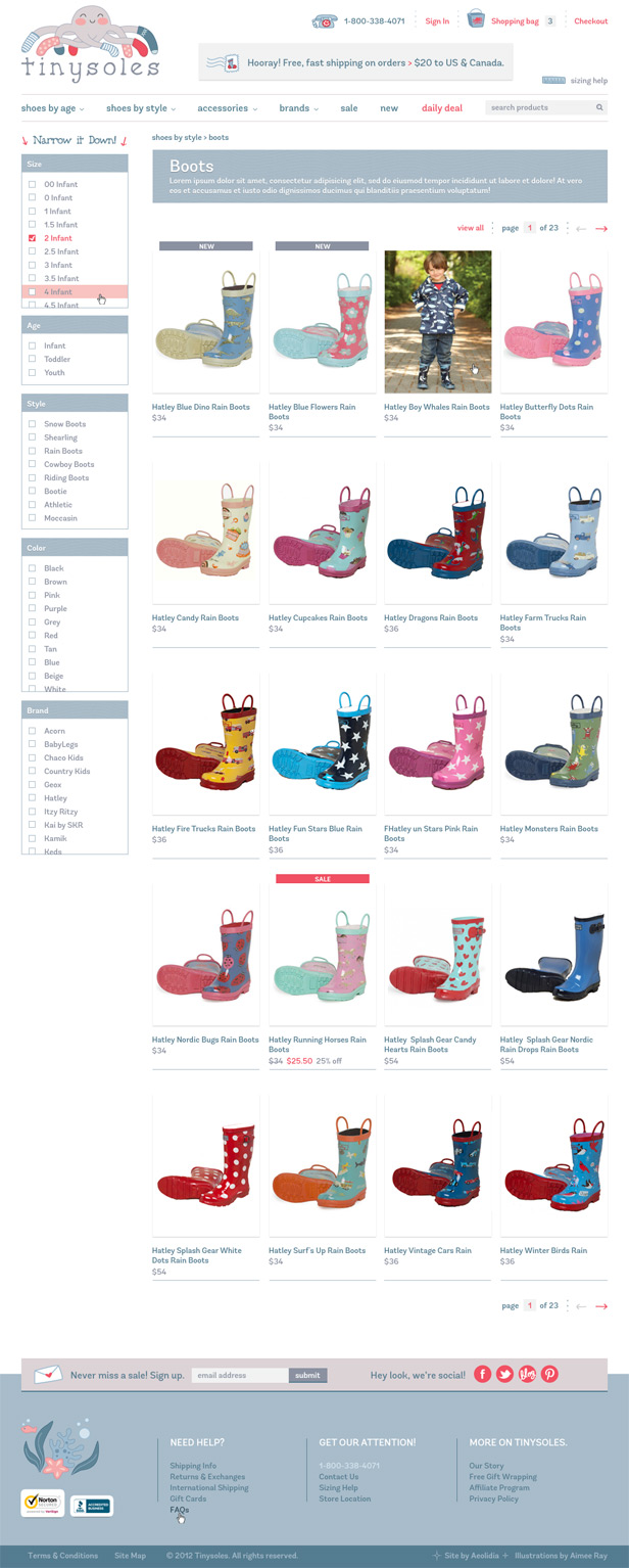
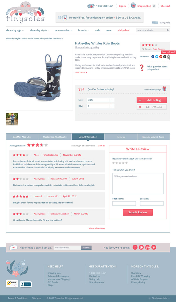
Then, Meg hopped to work on the website design. You can take a peek at the original website design:
- Home page (click to see): cluttered and confusing, with no prioritization to the site map. The logo is very busy as well, and not very memorable.
- Category page (click to see): lots of text on this page, and hard to distinguish what text goes with what item or easily pick out tools to help you shop.
- Item page (click to see): the huge amount of information in the sidebar becomes very apparent on this page, and the “add to cart” button is so wee and tiny.
There is nothing like focusing on what you offer to make your business cohesive and have it appeal to that perfect customer. Chalese of TinySoles understands that, and told us this about her business:
“Our store was built on the philosophy of only carrying shoes that promote natural foot health and development, so we hand select all our products based on quality, style and age/stage appropriate design. We definitely cater to a more narrowed selection of style that is MODERN, URBAN and OUTDOORSY – we steer clear of loafers and classics (we like to call them Grandma Bait!). We offer the expertise, personal service and product knowledge of a boutique store while providing the shopping perks of a big store like huge selection, great prices, free shipping & easy returns.”
Chalese also gives us a great example of how having focused goals results in a successful website. Check out these well-thought-out goals:
“Our ultimate goal is to sell product, but we want to be everyone’s first go-to resource when they’re looking for kids’ shoes & accessories. So we don’t want someone walking away thinking ‘I just got a great deal on a pair of shoes from some random online store,’ we want our customers to love their entire shopping experience with us so they want to come back and tell all of their friends about us.
We want our customers to know we have the best selection of kids’ shoes and accessories, that we offer free, fast shipping on all orders >$20 to US & Canada, that we’re here to help them find the perfect shoes for their kids with our real customer service, expert product knowledge and sizing help, and that we stand behind everything we sell. We also want our site to be really easy to navigate and find what you’re looking for.”
Project Testimonial
We’ve received a ton of compliments on the new site. Everybody seems to love the look and layout and say that it’s much easier to navigate and find what you are looking for – so yay! We’re very happy with the end product and feel like our site finally reflects our company and delivers on the smile factor we were looking for. We’re expanding into apparel which is exciting and the new logo and site design have allowed us to do that seamlessly.
-Chalese Smartt, TinySoles
How Does It Look?
What do you think? Does this now look like a shop you would not only trust with your credit card, but that you’d remember when you saw it again, and would recommend to a friend?
Is your branding communicating the message you want it to? Is your site clear and easy to understand? If not, you should get in touch with us!
A Newsletter That Goes Beyond Shopify 101
It’s easy to find beginner info about ecommerce online. If you’re past that? Subscribe to our newsletter for advanced strategies and need-to-know info for established shops. You'll get:
- Weekly tips to help you market and sell your products
- Updates when there is news that may impact your site
- Round ups of interesting links and info for brands
- Invites to our live trainings and webinars
- Instant access to our past emails
"*" indicates required fields
Related Posts
Let's take your online shop to the next level
The Shopify websites we design have a reputation for substantial improvements to ecommerce conversion rates and online sales. Let's talk!

