Bold! Fresh! Fun! Tammie Bennett Case Study
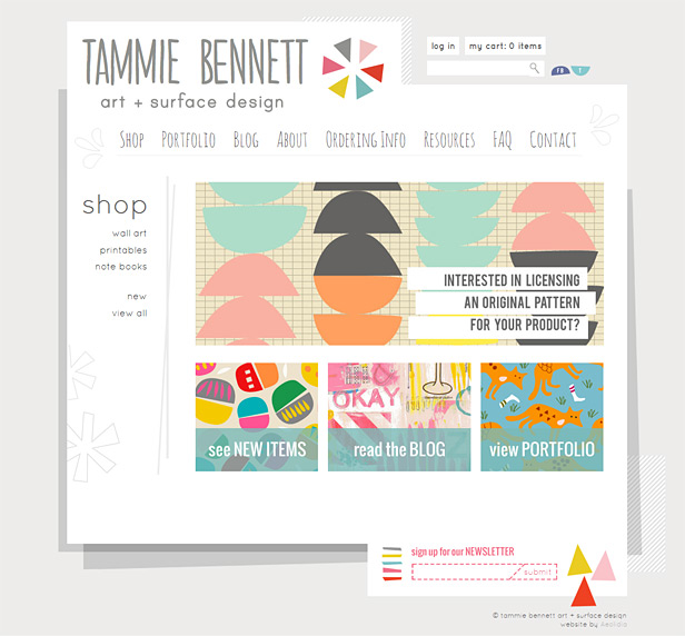
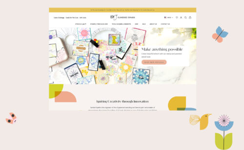
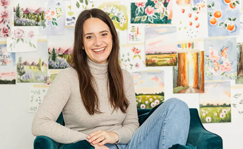
This is the third website we’ve worked on for Tammie Bennett (first a shop selling her handmade goods, then a site for her Bennett Running events), and now she’s back with her art and surface design – who knew she was so talented? She’s always been fun to work with, and this site was no exception – her illustrations were fun to work into the site design.
Tammie created her own logo and Lauren worked on the web design, then Shoshanna brought it all to life in Shopify and WordPress.
Lauren said about the design:
I have been having a field day working on it and was having a hard time bringing it to a finishing point. The result is something that I am super excited to show you! What I finally settled on uses relatively few of awesome illustrated options you sent… but keep in mind that there is plenty of space to work this great material into other pages on the site. I don’t think they all should be present on the home page, as they compete too much with the brilliant colors in the content images of your work. I also had to be careful not to use too many elements in order to preserve some contrast, letting the graphic bits create a few interesting pops, rather than squeeze them in at every opportunity. I was noticing that my early attempts were producing a concept that was at the same graphic “volume” overall. So, instead of using all the elements, I scaled back and approached complementing the wonderful “dancing” feeling of your artwork by way of the body of the site itself. You’ll see a more sculptural, alternative shape rather than a typical bounding box. In this way, the site design supports your fun, geometric style without competing/distracting with color.
Here are some of the keywords and ideas I thought about, while keeping your target markets in mind:
fun, bold, #altsummit, handwritten text, youthful (but not childish), has movement/dances, optimistic and fresh, upbeat, bright, bold, happy
The revision process was fast and fun on this one, and we all agreed that Lauren nailed it. Tammie even reported that her husband said, “she totally got you!” after viewing the design.
Tammie says:
“the awesome folks at aeolidia were super easy and fun to work with. they patiently answered my tons and tons of questions. i gave them a vision and they fulfilled it even better than i thought they could. they were super organized and i always knew what step of the process we were on. i’ve worked with them on three websites now and will recommend them to everyone.”
View more website design projects in our portfolio.
A Newsletter That Goes Beyond Shopify 101
It’s easy to find beginner info about ecommerce online. If you’re past that? Subscribe to our newsletter for advanced strategies and need-to-know info for established shops. You'll get:
- Weekly tips to help you market and sell your products
- Updates when there is news that may impact your site
- Round ups of interesting links and info for brands
- Invites to our live trainings and webinars
- Instant access to our past emails
"*" indicates required fields
2 thoughts on “Bold! Fresh! Fun! Tammie Bennett Case Study”
Leave a Comment
Related Posts
Let's take your online shop to the next level
The Shopify websites we design have a reputation for substantial improvements to ecommerce conversion rates and online sales. Let's talk!




Hi Arianne,
Tammie’s new site looks great! I love seeing all the unique and creative stores that people create with Shopify. Keep up the great work!
Thanks, Mark! We’ve been very happy working with Shopify.