Kyoko Nakayoshi, owner of Cotton & Cloud, and one of our long-time clients, recently came back to us for re-branding and a redesign of her site. I wanted to show you the process of how we got from Kyoko’s original ideas to her final logo.
Kyoko is a knitwear designer for hand knitters, and her aim is to create knitwear that is stylish for people to make and wear (or give to their loved ones). Her designs often have modern shapes and silhouettes and she writes patterns in a way that hand-knitters can follow logically.
Meg and Brad were the design team for the new Cotton & Cloud logo and site, and their instructions were to create something clean and welcoming using rustic color shades (NO pastel and NO bubble gum shades!). Kyoko wanted a graphic that would stand alone without the text and still be recognizable. She suggested knitting needles and possibly a cat or ball of wool for the graphic.
Meg and Brad got to work and came back with this first round of concepts:
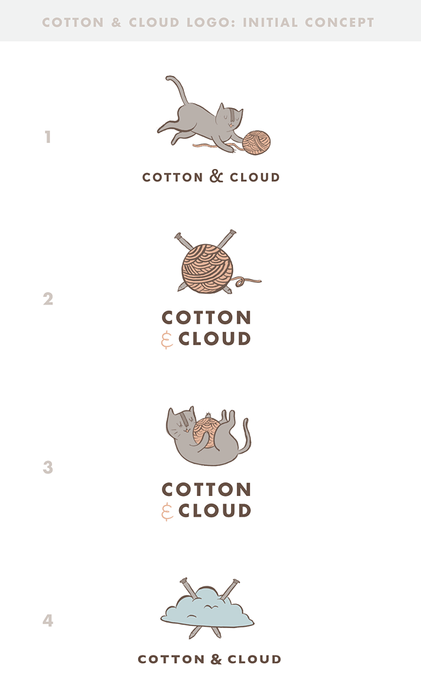
We wanted to create some options that fit your target demographic and are happy-go-lucky. We definitely took your advice to create an illustrated element that is separate from the text “cotton & cloud”. We wanted to keep the illustration fairly simple while still giving it the uniqueness it needs to make your brand its own. We also wanted it to look clean and uniform with a touch of whimsy via the illustration.
Kyoko had a hard time choosing! She said all the choices put a smile on her face, but she loved #4, the cloud idea, and thought it would help people to remember her business name as well. She wanted to try a more feminine or maybe a serif font and she wanted the colors to be a little stronger or darker, and keep the look rustic.
Meg and Brad came back with this round of revisions:
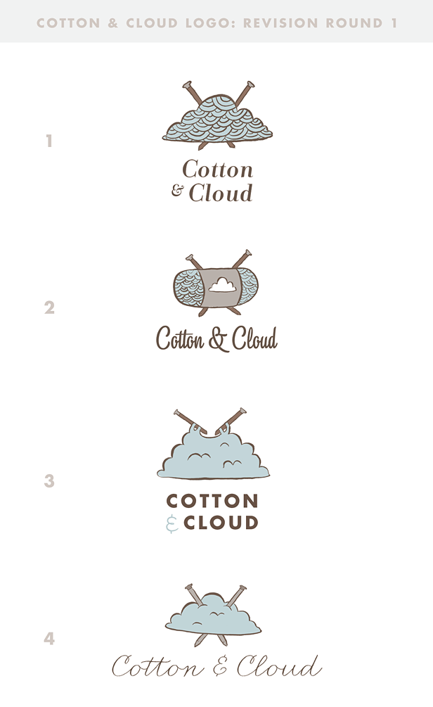
With this feedback:
I’ve included some different font options that are fairly diverse. From slightly whimsical yet easy to read (option 1) to feminine and airy (option 4). Please feel free to let me know which font choices you like and which illustrations you like. We can certainly mix and match!
Our personal favorites are option 1 & 3. We love how easy to read they are. The icons are also very clear and easy to understand, especially when left alone or used as a square avatar.
Kyoko still loved the original cloud, and seeing these alternate ideas cemented the chosen cloud as “the one” for her! All that was left now was to refine, settle on text, and adjust the knitting needles a bit. Final revision!
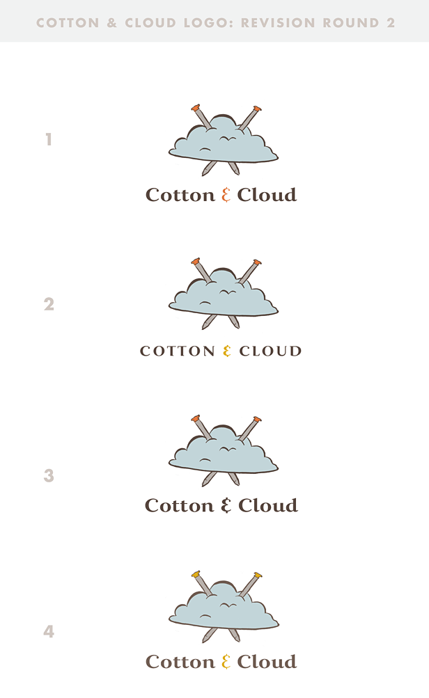
Meg said:
I’ve used the same font in each option. The first 3 have a darker outline with orange tips. #4 has the original lighter outline with yellow tips. Let me know your thoughts! We really like #1 & #4. I think the extra color adds a lot of personality!
#1 from this round was the winner! Kyoko was thrilled, and sent us this sweet note after seeing these concepts:
Hi Meg!
Thank you so much for the revision round 2. You nailed it 😀
I absolutely LOVE #1. It’s beautiful and I am just so grateful – you don’t know how excited I am!It’s warm, happy, relaxed, stylish, creative, unique and fun. Perfect!
OK, so let’s decide on #1!
Thank you so much for such a wonderful creation. “big hugs*!!
Kyoko
x
What do you think? Do you love the new Cotton & Cloud logo? Would you have chosen differently at any step of the process? I always see these initial ideas, and wonder what we would have ended up with if a different path had been chosen, but it’s hard for me to see anything but this mild little cloud as the face of Cotton & Cloud now!
A Newsletter That Goes Beyond Shopify 101
It’s easy to find beginner info about ecommerce online. If you’re past that? Subscribe to our newsletter for advanced strategies and need-to-know info for established shops. You'll get:
- Weekly tips to help you market and sell your products
- Updates when there is news that may impact your site
- Round ups of interesting links and info for brands
- Invites to our live trainings and webinars
- Instant access to our past emails
"*" indicates required fields
2 thoughts on “A Soft Little Logo For a Knitting Shop | Cotton & Cloud”
Leave a Comment
Related Posts
Let's take your online shop to the next level
The Shopify websites we design have a reputation for substantial improvements to ecommerce conversion rates and online sales. Let's talk!





I love #3 from revision 1, because i think that represent the name of the brand <3 really good job!
Yes, the cloud that is actually being knitted! I like that one, too, though if you don’t know what you’re supposed to be seeing, it doesn’t look as “cloudy” as the one we ended up with.