We recently had the pleasure of redesigning the O-Wool site, and I just love Jocelyn’s story:
O-Wool is a small company with the goal of providing knitters and crafters with a yarn that is environmentally responsible, affordable, and made locally in Philadelphia and the USA.
O-Wool’s skeins are wound by a gentleman in Philadelphia who has been working in the textile mills since his teens. It is a joy to watch him work – stopping and starting the skeining machines, snipping and tying off the skeins with the speed of someone who’s been doing it their whole life. He works in an old mill in the Kensington neighborhood of Philadelphia. In 1928, one third of Philadelphia’s 850 textile companies resided in Kensington, and it was considered the heart of manufacturing in the city. As textile manufacturing became cheaper abroad, Philadelphia could not compete. There are likely less than 50 textile companies in the whole city, and Kensington’s booming industry has given way to drug dealing and violence. I am happy that O-Wool can play a small part in supporting this last vestige of Kensington’s history.
O-wool’s original website felt busy and crowded, even on pages without much information. Among the problems we aimed to solve:
- Background pattern was too strong, and drew the eye to itself, uncomfortably.
- No visual hierarchy to the text. All the wording, from the logo, to the tagline, to the links was equally large and important-looking, so it was hard to know where to look first.
- No product photography on the home page to get the customer excited about what O-Wool does.
- Too many clicks and confusion to get to what you were looking for.
Meg and Brad first worked on a fresh new logo (which could easily be its own blog post – so much loveliness going on there!). You can see the final branding we ended up with below – from a dumpy, grandmotherly look to something modern, pretty, and inviting. What a difference removing visual clutter can make!

Then it was time to create a website that would really work for O-Wool. Jocelyn requested:
When visitors come to the home page I want them to get the sense that the company is organized and professional but is small and personal and interested in the hand-made. I’d like to feature beautiful photography on the home page, backed up by a warm feeling from the overall design (not TOO clean/modern/cold). My goal for when a visitor finds my site is to make it feel like it’s a place with a personality that they not only want to purchase yarn and knitting patterns from, but want to come back to.
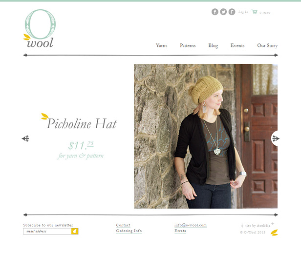
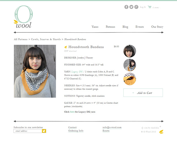
You can see the new home page at the top of this post, and the new product detail page below. Brad presented the new look with this information:
We have to say that you have some amazing product photography! We wanted to create an atmosphere where these photos could be highlighted. Keeping the extraneous design elements a bit more minimal, we can showcase the products while easily allowing the user to navigate your site.
I asked Jocelyn how the new site was helping her, and she said,
It was worth the investment because I have a seamlessly functioning website that looks beautiful. It saves me SO MUCH TIME compared to building a site myself, and updating the (poorly constructed) site I built myself. For me, it’s worth the peace of mind that everything looks great and is working.
The site looks so professional that sometimes it’s actually been a hindrance in my industry – people think my company is bigger than it is, and they value small, family businesses and overlook me. I have to reiterate that my business is JUST ME to many people. I have to say, though, I’d rather have that problem than have a site that looks home made.
We are all so pleased with how this site turned out. The logo and design make me feel happy and peaceful, and I find myself checking in on it all the time with a smile! What do you think? Would you have been able to maintain interest in shopping on their original site, or would the clutter have turned you away?
Could you use some help removing visual clutter from your website? Post a link to it in the comments for some suggestions from me.
A Newsletter That Goes Beyond Shopify 101
It’s easy to find beginner info about ecommerce online. If you’re past that? Subscribe to our newsletter for advanced strategies and need-to-know info for established shops. You'll get:
- Weekly tips to help you market and sell your products
- Updates when there is news that may impact your site
- Round ups of interesting links and info for brands
- Invites to our live trainings and webinars
- Instant access to our past emails
"*" indicates required fields
6 thoughts on “Removing Visual Clutter | O-Wool”
Leave a Comment
Related Posts
Let's take your online shop to the next level
The Shopify websites we design have a reputation for substantial improvements to ecommerce conversion rates and online sales. Let's talk!




What a refreshing redesign! It’s great that this client has the “problem” of appearing too big time. That said, I think the site does read as boutique and personal.
One of the obstacles between my website and a thorough decluttering is that I’m afraid of trying a new WordPress theme for fear of losing some look or functionality that I inexpertly put together in the current one (Twenty Ten!). DIYing can be great, but it can also be crippling when you don’t trust the architecture you put in place.
Now I feel like shopping for yarn, maybe a nice bulky-weight kind.
Thanks, Katie! For redesigning your own site, you can take the pressure off by duplicating it and then working on it behind the scenes, while leaving your existing website intact. That way, if anything goes wrong, your current site is still humming along happily.
One thing that stands out to me about your current site is that you’re telling people how to use your site (“click on the services tab to begin”), which tells me that you’re not confident that they’ll know what to do on their own. Some visual hierarchy could really help your visitors know where to start and how to use the site.
That’s very astute feedback. The call-out to the services page is absolutely there to compensate for the unintuitive layout. And I’m now more confident about changing that layout, since it sounds like there’s a way to make thoroughgoing design updates without endangering what’s already working. Thank you so much!
I would love to get some feedback as I am trying to streamline and clean up my site http://www.infiniteglassworks.com. I want to come across as bright, modern and contemporary. I have a sneaking suspicion I should be using more text but I am sort of on the fence about it. Any suggestions? Thanks so much!
Hi Kate,
I’m interested to hear more about this suspicion you’re mentioning about text. I don’t think you necessarily need more text but I’m interested to hear if there’s a particular problem you’d be trying to solve by adding some.
My quick thoughts about your site from a few-second skim are:
(1) Your theme is reading a little too “businessy” or even “corporate” to me, which I think it actually distracting me from your lovely work. I think it’s something about the stye of the divider lines and the all the grays.
(2) Sometimes black and dark gray can be a nice contrast to bright photos but especially around your slider it’s actually making those images seem boxed in and crunched to me. I’m also wanting to see more/ larger/ brighter/ in-context (farther back, in a room) photos of individual pieces.
As far as streamlining content goes, I definitely am not clear at first glance where to go on the site for specific information. E.g. are the lighting pieces in the Lighting section available for purchase (via the purchase menu item?) or are they just examples of custom work? Same question for blown glass – is that a set of examples, and really the stuff you have available is what you’re linking to in the online store link on that page and via the Purchase link?
I think it would be helpful to focus on the actions you want users to take and then build from there. For example, if I’m coming to your site interested in blown glass, my first thought is going to be “what can I get here and where?” so you should strive to answer that right off the bat. It could be as simple as removing the “custom design” and “purchase” items from the menu, and moving those to the top of the lighting and blown glass pages.
I’m starting to ramble here, but hopefully this gives you a starting point!
Zoe
(Aeolidia developer)
Thank you SO much for your reply, it is much appreciated! I have read a lot about text containing keywords on my home page being very important, and wasn’t sure if I had enough text on my homepage or if it needed to be more extensive.
Your comments and advice are really helpful, I had a feeling that my site was sort of confusing (what are examples, what are for sale, etc) and I am thinking of switching my site to an e-commerce site so your suggestions to focus on actions could not have come at a better time.
As for the dark grey colour, frankly I see exactly what you are talking about. It’s a very formal colour. After reading your comments I think I will implement something with a lighter background and perhaps less ‘structure’.
Again, I cannot thank you enough for your insights into my website, sometimes all I need is a fresh set of impartial eyes to give me an honest opinion. Thanks so much 🙂
Kate