A Logo With a Plush Mascot | Tinysoles
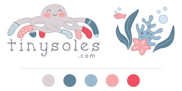
Chalese from Tinysoles came to us looking for a new logo and a fresh design for their website. We’re still hard at work on the web design, but I wanted to show you the logo, because it’s making us all smile, and I think you’ll get a kick out of the special bonus Aimee included for them!
Among other great info, Chalese told us this about the shop and what would work well for the logo:
We are an online shoe store that specializes in baby & kids’ shoes and accessories. Our store was built on the philosophy of only carrying shoes that promote natural foot health and development, so we hand select all our products based on quality, style and age/stage appropriate design. We definitely cater to a more narrowed selection of style that is MODERN, URBAN and OUTDOORSY – we steer clear of loafers and classics (we like to call them Grandma Bait!). We offer the expertise, personal service and product knowledge of a boutique store while providing the shopping perks of a big store like huge selection, great prices, free shipping & easy returns.
We want a logo that is modern, clean & fun but still has that perfect balance of unique character in it. We like the look of a hand drawn font that can capture those qualities – maybe even giving it a slight kid feel – but we want a text that is also easily readable. We have tossed around the idea of using 2 colors (or 2 different hues within a color) to distinguish the tiny from the soles as a possibility. We want a logo that makes us smile because it’s fun.
Of course Aimee, their logo designer, was able to accomplish the “makes us smile” aspect of this! Aimee is the master of cute, as you can see from her design theme for Aeolidia, with our favorite merman. She started off with these sketches as ideas:
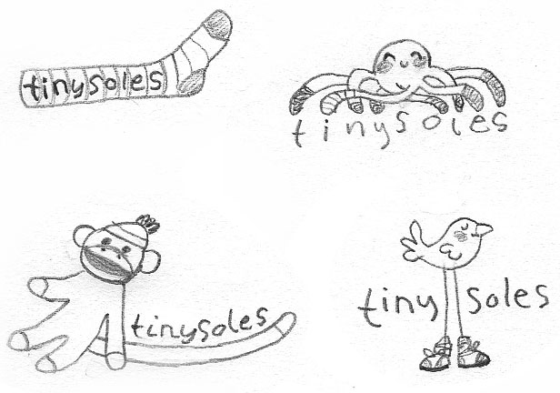
The Tinysoles team had a hard time deciding with the octopus or the bird, but they ended up choosing the octopus, because it felt the most fun. From there, Aimee refined the concept, added color, and worked on some additional icons and illustrations.
Aimee always has a great time working on illustrated projects and throws her heart into her work. She let me know:
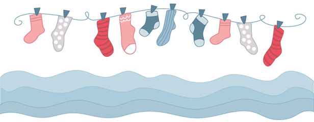
This was a really fun project to work on, I did a few different sketches at first and we settled on the cute, smiling octopus character. Since he has lots of feet, it was perfect for their shoe and sock shop. The grey logo won since it is more gender neutral, but I really liked the alternate pink version too. It was fun to design coordinating icons and illustrations to accent the web design and I think the simple, modern color palette really pulls everything together. It was great to be able to sew up the plush octo to go along with the logo, he will be a cute prop for product photos!
What’s that, you say? Plush octo? Check out this adorableness:
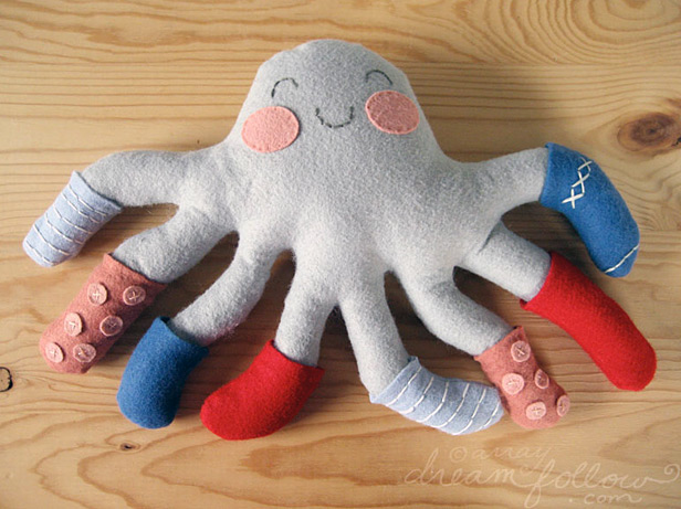
Ha ha! Makes you smile? Check! Have a happy day, courtesy of Tinysoles’ new mascot!
Benzie Design Case Study
Behind the scenes of a brand identity for a wool felt shop. Owner Renae loved her logo so much she embroidered it!
Related Posts
Let's take your online shop to the next level
The Shopify websites we design have a reputation for substantial improvements to ecommerce conversion rates and online sales. Let's talk!

