Creating a Cohesive Brand For a Vintage Jewelry Store
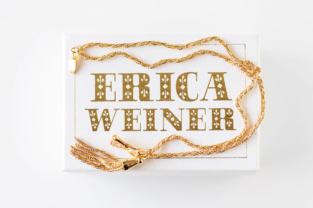
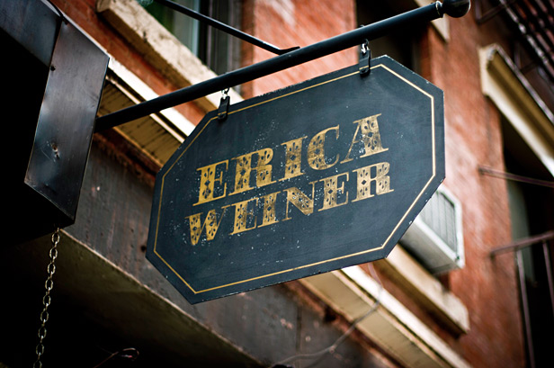
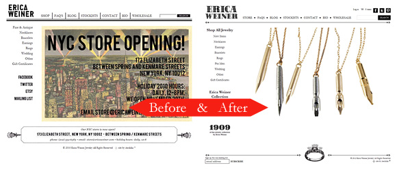
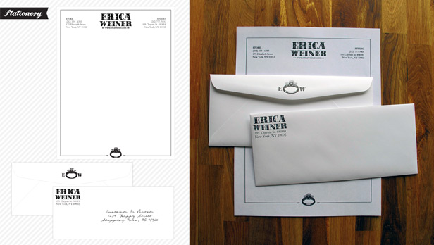
One of our fave clients, Erica Weiner, came to us to help her tighten up her branding and packaging. Erica and her mighty team settled on a logo font, using it on their storefront, store signs, shopping bags, receipts, and ring boxes. She came to us at Aeolidia to work on jewelry packaging and stationery — cards, heat-stamped boxes, letterhead, business cards, etc. — and we also took the opportunity to align the look of the website, thereby creating a cohesive brand.
Mariah from our team was the designer for this project, and I loved what she had to say about the branding plan:
Your jewelry is very cool and unique, and when you have such a neat style that reaches outside the ‘normal’ (a.k.a. boring) standard, it seems a wise choice to make every detail of your brand as special as your product is. Doing this re-affirms to your customer that you care about them and their experience with you. It tells them that when they buy something from Erica Weiner, they’re getting much more than a beautiful piece of jewelry, they’re getting a treasure to cherish. They’ll recognize the love and care that you have put into each and every detail, making their experience a memorable one. –Mariah DeMarco
I was ready to write up some info about this project, but I asked Erica for a little testimonial, and she covered everything I was planning to mention, so I’ll just let her take it away:

Aeolidia designed and implemented our previous website two years ago, and when it became time to upgrade yet again, I didn’t consider asking anyone else. What we thought would be a simple “tweak” turned into a major relaunch, with re-branding happening simultaneously.
Aeolidia has a crack team from which they hand-pick the best designer to work on your project, and Mariah didn’t disappoint. I sent her my cut-and-scotch taped mockup of what I wanted the logo to be, and she finessed it into a slick (but not TOO slick) logo. She helped me negotiate with printing specialists (something I don’t think all graphic designers do), and was always available to answer my tech-ignorant questions without making me feel embarrassed about my lack of digital savvy.
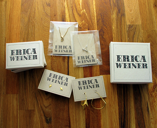
I’m a tough person to please, but Mariah was patient through the many re-designs and seriously impressed me with her invention of a historically-inspired letterhead design. She helped keep the new logo and look integrated with the site’s relaunch to complete our brand’s total makeover.
Next up: Aeolidia’s doing our lookbook. My advice to other business owners: don’t be afraid of working with Aeolidia over email instead of in person (or over the phone). An archive and online hub for your projects are ESSENTIAL. –Erica Weiner
It was great to watch this all come together and satisfying to know that we helped give Erica’s shop the polish and vintage charm that it deserved. Please visit the Erica Weiner site here: ericaweiner.com.
(originally posted on Oh My! Handmade)
A Newsletter That Goes Beyond Shopify 101
It’s easy to find beginner info about ecommerce online. If you’re past that? Subscribe to our newsletter for advanced strategies and need-to-know info for established shops. You'll get:
- Weekly tips to help you market and sell your products
- Updates when there is news that may impact your site
- Round ups of interesting links and info for brands
- Invites to our live trainings and webinars
- Instant access to our past emails
"*" indicates required fields
Related Posts
Let's take your online shop to the next level
The Shopify websites we design have a reputation for substantial improvements to ecommerce conversion rates and online sales. Let's talk!

