 Grab my guide to the 10 main ways to grow traffic and optimize to boost sales.

It is always such a pleasure to work with clients who have big dreams and a clear vision for their small businesses. Pichamon’s whimsical handmade doll business in Bangkok needed a logo that would capture the interest of customers and she knew exactly how the logo should make them feel:
My desired logo would give the feeling of sitting on a cosy-flowery armchair in a small house of the little red riding hood’s grandma, listening to the fairy tales and folklores. During the story-telling, you will hear the sound of birds, the wind blows and maybe the giggles of wood nymphs and flower fairies. (And, she is a good story teller as she can keep you focus to her story while knitting at the same time!) By looking through the windows, you will see rabbits, deer, squirrels, raccoons and skunks playing together. Then, grandma invites you to join her afternoon tea break in the backyard garden full with wild flowers. You are sitting under the walnut tree and excited to see some foxes passing by.
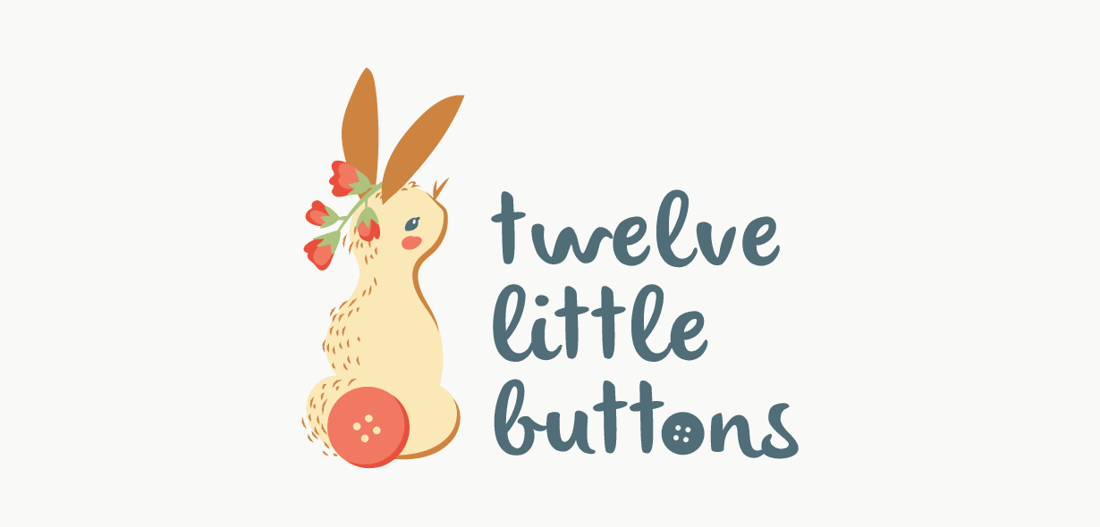
From sketch to logo
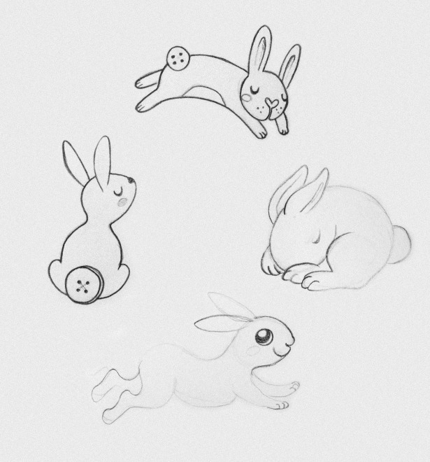
Because Pichamon makes cute bunnies, I got to work drawing adorable bun buns and had a lot of fun playing with their shape. I wanted to find something iconic without being cliched. When you think rabbits you think of their ears… so I kinda wanted to stay away from something so obvious. Rabbits have a beautiful shape to their bodies, and instead of focusing on their heads, I started trying to find ways I could draw their butts! Replacing a bunny cotton-tail with a button was my first big idea. It would be something unique, it would tie in with her business name and my head was swimming with the different ways I could use actual buttons sewn into her print work.
Pichamon loved the idea of seeing a wild woodland bunny in her branding. Something sweet and curious. She didn’t want something too cluttered, and I knew it would have to look good when printed quite small as it would be used on tags for her products.
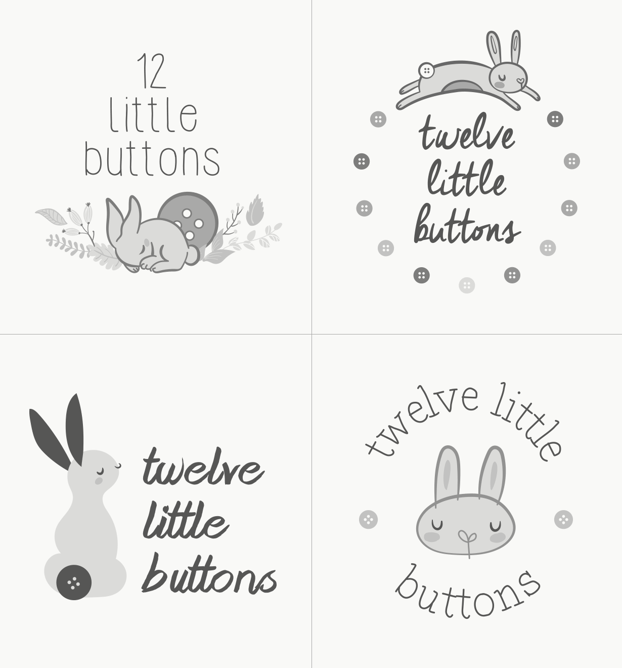
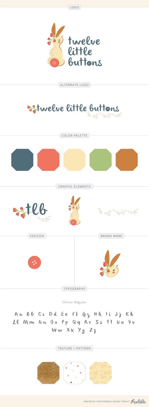
Whenever I send over my first round of design ideas I always keep them black and white so we aren’t distracted by colour and can focus purely on the composition of the logos. From the first set of designs, Pichamon loved the first 3 designs. She had the same thoughts as me, something unique, simple and sweet.
From there I took the first 3 options and refined them a bit more. I added some colours and texture and they started looking a bit more polished.
In the end, we had to cut it down to one, so Pichamon made the decision to go minimal with the third design. She loved the idea of having some flowers in the design, and loved the handwritten look of the text, but wanted me to explore it a little deeper in the next round to tighten it up. She also asked me to open up her bunny’s eyes so it looked curious and a bit more alert rather than like it was dozing in the sun.
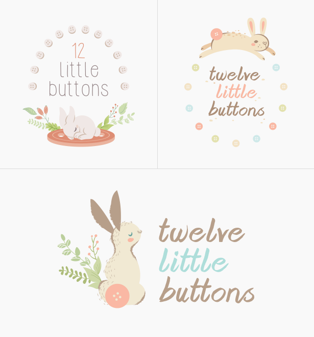
Her final request was to go bold with her colours. We had talked about being unique and standing out and she thought we were almost there with the design, but the colours were too pastel. She wanted something bold but delicate and was a bit unsure if this was something we could achieve. I told her, with risk comes reward, and dove in!
I brightened her colours up, opened her bunny’s eyes, changed the font to something a little sweeter and simplified the lines down to be thicker to match the new font. I added some sweet bell flowers behind her ear to bring back that wild and free feel and everything looked beautiful!
Pichamon’s response to her final logo
Sarah, I would like to tell you that…your works are OH-SO-PERFECT!
This is surely the LOVE AT FIRST SIGHT as you told me. You make me short of word to describe how wonderful I feel right now. I love every details presented in the style guide including the furry lines that you added. Actually, at first, I have a little concern as I am not sure that polka dot theme would go well with the woodland theme or not. But you have made it! LOVE LOVE LOVE.
Lastly, I am so sorry that I have to copy your words because I have the same feeling as you _…..You have honestly been such a pleasure to work with and I am SO thankful to Aeolidia that has chosen you as my designer. I think our styles were a perfect fit 🙂
Thank you very much for making me smile.
Sarah’s final thoughts
Pichamon’s feedback and helpful suggestions really made this project work. She told me what she loved and what wasn’t working for her. She gave me lots of visual direction and let me go a little crazy with my own style. It felt very natural and together we made the perfect team!
We have room in our schedule for logo projects right now! Please get in touch with me about your logo, and be ready to knock ’em dead in the new year!
Browse Posts
A Newsletter That Goes Beyond Shopify 101
It’s easy to find beginner info about ecommerce online. If you’re past that? Subscribe to our newsletter for advanced strategies and need-to-know info for established shops.
Learn how the top shops grow:
"*" indicates required fields

Let's take your online shop to the next level
The Shopify websites we design have a reputation for substantial improvements to ecommerce conversion rates and online sales. Let's talk!