 Grab my guide to the 10 main ways to grow traffic and optimize to boost sales.

Are you thinking of rebranding a brick-and-mortar shop? It’s possible to grow your brand so much that you, well, outgrow your brand. Before you panic, know that this is a good problem to have. When embraced strategically and with an open mind, it can be a period of rich opportunities.
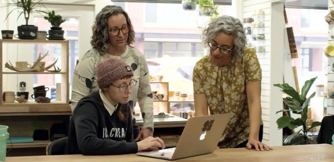
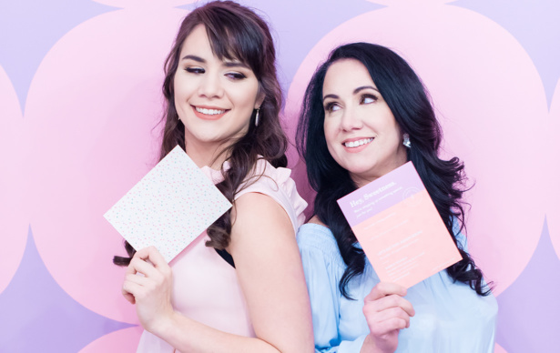
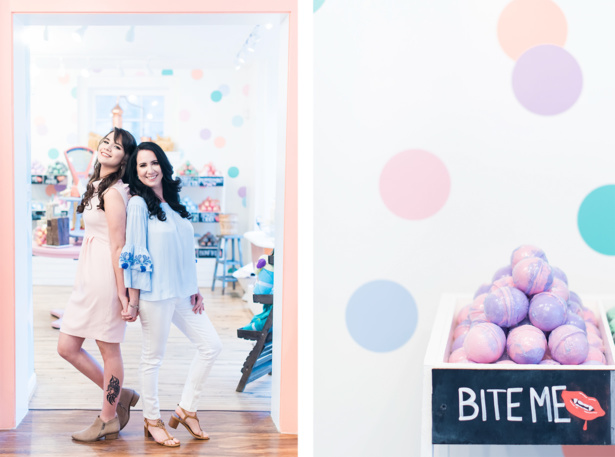
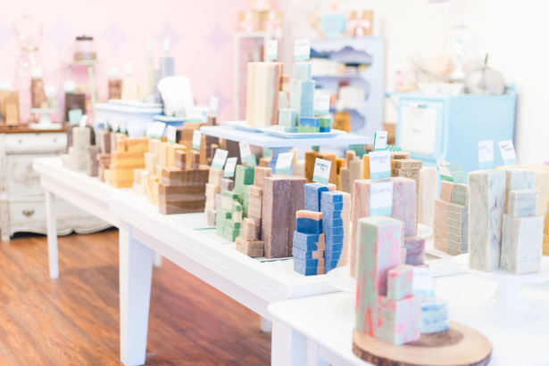
Such was the case with Crystal and Morgan Wellman, founders of the soap and apothecary boutique formerly known as Ladyburg. Originally launched as a brick-and-mortar in historic downtown Fredericksburg, VA, the company enjoyed deep ties to its local community. The common “burg” in both the name of the town and the brand helped reinforce this connection, but as the brand began setting its sights on online and wholesale spaces, Crystal couldn’t help wondering if it was time to rename the business.
“I am coming into this branding with the plan to transition from a local boutique to a brand that could easily be on the shelves of boutiques across the country or even a Target,” she told us when we started her rebranding project.
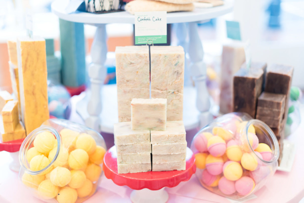
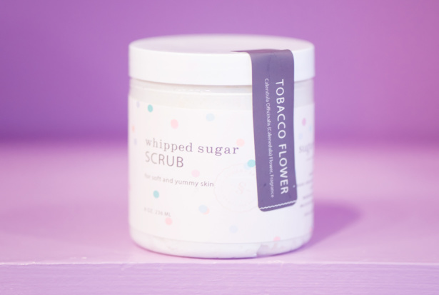
She also worried there might be a disconnect between the Ladyburg name and the fun, cheeky personality their brand was known for. With names like Bite Me and Queen Bee for their bath bombs, and luxuriously sweet Whipped Sugar Scrubs, was it possible they weren’t fully tapping into their brand’s potential?
We believed so. Their products were fun, approachable, and flirty with some luxury and indulgence thrown in. The brand’s ideal customer was more grown up and polished than “Ladyburg” seemed to hint at, but with a deep appreciation for wit and whimsy.
Time to Grow (and Glow) With a New Name and Identity
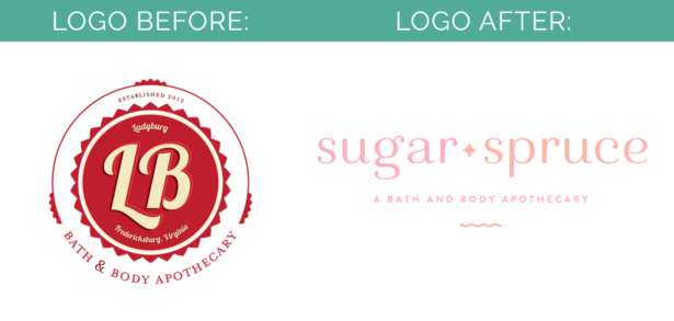
We decided a complete makeover for the Ladyburg brand was in order, beginning with the name. Crystal wanted a name that would feel timeless and embody a professional, sophisticated image to stand apart from other handcrafted bath and body stores. She was hoping for a name that would evoke “a magnetic brand personality that customers can’t get enough of.”
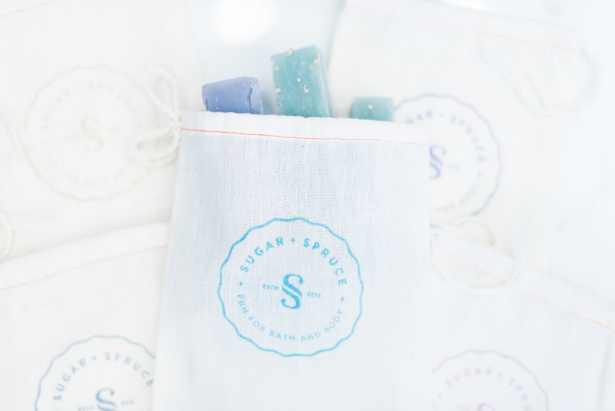
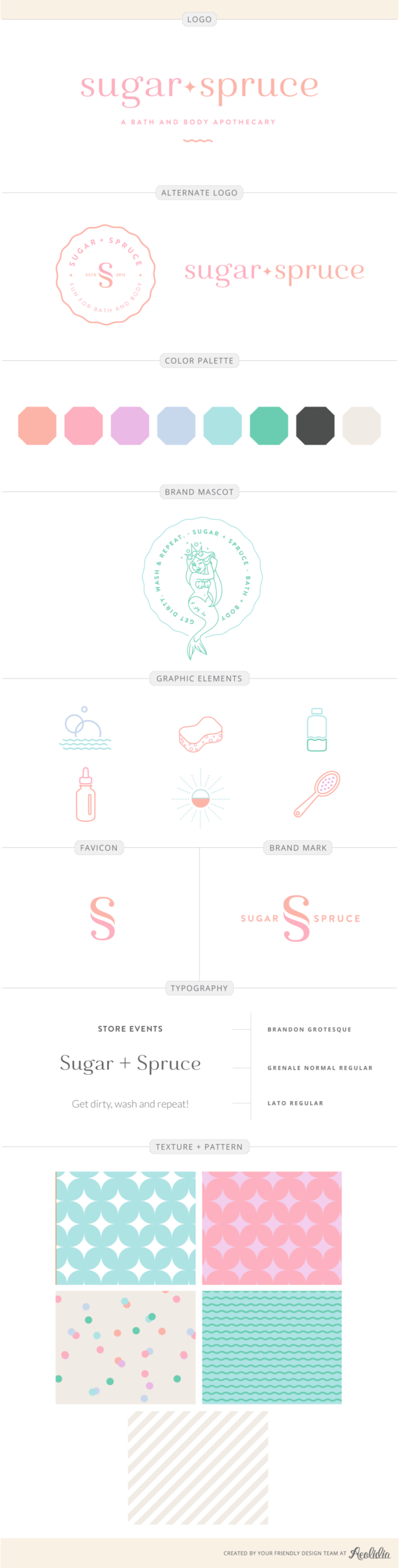
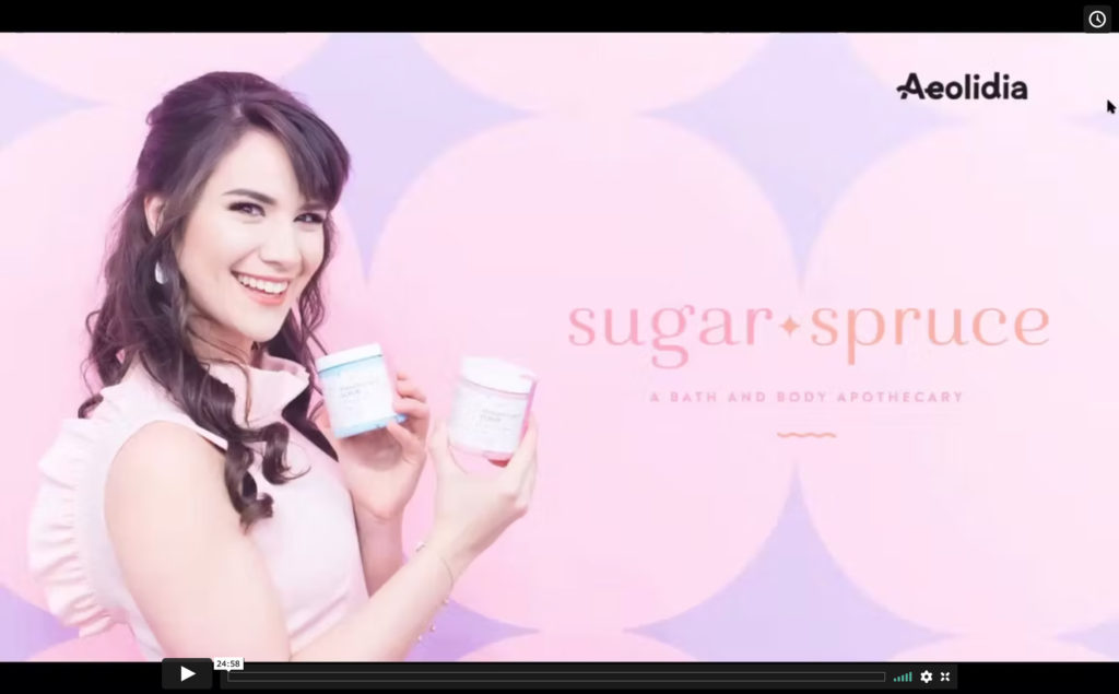
As I brainstormed names, I kept thinking of irresistibility. What’s more enticing than sweet things like sugar scrubs and bath bombs and a relaxing soak? I began playing with the phrase “sugar and spice and everything nice.” This phrase is all about telling girls and women what they should do, whereas Crystal’s brand was all about embracing something girls and women want to do: indulge, take time to themselves, and enjoy sprucing themselves up. With a simple twist on this phrase, Sugar + Spruce was born. It caught Crystal and Morgan’s attention immediately.
“It was both of our first choice. We love that we can ‘spruce up,’ but also love how it plays into girl and boy. We can have fun with this one,” Crystal said. “We appreciate a clever pun, love a good rhyme, and never miss an opportunity for a double-entendre. We want to bring a smile to our customers’ faces and bring a little humor into their day!”
With a sweet new name settled on, our designer, Ann, began exploring ways to bring out its fun cheekiness visually. She focused on conveying a personality with a modern and vibrant sensibility, avoiding any commonly used typefaces and elements found in other apothecary-style brands.
“Your customers are design savvy,” she said. “Sugar + Spruce needs to feel luxe and more modern than the typical brands in your niche, which tend to rely heavily on antique and vintage design cues.” To tie into the sugary elements of the brand, Ann envisioned creating eclectic patterns inspired by candy, bakery, and soap packaging.
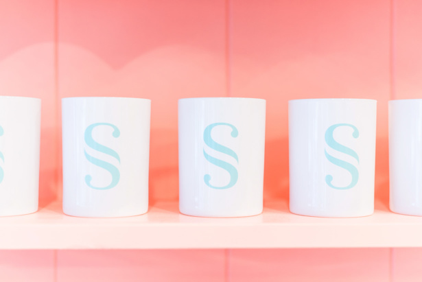
After playing with many different typefaces and treatments, Ann was inspired by the idea of a sparkle, which was rooted in the act of “sprucing up.” Since she knew a colorful and varied color palette would be best for the brand, she wanted to retain some simplicity in the logo. This would make it work better across all of their packaging and products.
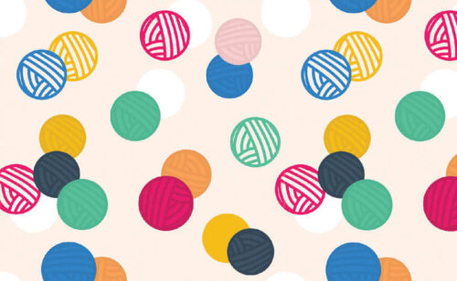
It also helped create unity and consistency across custom patterns and textures that would continue telling the Sugar + Spruce story. A mod sparkle pattern, a subtle wave texture, a neutral stripe pattern, and a fun splash of confetti would each work together or separately in branded graphics such as blog posts, tissue paper, and shelf talkers.
A Character for the Brand’s Personality
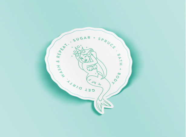
Our team, at this point, was having so much fun brainstorming all the new visual opportunities for Sugar + Spruce. It really felt like the brand was coming to life—so much so, that we imagined a mascot for it. This brand ambassador would encompass their vibes and values: vibrant, tongue-in-cheek, feminine, and whimsical. She’d be a mermaid, illustrated in a modern, simple style.
“I can imagine her making your customers smile when they spot her on the back of a bottle or in your store. Your ideal customer will appreciate the bit of mischief and subtle sense of humor,” Ann explained. “This type of character infuses a bit of whimsy to the Sugar + Spruce personality, without making it too silly or juvenile.”
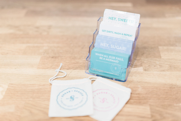
The merlady was illustrated by Sarah, playfully winking and donning a bubble crown to bring out the irresistible nature of Sugar + Spruce bath and body products. With copy like “Get Dirty. Wash + Repeat.” and “Hey Sugar, there’s more where this came from” all of the visual and messaging elements were now working in beautiful (and fun) harmony.
Hello, World: Sugar + Spruce Makes a Big Splash
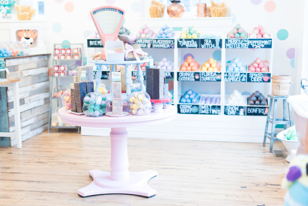
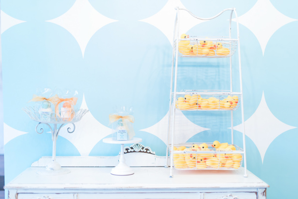
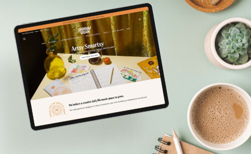
Since Sugar + Spruce relaunched, both their brick-and-mortar space and their online space have undergone a complete transformation. These changes are not only cosmetic—they’ve set the tone for what kind of products Crystal and Morgan are creating next, and have steered them in an exciting new direction in terms of public relations and partnerships.
“We’ve worked with numerous lifestyle bloggers and influencers who are equally as excited for our new brand,” Crystal says. “Our new brand has opened up more avenues and we’ve loved exploring how we can continue expanding our brand awareness.”
Thinking of starting with a fresh, clean slate for your growing brand? Contact us about designing a total transformation that will let your business’s true personality shine.
Sugar + Spruce Case Study

Behind the scenes peeks at a brand identity for a brick & mortar apothecary, whose in-store experience involves a mermaid!
Browse Posts
A Newsletter That Goes Beyond Shopify 101
It’s easy to find beginner info about ecommerce online. If you’re past that? Subscribe to our newsletter for advanced strategies and need-to-know info for established shops.
Learn how the top shops grow:
"*" indicates required fields


Let's take your online shop to the next level
The Shopify websites we design have a reputation for substantial improvements to ecommerce conversion rates and online sales. Let's talk!