Laura of Prismera Design had created her own logo the first time I worked with her on her website, and recently came to us for a professional, modern jewelry logo design that would make her business sparkle. It’s very satisfying to revisit the brand identity of a long-time client. In this case, it was especially rewarding, and you’ll see why.
Too often, we see a disconnect between a business and the way it presents itself to the world. So much care and time and creativity is put into the product, but the logo is an afterthought: either cobbled together with limited design skills, or not fitting with the style of the product. It pains me when I see that the brand identity hasn’t gotten enough love and time, because customers are going to evaluate the business as a whole, subconsciously being put off by a poor logo, even when the product is impeccable.
Why Laura was ready for a professional logo
When Laura decided it was time for a new look, she gave us this thoughtful information about where she was at and where she wanted to go:
My current logo doesn’t feel like a logo, I just selected a font that I liked that was readable. I used to have a different logo that I created early on and abandoned it when I got tired of it, there was nothing really wrong necessarily, other than the fact that it didn’t really seem special.
As for the current “logo,” while I do like the fact that I can use this font anywhere and it IS readable, I also want something that is more memorable and distinctive. I am usually attracted to design trends, which could be an issue because I don’t want to have something that will get tired quickly.
Basically, I’d like a strong identity that people will take notice when they arrive on the site! For the first time ever!

Coherent design will show that you’re trustworthy
Laura hit the nail on the head when she told us:
I didn’t have a strong sense of how I wanted my logo to work with my business to start with, so going with a new logo is less about a shift in perception and more about pulling myself together and putting my best foot forward.
I feel like because I don’t have a coherent look to my logo/site, it can be confusing for my customers to understand the type of company Prismera is. I find that my work resonates with the design community and want to create an overall feel of professionalism and a high standard for quality but also get across that this is a small, personable business.
The work I sell is higher end, so I want people to feel like they can trust my company- that it’s established and professional (which I think I achieved when I first hired you guys on to do my site!!) but I’d like to take it a step further with having a logo/colors put together. My packaging and marketing materials are all over the place because my logo isn’t distinctive and I think once that establishes a style, I can really work on the collateral.
This is so right! It’s a thrill to work with someone who understands how important presentation is when selling, and what a professional logo will do for her.
How we use a business’ story to craft their logo
When creating a logo, we always ask our client how she came up with the name of her company, in case it sparks some creative ideas for the logo. Here is Laura’s story:
Originally, the words were created from two words, prism and chimera, to describe the idea that this business was a fantasy or a dream that I’ve had, a world where I could create anything. And prism symbolized the multifaceted possibilities!
A modern jewelry logo that is strong, sturdy, and warm
Laura’s designer, Meg, got to work on some ideas, all of which were thrilling. Laura worked to pare them down (making the hilarious comment, “editing is sad”), and we ended up with a logo that is modern, strong, and sturdy, but still warm. Meg’s beautiful custom script dots the i with a prism, and includes patterns and icons for many branding and marketing uses.
The best thing about a well thought out logo is having something that adapts to many different situations. Laura can use her logo in black on white, white on black, there is a simpler version for smaller settings, and she can use just the gem/prism mark as a standalone.
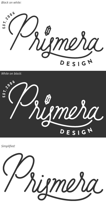
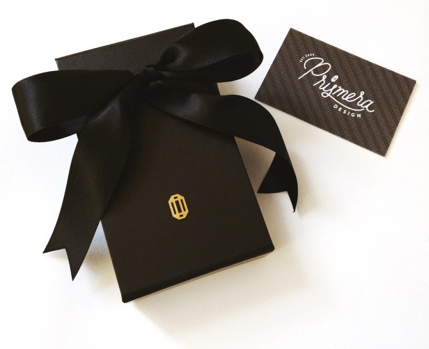
The color scheme, collection of fonts, patterns, and icons, give Laura tools to use when designing her own packaging and promoting her business.
A change in direction
The most inspiring thing about this project was how our graphic design work gave Laura the confidence to make a big change that she’d been contemplating for a long time. Below is the story she told me about her new design direction:
I’m beyond excited about this next step – after contacting you for a rebrand, I started thinking about a more major shift with my business.
For the past 8 years, I’ve been creating jewelry that had really strong ties to my illustration background. But there has been something that was brewing in the back of my mind, a style that didn’t really fit what Prismera was all about at the time. So I quieted that voice and kept forward.
After contacting you about the rebrand, a friend of mine reminded me that this would be the perfect time to change direction. I realized she was completely right!
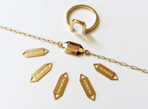
I was so inspired by the design direction that the Prismera rebrand was taking that I decided to base this first collection on one of the icons that Meg put together. Everything about the process is still the same – the pieces are still modern, delicate designs that start off as my own hand drawn images. They are still produced by various smiths and then come into my Berkeley based studio, where I complete the finished product.
I really appreciate logos that show a sense of history – I know that in the grand scheme of things, my company is fairly young but I am really proud of the breadth of work I’ve created these last 8 years and the different types of people that the work has connected with.
Advice on logo design:
I asked Laura for her feelings about the project, and she had two great tips for working with a logo designer:
I worked with Aeolidia on creating my website many years ago, and when the time came to do a rebrand, there really wasn’t any question about who I would turn to. I had been wanting to do a proper branding of the whole business for years but I knew that until I had a solid idea of what I wanted out of it, the end result wouldn’t be satisfying.
I want to use this opportunity to talk a little about how I went through this process because there’s definitely a trick to it. I believe there are two really important things to do when hiring someone to work on your branding. The first was understanding the message that I wanted to get across for Prismera. Knowing where you want to stand with your customers is paramount- Aeolidia is almost magic but even they can’t tell you what your business stands for.
The second was this: TRUST THE PROFESSIONALS. I won’t lie, there were moments during the design process where I doubted some of the decisions. But every time I took the sketches and had them polled by a larger group of online shoppers, the overwhelming response was that Meg knew what she was doing and I needed to let her!
Tackling the website refresh and designing the packaging materials afterwards was a breeze. The gorgeous icons made it easy to organize the site in a clear way and Aeolidia was quick to jump in with opinions when things didn’t seem quite right. It’s wonderful to be able to rely on their extra eyeballs. What else can I say – Aeolidia, you make me fall in love with you over and over again.
Hooray, thanks to Laura – dream client or what? Visit Prismera here.
I would be absolutely honored to talk with you about your logo and brand identity. Have you been waiting for the right time to take the leap to getting your sh*t together? Maybe now is the time! Send me an email with a bit about where your business is at and what you’re looking to make out of it, and I will take some time to look over what you have and give you my honest opinion about how best to proceed.
Brand Strategy
Building a solid, strategic foundation for your brand. With Ann Parker, our brand and web designer and brand strategist.
Browse Posts
A Newsletter That Goes Beyond Shopify 101
It’s easy to find beginner info about ecommerce online. If you’re past that? Subscribe to our newsletter for advanced strategies and need-to-know info for established shops.
Learn how the top shops grow:
"*" indicates required fields
4 thoughts on “Prismera: Modern Logo for a Jewelry Designer”
Leave a Comment
Related Posts
Let's take your online shop to the next level
The Shopify websites we design have a reputation for substantial improvements to ecommerce conversion rates and online sales. Let's talk!
 Grab my guide to the 10 main ways to grow traffic and optimize to boost sales.
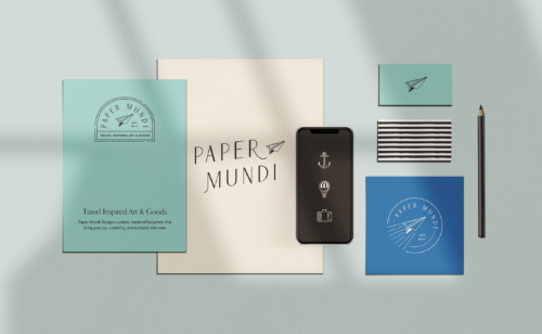


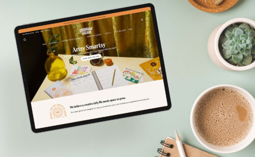
Thank you, Naomi! It’s a custom script, hand drawn by Meg for this project (not a font). Isn’t it lovely?