Designing Petit Collage’s Shopify Website With Personality
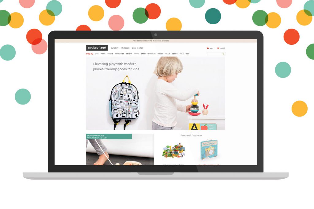
When you’re building your business website, it’s imperative that your personality continues to shine through, even as your brand evolves. Such was the case with Petit Collage, a line of modern, sustainable, innovative goods for kids and play. Since its launch, the brand had evolved from art prints into a full-out lifestyle brand with a presence in gift shops and museums all over the world. But the playful, design-forward personality that Petit Collage had so mindfully cultivated wasn’t coming through in its web design. Founder Lorena Siminovich told us, “We are more fun than we sound, and more aspirational than we show.” Here’s how we designed a high-converting Shopify website with personality for a toy designer’s online shop.
The previous web design was showing signs of growing dated, and it was slow and not very social media-friendly. Lorena wanted a new site that would allow video and larger photos, in order to immediately let customers experience their beautiful products. The main goal was three-fold: explain the brand better, boost the ease of shopping, and make it mobile-friendly to start capturing mobile sales the site was currently losing. We set out to make sure all these elements reinforced one other. Letting the brand’s personality shine through entices customers to make a purchase, while a user-friendly shopping experience serves to further illustrate the functional elegance of the brand.
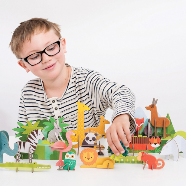
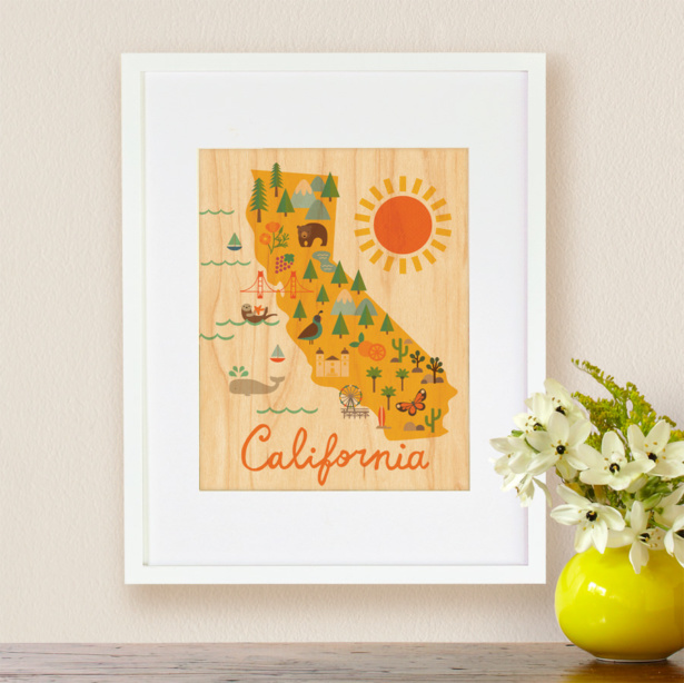
Aeolidia designer, Christine, told the Petit Collage brand story by implementing an airy layout with bright photography, pops of color, and rich functionality. The new header was designed to be clear and compact, with multiple levels of navigation to let customers know they can shop by age, price, theme, or one of the shop’s other categories.
For weekly tips like this, subscribe to our newsletter
"*" indicates required fields
The resulting design was not only more aesthetically pleasing but more user-friendly, regardless of their online platform. Updating to a mobile design helps with sales and gives businesses an immediate boost in search engine rankings because Google demotes sites that aren’t mobile-friendly.
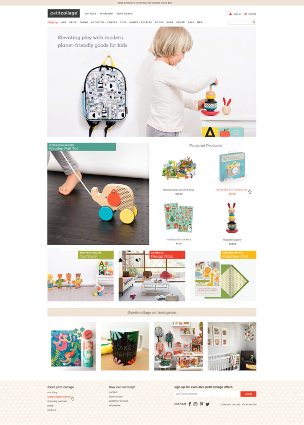
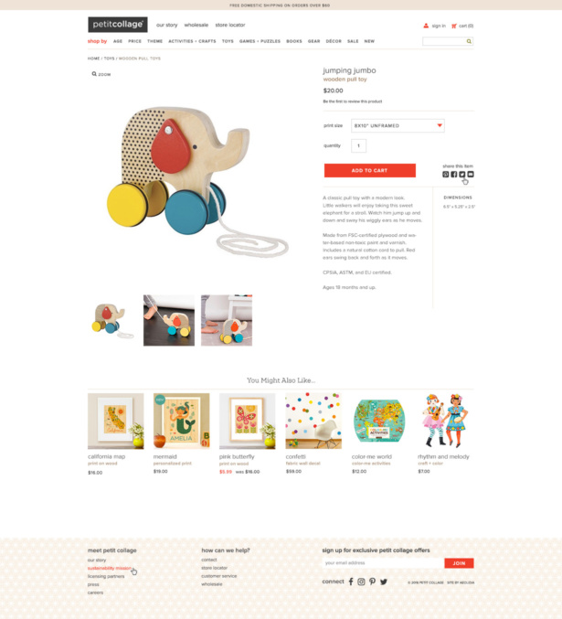
On viewing the first design concept, Lorena was instantly taken by it:
“Quick note to say I ABSOLUTELY LOVE IT. I’m sure we may find some tweaks here or there needed but this is RIGHT ON!!!”
We love hearing these positive initial reactions from clients because that tells us that we’re on the right path to quickly build that same emotional connection with their customers.
Take a look at the new Petit Collage website! And tell us, how has your brand evolved over the years? Contact us about creating a stunning new web design that showcases your business personality in all its glory.
Want to get to know us a bit better before diving in? Our newsletter is the perfect place. I’ll explain it all bit by bit over a few weeks, right to your email.
Forecasting Your ROI

Aeolidia aims to be a step towards 10x-ing a business, not just a 10% improvement. Is it time for your business to take this step?
Related Posts
Let's take your online shop to the next level
The Shopify websites we design have a reputation for substantial improvements to ecommerce conversion rates and online sales. Let's talk!

