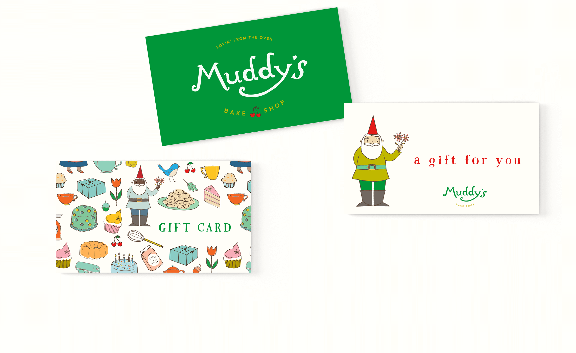
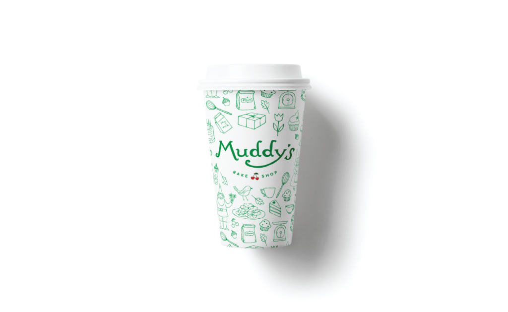
Kat told us: “Our current logo definitely communicates the ‘handmade/indie’ vibe, however it’s not weighty enough. We would like to prioritize the “Muddy’s” while still being clear what kind of products you can expect. Needs to SHOW UP on tees, stationery, labels, etc. Maybe feel a little more established as a name brand but still super independent and quirky.”
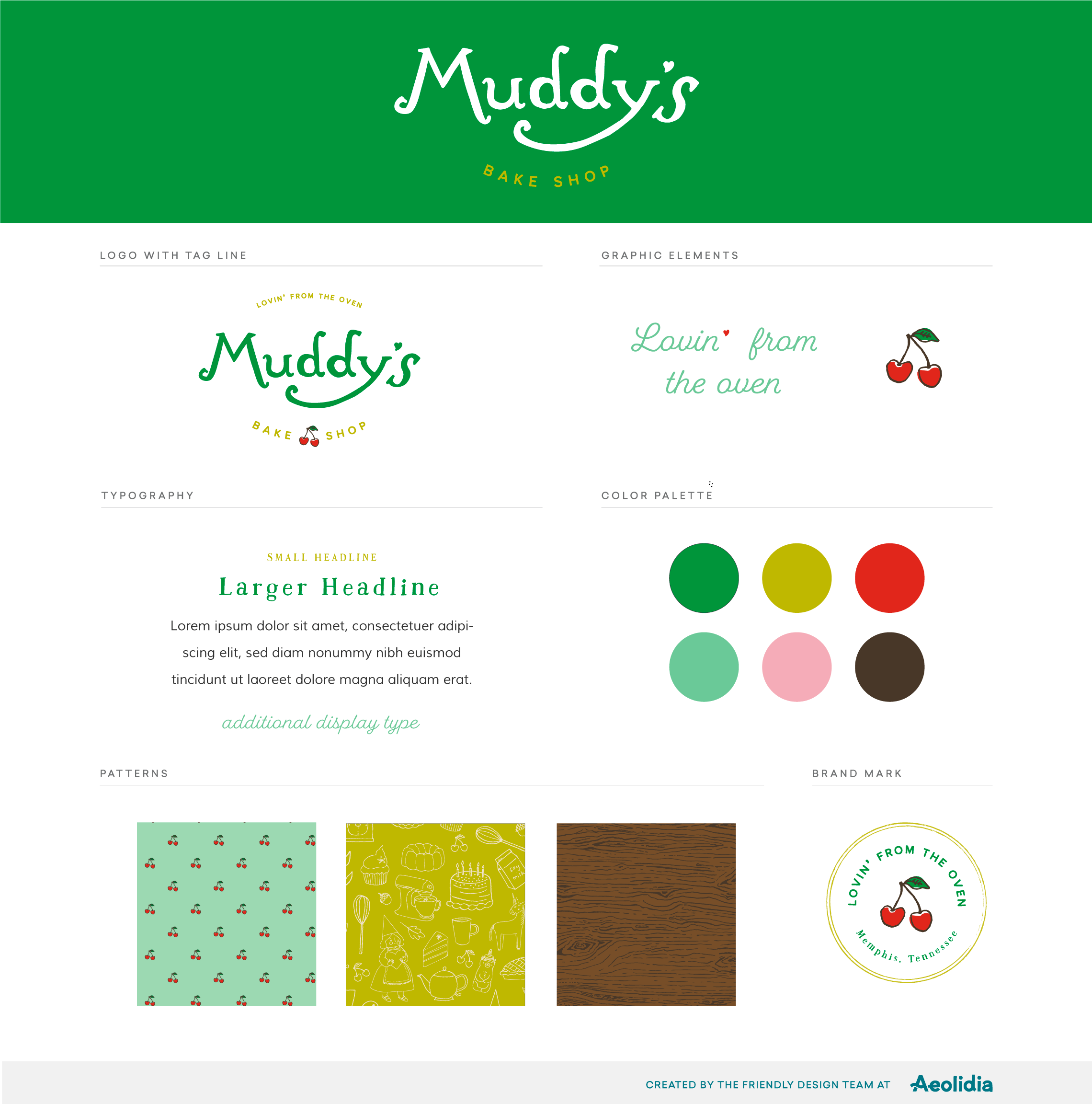
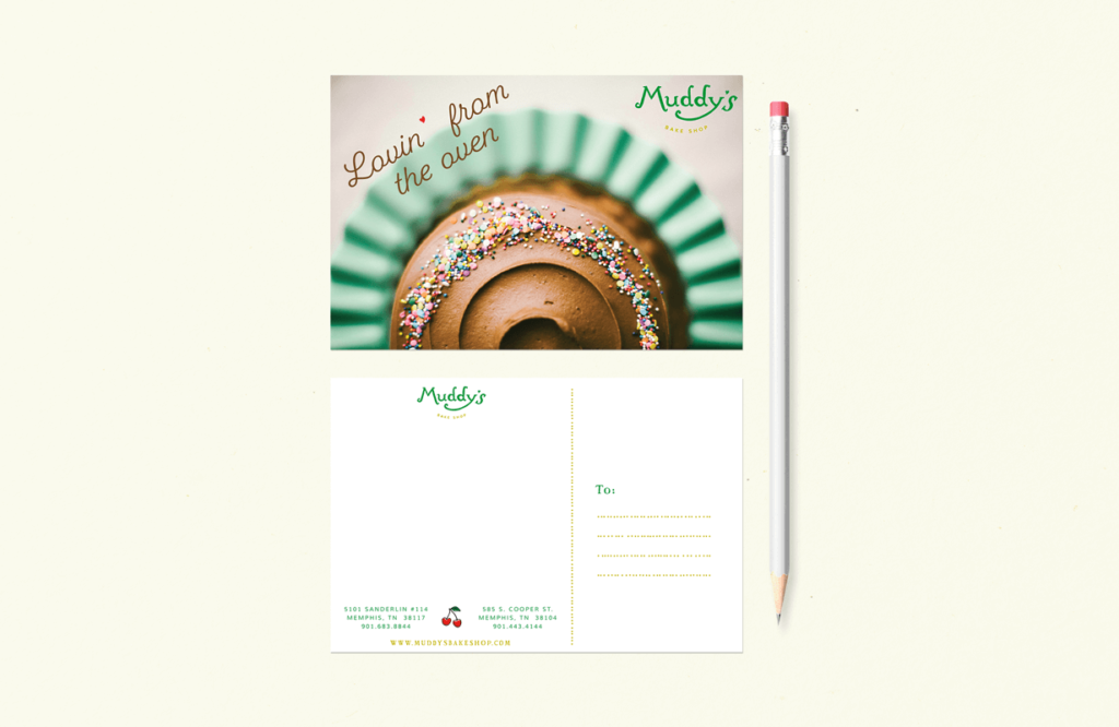
Kat provided our designer Christine with a wealth of information and inspiration for putting together the logo, as well as illustrations by Denise Holmes. (All inspiration, by the way, that spoke directly to Christine’s own heart!) Christine went with a hand-drawn type for the new Muddy’s logo and it hits all the marks—proper but playful, childlike but not precious, friendly and charming.
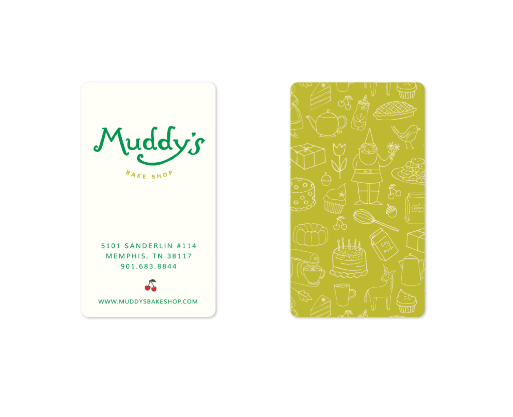
The swirly-ness and loops of Christine’s hand-drawn lettering, especially in the “M”, is reminiscent of the prior Muddy’s logo, which will bring a touch of familiarity to Muddy’s existing customers. But the new logo is bolder and more confident, which reminds their fans that Muddy’s has been around for a while and they’re in Memphis to stay. Christine gave Muddy’s a completely unique look that will take their bake shop into the next decade and beyond.
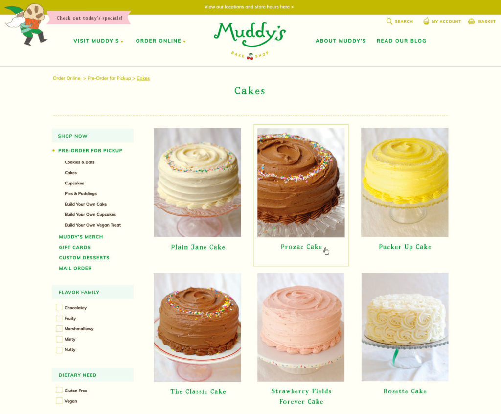
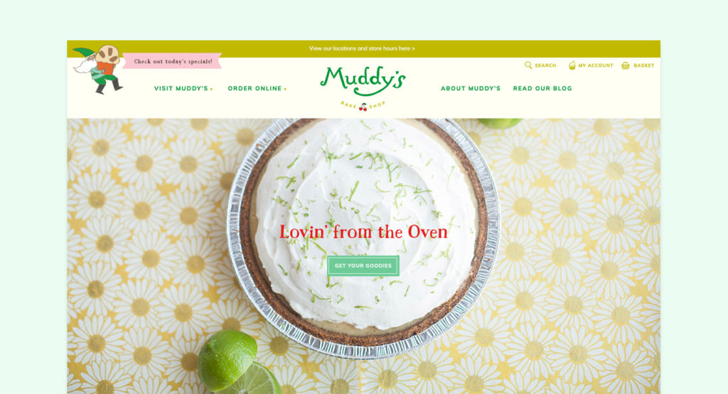
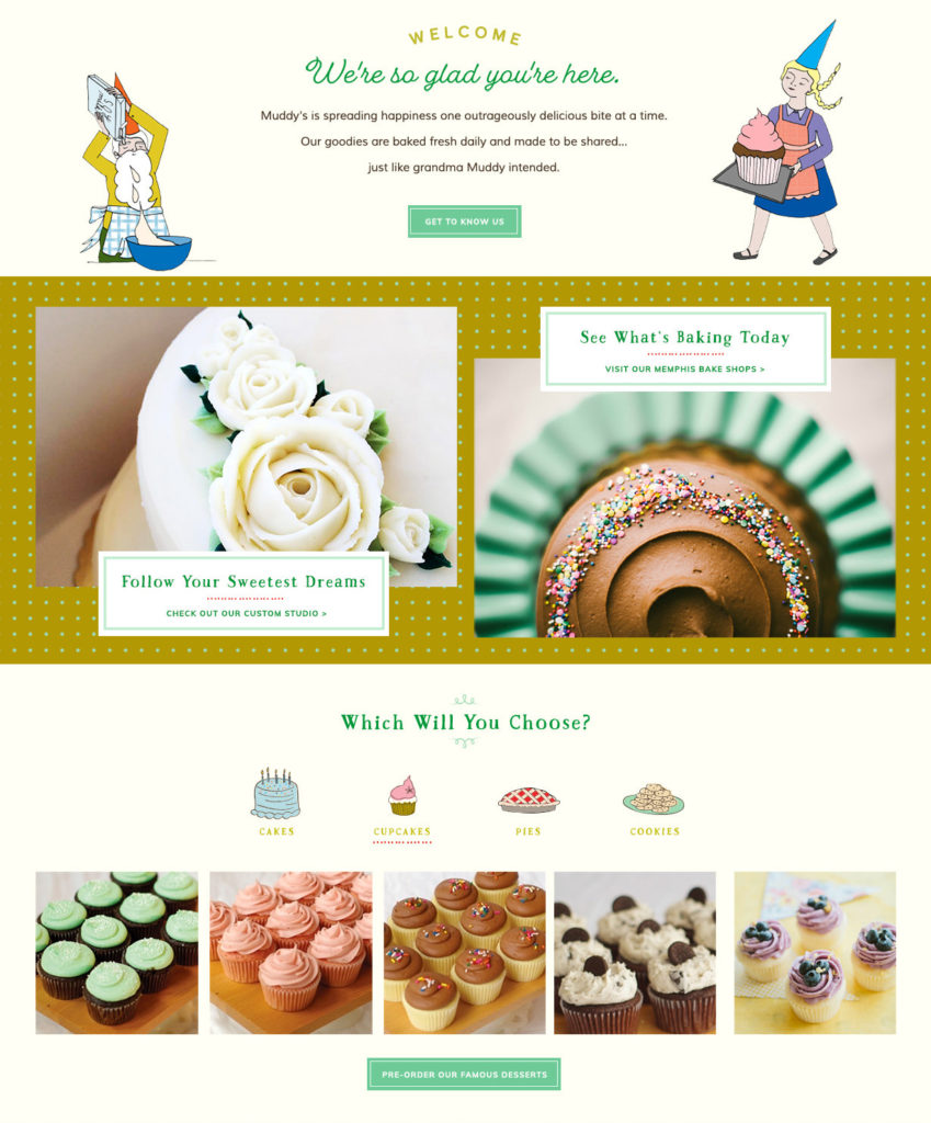
The home page shows off their most popular items with drool-worthy photos of their cupcakes, pies, and vegan treats, while the individual item pages were created with the needs of a bakery in mind. Customers can choose their preferred icing and inscription colors from a drop-down navigation and select a pickup date and time for pre-orders. On the collections page, customers can sort by flavor families (like chocolatey, fruity, marshmallowy, minty, and nutty) and by dietary needs like gluten free and vegan options.
On the back end of the website, Muddy’s team can alter the availability of individual products based on certain dates or holidays, as well as turn off ordering for specific dates. For example, during holidays like Thanksgiving or Christmas, they may want to keep ordering live, but black out pick up dates when the retail shops may be closed.
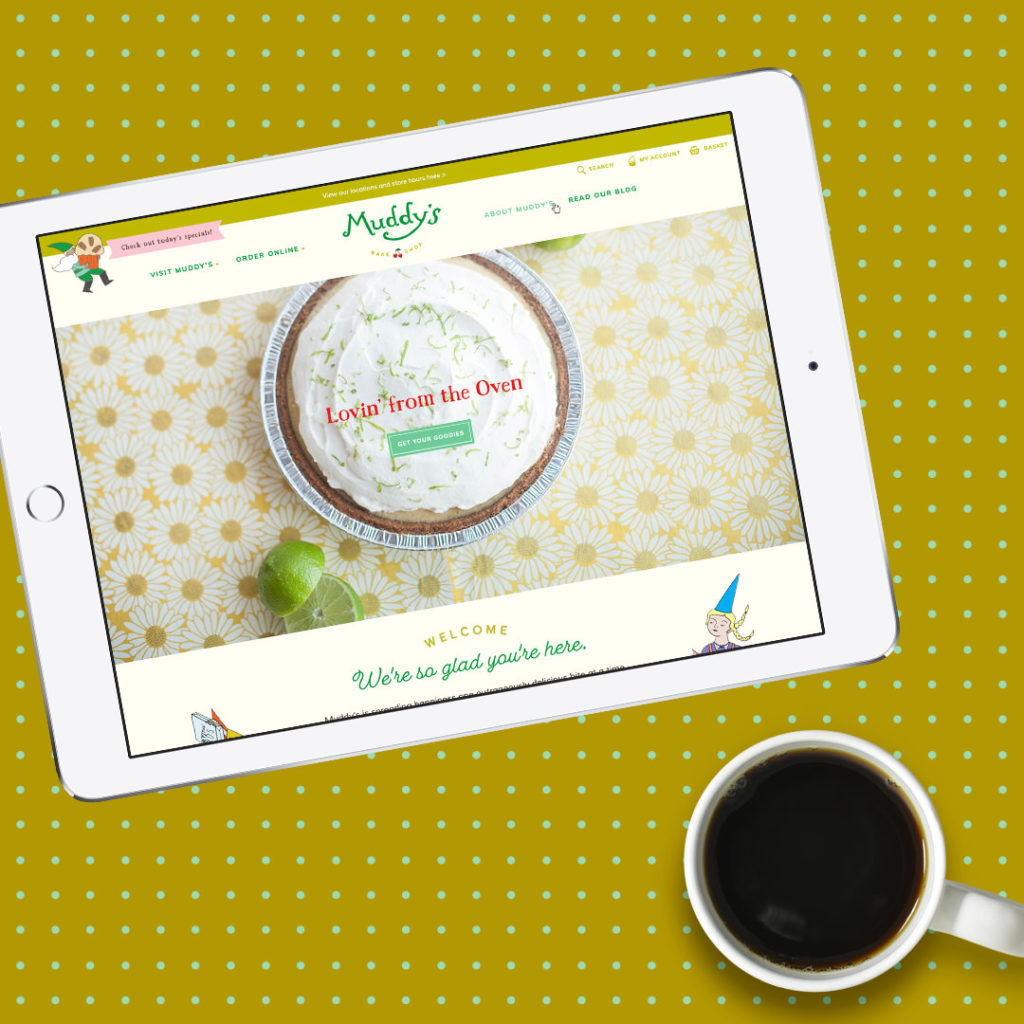
When we checked in 6 months after the launch of Muddy’s new website, things were looking good! Their website gets a majority of its traffic from organic search engines like Google. Now that their new Shopify website makes it easy to order and customize desserts online, traffic from organic search is their highest converting traffic channel and it drives a big percentage of online revenue. Overall engagement on the Muddy’s site is good, with a low bounce rate and plenty of returning visitors. What a sweet treat!

