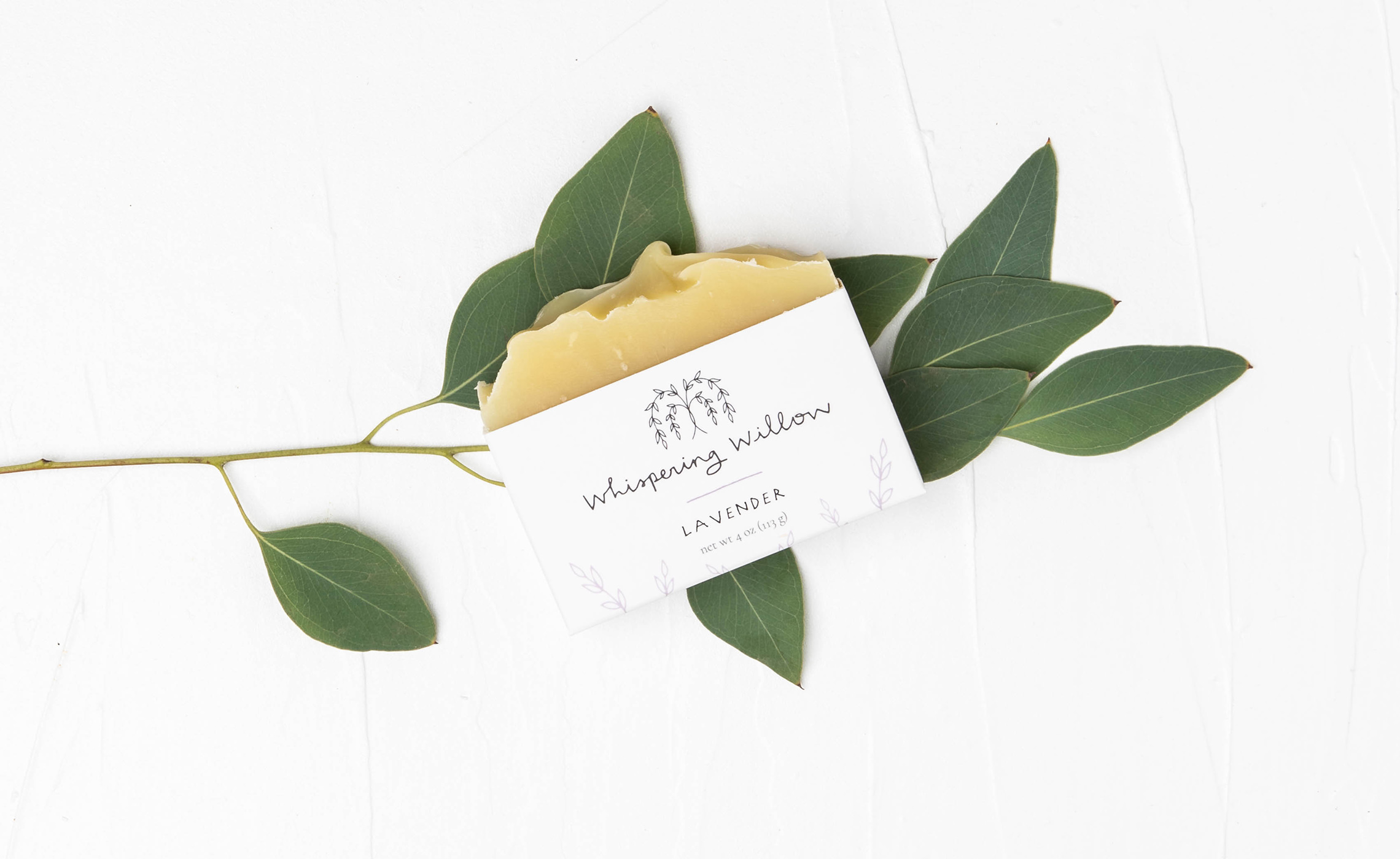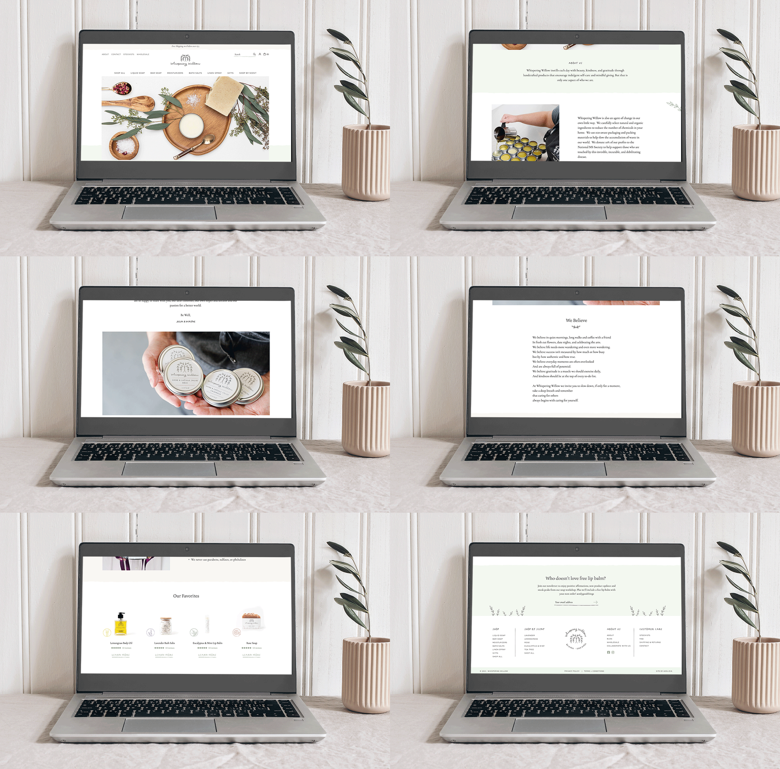
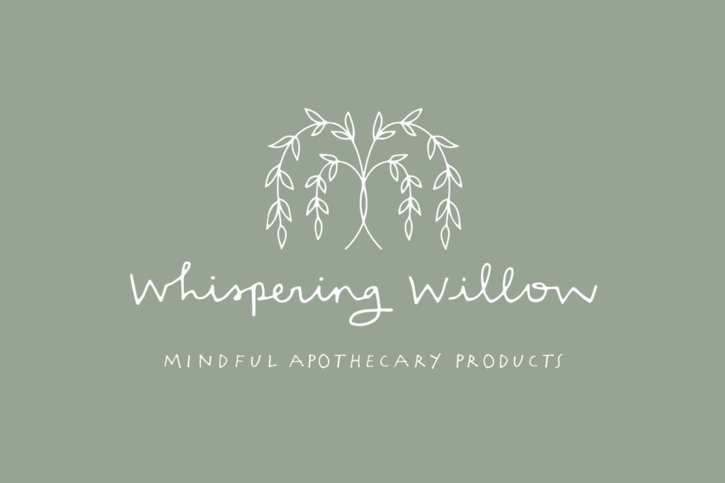
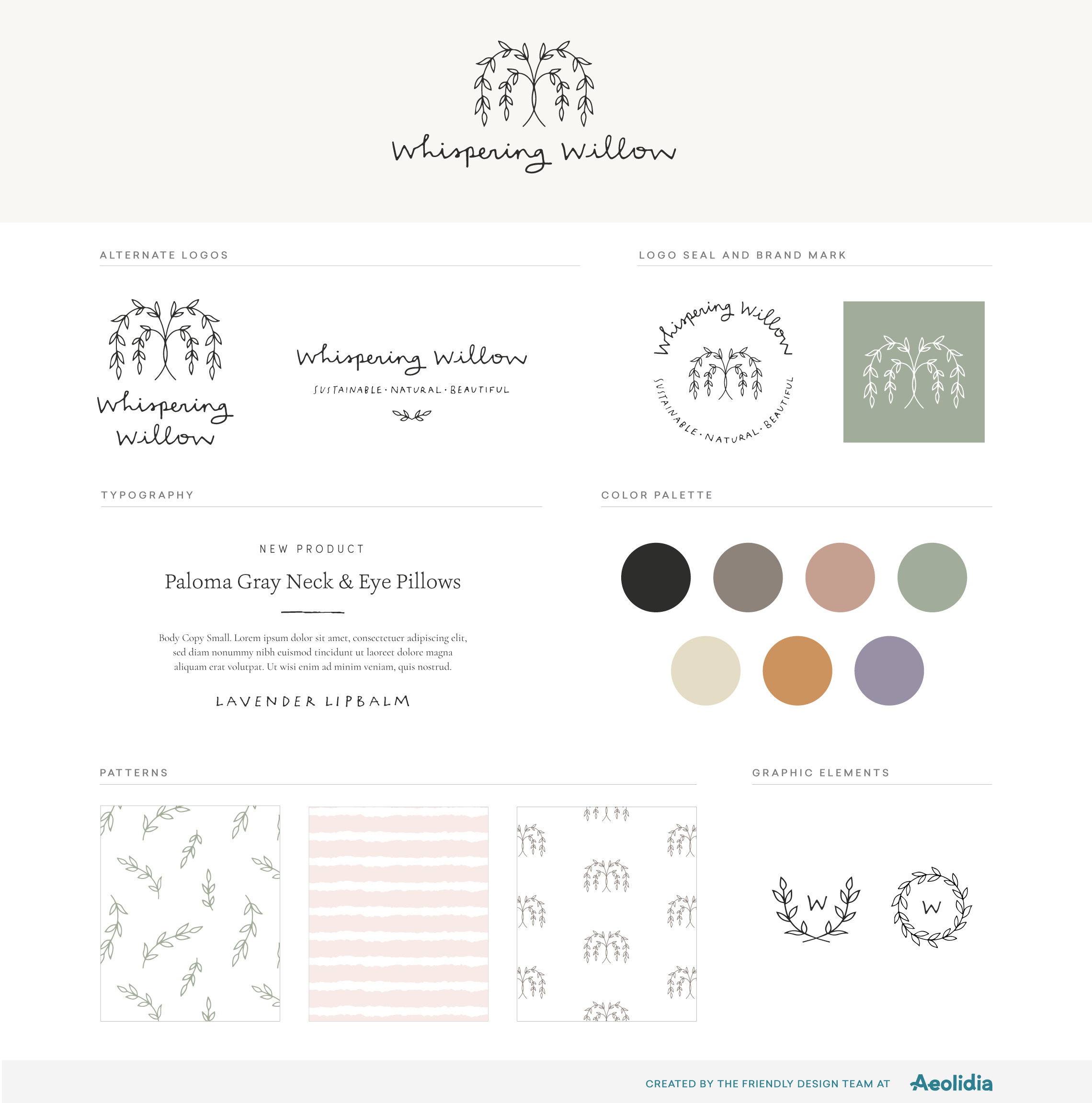
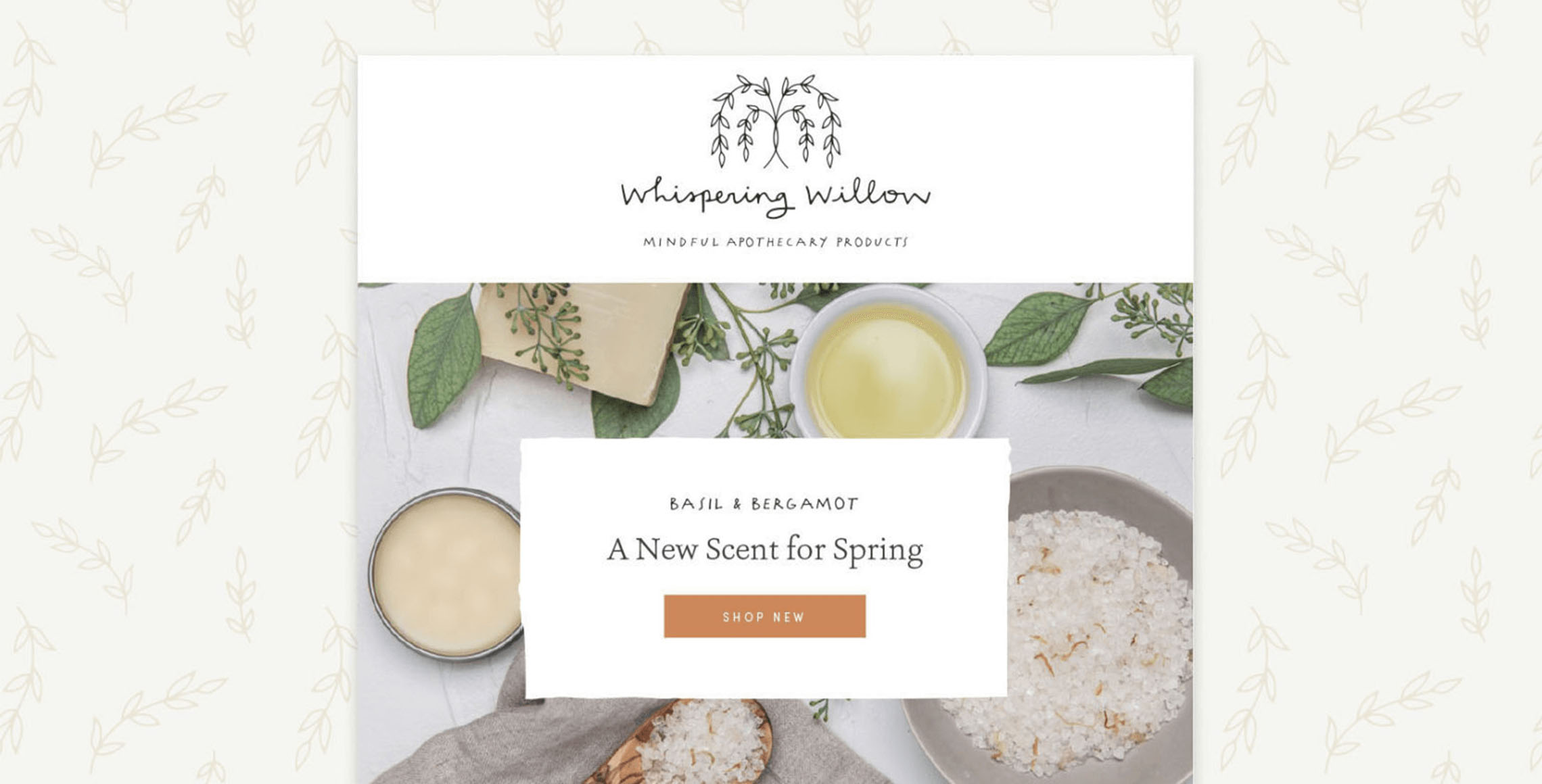
For the apothecary logo, we were inspired to create a hand-drawn style tree and logotype that has an organic yet clean quality. For the brand mark, we created a simplified version of a weeping willow that felt warm and inviting but also clean and modern. The hand-drawn willow icon is symmetrical and beautiful, with the leaves surrounding the trunk evoking the feeling of a warm embrace. The thin line style is delicate and has a “whisper” feel in its gentle curves and little leaves.
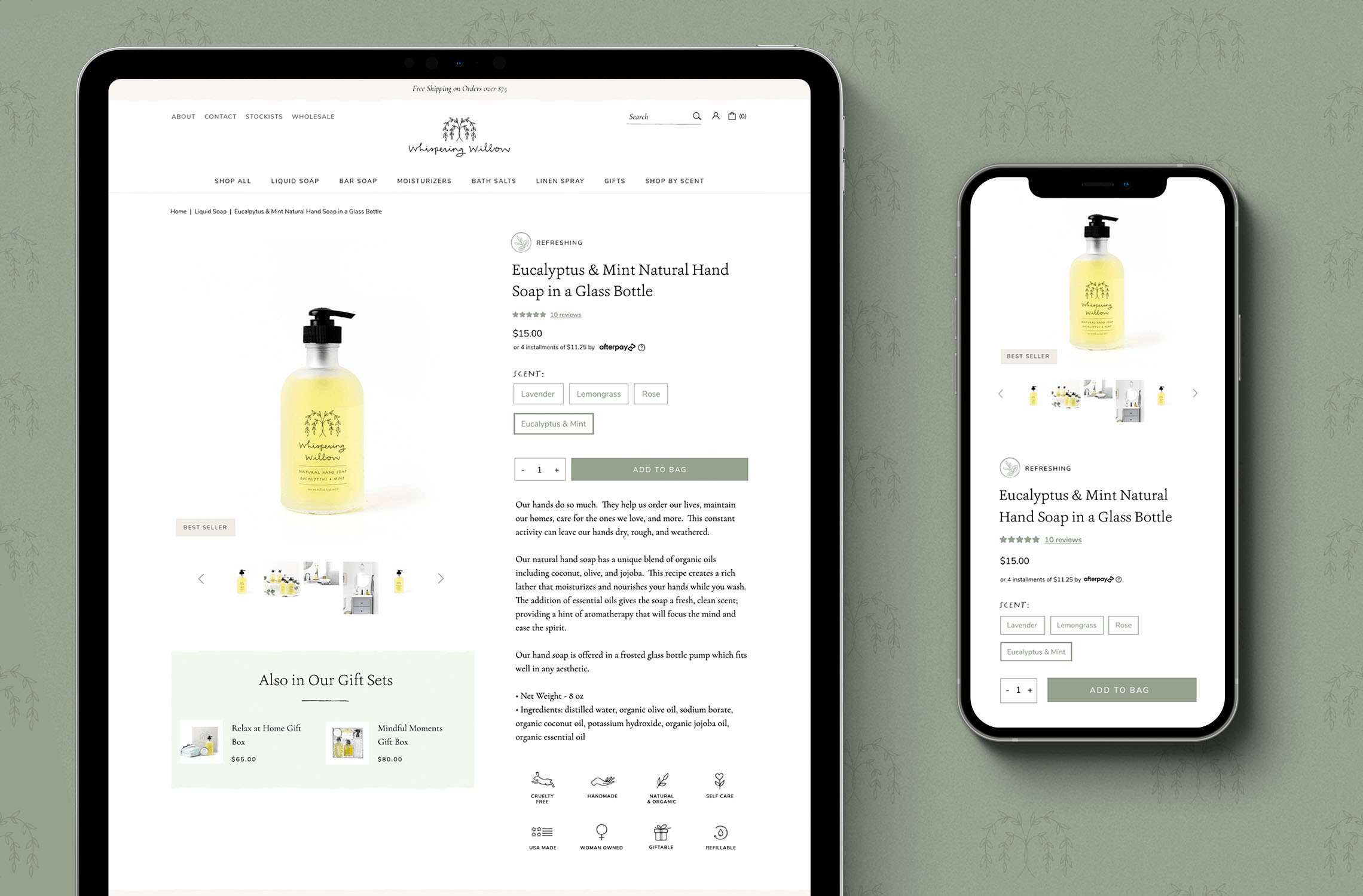

Our sales for the rebrand year grew 40%+ over the prior year. It is hard for us to separate how much of our growth during that time was due strictly to the rebrand as we were steadily delving into the wholesale market; however, our typical growth had been around 20% year over year. With that in mind, we feel confident that the rebrand played a significant role in our success.
Julia & Wayne
Whispering Willow
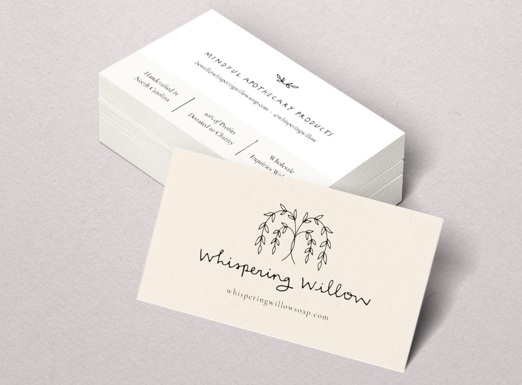
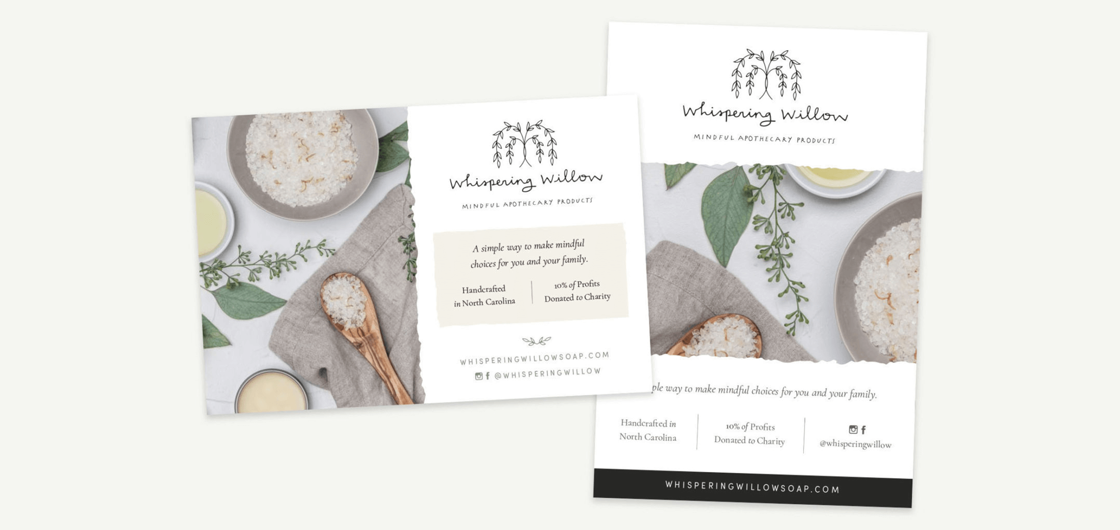
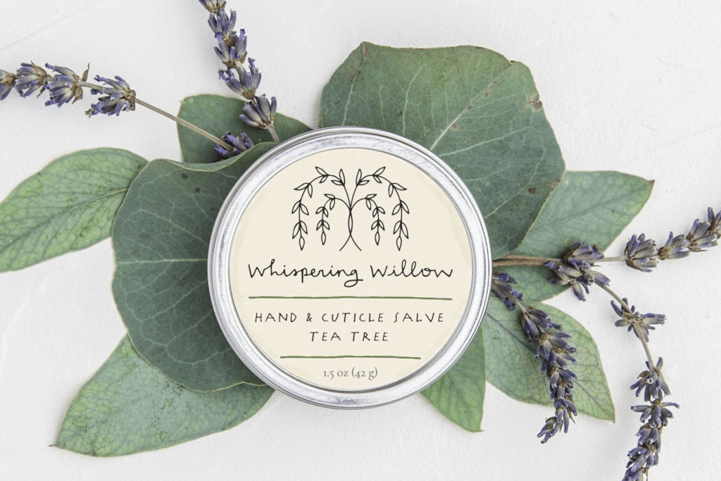
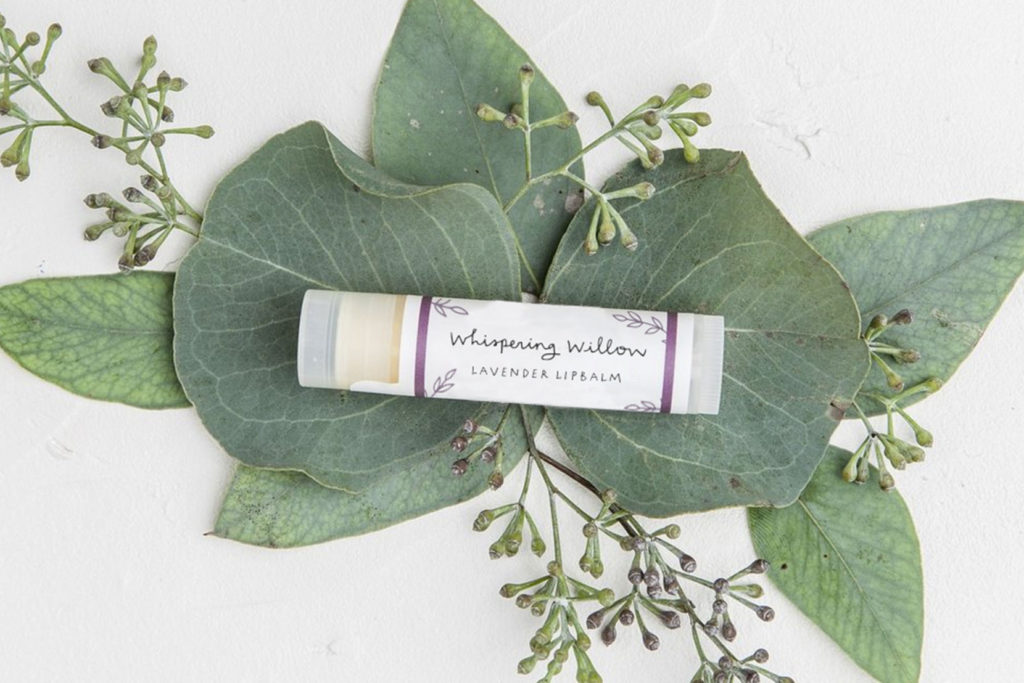
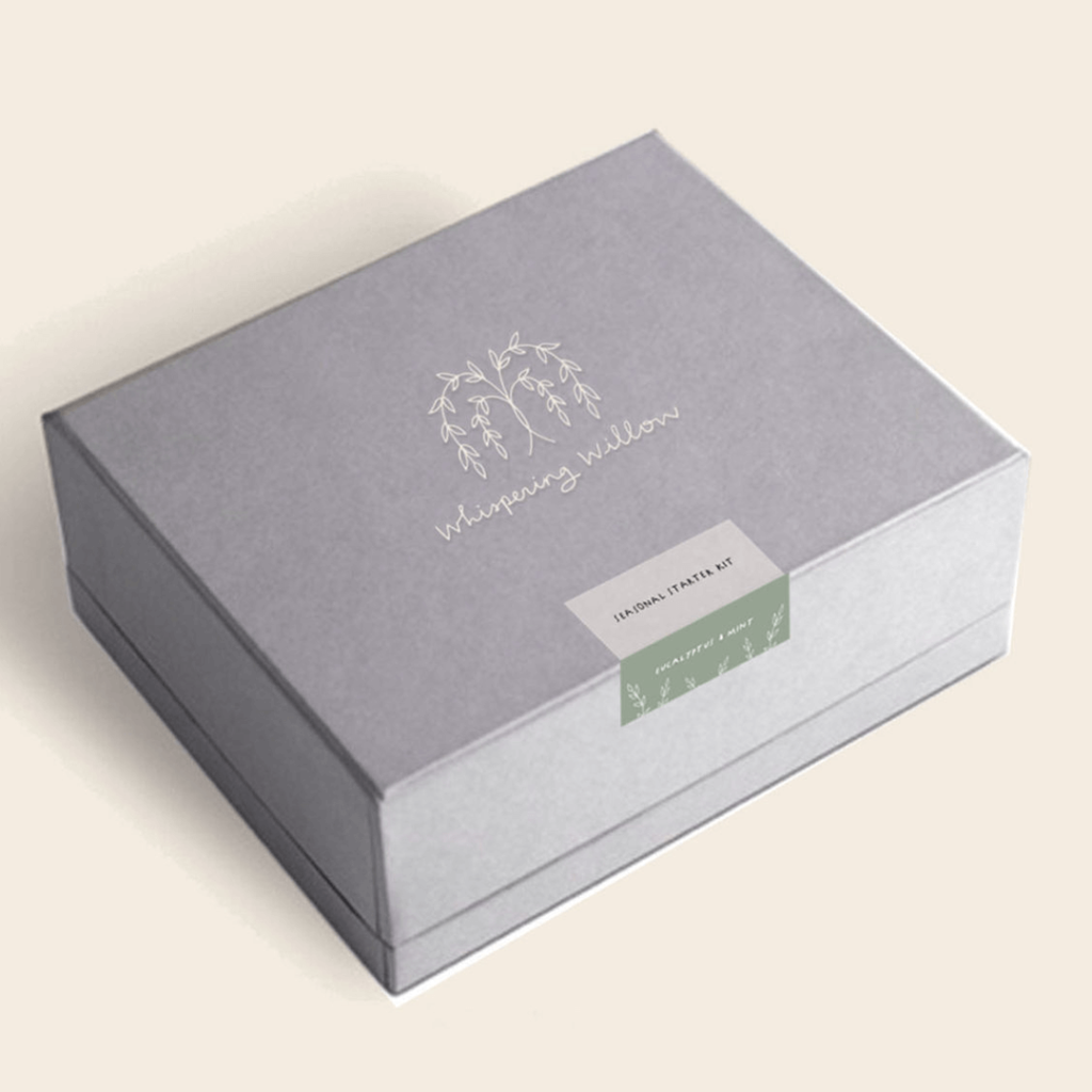
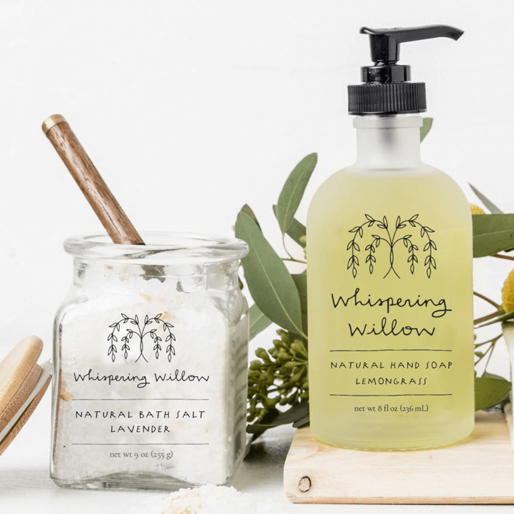
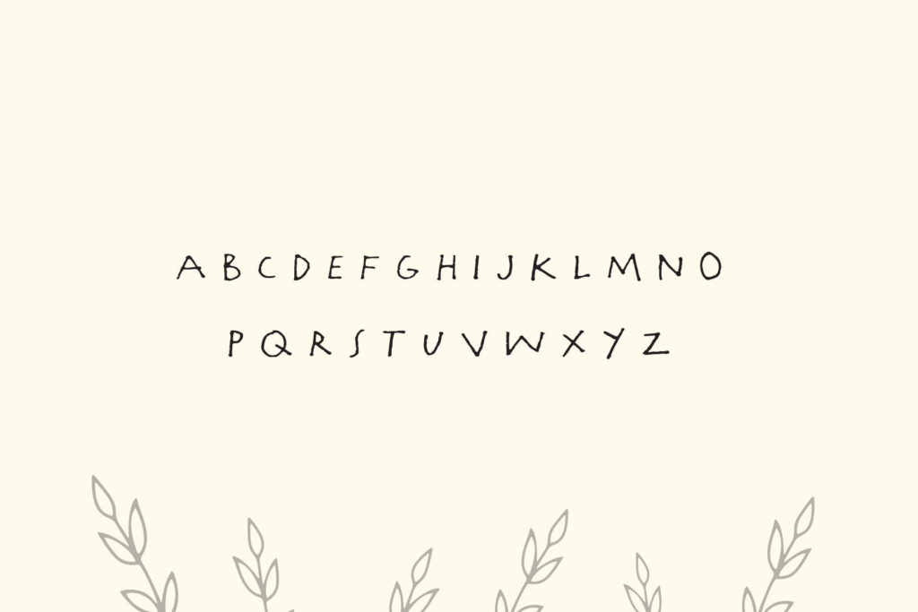
The custom hand-lettered font style is thin and clean but contains an organic and warm quality through the imperfections in the letterforms.
