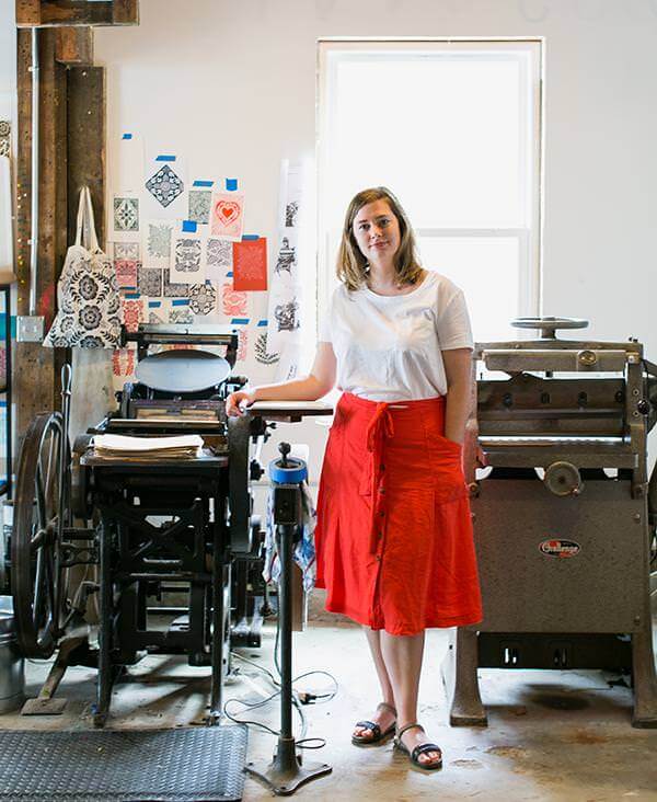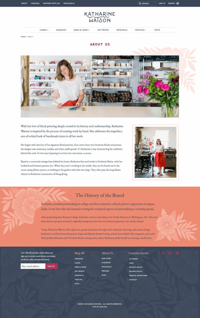
Since a large part of her existing business already came from in-person events, Katharine enlisted our help to translate that experience to her retail website. She told us: “I’ll feel like it is a success if we can capture some of that casual, conversational, walking-into-our-studio vibe that we’ve been able to translate to events. I want our online customers to feel as connected to the business as in-person clients do.”
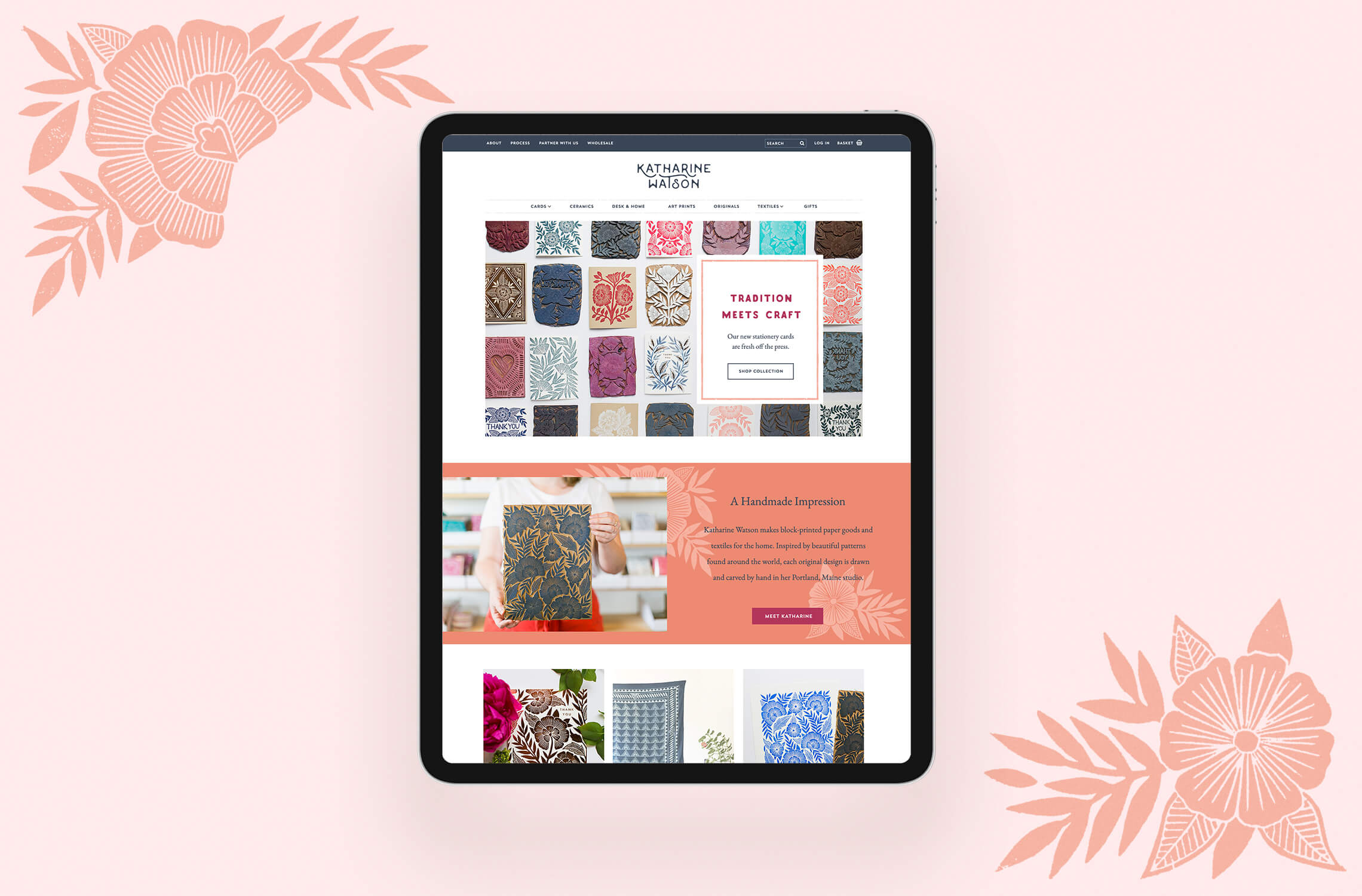
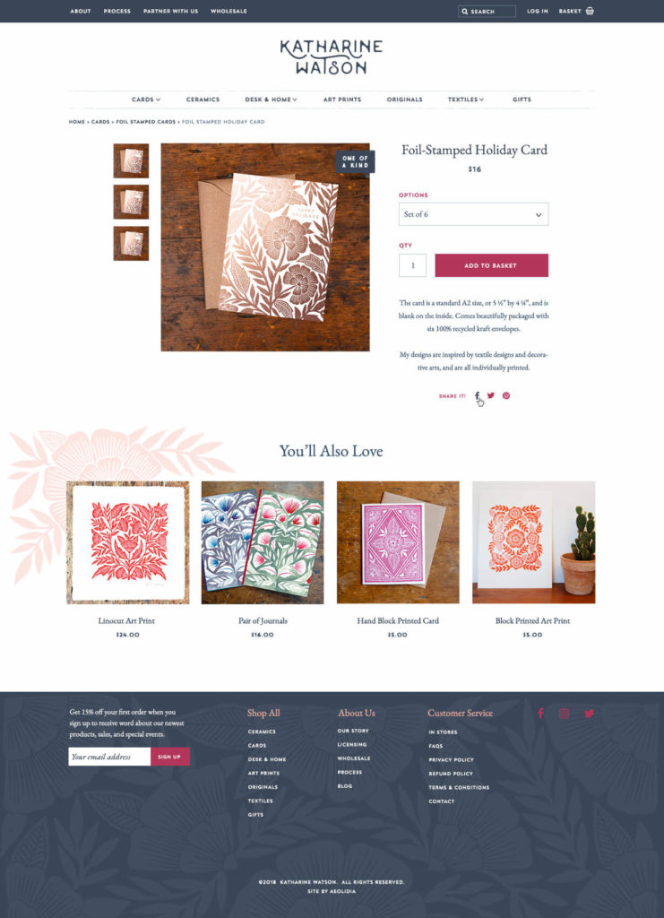
We took great care to plan all the little details for the homepage, which would be repeated and carried through all the pages of Katharine’s site. The new design introduces customers to Katharine’s work and her traditional block printing process, while making it clear to website visitors that they can purchase the products online.
Christine’s responsive design ensures that the elements will flow and shift easily to look great on smaller screens like tablets and mobile phones.
When we checked in nearly a year after the launch of the new website, things were going really well. The new site has a low bounce rate, which means people are spending time exploring, and a high conversion rate means that they’re also purchasing products! Katherine told us:
“The website is working amazingly well! We’ve gotten a ton of good feedback about the design as well as the functionality, and we’re much more excited about pushing our customers there, and therefore spend more time working towards that. It’s also been really easy to customize and make new sections and graphics as needed (like for the holidays, or launching a new product category).”
Katharine Watson
I’ve had some experience with web design in the past, so one of my main worries was that it wouldn’t be worth it to hire someone else. After seeing the finished product, everything is so polished and professional, and looks SO much better than a DIYed site, that that question is long gone. I was hoping for a site that was simple but polished, professional, and easy to use, and I think Aeolidia really delivered on that!
Katharine Watson
